Design house: A compact yet cozy home – built in the early 1900s
Interior designer and founder of Lorla Studio, Laura Hur takes us on an exclusive tour of her San Francisco apartment

Bold colors and inspiring decorative displays have helped turn Laura Hur’s magnolia and beige rental into an elegant and personal home, one that makes her and her family smile
There are many difficulties when it comes to designing a rental home, but interior designer Laura Hur wasn’t about to let that stop her from creating a dream space to work, entertain and relax in.
After a decade of diverse experiences in the design world, Laura Hur launched Lorla Studio to provide clients with holistic design solutions, blending her background in the social sciences with her expertise in the built environment. She used her interior knowledge to add life to this San Francisco rental space.
We speak to Laura about the design project below.
- See some of the world's best homes – beautiful properties from around the globe
My husband and I moved from New York City to San Francisco in January 2019, along with my daughter who was only 3 months old at the time.
We really wanted a true San Francisco experience, and fell in love with this Stick Victorian row house. Stick Victorians are all over San Francisco, and are typically narrow town homes with square bay windows built in the late 1800s and early 1900s.
I run an interior design business, working on both commercial and residential projects on both coasts, and at the time we signed the lease I was planning on renting an office space.
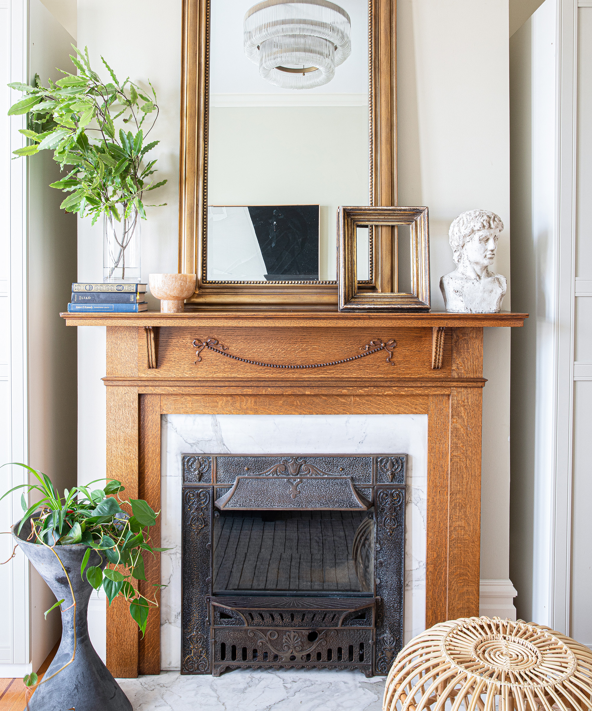
Despite the home being over 100 years old, it is in great shape, and has been cared for very well over the years. A few changes have been made, such as adding skylights, a master suite, garage and extra bedroom on the ground level, but the layout is still as it was 100 years ago, as are many of the materials, including the original wood floors, mantel and fireplace surround.
'I really wanted a neutral and bright space, with layers of textures, and envisioned textured, creamy white-walls as the starting point,’ says owner and interior designer, Laura Hur.
To my disappointment, our landlords would not let us paint a single wall. All of the walls are the same beige color throughout – textbook rental home.
The color isn’t terrible, but there’s way too much of it. Thankfully, I was able to talk our landlords into allowing us to swap out all of the light fixtures, another lease no-no, and that made a huge difference instantly.
Due to the tight restrictions the lease imposed on the design, this project became almost exclusively about furnishings and decor details.
It was a challenge to balance my ideal vision of the space – the lease restrictions and our budget provided many constraints – but it forced a fine balance of making pieces we already had work alongside thoughtfully curated new additions.
Every new piece we purchased had to either be something beautiful that we loved and could envision in future homes, or serve a necessary function in this rental, such as a dining room table and storage. I have a two year old daughter, so durability was in the front of my mind as well.
Overall, the more art that we hung, and textiles that we brought in, the more this rental felt like home, and to me that is the best feeling you can create. I updated the lamp shades on several of our existing lights, which is a fun and inexpensive way to breathe new life into an older item.
Living room
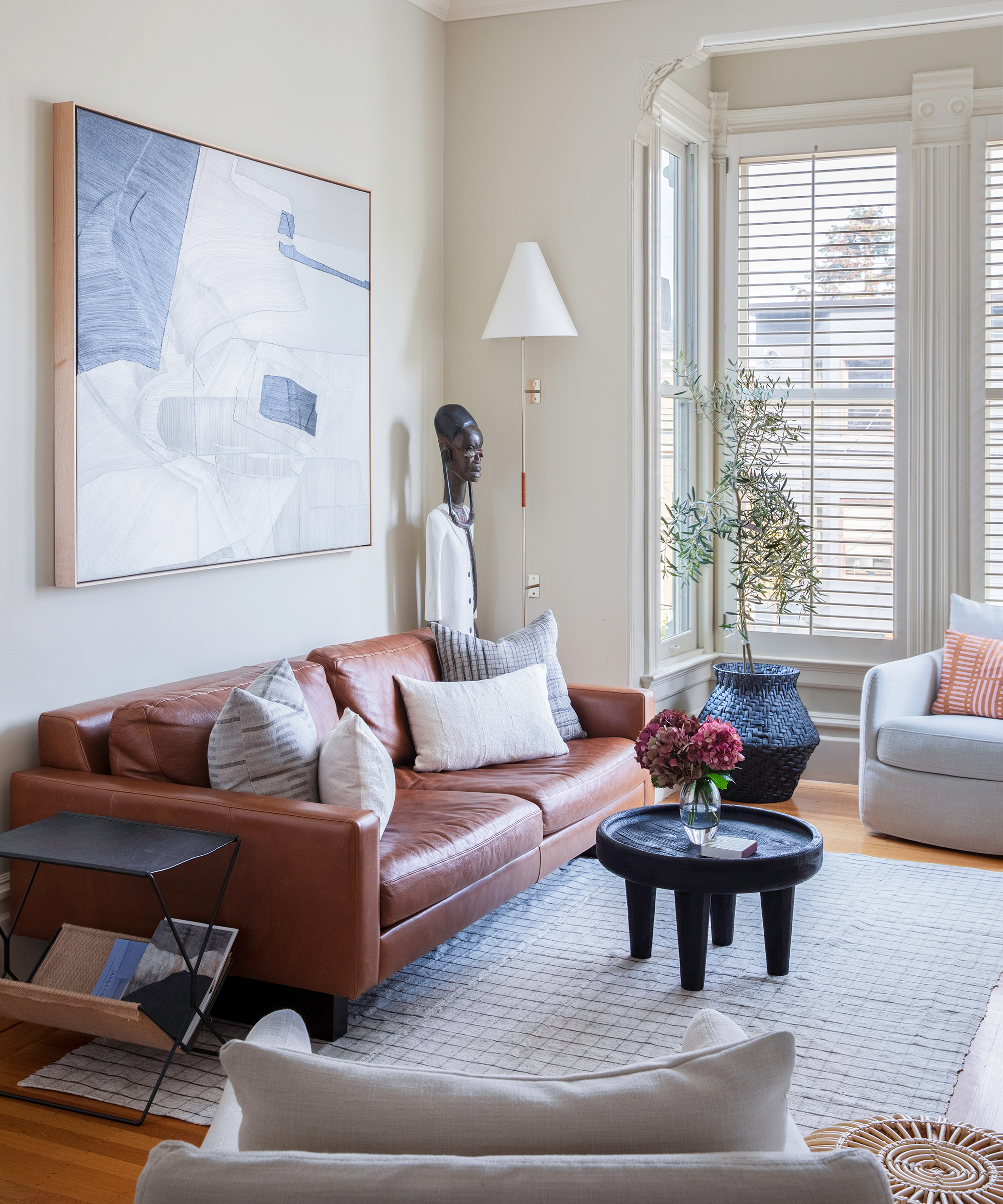
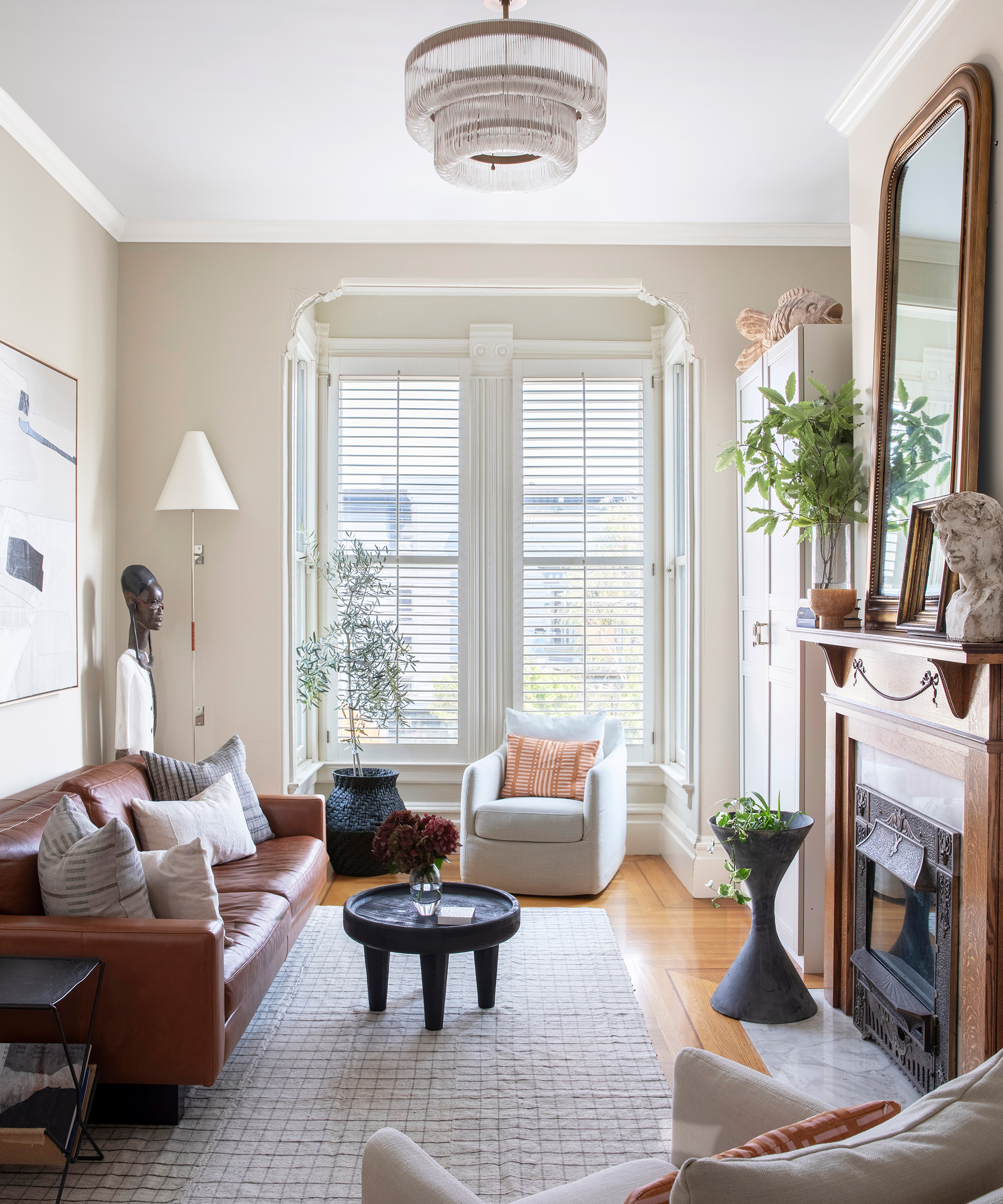
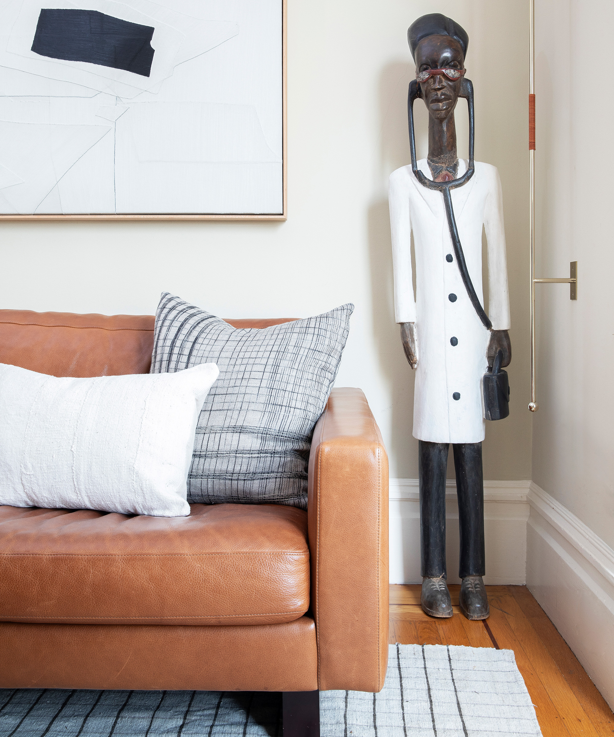
The stand out piece here is the large artwork from Joelle Somero – it is one of my favorite items in our home.
We worked with our existing sofa from Room & Board that we brought with us from New York – it’s a great small space sofa.
The slipcover swivel chairs from Big Daddy’s Antiques are incredibly durable, and neutral enough to work in future homes.
Home office
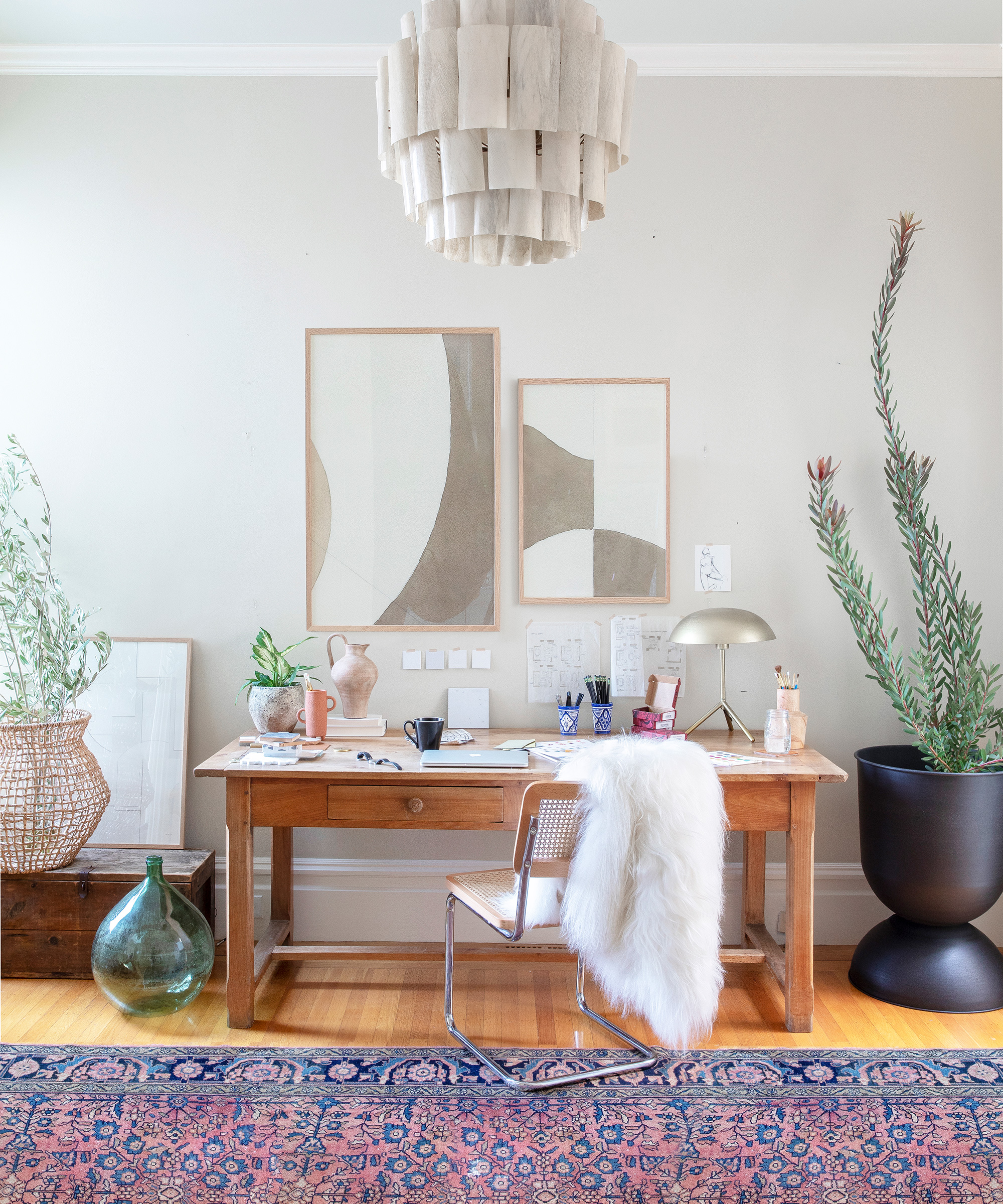
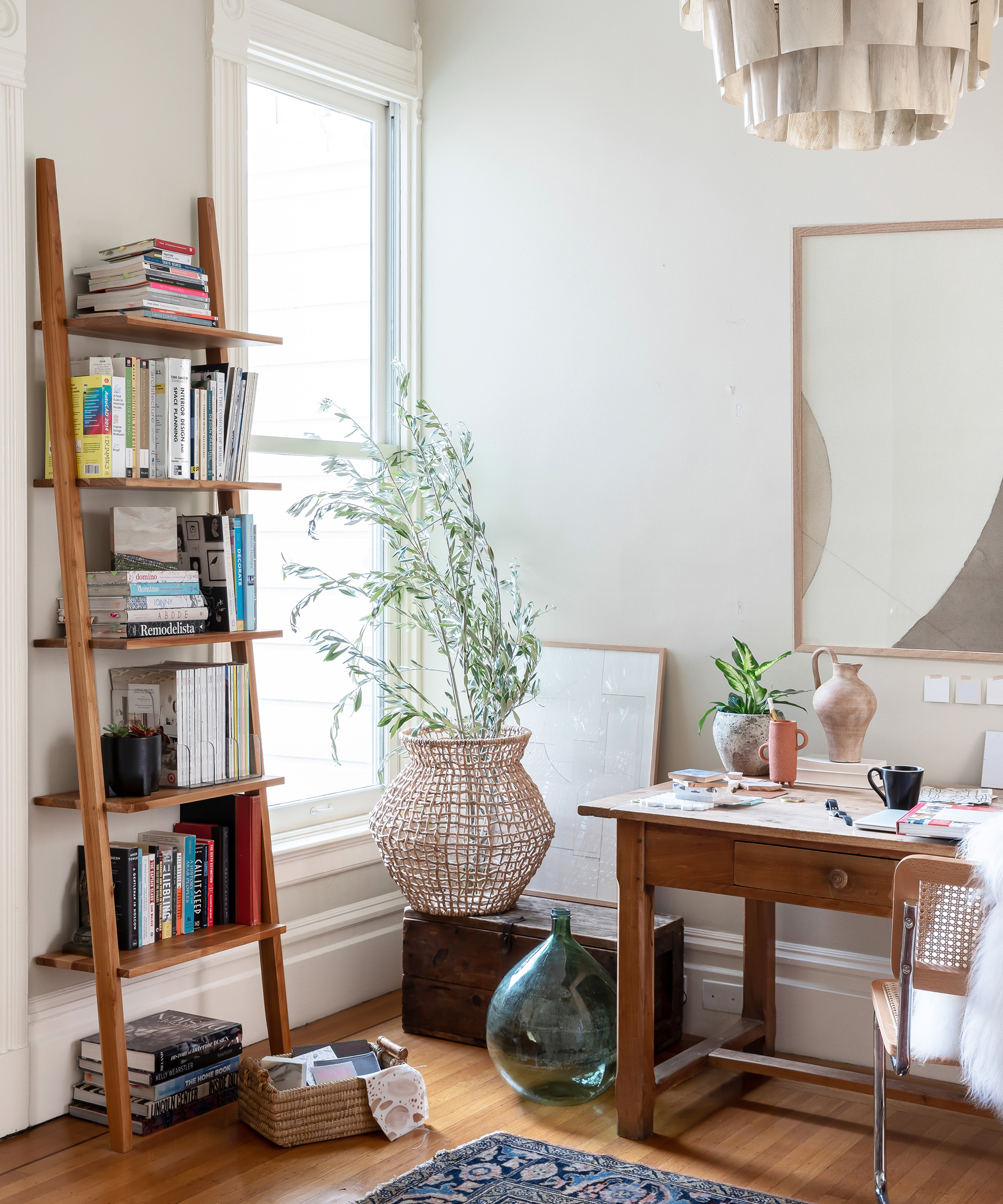
I love the combination of the vintage pine desk discovered at an estate sale in Berkley, CA, paired with the vintage carpet from Jean Palmer Home and the contrast in the oversized, modern planter from Ferm Living.
Kitchen
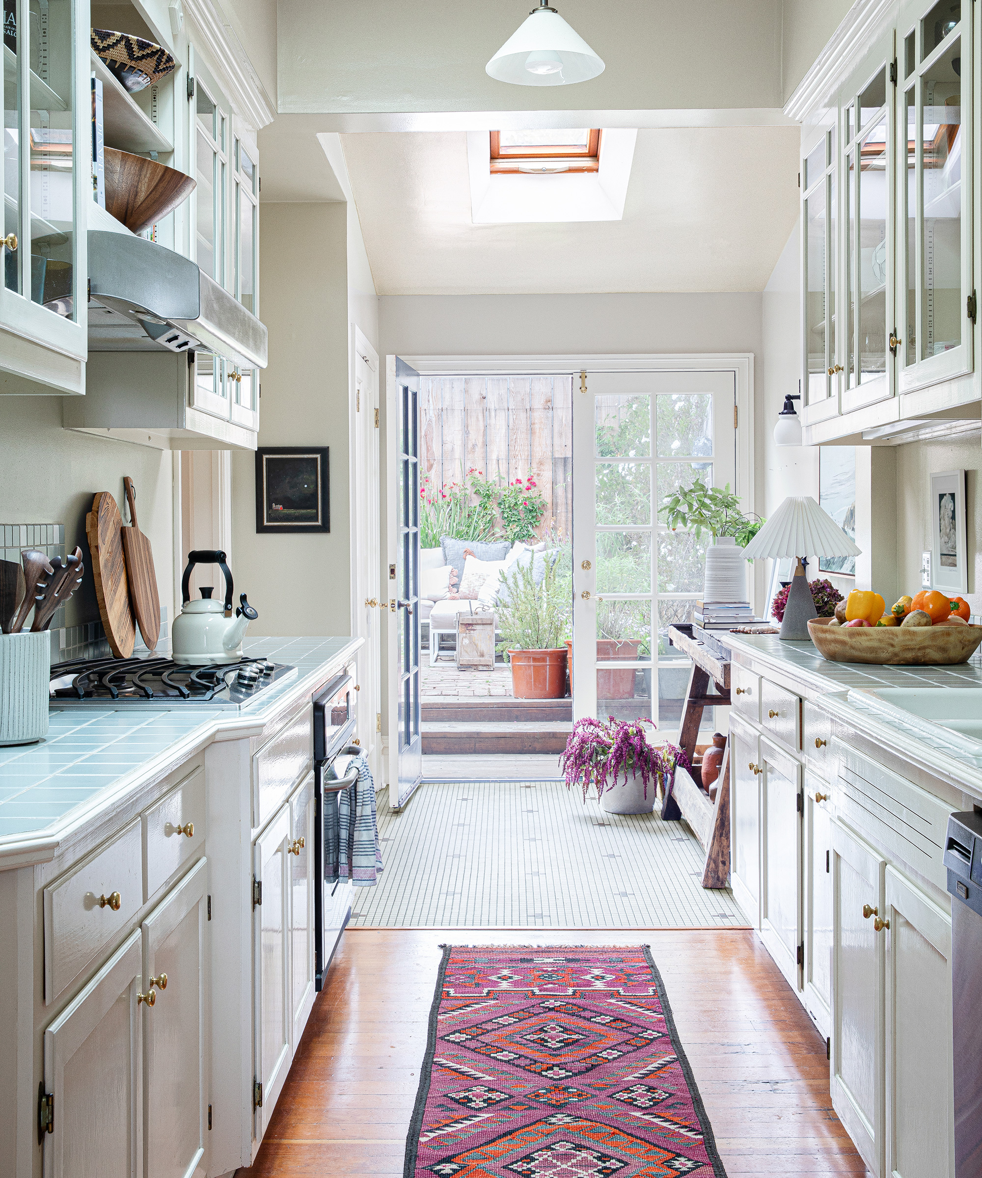
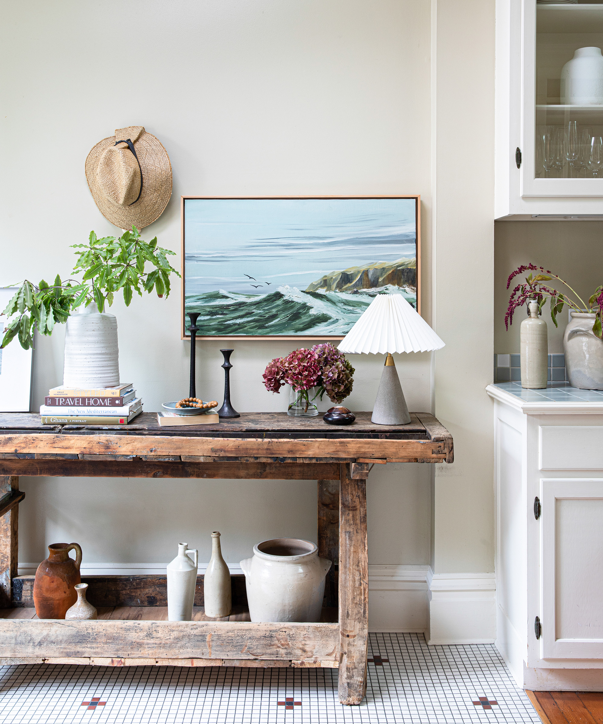
There was not a lot that could be done in the kitchen because of our lease restrictions, but a few decorative touches can go a long way in personalizing your space.
The bright rug brings a much needed dose of color, and we even hung art in here, above the countertops.
I love the vintage workbench from Elsie Green. It’s beautiful and makes great use of the awkward space off the end of the kitchen, in front of the garden doors.
Dining room
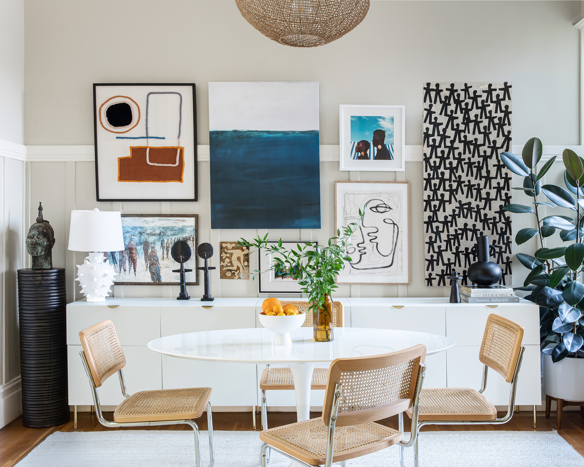
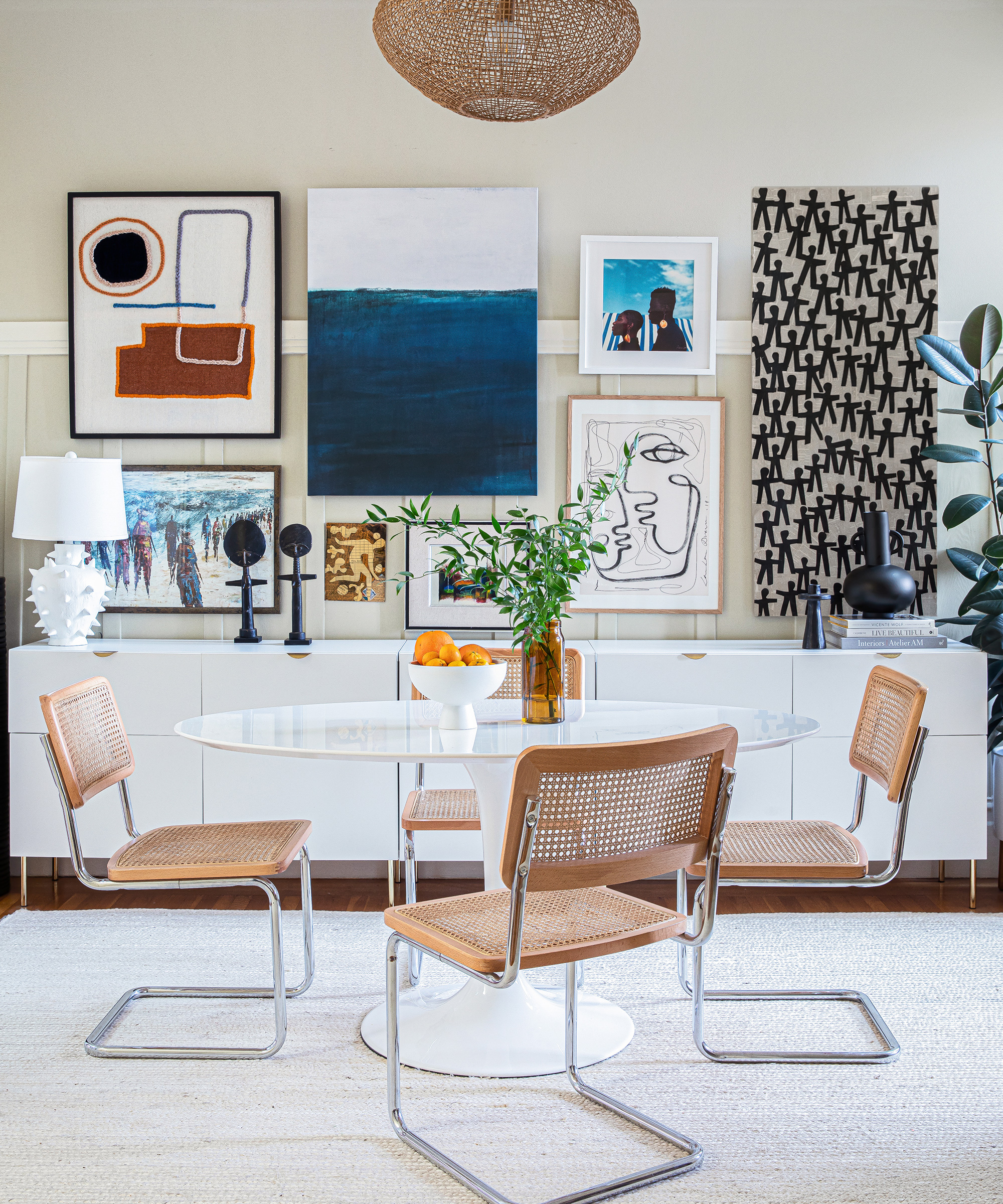
A lot of time, effort and consideration went into the gallery wall here, and it was time well spent because it makes my family happy every time we look at it. It really brings the room to life, and is very personal, which is what art should be.
There are a few new pieces, like the LRNCE textile art – I am a huge fan of her work.
The majority of the artwork has been collected over time, and takes us back to different points in our life; the small abstract work in the middle is a gift from my husband’s beloved, late grandfather; the mixed media pieces are from Wayne Cunningham and were purchased in Hudson, NY; the bold photography by Prince Gyasi reminds my husband and I of the two years we spent in Ghana, as does the abstract painting that we brought home from Ghana.
All of this art is intentionally paired with a minimal table and furnishings that let the art take center stage, and work well for circulation.
Main bedroom
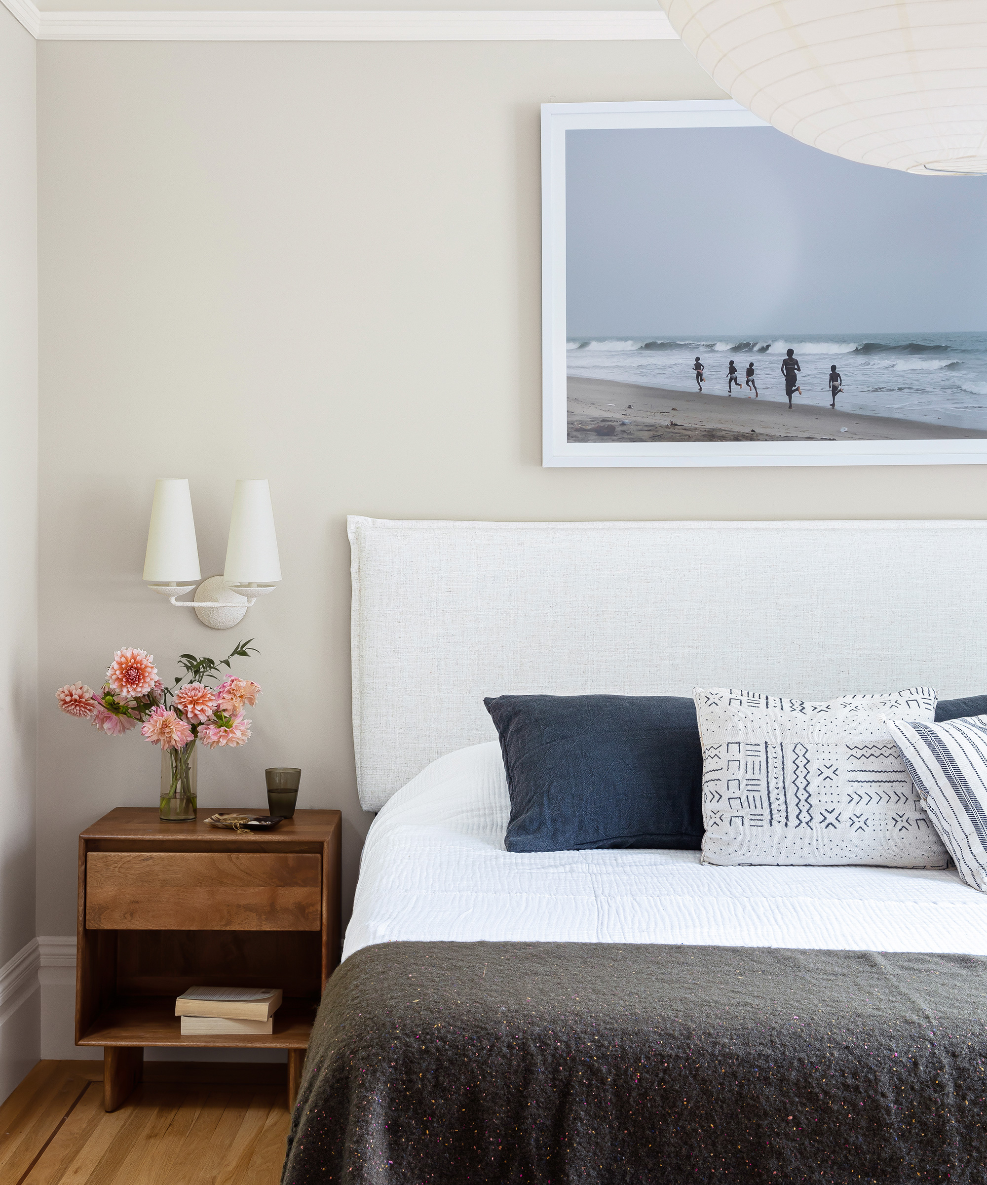
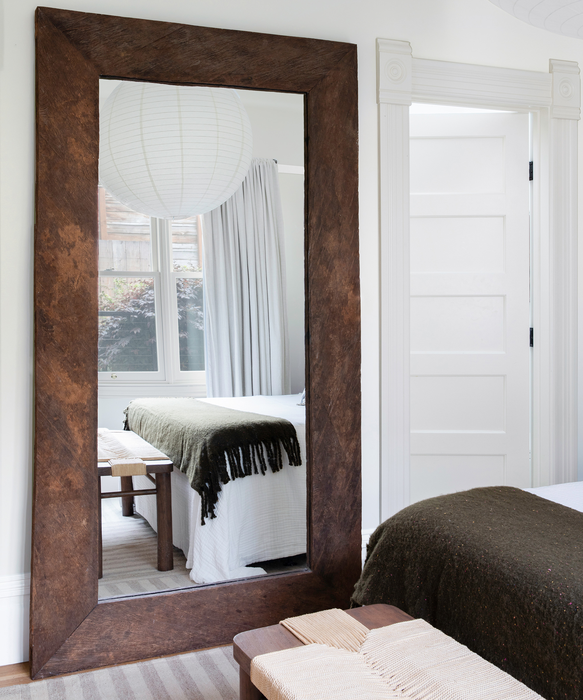
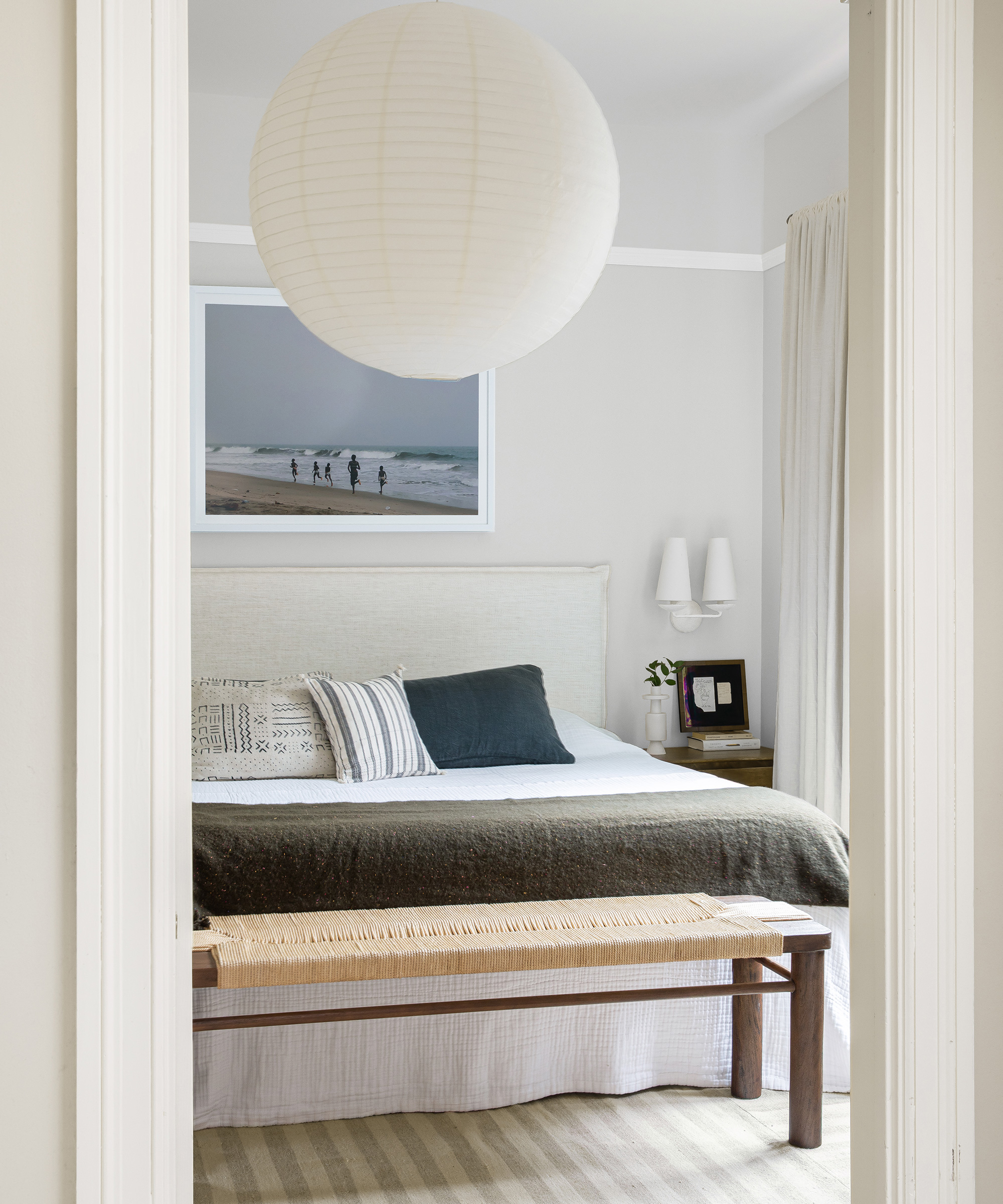
I wanted this room to be extremely zen and free of clutter, so I sourced neutral furnishings and decor, and went minimal with the artwork, only installing one large piece over the bed.
One of the best deals in my house is the massive, 36” round paper lantern in here. It instantly transformed the feel of the space, and only cost about $30.
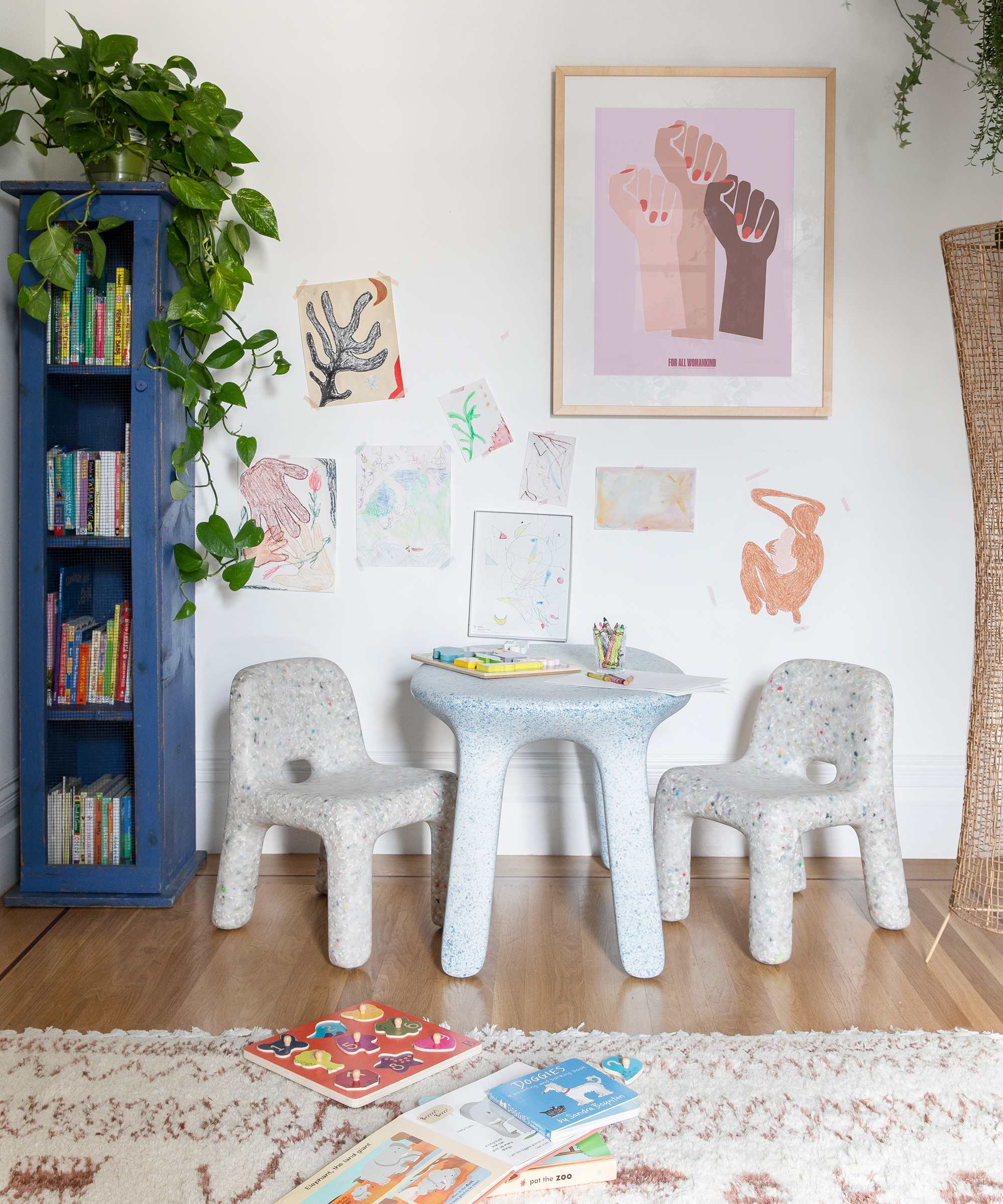
Play room
Nursery
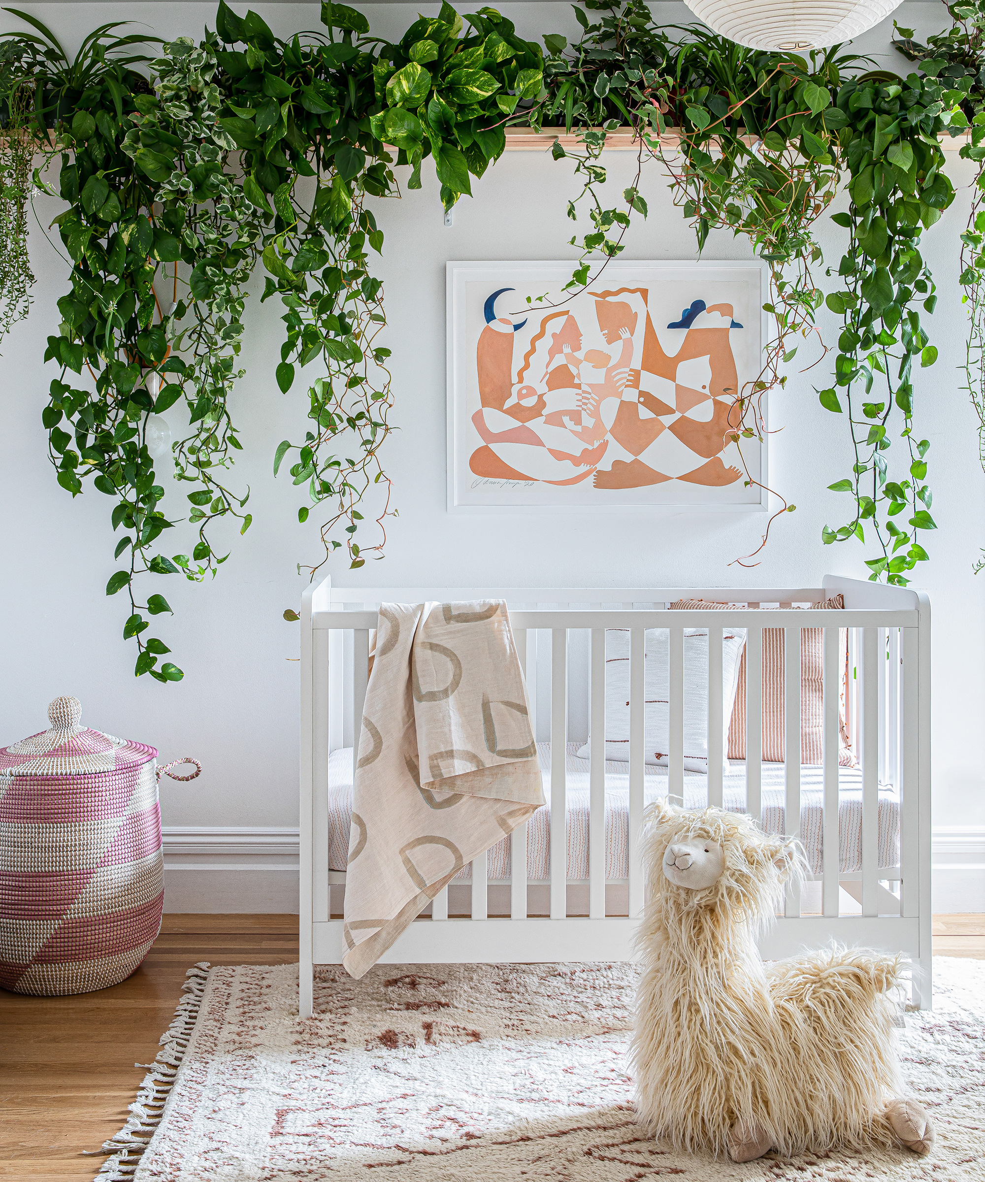
My daughter’s room is my favorite room in the house, but more importantly, she loves it and spends a lot of time in it.
It was so much fun creating a room just for her, and thinking of ways we could make it a creative and cozy space for her to enjoy.
It was really special to get a piece by Octavia Tomyn commissioned for my daughter for her second birthday.
Octavia captured our family beautifully, and my hope is that this piece is something my daughter will take with her when she moves out on her own as a reminder of us.
Garden
I am not sure if I would consider the project done, because almost every space I have ever lived in is a constant work in progress.
My tastes change over time, and I am always moving things around, trying a chair in a new corner, a new light fixture here, moving artwork there.
That said, one of the smaller, yet extremely impactful changes that happened immediately upon arrival was to swap out all of the landlord’s light fixtures for our own. Updating the lighting immediately elevated the entire space, improving the vibe and quality of light.
Overall, the more art that we hung, and textiles that we brought in, the more this rental felt like home, and to me that is the best feeling you can create.'
Interior design / Laura Hur at Lorla Studio
Photography / Vivian Johnson
Sign up to the Homes & Gardens newsletter
Design expertise in your inbox – from inspiring decorating ideas and beautiful celebrity homes to practical gardening advice and shopping round-ups.

Jennifer is the Digital Editor at Homes & Gardens. Having worked in the interiors industry for several years in both the US and UK, spanning many publications, she now hones her digital prowess on the 'best interiors website' in the world. Multi-skilled, Jennifer has worked in PR and marketing and occasionally dabbles in the social media, commercial, and the e-commerce space. Over the years, she has written about every area of the home, from compiling houses designed by some of the best interior designers in the world to sourcing celebrity homes, reviewing appliances, and even writing a few news stories or two.
-
 Ina Garten's storage pantry is an insightful window into all of the best cookware used by the chef – and it's easy to recreate on your kitchen shelves from $48
The beautiful dishware in The Barefoot Contessa's Hamptons pantry showcases the tools she uses most often to cook – this is exactly how you replicate it
By Sophie Edwards Published
-
 Extend the lifespan of your appliance with 5 simple but crucial washing machine maintenance tips
From cleaning the filters to keeping the door open, experts reveal the washer tips they swear by
By Andy van Terheyden Published