This classic London mews house has an unexpectedly modern interior
Behind the classic façade of this Victorian house lies a contemporary style, thanks to the imaginative approach of designers Kitesgrove.

Everything about this classic Victorian mews house speaks of contrast. A flat-fronted, period façade gives no hint of the bold architectural shapes and unconventional layout within, just as a deeply peaceful crescent setting belies the building’s hectic west London location.
It’s exactly this juxtaposition that appealed to owner Lynn Chen. Though she had renovated a number of London new-build apartments, the prospect of nudging a period house towards relaxed, modern living was new to her.
Nonetheless, its previous incarnation, which incorporated a vast LED-lit glass staircase, seemed to Lynn to jar with the bones of the building.
‘I wanted to restore the English feel of the house and to respect its context,’ she says. ‘It also needed to cater to our busy family life.’
Working with architects Studio McLeod and interior design practice Kitesgrove, Lynn simplified the layout of the house, improved circulation and carved out two further bedrooms and bathrooms without expanding its footprint.
Hallway
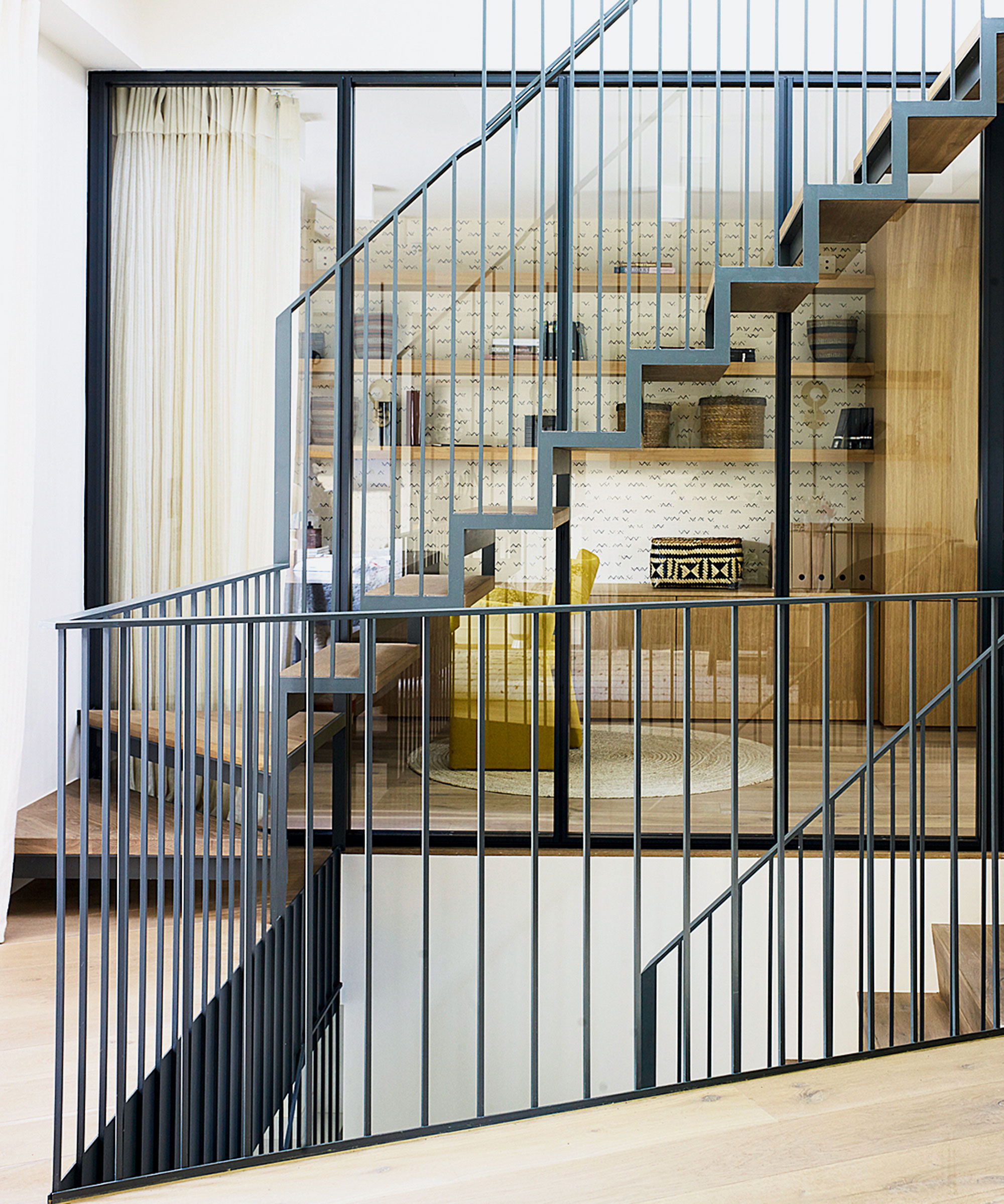
Key to the design of this hallway was the creation of a lightweight steel and oak open staircase hung from the roof, which neatly dissects all three storeys.
Extra light was introduced throughout via floor-to ceiling windows, skylights and an ingenious Rubik’s Cube-like configuration of angular light wells.
Kitchen diner
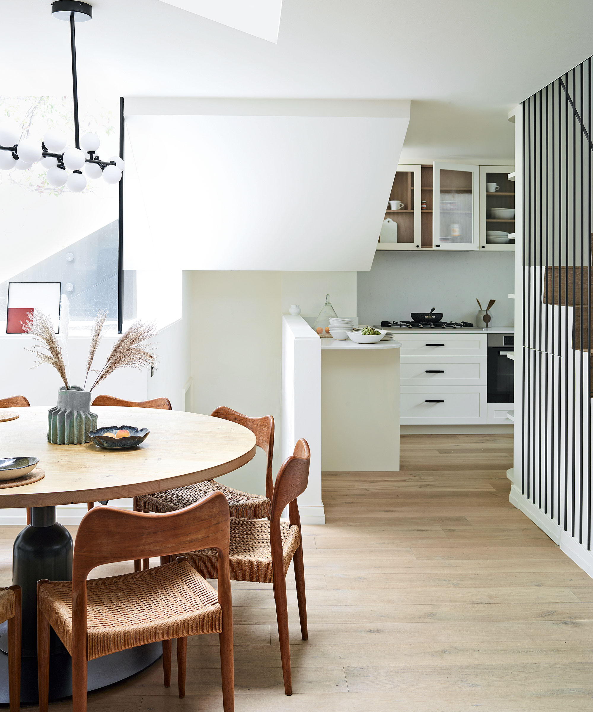
'A well-conceived layout was our driving force,’ says Kitesgrove’s Caitlin Nicol. ‘We moved the kitchen and dining room area to the lower ground floor, along with an informal living room.
Above the table is a triangular skylight – just one of the striking architectural features of this renovation.
Dining area
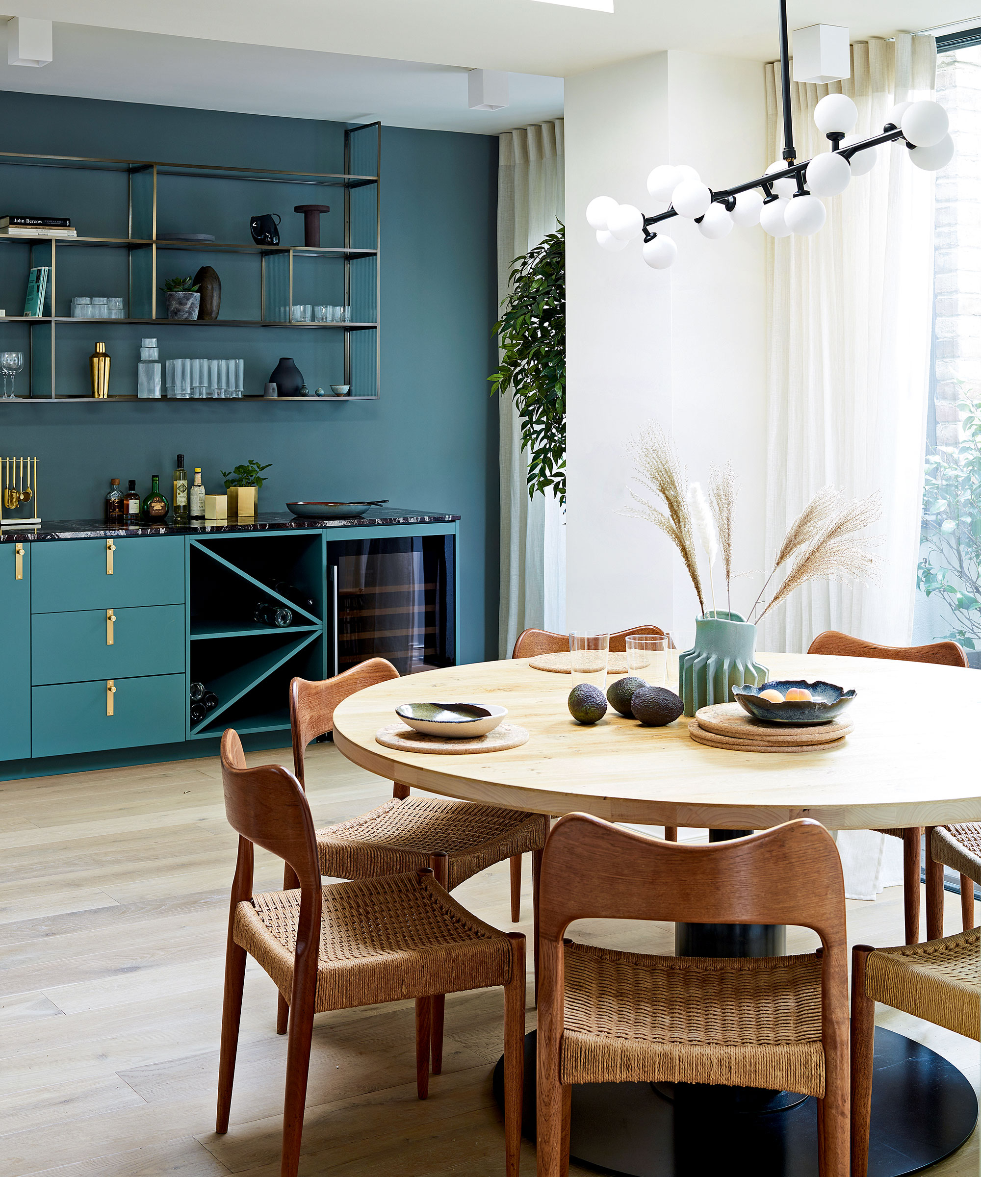
One corner of the dining area has a streamlined marble-topped bar, painted in a grounding blue-green, complete with wine fridge for easy entertaining. This creates a natural focal point while, conversely, the off-white kitchen seems to melt seamlessly into its setting.
'My family loves spending time around the dining table and so it made sense for us to have kitchen, dining and relaxation areas on one floor,’ says Lynn.
Living room
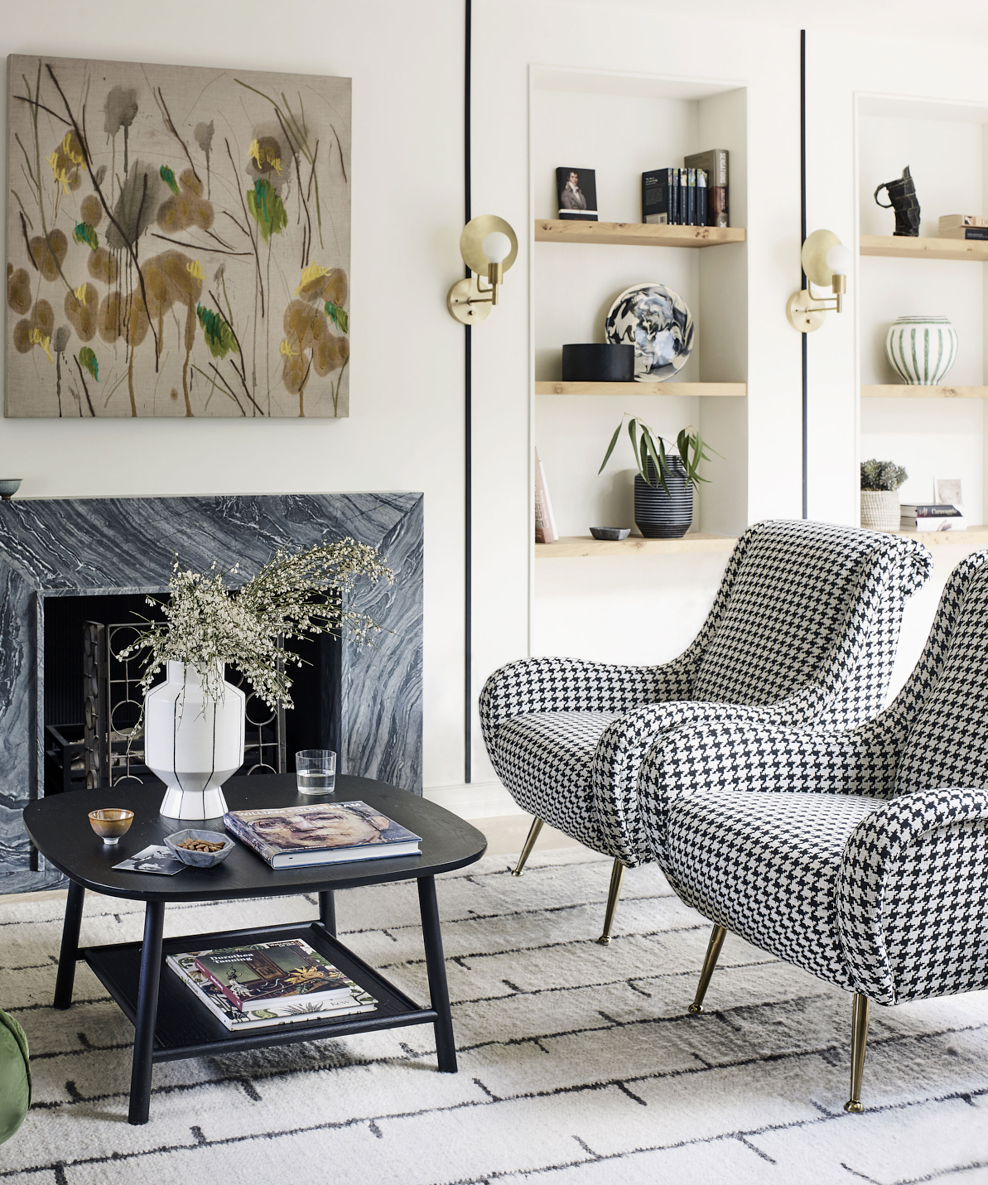
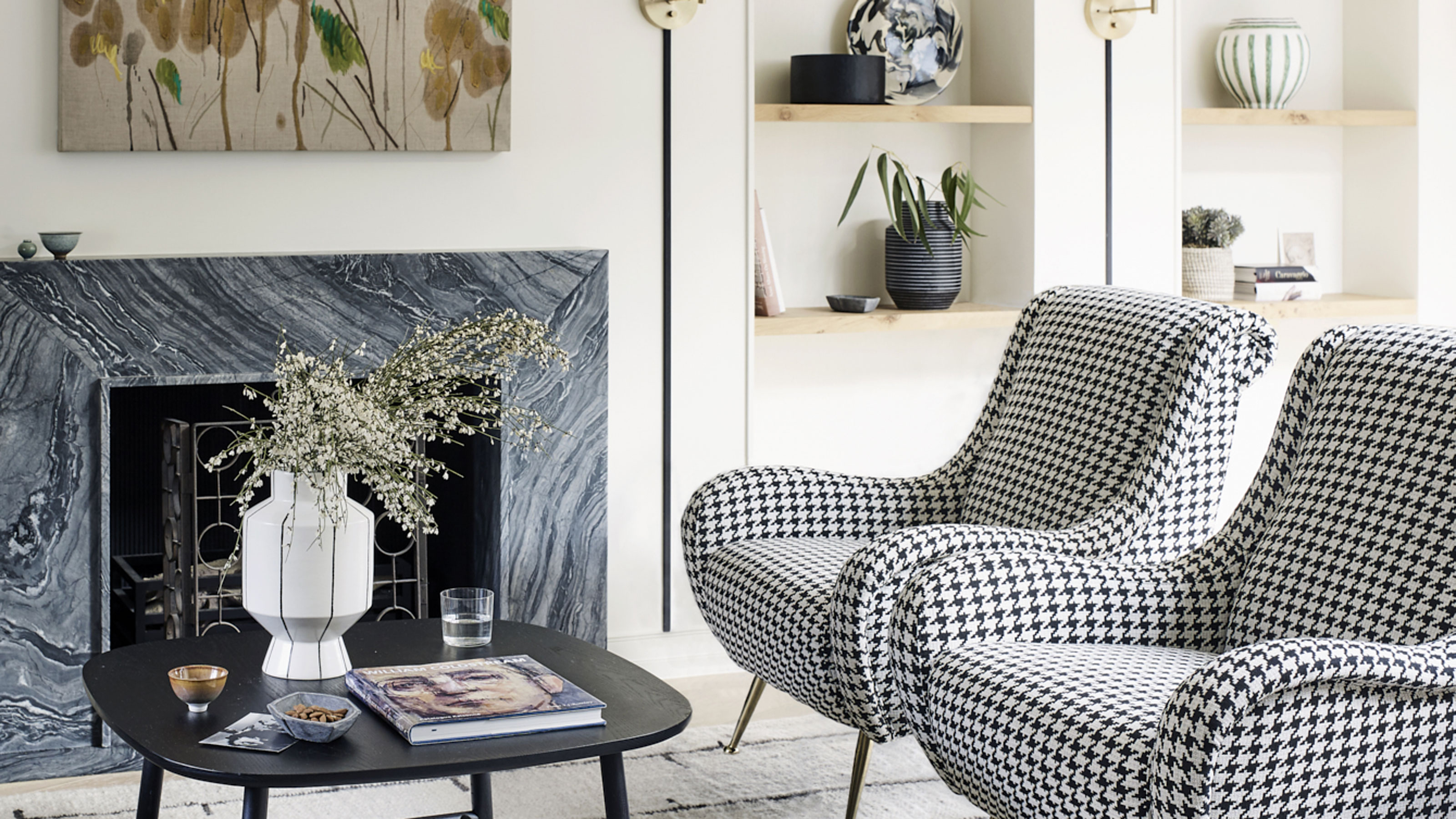
The open-plan living room is anchored by a fireplace.
Simple details create a characterful look, including the black strips on the wall that chime with the rug and mid-century chairs. The mid-century modern living room furniture complements the angular skylights.
Office
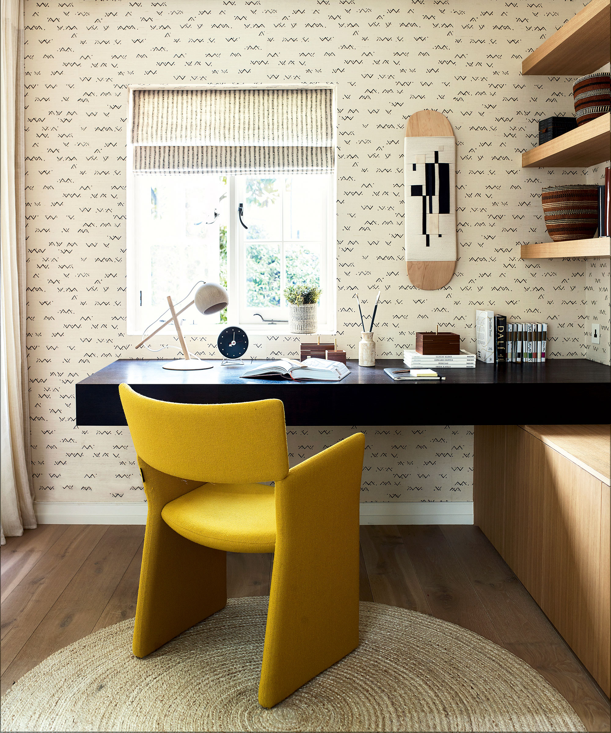
A glass-fronted home office was created on the ground floor.
A patterned wall and window treatment double the decorative impact of this space. The walls were papered in a sisal grasscloth, featuring an informal deconstructed chevron design.
The glazed wall allows for a sense of space while providing acoustic and visual privacy when necessary.
The tweaks to the layout were instant game changers. ‘It meant the spaces related to each other,’ says Lynn.
Main bedroom
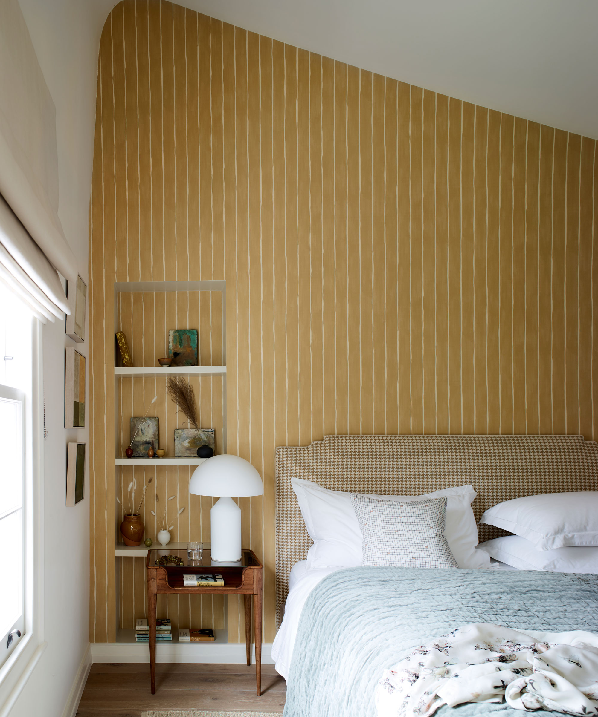
Lynn’s decorative choices were gentle yet impactful, thanks perhaps to the structural motifs that run throughout.
As a result, in the main bedroom elegant ochre striped wallpaper echoes the vertical lines of the staircase and emphasises the softly curving roof angle. Its deep ochre hue evokes a cocooning feel.
Though Lynn has a preference for minimal interiors, she wanted to experiment more boldly with pattern and color.
Bedroom
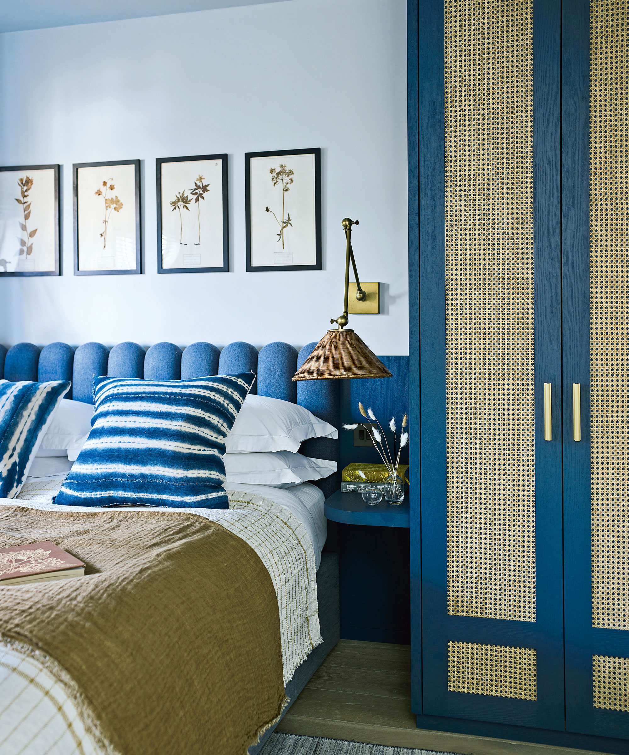
The scalloped headboard and a rattan-fronted wardrobe in the bedroom add depth and texture to this space on the top floor.
Bathroom
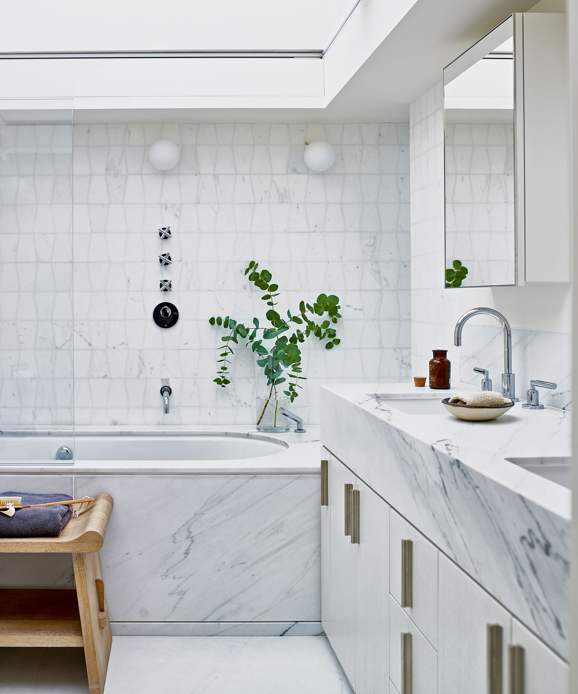
To flood this bathroom with natural light, a vast and retractable skylight was put in. The sinks and bath are surrounded by Calacatta marble.
A hidden jewel of a cloakroom, tucked under the stairs, features a modern pastoral wallpaper by Cole & Son. ‘The house was built in 1850, around the time of London’s Great Exhibition, with its emphasis on cultural and decorative richness,’ says Caitlin. ‘We took our cue from that, sourcing furniture and fabrics that introduce a global flavour, along with a sense of comfort and warmth.’
Now, a series of contemporary shapes complement this building’s period origins while standing apart from them. It’s an unexpected harmony that appeals to Lynn. ‘The house is a stone’s throw from everything I need and yet it’s incredibly private,’ she says. ‘It is such an oasis of calm amid the busy city life.’
Interior designer/ Kitesgrove
Architect/ Studio McLeod
Photography/ Mary Wadsworth
Text/ Emma J Page
Sign up to the Homes & Gardens newsletter
Design expertise in your inbox – from inspiring decorating ideas and beautiful celebrity homes to practical gardening advice and shopping round-ups.

Interiors have always been Vivienne's passion – from bold and bright to Scandi white. After studying at Leeds University, she worked at the Financial Times, before moving to Radio Times. She did an interior design course and then worked for Homes & Gardens, Country Living and House Beautiful. Vivienne’s always enjoyed reader homes and loves to spot a house she knows is perfect for a magazine (she has even knocked on the doors of houses with curb appeal!), so she became a houses editor, commissioning reader homes, writing features and styling and art directing photo shoots. She worked on Country Homes & Interiors for 15 years, before returning to Homes & Gardens as houses editor four years ago.
-
 These are the worst houseplants for beginners – experts reveal 5 difficult plants to avoid, plus easy alternatives to choose instead
Caring for these houseplants successfully requires a lot of of TLC
By Tenielle Jordison
-
 Taylor Swift and Anna Wintour popularized artist Tricia Paoluccio's stunning flower designs – she explains how you can use 'wild botanical beauty' to transform your Easter tablescape
In our exclusive interview with Tricia Paoluccio, she explains how to use flowers to decorate your table like the designs worn by Taylor Swift and Anna Wintour
By Sophie Edwards