Design house: A quaint Art Deco home has been given a contemporary lift with color, texture and luxe materials
A first home has been lovingly transformed into a modern masterpiece

Design expertise in your inbox – from inspiring decorating ideas and beautiful celebrity homes to practical gardening advice and shopping round-ups.
You are now subscribed
Your newsletter sign-up was successful
Want to add more newsletters?
Located in the Mira Loma neighborhood of San Francisco, this 1930s built home has an Art Deco appearance, typical to the surrounding homes in the area.
It was the fairytale book aesthetic that really drew the owners in when looking for their first home, and it is easy to see why they adore it so much. In order to get the design just right, the owners hired interior designer Leo Cesareo. A decision that certainly did not regret.
Leo is a San Francisco based Artist and Designer that has worked with some of the design world's premiere interior designers, including Steven Volpe, Jay Jeffers and Lauren Geremia.
Article continues belowA graduate of the Rhode Island School of Design, Leo's approach to space and composition draws from his formal education in the visual arts. He strives to create unique interiors that are tailor-made for the contemporary individual and household.
We speak to Leo Cesareo about the design project.
The house is a small Art Deco row house – three bedrooms and two baths – and because the house isn't big, we really focused on the details to make the space interesting and unique.
My clients, Anthony and Garrett are newlywed, and has this is their first home together, we knew it had to be special from the get-go. They both have a relaxed, casual demeanour, and spend a lot of time at home, so it was important to make their new home together, a place to entertain that truly reflected their style and outlook on life.
Design expertise in your inbox – from inspiring decorating ideas and beautiful celebrity homes to practical gardening advice and shopping round-ups.
- See some of the world's best homes – beautiful properties from around the globe
This is their first home together, so we knew we had to get it right. They had been living in it for a few months before they reached out to me.
The home was in pretty good shape but it was missing the flare for the dramatic that my client Anthony wanted. The kitchen and master bathroom were dated and in need of a new design direction.
My client Anthony knew early on what he wanted to achieve with the remodel. We worked together to bring drama and a touch of whimsy to their otherwise drab interiors. We were able to come up with a design that was respectful of the age of the home and yet modern and eclectic.
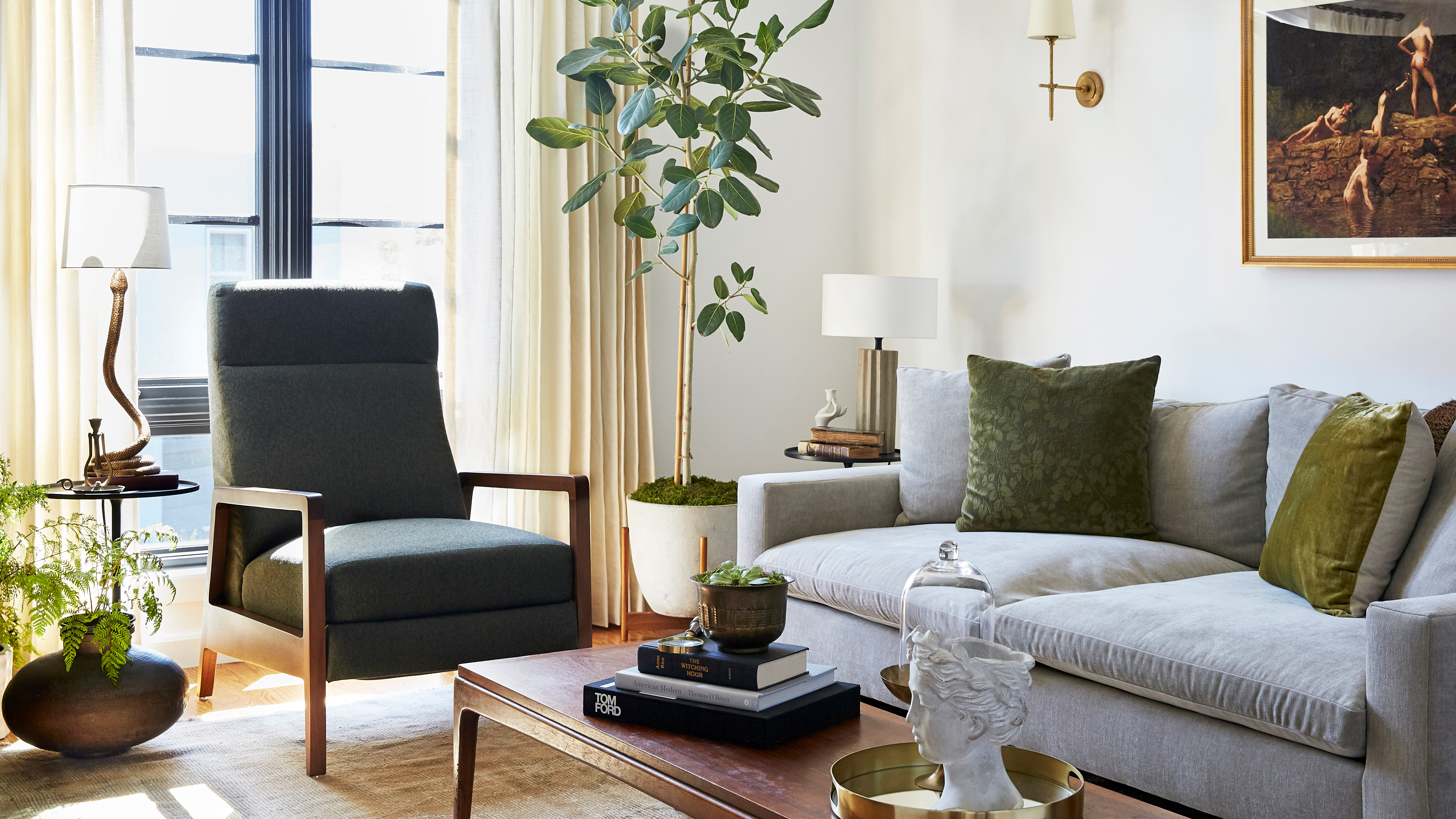
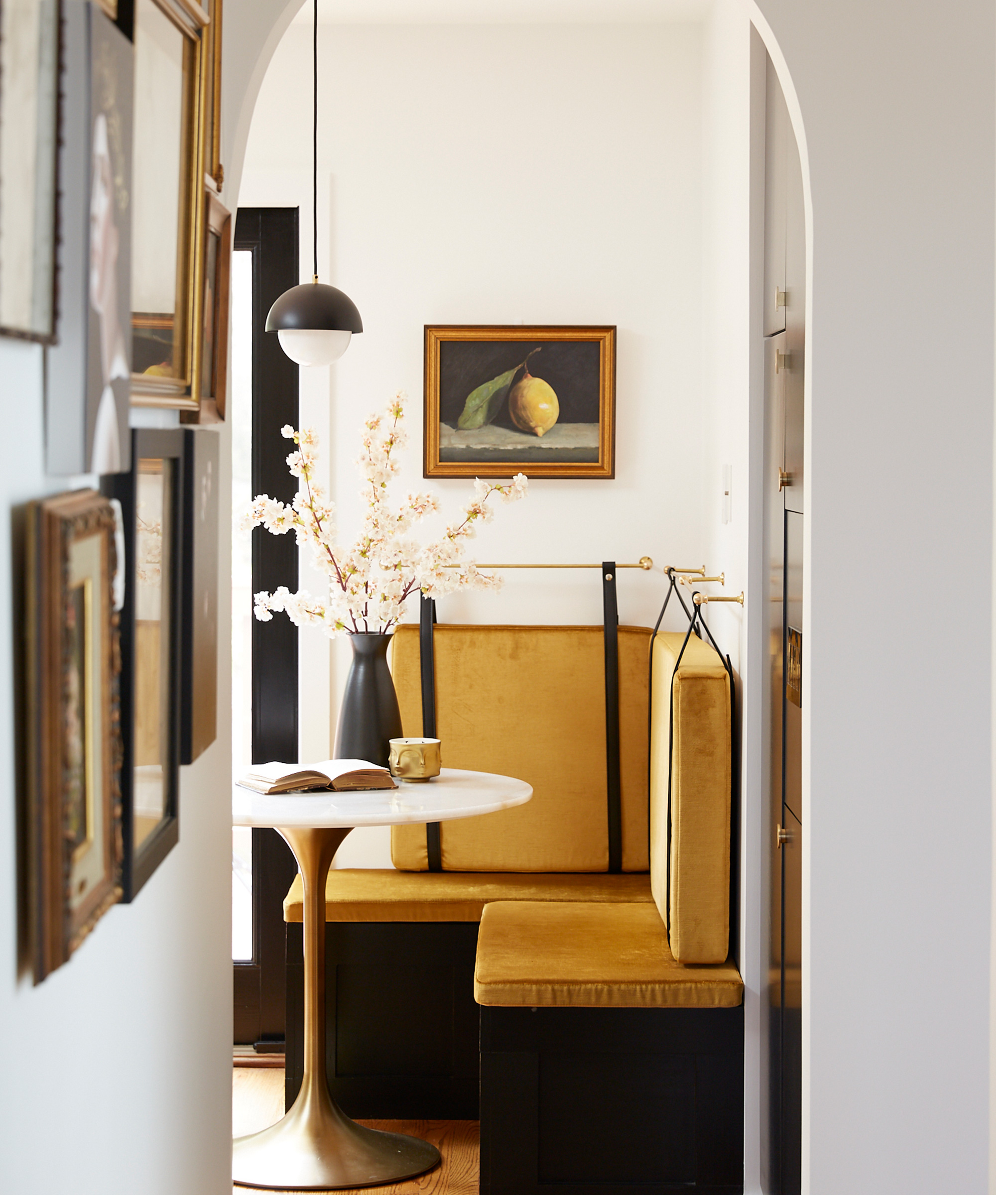
On the main level, we added architectural elements such as a beautiful new fireplace to their living room and arches in their hallway. It was a big undertaking and really put a dent in our budget, but it's such a great addition to the living room that it really was the right call.
To this day, my client still sends me pictures of them enjoying a book next to the fire on a cold and rainy day. It makes me happy to know that it was worth all the trouble.
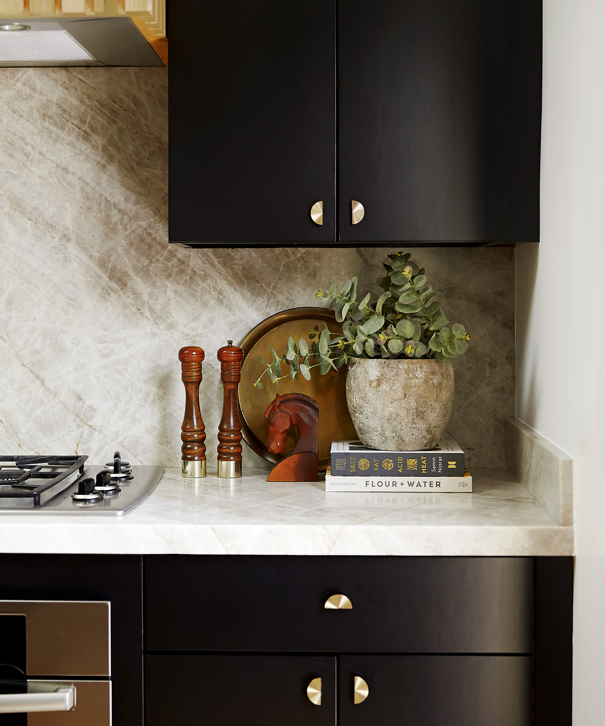
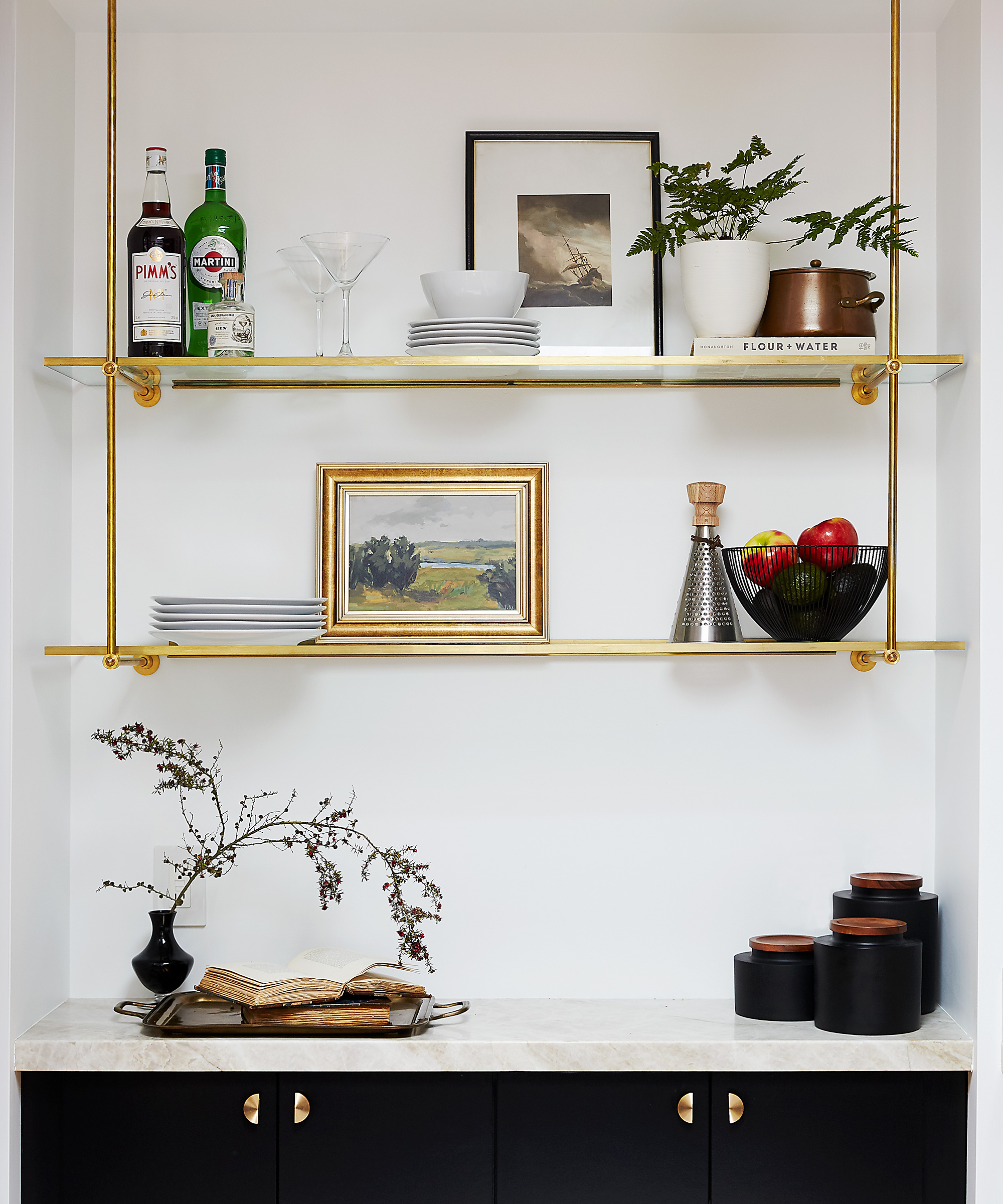
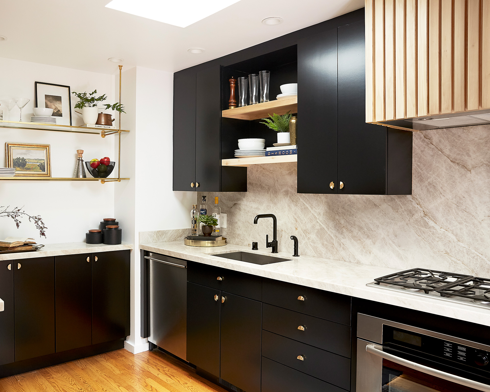
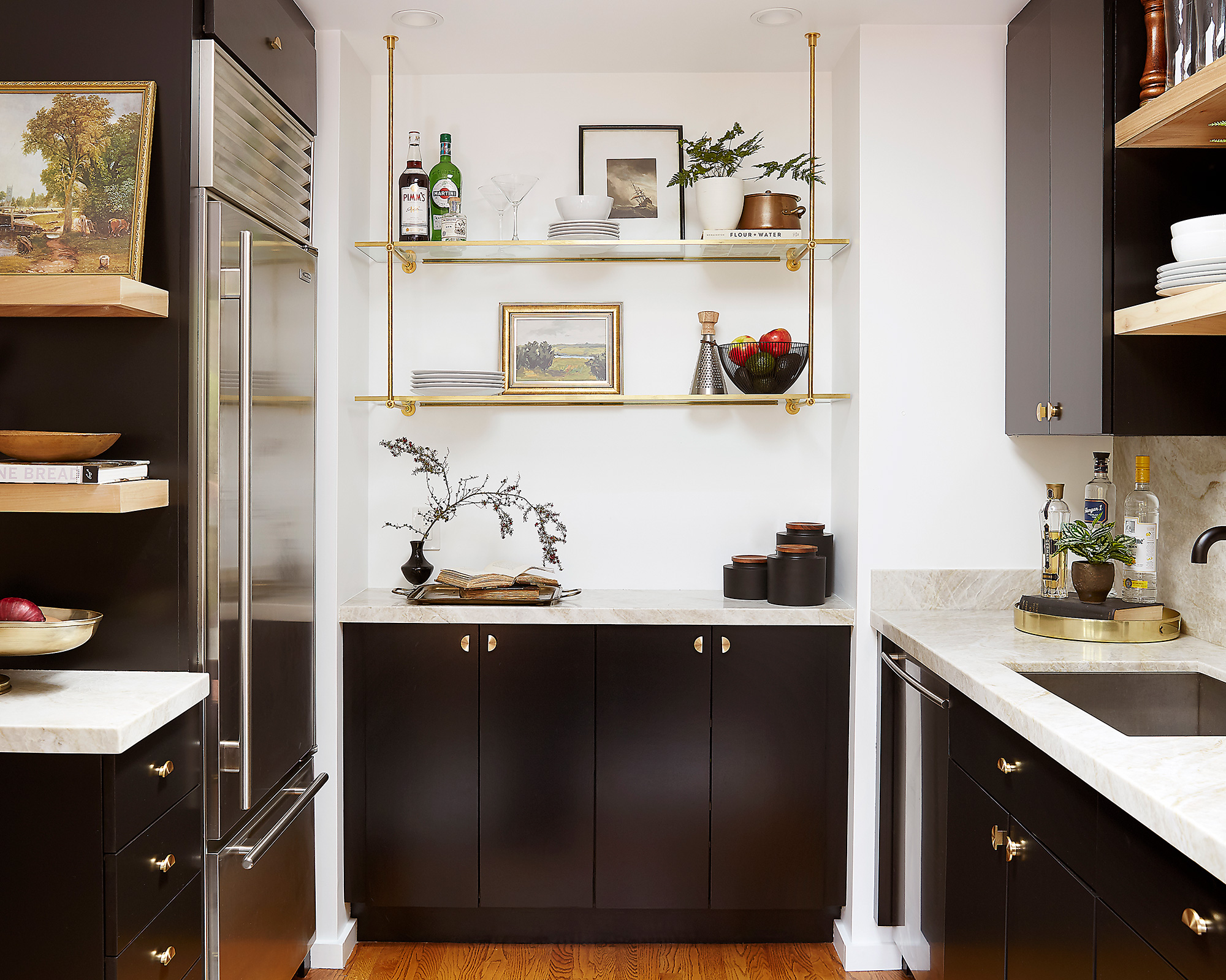
For us it was important that we created a scheme that the owners would cherish forever, so for wow-factor we had the kitchen cabinets refinished in a luxurious black motif, installed new brass hardware, and installed desirable quartzite countertops and backsplashes throughout.
The hood was customized with decorative wood slats, custom brass shelving and a much needed breakfast banquette – with storage – that ended up stealing the show.
Throughout the rest of the home we added new decorative lighting, hardware, furnishings, accessories and art.
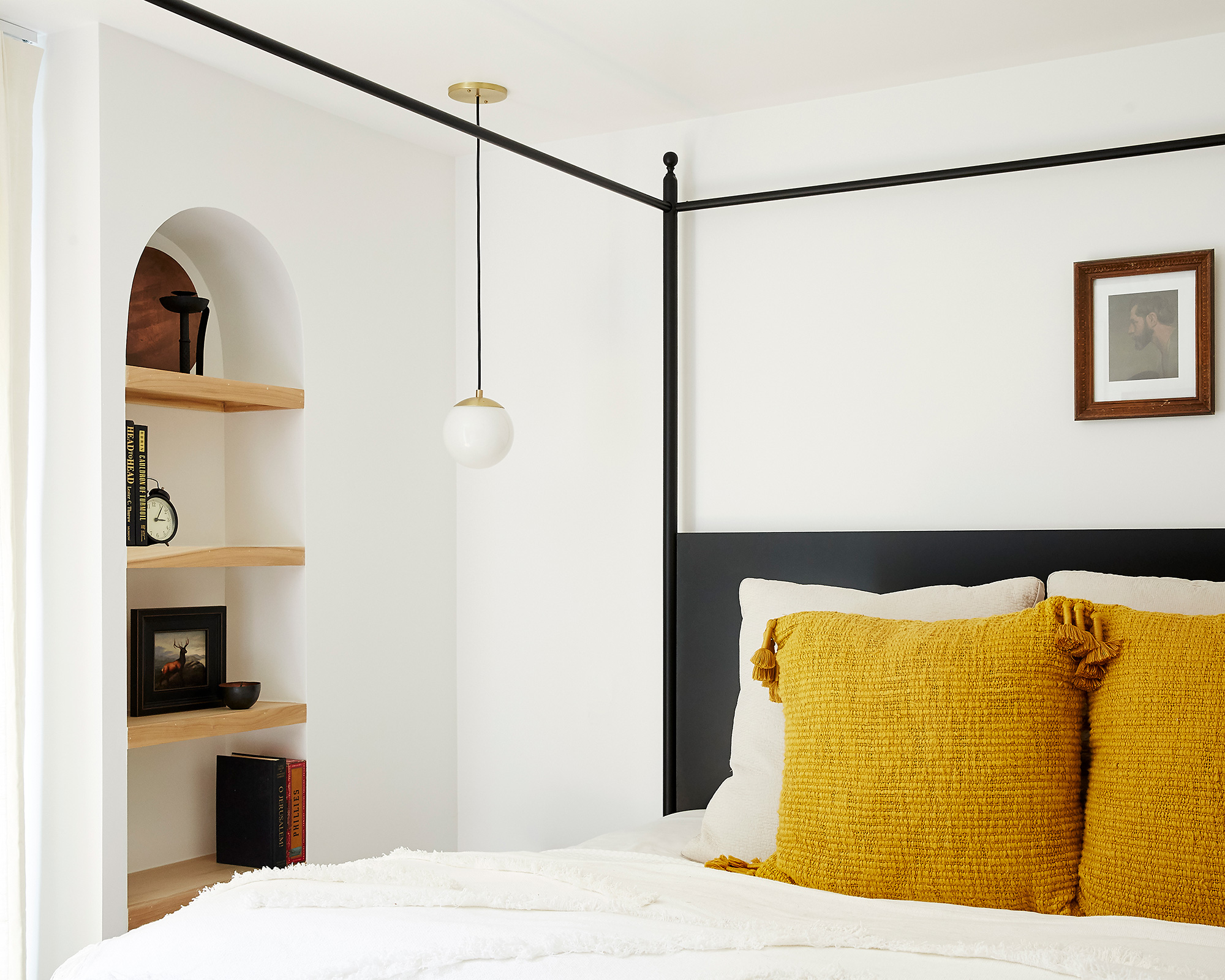
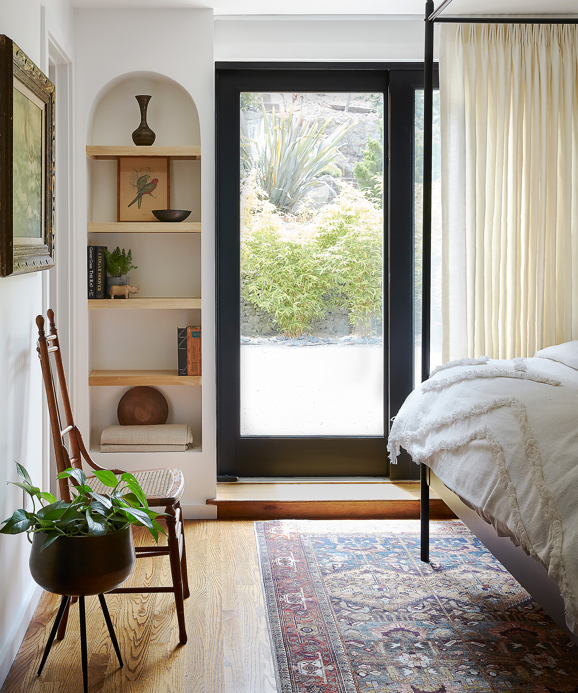
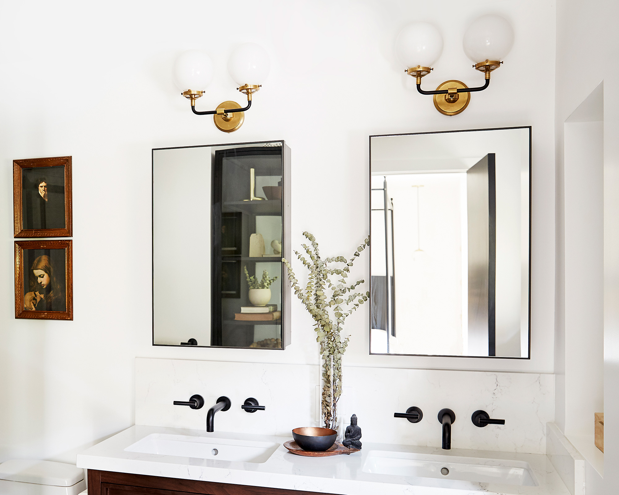
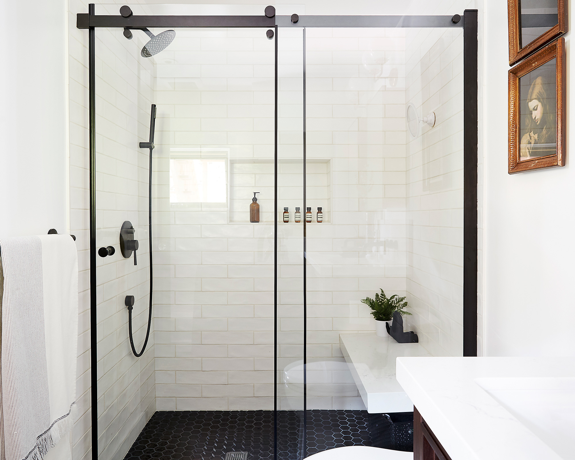
In the master bedroom we added arched bookshelves and a custom four poster bed. We expanded their original master bath by about 60 square foot. This allowed us to add a comfortably sized walk in shower and a much needed double vanity to their master suite.
We used quartzite countertops in the kitchen and ceramic tile and quartz in the master bath for durability. We had a limited budget so we had to make sure that our selection of materials would leave an impact.
For the hardware and lighting fixtures throughout we chose aged brass for a little art deco glamor, and for the plumbing fixtures we chose a matte black finish to help tie the space to the present.
In terms of sourcing items for this project, we wanted to keep it local. My friends at Stone Fleury helped us with the furnishings, Wayfair came through in a big way, when we were in a pinch.
Our vision for the furnishings and decoration was to create an elegant space that was dexterous enough for lounging and entertaining.
My clients have an elderly dog, so all their furniture choices had to be durable first, and comfortable second.
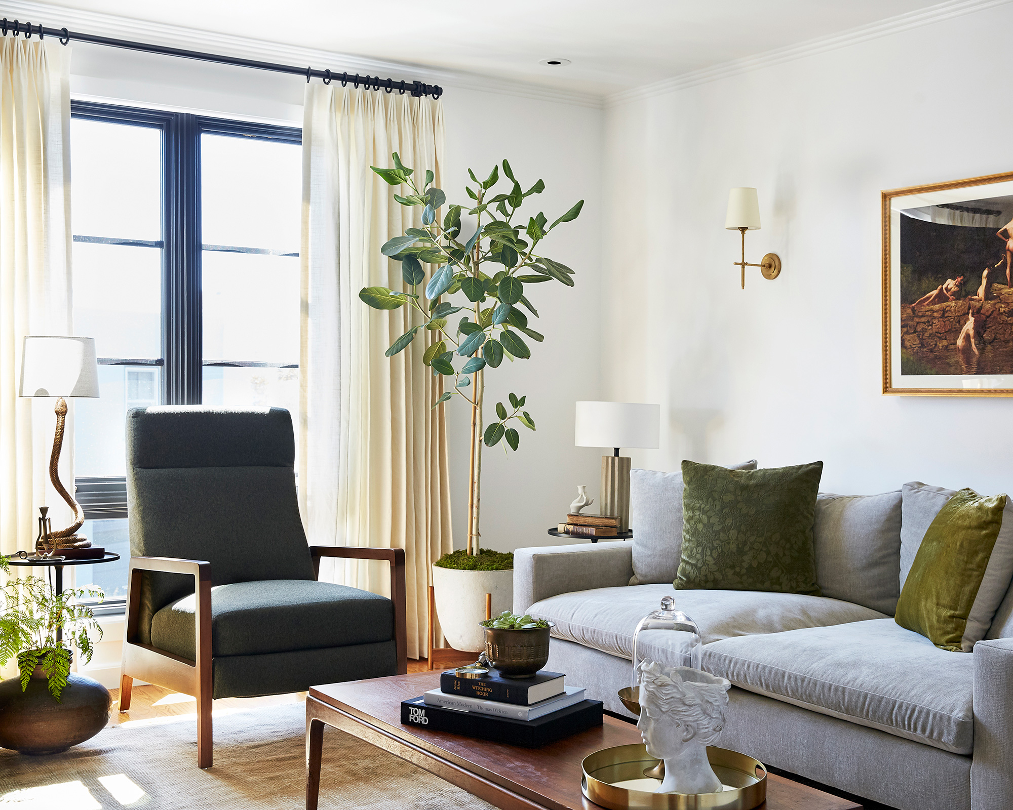
The one request my client's husband had was that he get a recliner and we managed to find a great option that was custom upholstered to match the living room.
Many of the other pieces and accessories were sourced at vintage shops and the Alameda Flea Market, (always a great local source for one of a kind treasures). I designed their custom banquette with a local woodworker and upholsterer as well.

Frustratingly, this project took twice as long as originally expected. This was due to notoriously tough permitting issues with the city of San Francisco, as well as some unexpected setbacks we discovered along the way, which in retrospect – and, for a house this old – should not have surprised anyone.
We worked right into the lockdown in March 2020, and my clients had to do a lot of the finishing touches themselves because of it, but they absolutely love their new home and are thankful that we got started on it when we did, since everyone's spending so much time at home now.
I am so proud of how this project turned out, and that I was able to transform their first house together into a warm and inviting space – one that is truly unique.
Photography / Liz Daly
Interior design / Leo Cesareo

Jennifer is the Digital Editor at Homes & Gardens, bringing years of interiors experience across the US and UK. She has worked with leading publications, blending expertise in PR, marketing, social media, commercial strategy, and e-commerce. Jennifer has covered every corner of the home – curating projects from top interior designers, sourcing celebrity properties, reviewing appliances, and delivering timely news. Now, she channels her digital skills into shaping the world’s leading interiors website.