This 1930s West Village apartment gets a stylish update by NYC furniture guru
This homage to mid-century design keeps a keen eye on the contemporary – and is home to a striking statement wallpaper

‘Our goal was to create a warm and inviting space where every room could be used,’ said Christine Retlev. ‘We also wanted to design a space that was truly unique, but represented what you would expect to find in the West Village, a bohemian neighborhood of New York.’
Retlev – a furniture dealer specializing in antiques and contemporary handcrafted pieces – spent two-and-a-half years transforming a pair of adjacent 1930s apartments in the city into a three-bedroom home for her and her young family.
‘I have found it helpful to begin projects without any preconceived ideas,’ said Retlev. ‘Every space is unique and has its own feeling, so when I walk into a space for the first time I try to listen to what my first feelings and impressions are of the space and then begin to weave a story.’
The result is a design that pays careful attention to the apartment’s Modernist origins and Art Deco inclinations, but incorporates contemporary finishes and oodles of personal touches ranging from fittings designed by Retlev herself, to a statement wallpaper that takes your breath away.
- See: World's best homes – tour the globe’s most beautiful houses
Foyer
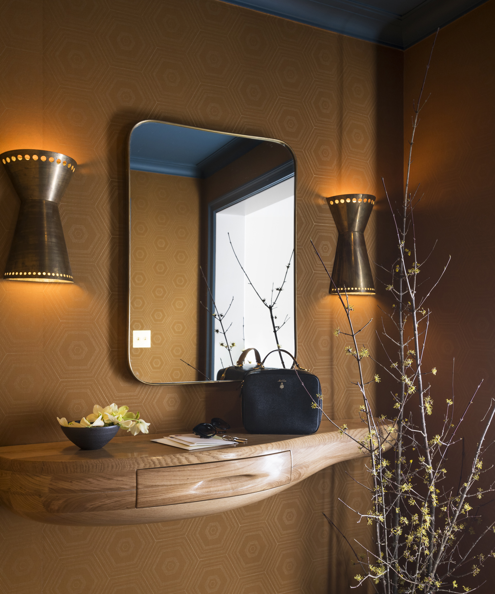
‘When you enter, you almost walk directly into the living room,’ explained Retlev. ‘To distinguish the rooms, I covered the walls with a fabulous rust colored fabric by Muriel Brandolini. The wallpaper is a subtle introduction to this cognac color that runs throughout the home.’
This small entrance area is given depth with a large round-cornered mirror, styled with vintage brass sconces and a wooden console table by French sculptor Jacques Jarrige.
Living Room
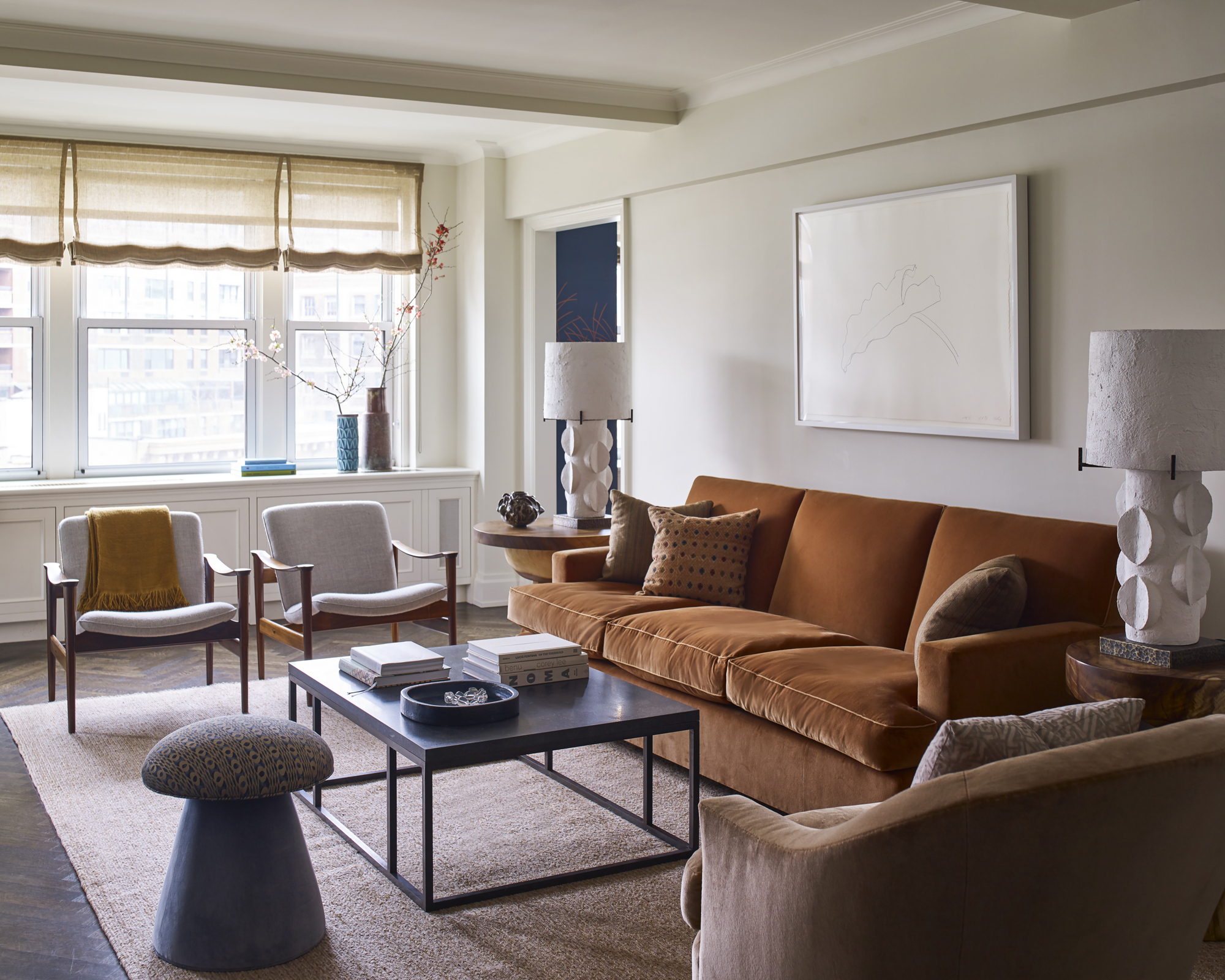
‘The living room is calm. It’s a place for the eye to rest before you enter the dining room,’ said Retlev.
This room is where Retlev really delves into the apartment’s 20th century past. A squared layout features a mix of Scandinavian mid-century furniture and contemporary handmade pieces (as well as a continuation of the aforementioned cognac color), including a coffee table by Rose Uniacke and sculptural plaster lamps from Blackman Cruz.
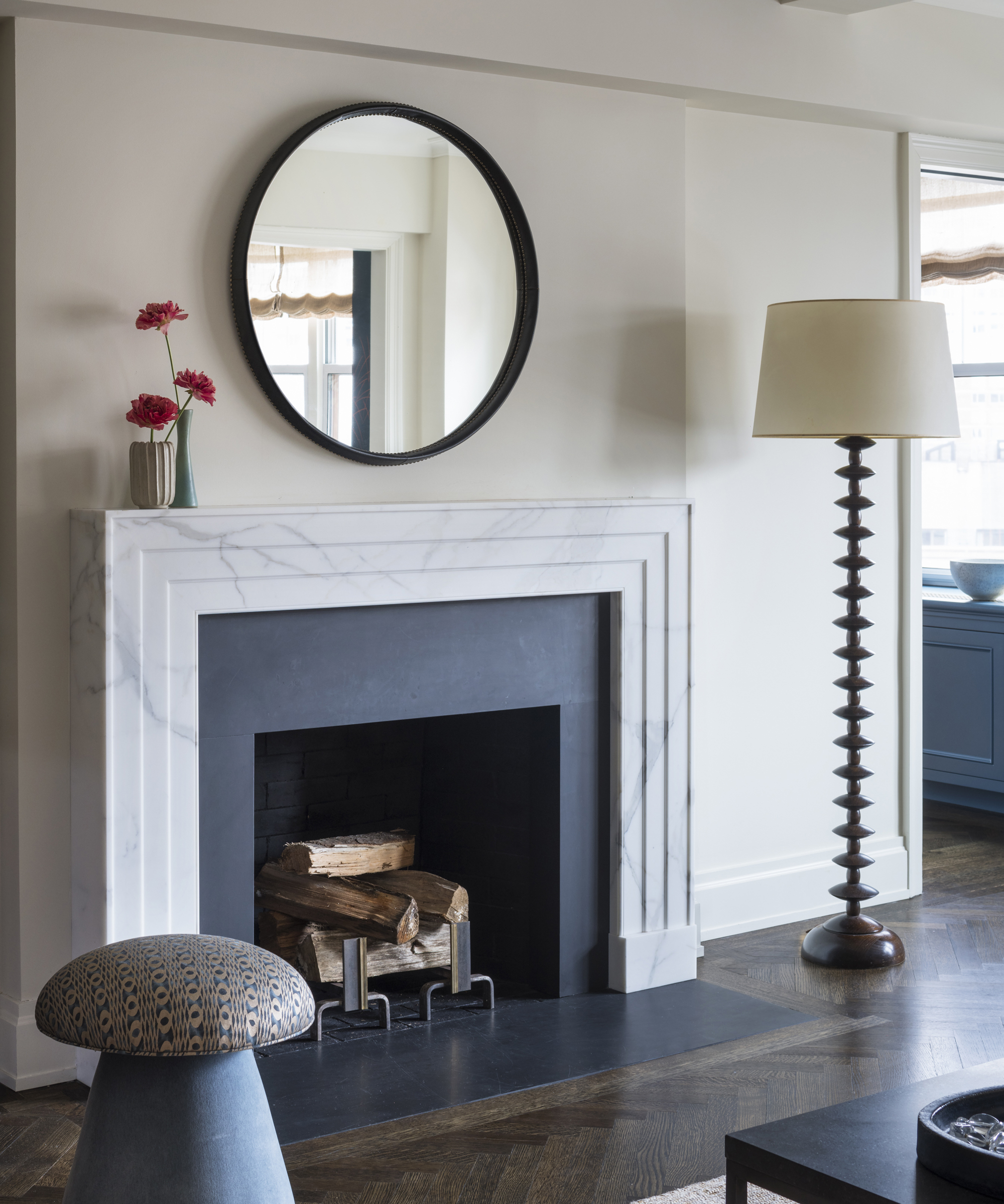
Retlev designed the room’s Art Deco-inspired Calacatta marble fireplace herself, and paired it with a mirror by German-born, mid-century designer Otto Schulz, purchased from Hostler Burrows.
- See: Living room ideas – clever ways to decorate living spaces
Dining Room
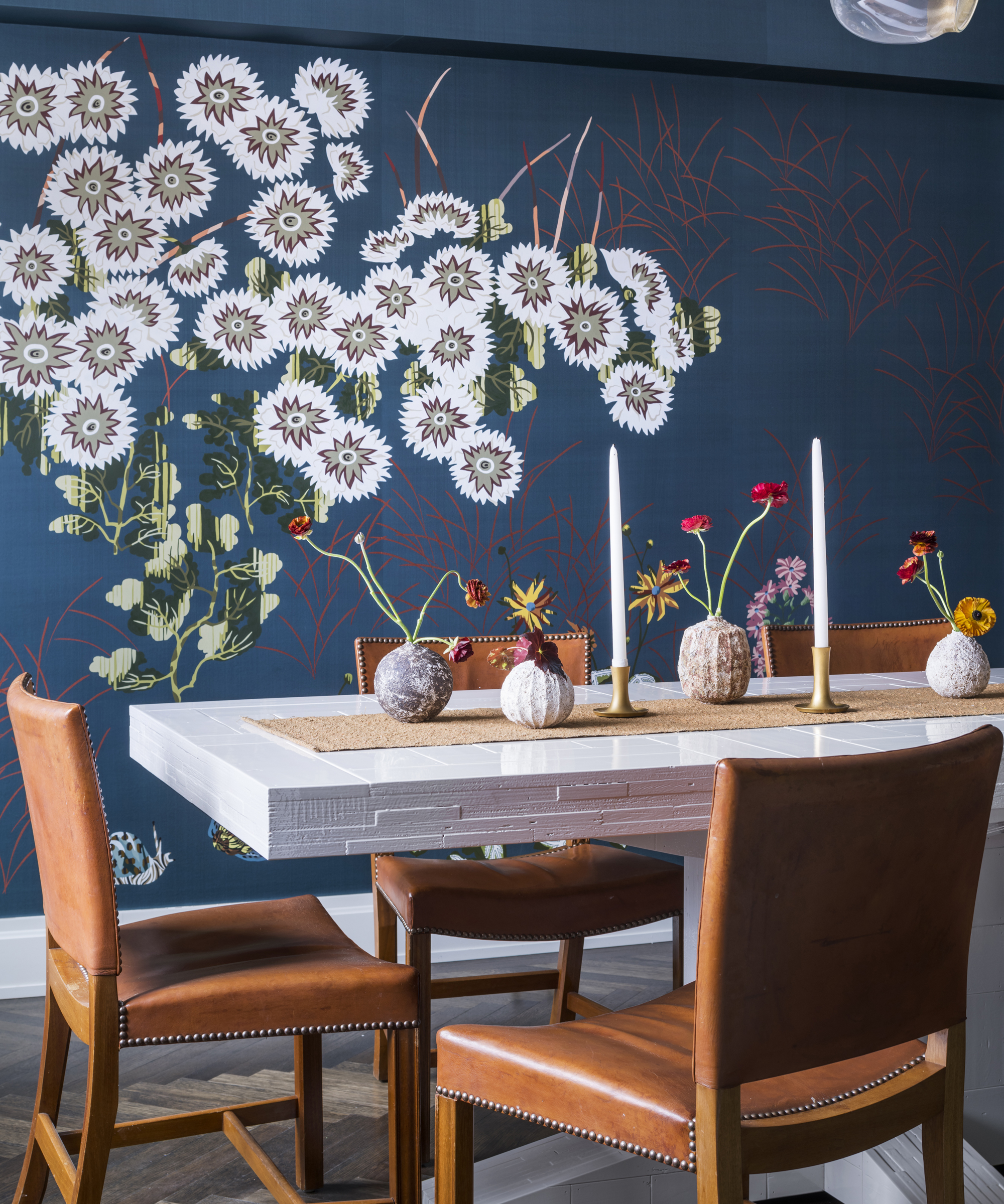
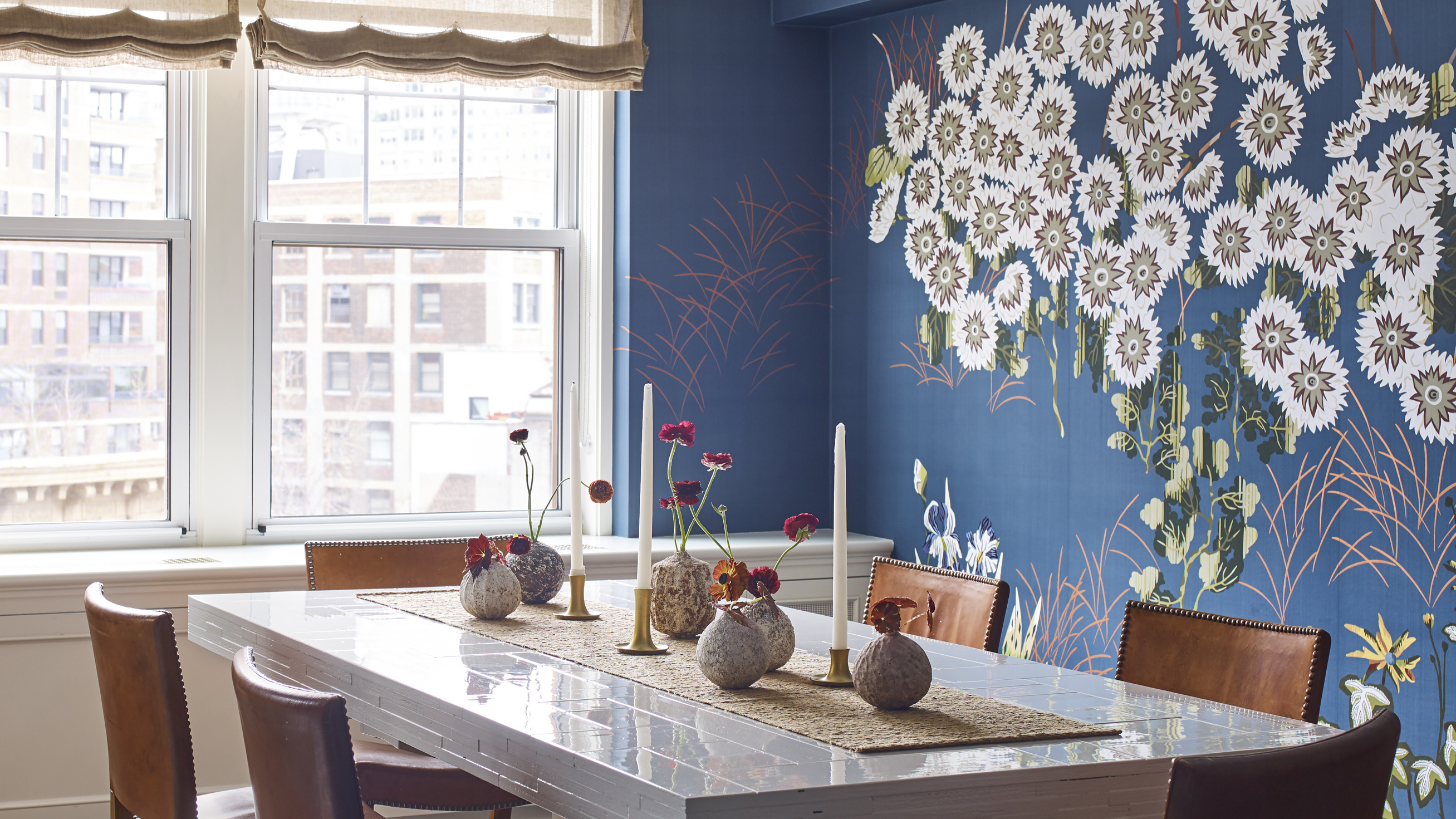
‘My favorite element of the project is the dining room wallpaper from Fromental’ said Retlev, who chose a design inspired by the work of pioneering French tapestry artist Jean Lurçat and screens from the Japanese Edo period.
‘Not only did the paper inspire the worldly mix of furnishings throughout the home, but it makes the dining room – once a guest bedroom – feel larger and more spacious.’
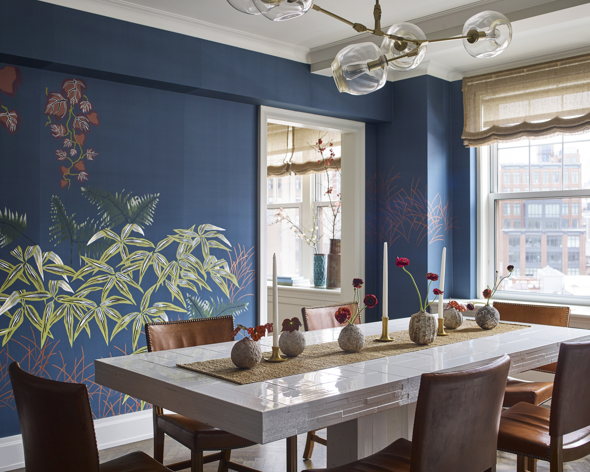
‘The rich rust and blue colors set the palette for the apartment. The colors in this design are lively and interesting but still not so much that it tires the eye.'
Powder Room
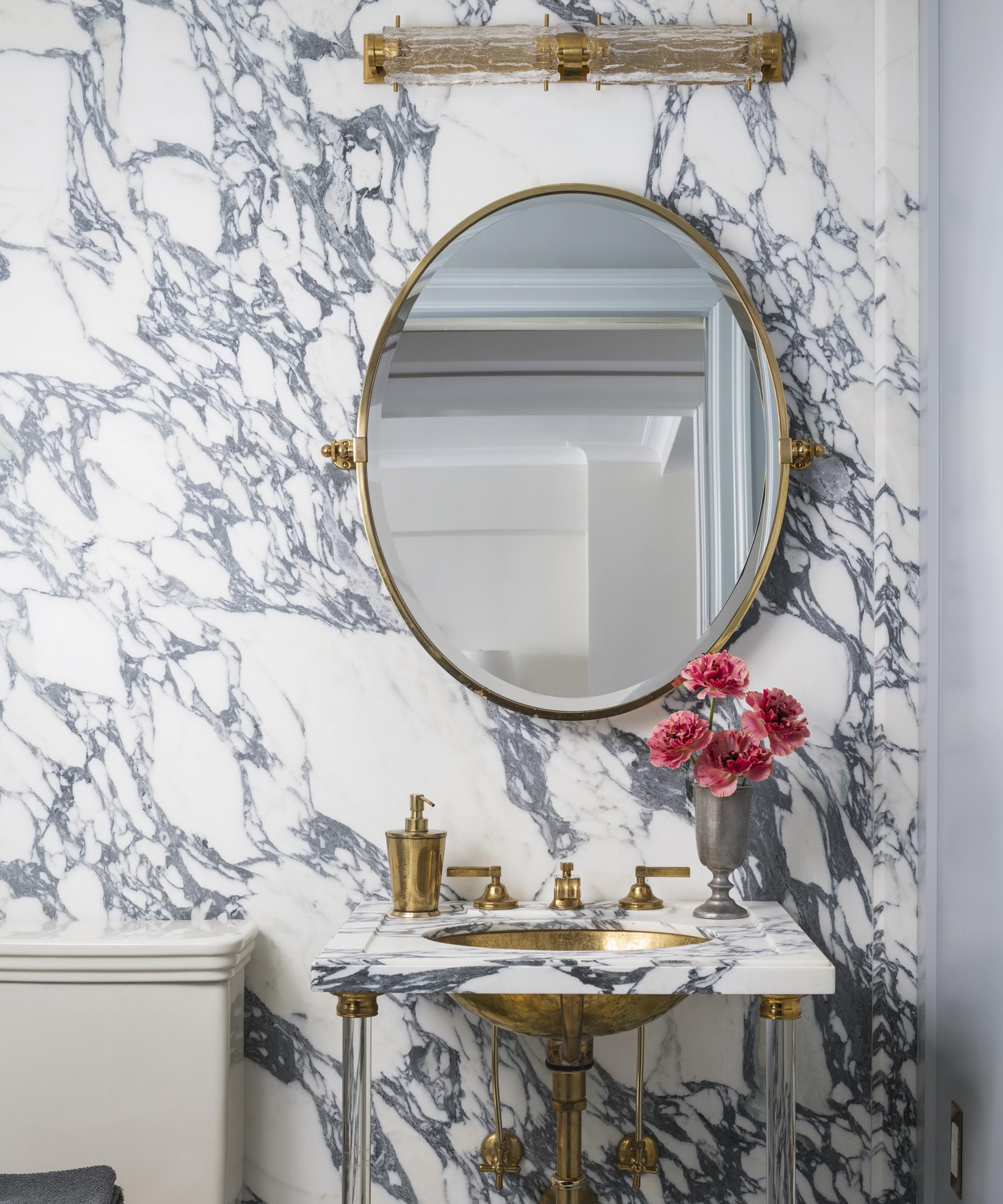
Retlev’s powder room is a lesson in rethinking small spaces to maximise both their functionality and impact. ‘On the way from the living room you pass through a small corridor to the dining room. Because of space restrictions, we installed a sliding door – and a huge slab of marble.’
The dramatic backdrop is not just a calling card to the contemporary, but creates a useful optical illusion. ‘The movement in the marble makes the space appear deeper than it actually is, said Retlev.’
Family Room
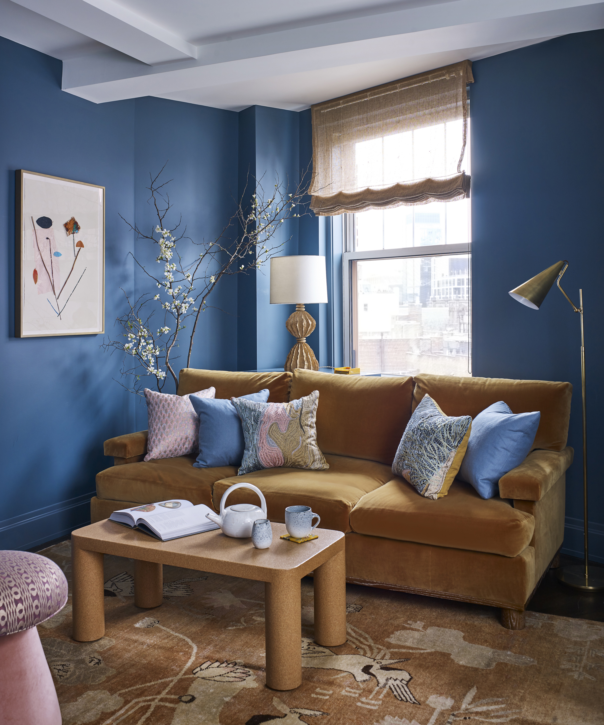
This nook just off the living room plunges visitors into the deeper tones that run through the rest of the home. The rich palette not only helps the room feel cozy, but also accommodates the apartment’s peculiarities. ‘It is a very odd shaped room and the dark blue walls make you forget its asymmetry,’ said Retlev.
The room also features a symbol of her dedication to finding just the right piece for any space. ‘The vintage Khotan rug was inspired by a similar Khotan I saw in Paris at the Dries Van Notan Store. I searched for two years for something similar.’
- See: 10 most popular Farrow & Ball colors – the must-have, on-trend shades
Master Bedroom
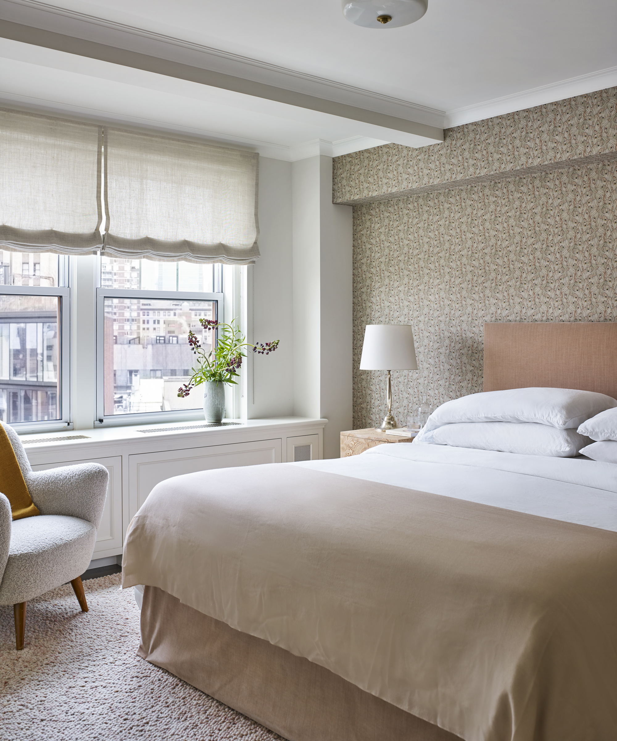
‘Each room incorporates color, texture and pattern’ said Retlev. ‘I am very conscious of the tactile experience one has when sitting down or putting your hands or feet on a surface.’
Nowhere is this more evident than in the master bedroom. The room – which plays densely textured floor, wall and furnishings against dramatically simple bed linen – has been based around the rug, designed by Elizabeth Eakins.
‘It looks like pink wool pebbles. Stepping onto the soft bumpy texture is a nice way to start every day. There is also a moth printed fabric from Radish Moon on the wall behind the headboard that creates interest while also being calm at the same time.’
Master Bathroom
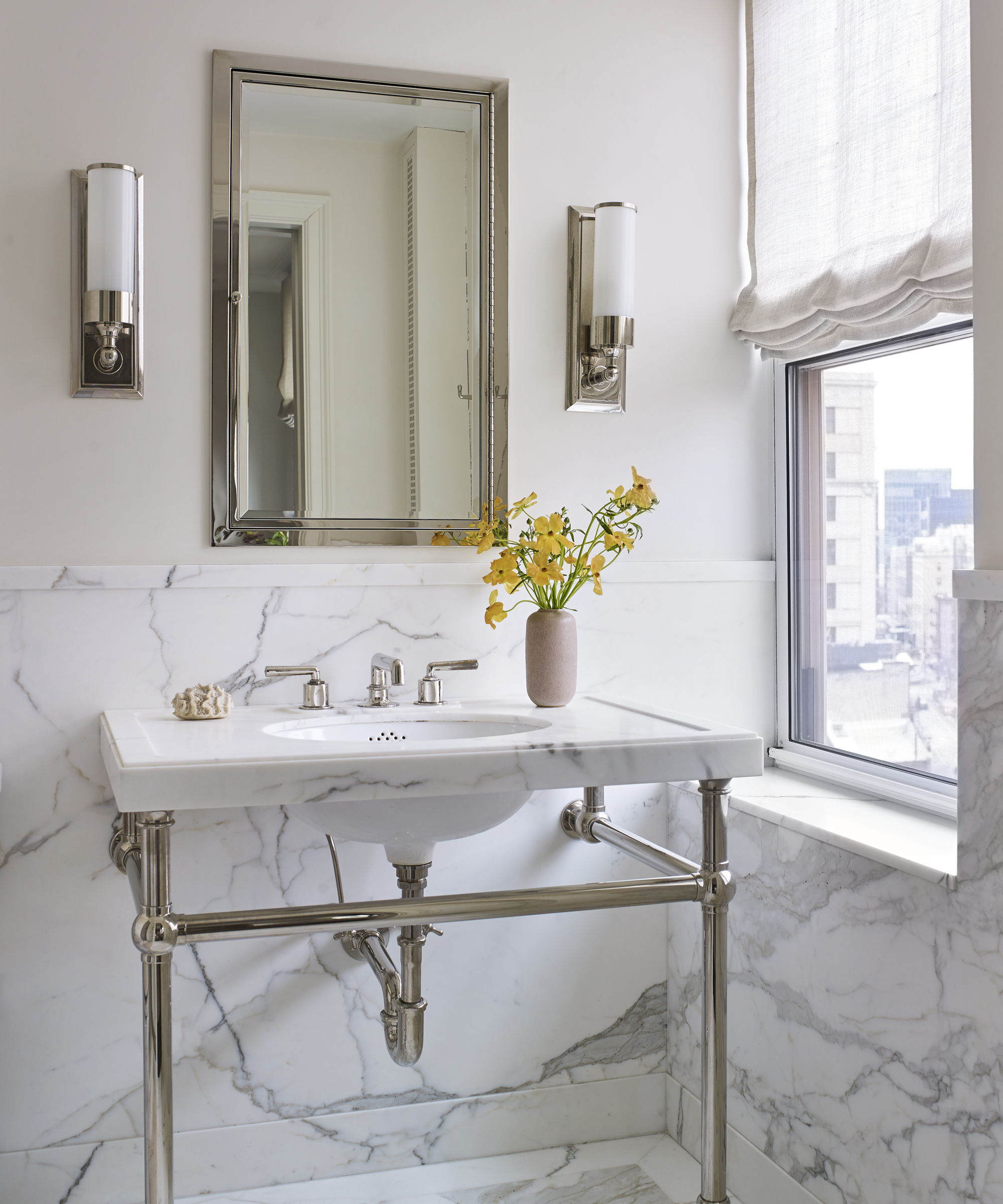
Marble takes centre stage again in the master bathroom, where Calacatta marble is used as wall cladding on the lower half of the walls, paired with soft taupe paint. The sink is another fitting custom-designed by Retlev, with the same marble paired with polished fittings from Waterworks and Urban Archaeology.
- See: Bathroom ideas – stylish decor ideas for all bathrooms
Kids Bedroom
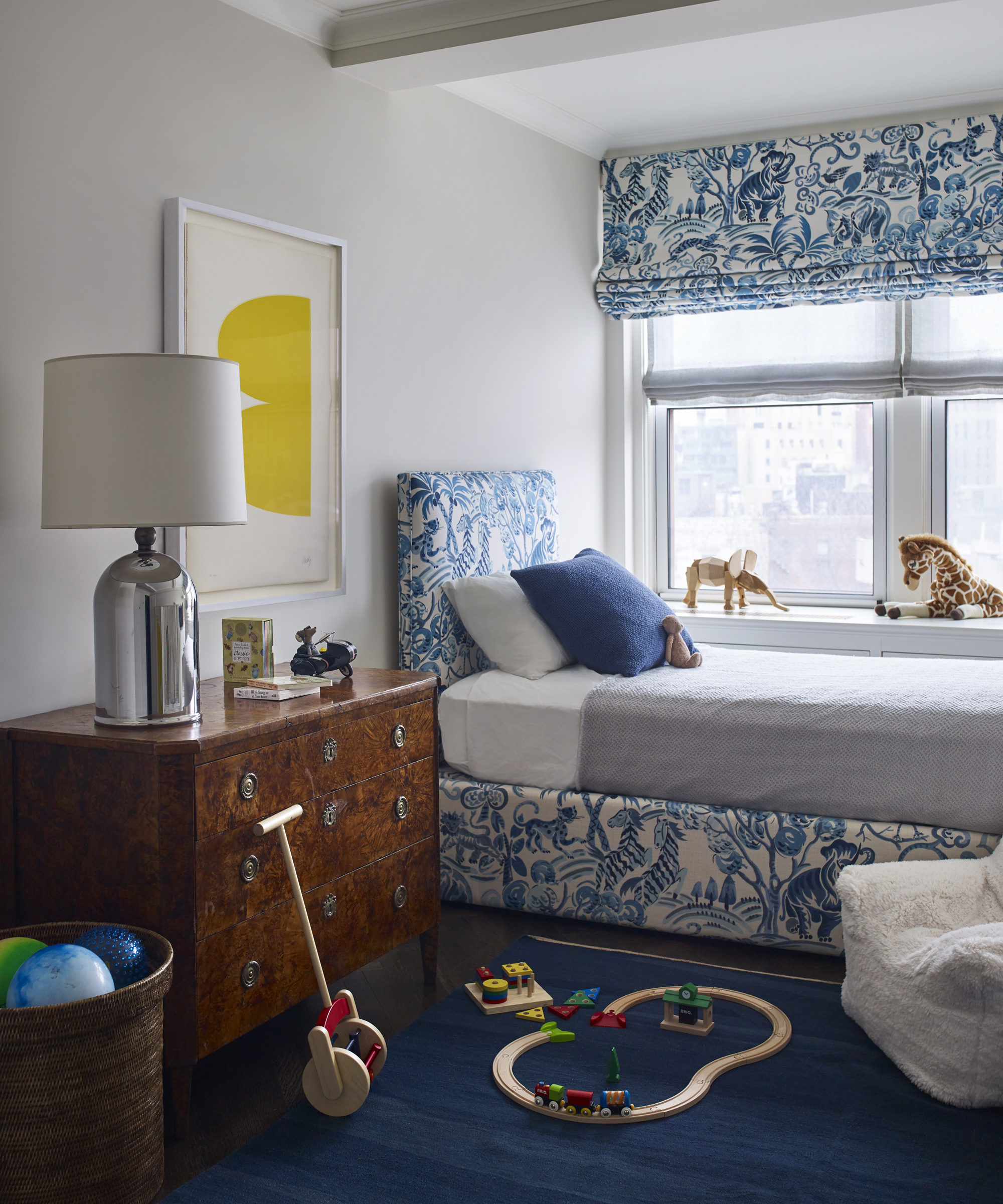
It may channel urban chic, but this is very much a family apartment – with Retlev even giving birth to her son part way through the renovation project. This children’s room sees the rich Prussian blue manifest in a textured rug and through the porcelain-inspired printed bed frame and blinds. Yellow graphic artwork keeps the room youthful, while the antique chest of drawers is decidedly grown up.
Kitchen
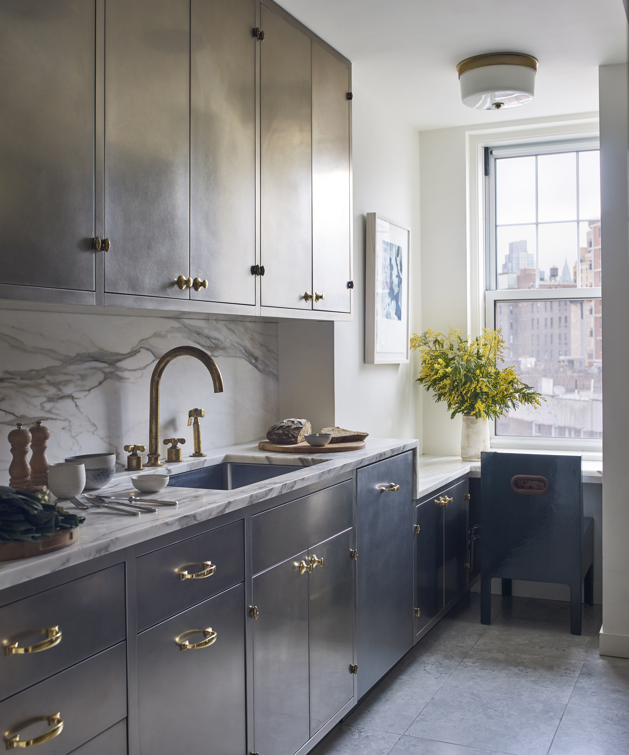
‘The custom kitchen cabinetry was inspired by a pewter and brass bowl from Svenskt Tenn in Stockholm’, said Retlev who, again, designed this aspect of the apartment herself. ‘The bowl was a wedding gift from my aunt and uncle in Sweden.’
The recurring deep blue and marble accents collide here in a small but well-designed kitchen space, complete with a seating area looking out onto the city beyond.
Second Bathroom

In the second bathroom, marble is swapped for monochrome tiling from London-based specialist Ann Sacks, which also provided the flooring for the kitchen. Designed as an update to the existing bathroom, the room is personalized with the same mirror used in the master bathroom, and continues the black accents in the tiling to the shower curtain and even the soap dispensers.
Interiors / Christine Retlev
Photography / Adam Macchia
Sign up to the Homes & Gardens newsletter
Design expertise in your inbox – from inspiring decorating ideas and beautiful celebrity homes to practical gardening advice and shopping round-ups.

Ailis started out at British GQ, where a month of work experience turned into 18 months of working on all sorts of projects, writing about everything from motorsport to interiors, and helping to put together the GQ Food & Drink Awards. She then spent three years at the London Evening Standard, covering restaurants and bars. After a period of freelancing, writing about food, drink and homes for publications including Conde Nast Traveller, Luxury London and Departures, she started at Homes & Gardens as a Digital Writer, allowing her to fully indulge her love of good interior design. She is now a fully fledged food PR but still writes for Homes & Gardens as a contributing editor.
-
 Martha Stewart's intelligent cabinets 'take every inch into consideration' – their 'visually light' style will solve your small kitchen storage problems
'Every kitchen can be beautiful and functional, no matter what the size': 9 years since sharing her clever storage, Martha's cabinets are just as beautiful
By Megan Slack Published
-
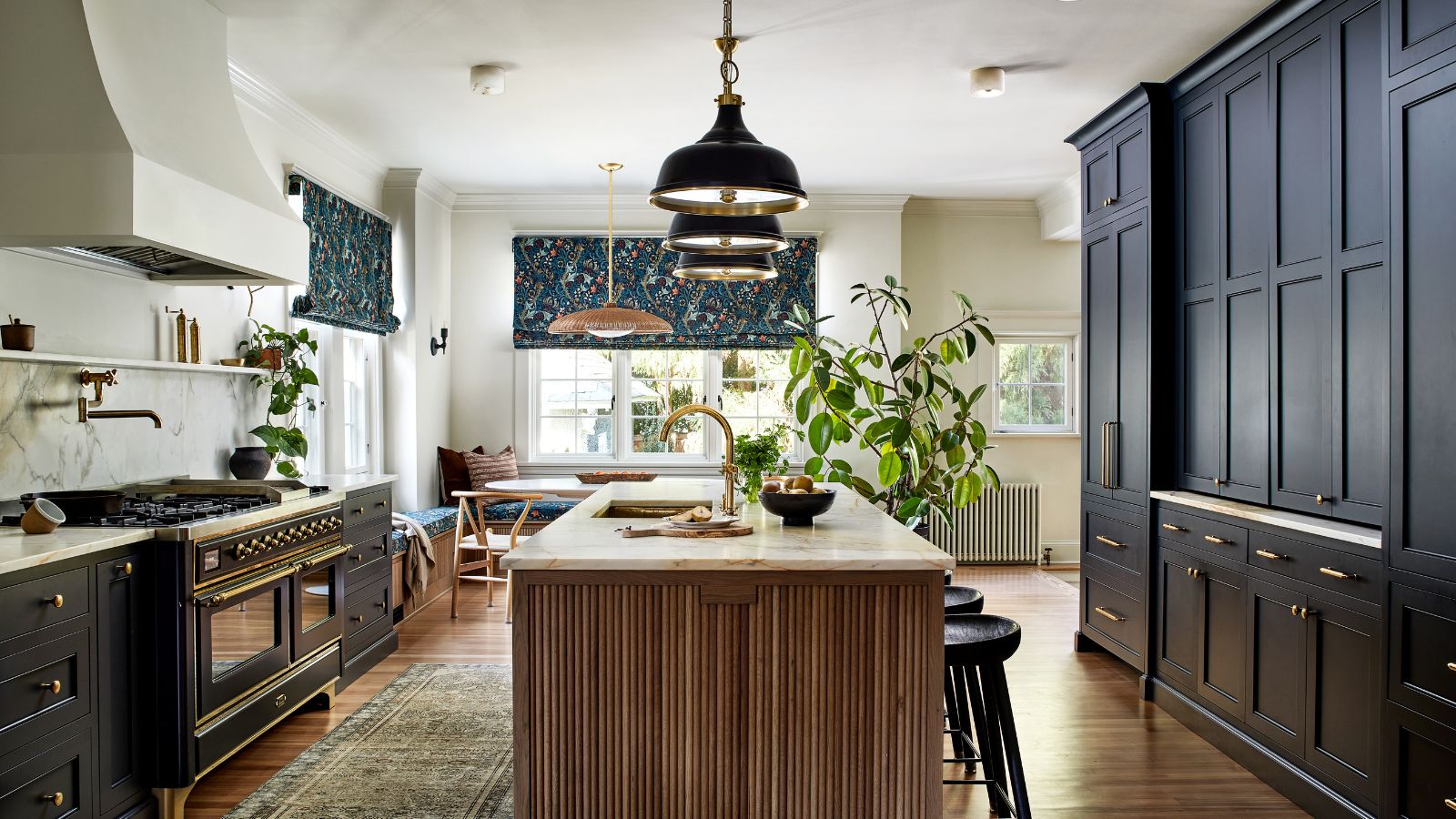 This once-dated kitchen is now a timeless space with the coziest details – and its the classic color palette that's made it a chic, welcoming space
Warming colors and natural materials combine to create this enduringly classic kitchen scheme
By Molly Malsom Published