This grand, light-filled 1930s home is a lesson in combining pattern
A fun sense of color and clever use of pattern have helped to give extra personality to this renovated period family home in San Francisco
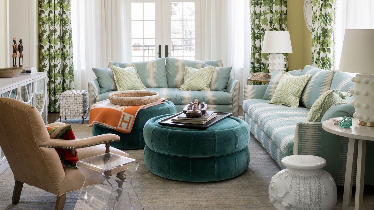

'Brilliant' was one of the first things designer Alison Pickart thought when she took on this San Francisco project.
‘The clients are such an upbeat family that the typical pale, bleached out and neutral palette in San Francisco wouldn’t have suited them,’ she says. ‘Driven by their personalities, I wanted to bring in a fun sense of color and pattern, all blending with an underlying preppy vibe.’
Alison’s clients, who are both entrepreneurs, were undeterred by the fact that this corner house in San Francisco’s Presidio Heights neighborhood had been in the same family for around 40 years and untouched for decades.
‘The house has exposure to natural light and a grand facade with quadruple frontage. My clients, who have four children, also wanted to move closer to their school, and imagined loving the house back to life and making it their forever home.’
See: World's best homes – tour the globes most beautiful houses
With the house in need of a full renovation, Stephen Sutro of Sutro Architects was enlisted to add a vast basement level with media room, gym, mudroom, laundry and extra guest bedroom suite.
‘It was one of the last projects to get approved before the regulations became tighter, but we still had to adhere to seismic guidelines. The amount of engineering that went into the basement was intense,’ Alison explains. ‘The 12-foot ceilings of the gym are so cavernous, the family jokingly refer to it as the racquet ball court. It’s breathtaking.’
Hallway
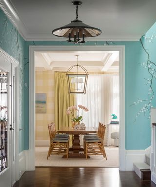
The identity of many of the rooms comes from the wallpaper choices – nowhere more prominent than in the foyer hall and staircase. Beguiling guests from the moment of entry, it’s dressed seductively in a traditional plum blossom hand-painted de Gournay wallpaper.
‘It’s a robin’s egg blue shade with white blossom and the skylight above means the color graduates from lighter to darker the lower down the house you get,’ says Alison. ‘It’s the central point from which everything else plays off,’ she adds.
Formal living room
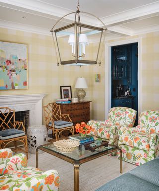
The oversized plaid wallpaper in the living room is as unexpected as it is bold. Riffing with the joyful and naive floral fabric of the club chairs, in combination, the pairing summons an irreverent mood.
Eager to preserve the home’s handsome proportions and architectural details, Alison was also aware that the house shouldn't become too formal or stuffy.
‘Although it is a grand property we wanted it to feel homey and accessible,’ she explains. This has been achieved through a series of twists on more traditional interior motifs.
Informal living room
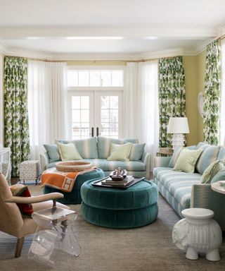
Traditional pieces honor the period of the property, while bold color and designs add modernity.
The main reception rooms are united by the chartreuse of the wallpaper and curtains, and have a cohesive identity despite a host of differing prints and fabrics.
‘Turquoise, camel and green blend with pops of orange and pink. Patterns are mixed in with Uzbek tapestry pillows and art collected from the family's travels,’ Alison adds.
See: Living room ideas – clever ways to decorate living spaces
Kitchen
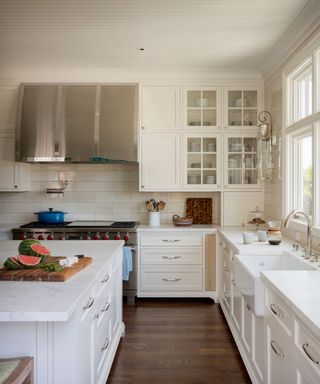
The space is pale yet interesting with panelling on the ceiling, tiles up to the ceiling and a mix of unit styles.
See: Kitchen ideas – decor and decorating ideas for all kitchens
Butler's pantry
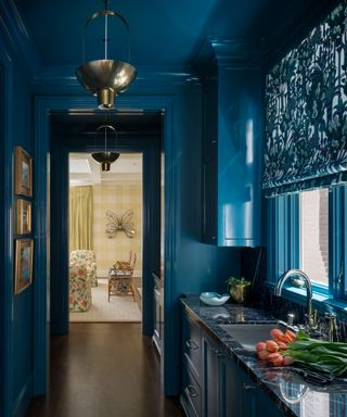
On the ground floor, a new corridor with butler's pantry/bar, WC and pantry connects the main reception rooms.
‘This addition gave the house a pleasing circular flow that didn’t previously exist,’ Alison adds. ‘It’s a compressed yet intimate section of the house where I used the blue that’s running through the house but took it to a deeper level of saturation, combining it with the lovely Jardin d’Osier print by Hermès.’
Painting the walls, ceiling and trim in the same saturated blue gives this space a dramatic quality.
First floor landing
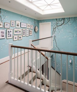
Alison arranged that fewer branches be painted on the wallpaper where the family photos are displayed. The skylight was enlarged to provide greater illumination through the center of the house.
Daughter's bedroom
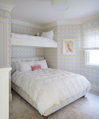
One modern print used throughout – on the bed, blind and walls – delivers a striking look, while the upper bunk is perfect for slumber parties.
Guest ensuite
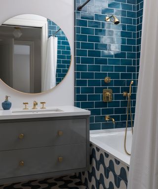
The rooms in the basement have a more modern feel. Here, a saturated blue tone pairs beautifully with the bronze tap fittings.
‘As a family with adopted children, the heritage and culture of their Ethiopian twins was a huge inspiration,’ Alison elaborates. ‘I took great pleasure in planning how to showcase all the treasures they have accumulated over the years and these details are what really made it feel like a home.’
With so much color and life, the vitality and joy Alison’s interiors have brought to the home matches the family perfectly.
Interior designer/ Alison Pickart
Architect/ Sutro Architects
Photography/ Aaron Leitz
Text/ Juliet Benning
Sign up to the Homes & Gardens newsletter
Design expertise in your inbox – from inspiring decorating ideas and beautiful celebrity homes to practical gardening advice and shopping round-ups.

Interiors have always been Vivienne's passion – from bold and bright to Scandi white. After studying at Leeds University, she worked at the Financial Times, before moving to Radio Times. She did an interior design course and then worked for Homes & Gardens, Country Living and House Beautiful. Vivienne’s always enjoyed reader homes and loves to spot a house she knows is perfect for a magazine (she has even knocked on the doors of houses with curb appeal!), so she became a houses editor, commissioning reader homes, writing features and styling and art directing photo shoots. She worked on Country Homes & Interiors for 15 years, before returning to Homes & Gardens as houses editor four years ago.
-
 Inside Shea McGee's Summit Estate – an elegant mountainside project that blends grand architecture with hushed cozy interiors
Shea McGee has mixed the old and new by creating a sophisticated chalet-inspired property that sits right at the heart of the mountains
By Eleanor Richardson Published
-
 ‘An important tenet in staying organized’ – 6 easy habits for a more minimalist and streamlined home
Working on these organizational habits will make your home more manageable
By Chiana Dickson Published