Design house: This historical home – in a wonderful location – has been given a new lease on life
This 1930s home has been tastefully updated by interior designer, Nicole Yee
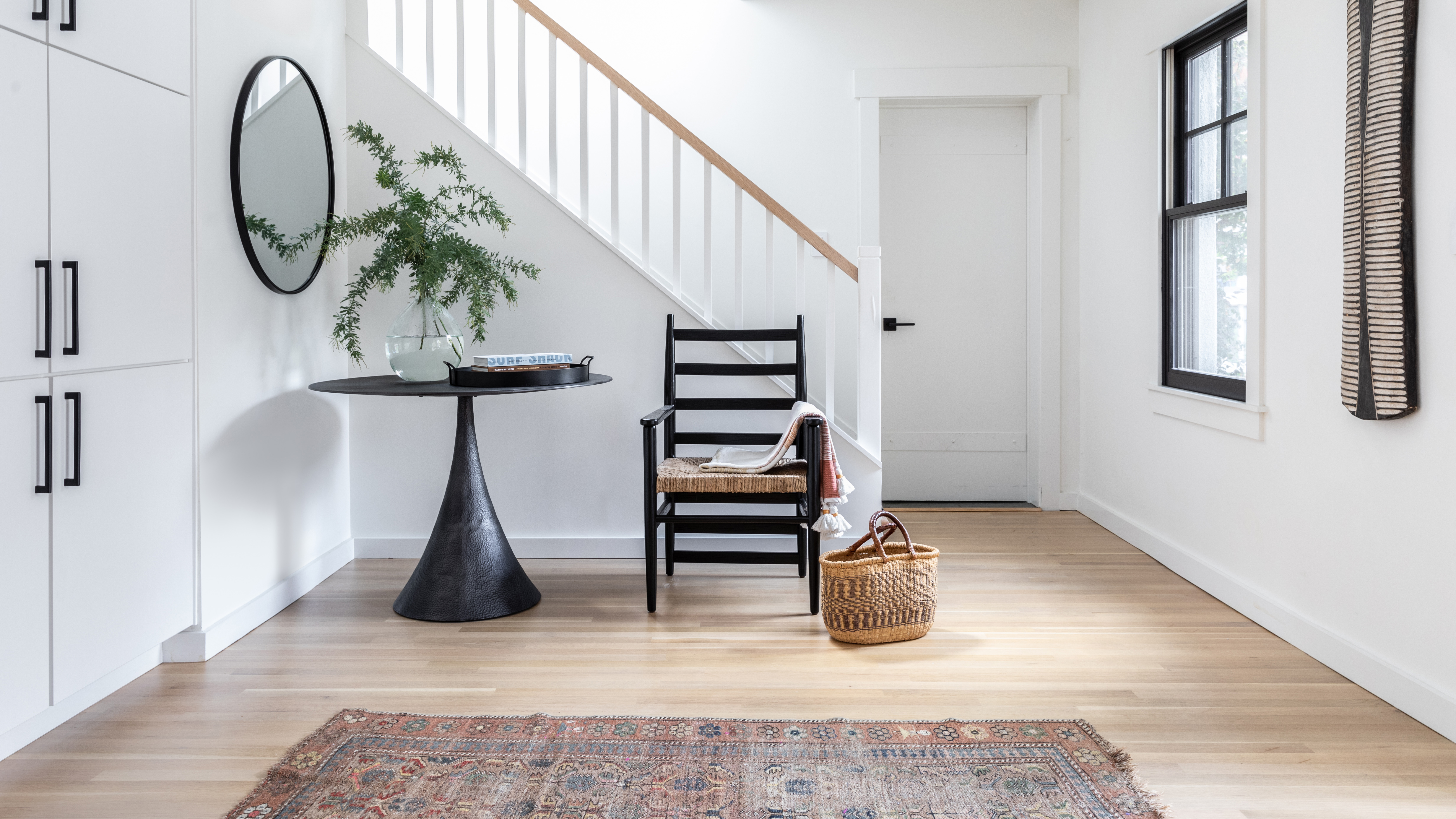

When you step into this historical home, you are instantly greeted by a modern yet characterful space, but it wasn't always that way.
A renovation in the 1980s meant that any charm that's typically inherent in a house of this era had been depleted over the years. Instead, the homeowners inherited textured walls, shiny paint finishes and worn fittings.
The owners, a family of four, hired interior designer Nicole Yee to thoughtfully and thoroughly transform the space to better suit their family lifestyle.
A lauded designer, Nicole is known for providing her clients with remarkable results. Her eye for detail is keen, and her creativity boundless. She focuses on creating original, well-edited designs for each client, and this home is no exception.
We spoke to Nicole Yee about the design project.
- See some of the world's best homes – beautiful properties from around the globe
The property
This is a 1930s historical home in the Rockridge neighborhood of Oakland, CA. It was remodeled in the 1980s in a rather rushed effort that depleted its 1930s character.
Decorative wooden plaques were hung above each window in a failed effort to add architectural interest. Lack of storage made it inevitable that the house always looked chaotic and cluttered.
Creating a durable, functional space for my clients – a fun-loving family of four including two adults that love to cook, two athletic teen boys and a dog – was the goal. Aiming for a minimal, yet family-friendly look, I knew the design needed to be practical, bright and brimming with light.
Hall
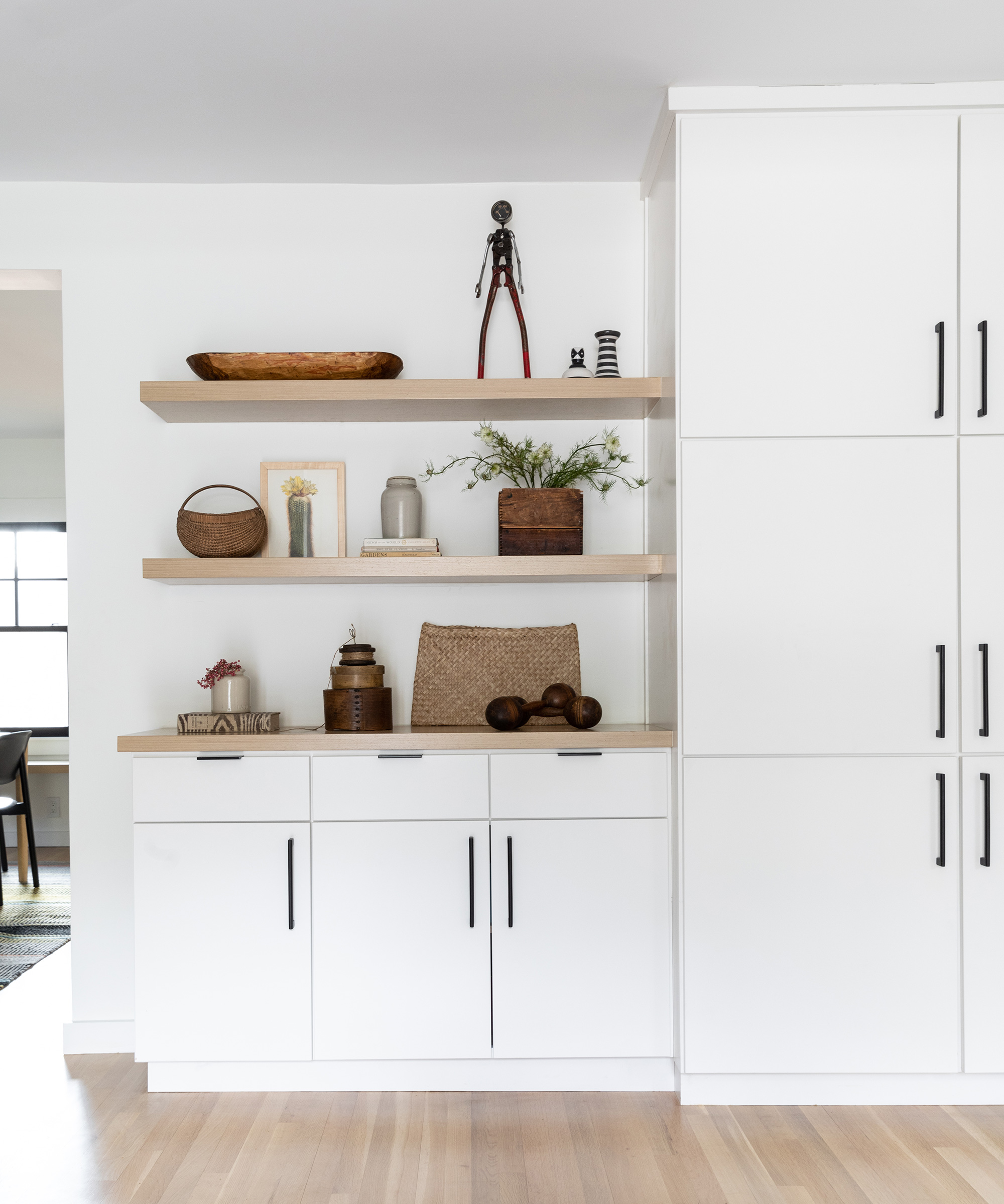
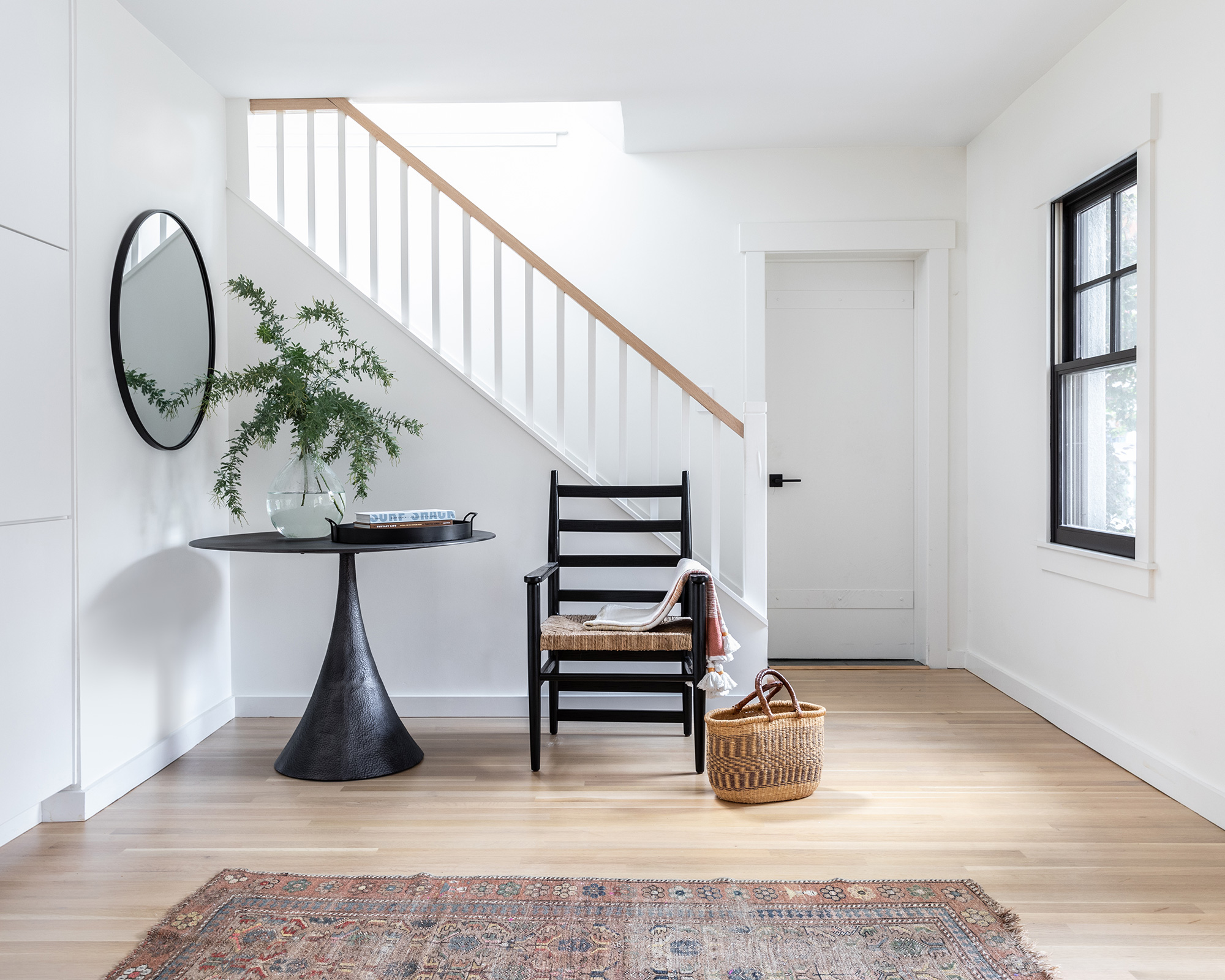
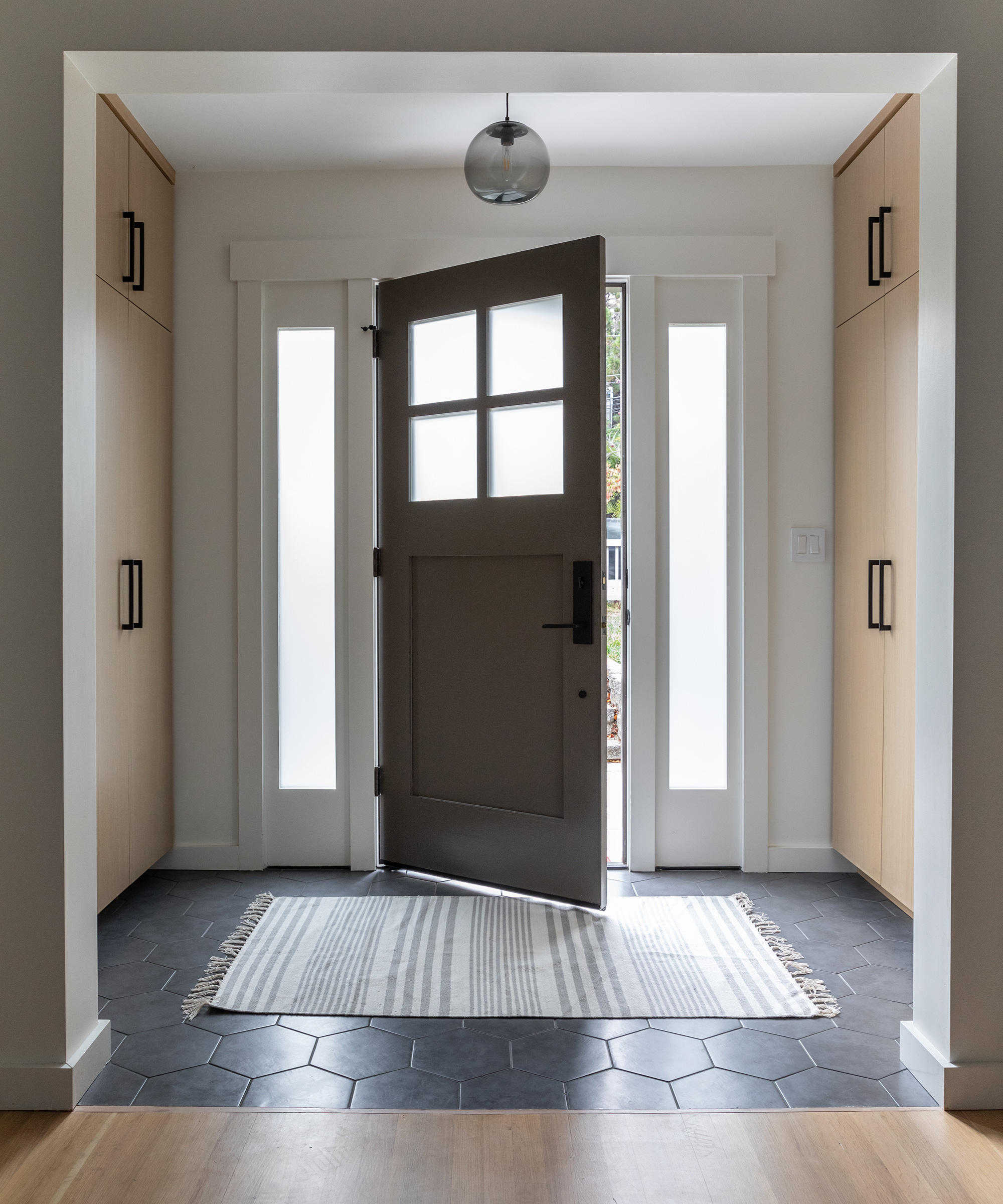
With the addition of custom cabinets in the hall, now everything has a place, removing the opportunity for clutter to gather.
Living room
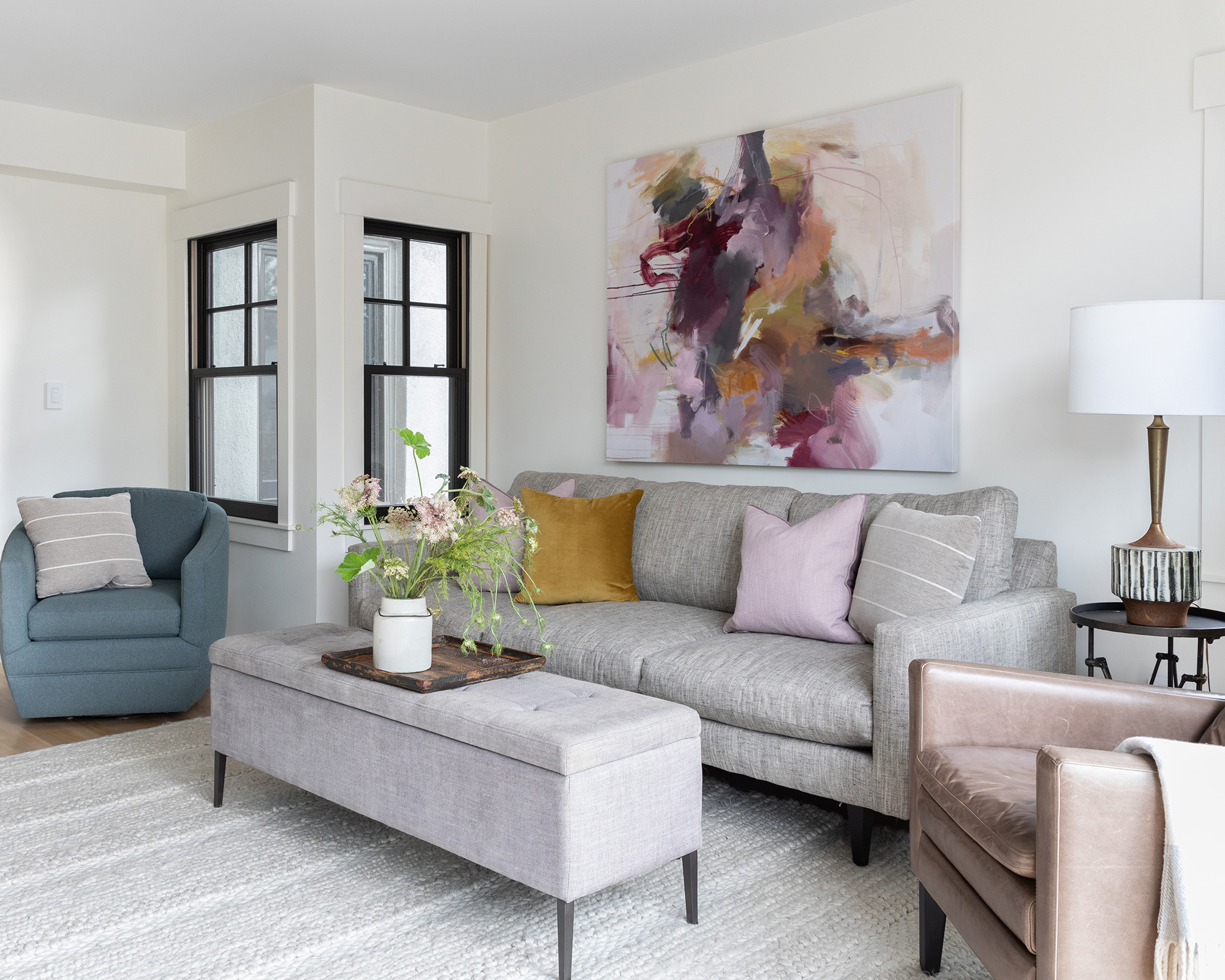
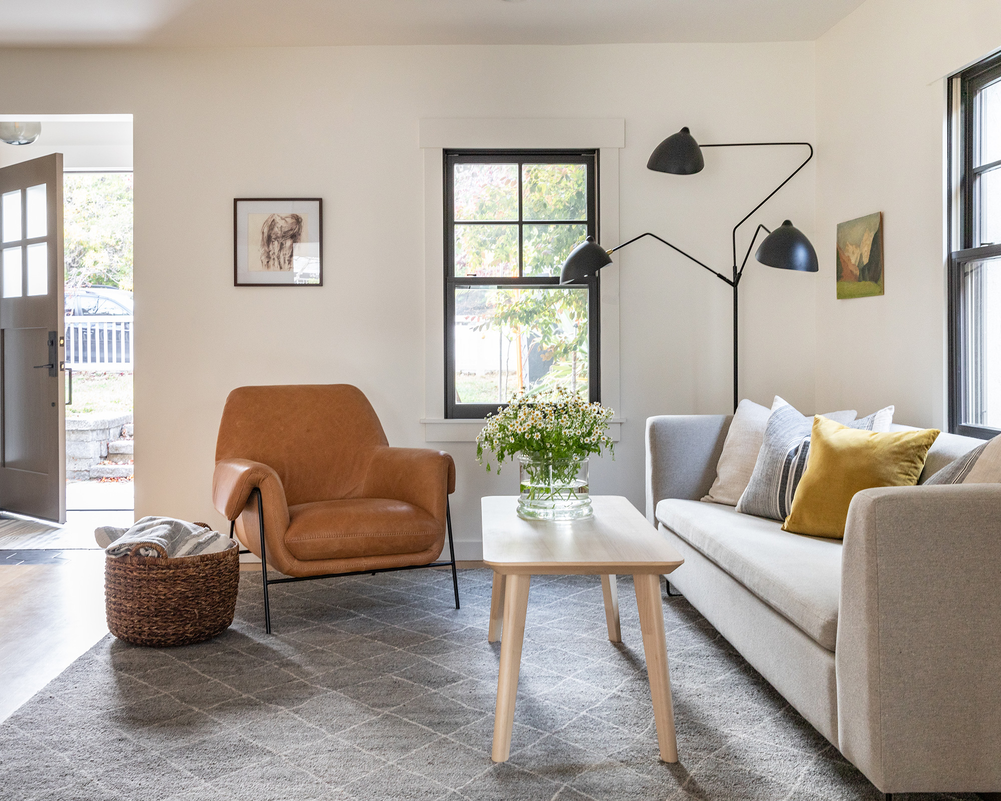
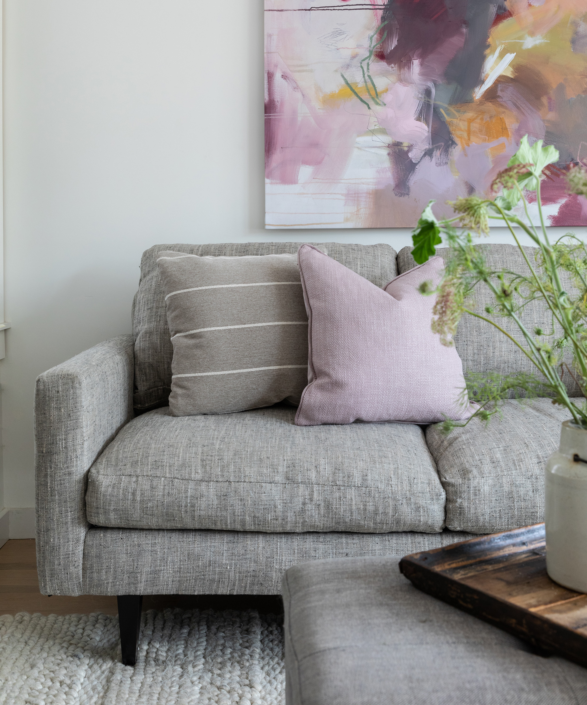
This space was designed with the whole family in mind. It is the perfect place to unwind, entertain or even play games. Structured yet comfy, it sets a clean, friendly tone for friends and family alike.
Light was a major factor when renovating this home. We wanted to incorporate as much as possible with clever window positioning, as shown above.
Kitchen
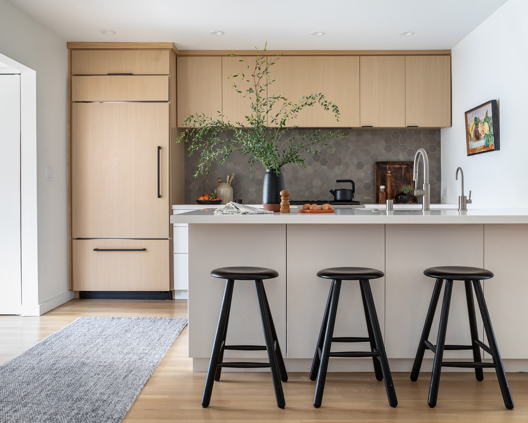
I always factor the environment and sustainability into my designs, so we made careful product choices to lighten the carbon footprint in this renovation.
The kitchen cabinets in this home were made locally in Oakland using wood products from environmentally responsible, legally harvested forests.
The kitchen backsplash tile was also handmade locally. The counter material is quartz made from recycled materials. We always use LED lights, no-voc paint and energy-saver appliances. The new windows are also energy-certified. We also donated old furniture for re-use.
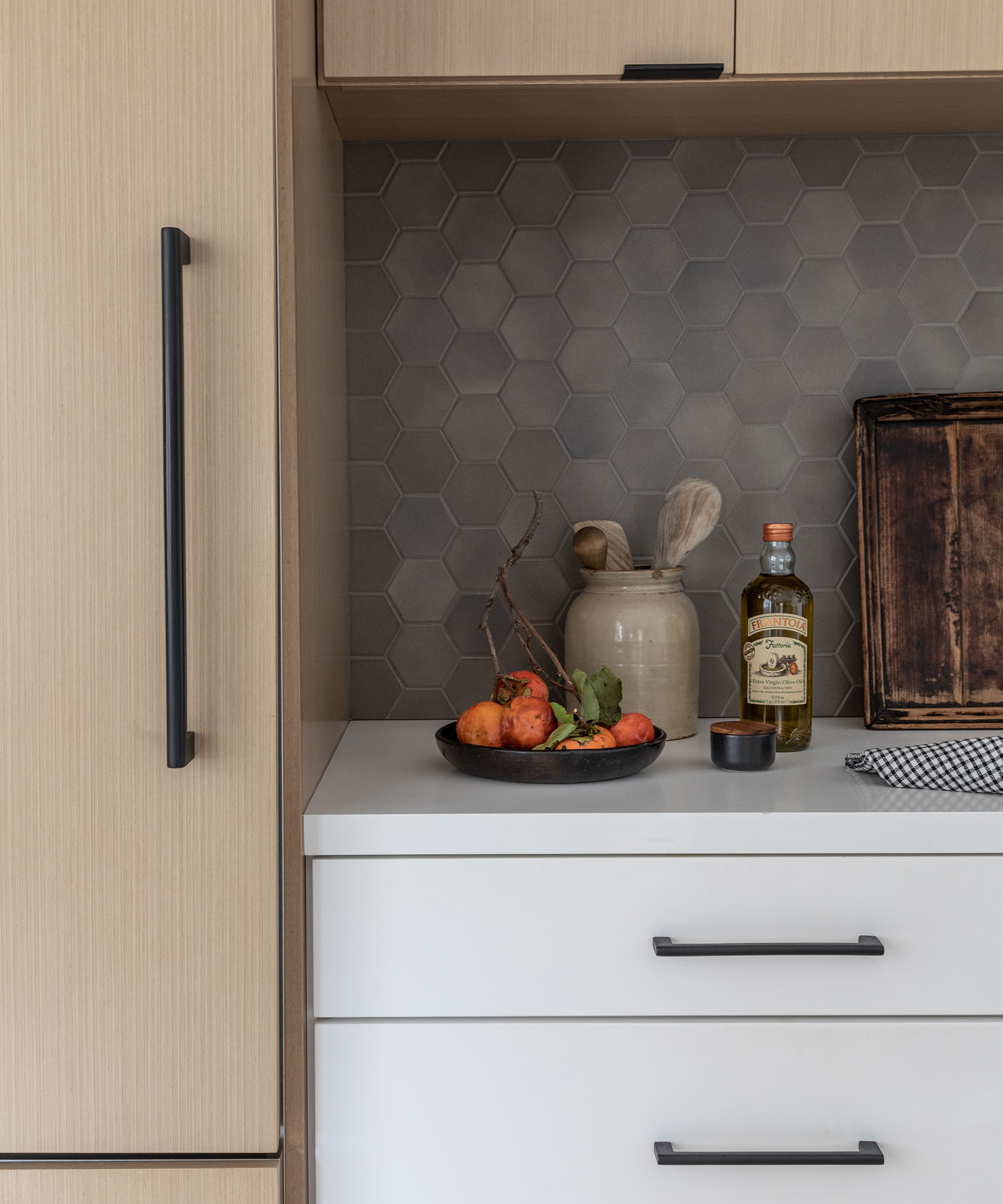
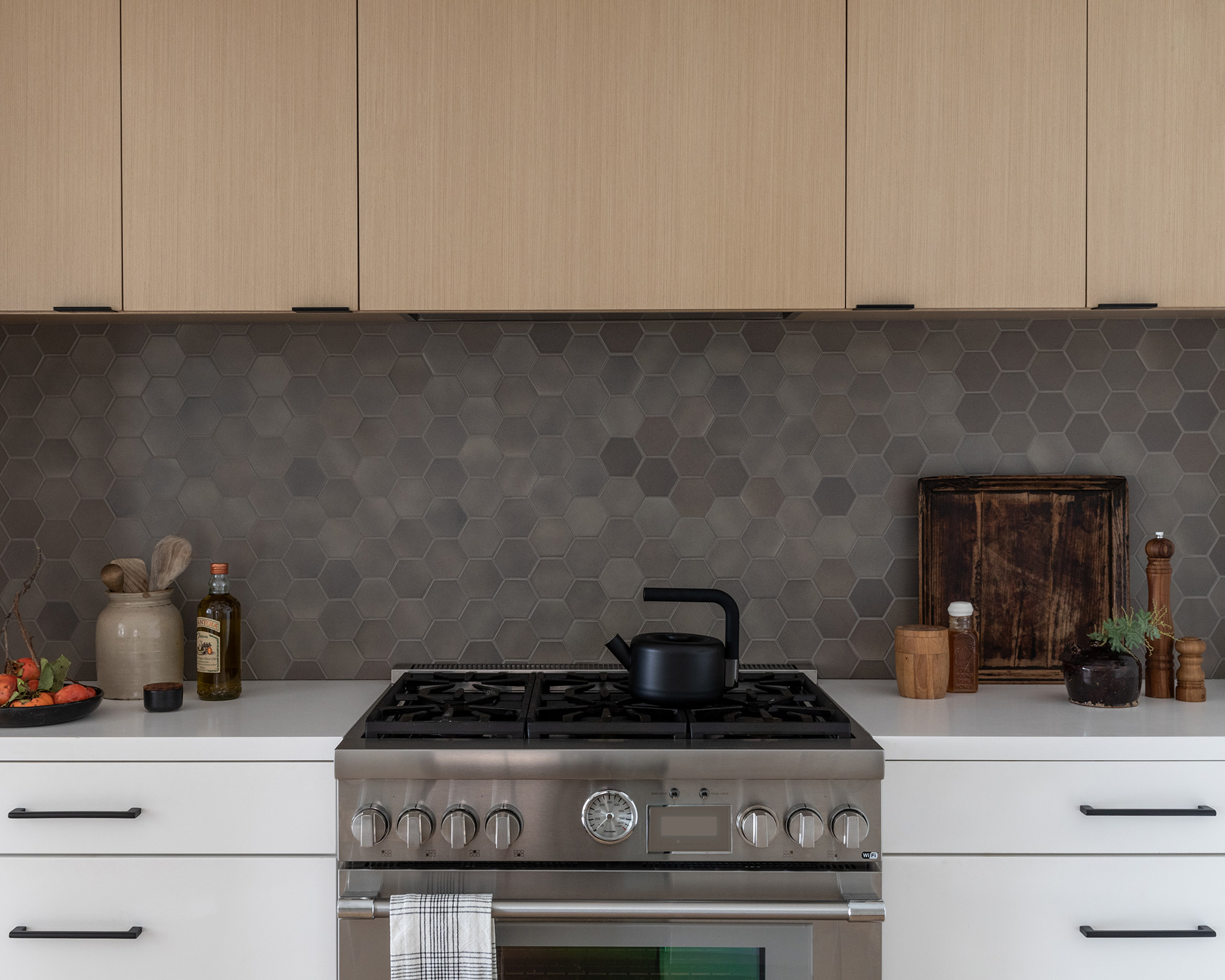
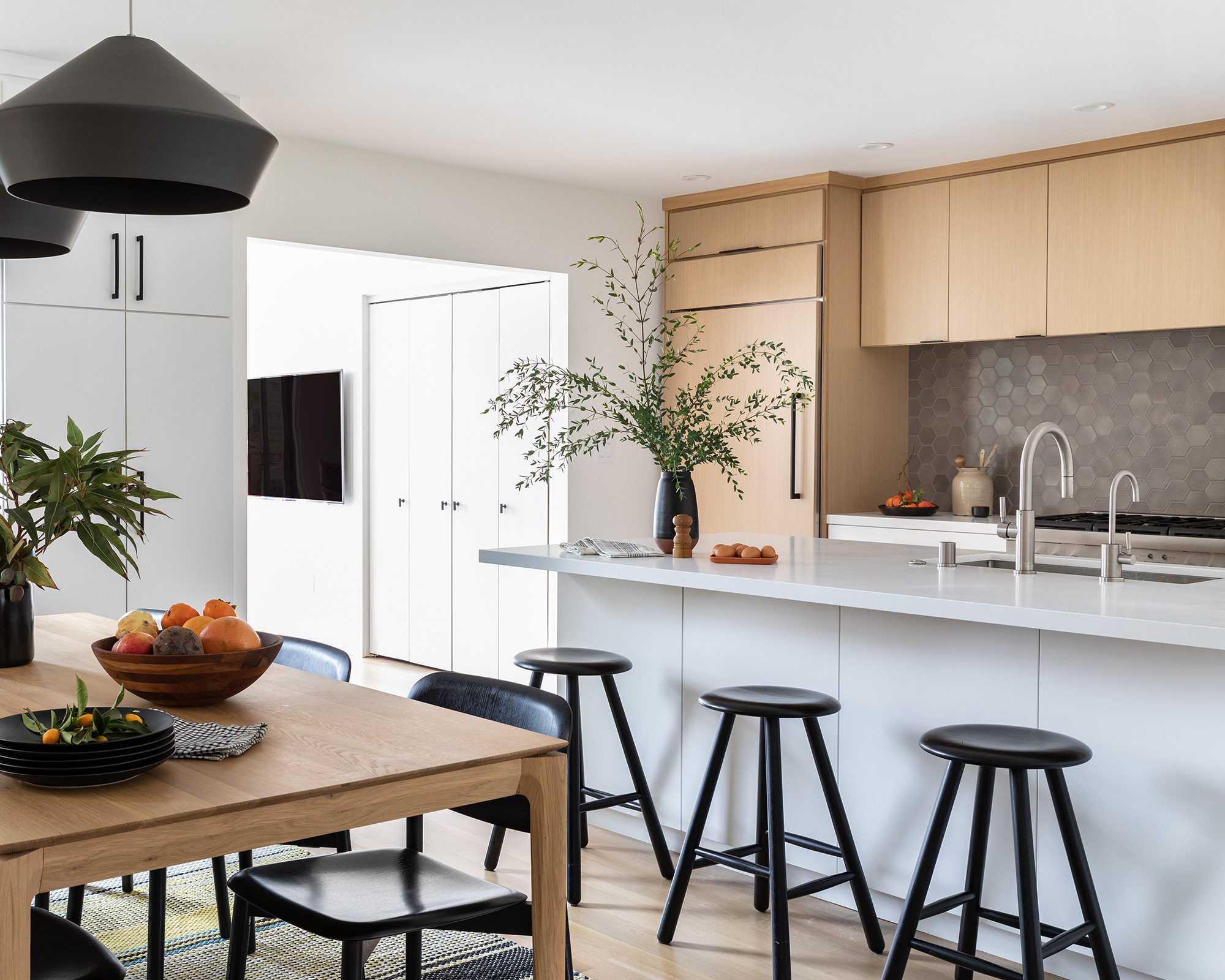
White kitchens are still the biggest selling 'color' in the kitchen market place, and there's no denying that choosing white cabinets – or, a combination of white and wood designs, as seen here – does make it considerably easier to adapt and tweak color schemes at a later date.
We've managed to avoid the 'clinical' look by making sure that there are some elements of natural materials in the room – wooden flooring, table and chairs.
What's more, the cabinets in this home were made locally in Oakland using wood products from environmentally responsible, legally harvested forests.
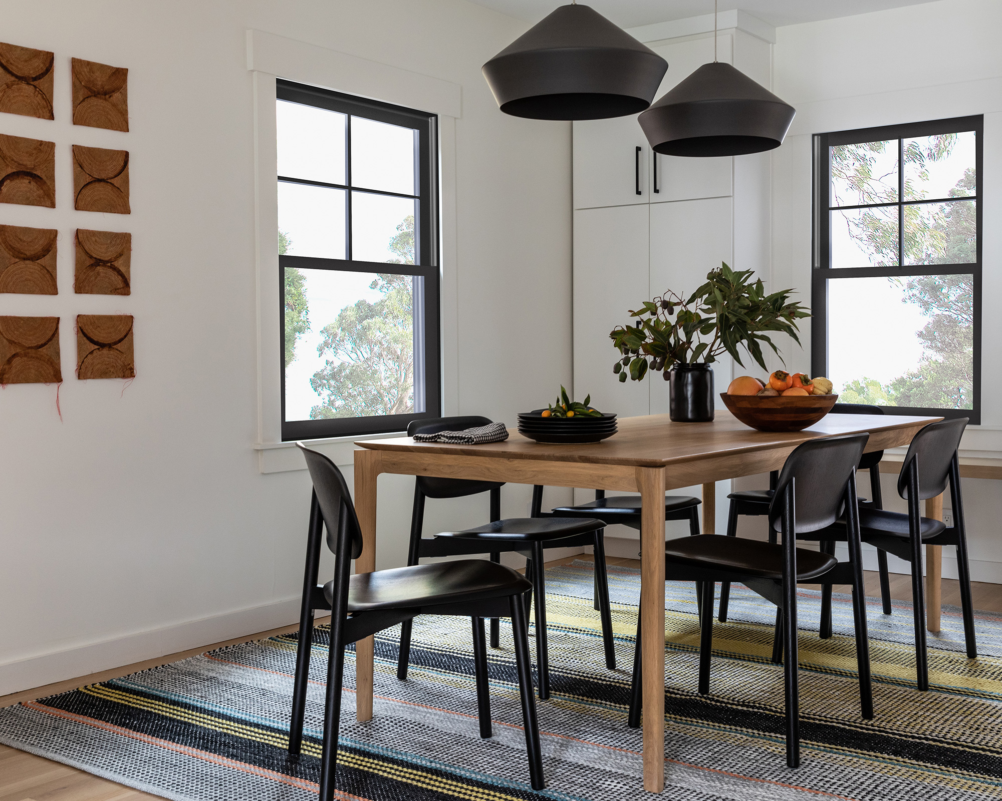
Dining room
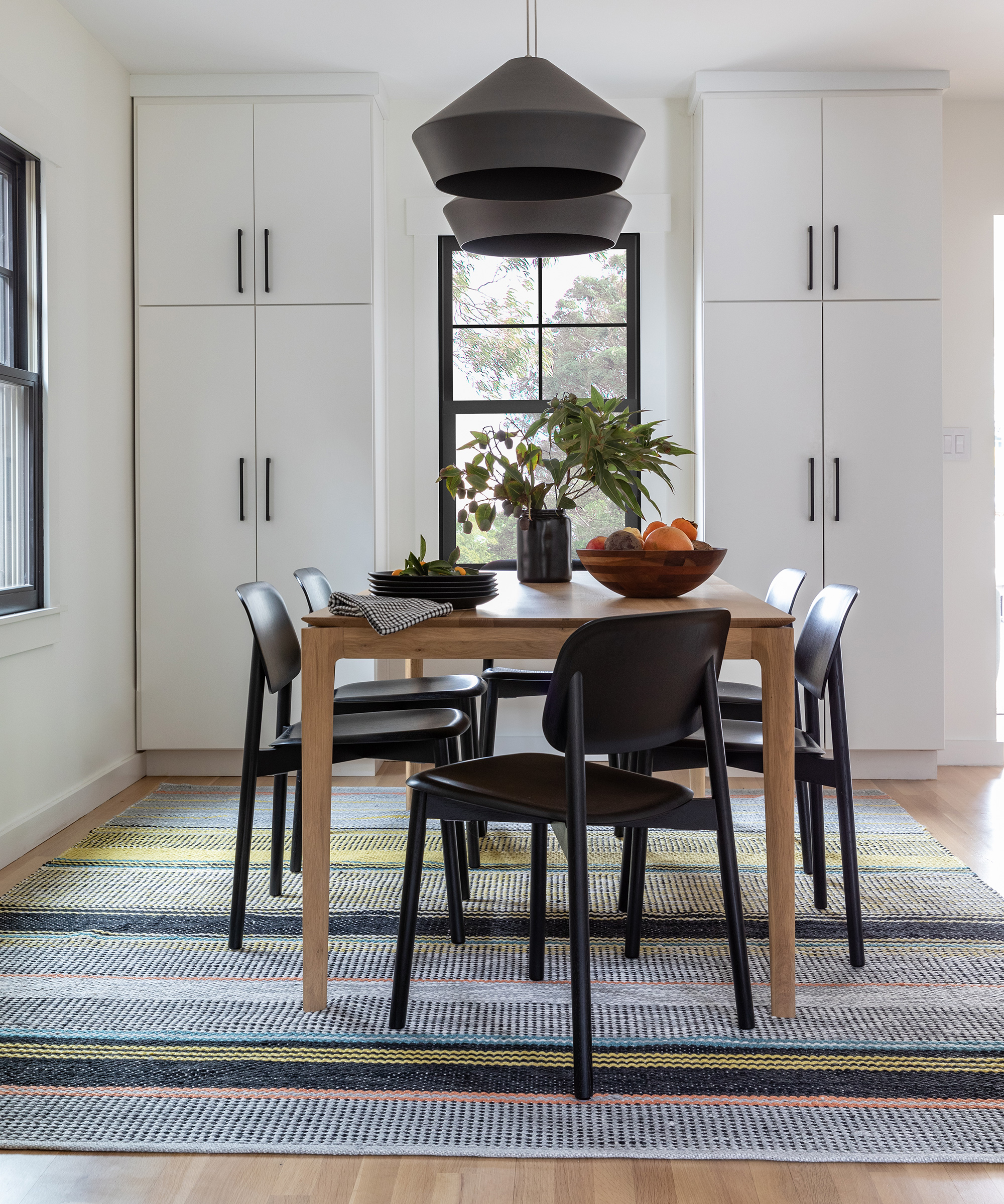
The dining room – a lesson in symmetry – highlights the minimal aesthetic the family have come to love. The beautiful new dining room table is made from FSC certified wood and was purchased locally.
Powder room
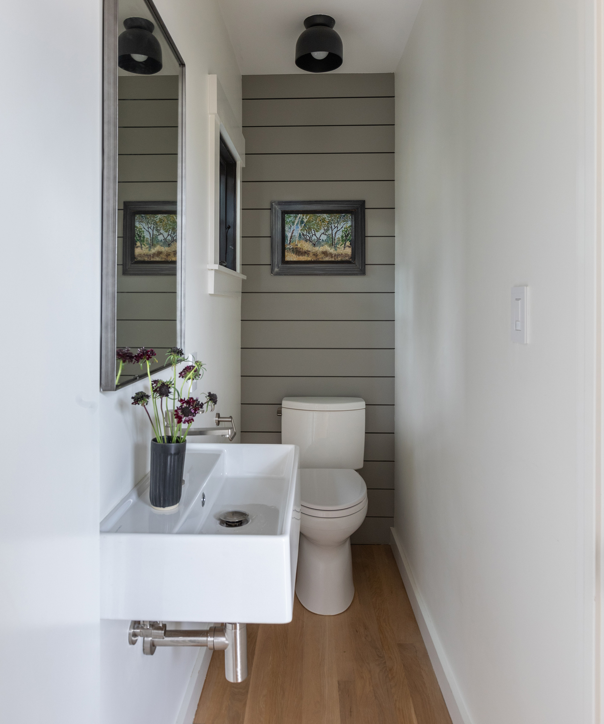
The powder bathroom started out as a little dark cell.
I added a small square window and two beautiful clay ceiling lights to fill the space with light. The narrow modern sink fit perfectly without having to knock out any walls, while shiplap boards at the back add texture and interest.
Photography / Lauren Andersen / SEN Creative
Interior design / Nicole Yee
Sign up to the Homes & Gardens newsletter
Design expertise in your inbox – from inspiring decorating ideas and beautiful celebrity homes to practical gardening advice and shopping round-ups.

Jennifer is the Digital Editor at Homes & Gardens. Having worked in the interiors industry for several years in both the US and UK, spanning many publications, she now hones her digital prowess on the 'best interiors website' in the world. Multi-skilled, Jennifer has worked in PR and marketing and occasionally dabbles in the social media, commercial, and the e-commerce space. Over the years, she has written about every area of the home, from compiling houses designed by some of the best interior designers in the world to sourcing celebrity homes, reviewing appliances, and even writing a few news stories or two.
-
 Ina Garten's storage pantry is an insightful window into all of the best cookware used by the chef – and it's easy to recreate on your kitchen shelves from $48
The beautiful dishware in The Barefoot Contessa's Hamptons pantry showcases the tools she uses most often to cook – this is exactly how you replicate it
By Sophie Edwards Published
-
 Extend the lifespan of your appliance with 5 simple but crucial washing machine maintenance tips
From cleaning the filters to keeping the door open, experts reveal the washer tips they swear by
By Andy van Terheyden Published