A wealth of color and pattern create the wow factor in this family home in London
Interior designer Amelia McNeil has injected a modern twist into this Victorian home with carefully chosen color and pattern

For Amelia McNeil, the clients on this stunning West London project, one of the world’s best homes, were definitely the dream clients as they loved pattern and color didn’t scare them. ‘They had no reservations about going for it,’ says Amelia.
The substantial project was a Victorian end of terrace in Fulham owned by a family with three children. 'With the help of Lucy Wood Architects, the house was gutted from top to bottom. We did the side return, which considerably increased the width of the rooms on the ground and first floors,’ says Amelia. ‘We added a bay window on the second floor, which transformed the main ensuite and we also added both a pod and a mansard on the second floor where the children’s bedrooms are.’
Kitchen
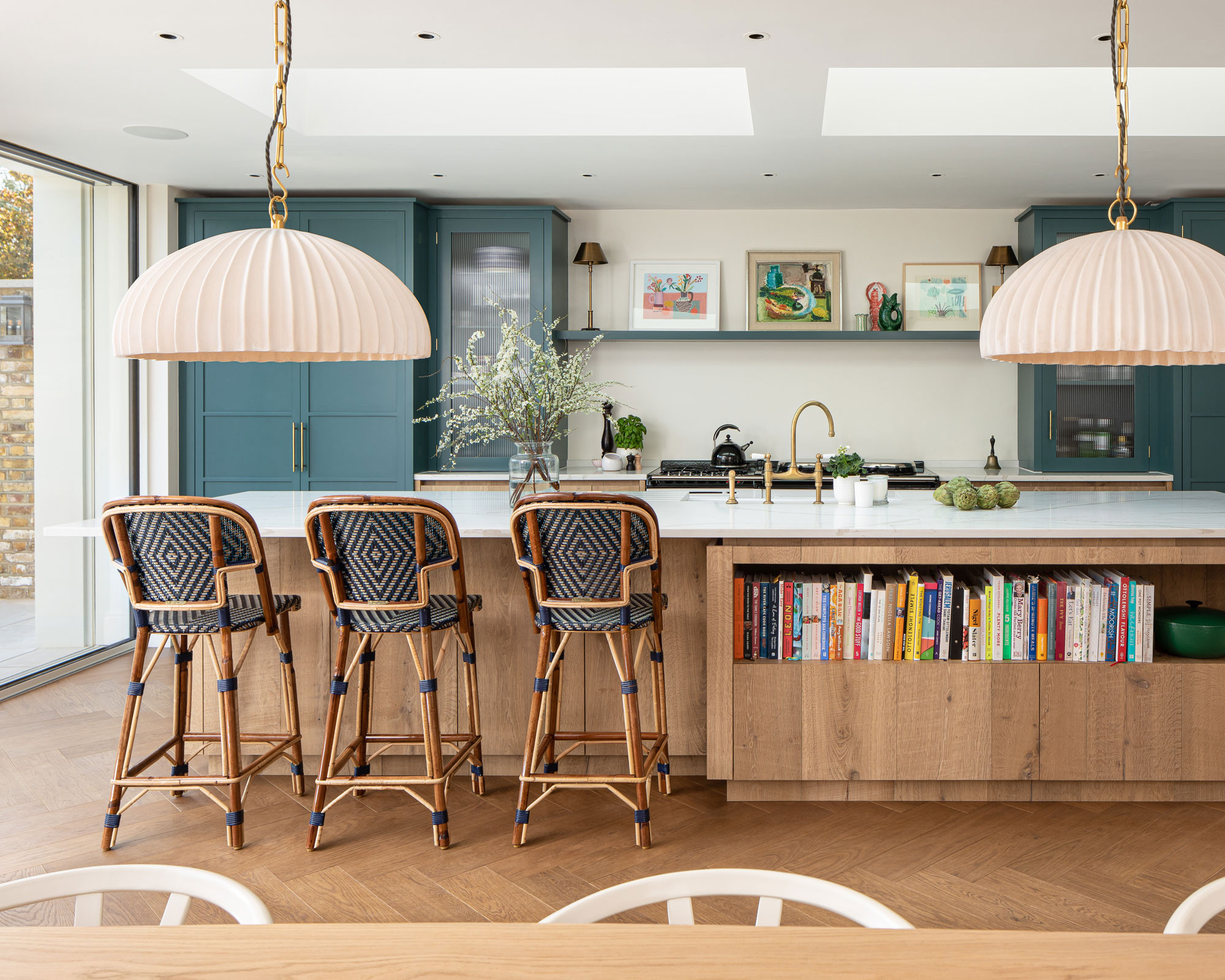
The kitchen also took in the side return aspect so the width of the space was increased. ‘As we have successfully done on one of our beachside projects, we added a glass sliding door that disappeared into the wall to increase the feeling of space and bring the outside in,’ says Amelia.
Rooflights were added above the island so that light comes in from above as well as through the glass doors.
A new island was built, as well as the pantry, breakfast bar and cabinets, which Amelia painted in a deep dark green blue that works well with nature.
Patterned bar stools add impact. ‘I love the pattern of these French cafe style bar stools and they are also really comfortable,’ says Amelia.
One of Amelia’s signature kitchen ideas is to break up the joinery in an island to house books. ‘It can be such a big chunk of joinery so it makes it less formal,’ she says. 'Wall shelves with books can look quite cluttered and I prefer to put interesting objects and artwork on them.’
Hadeda pendant lights above the dining table were chosen for their simplicity.
Kitchen seating area
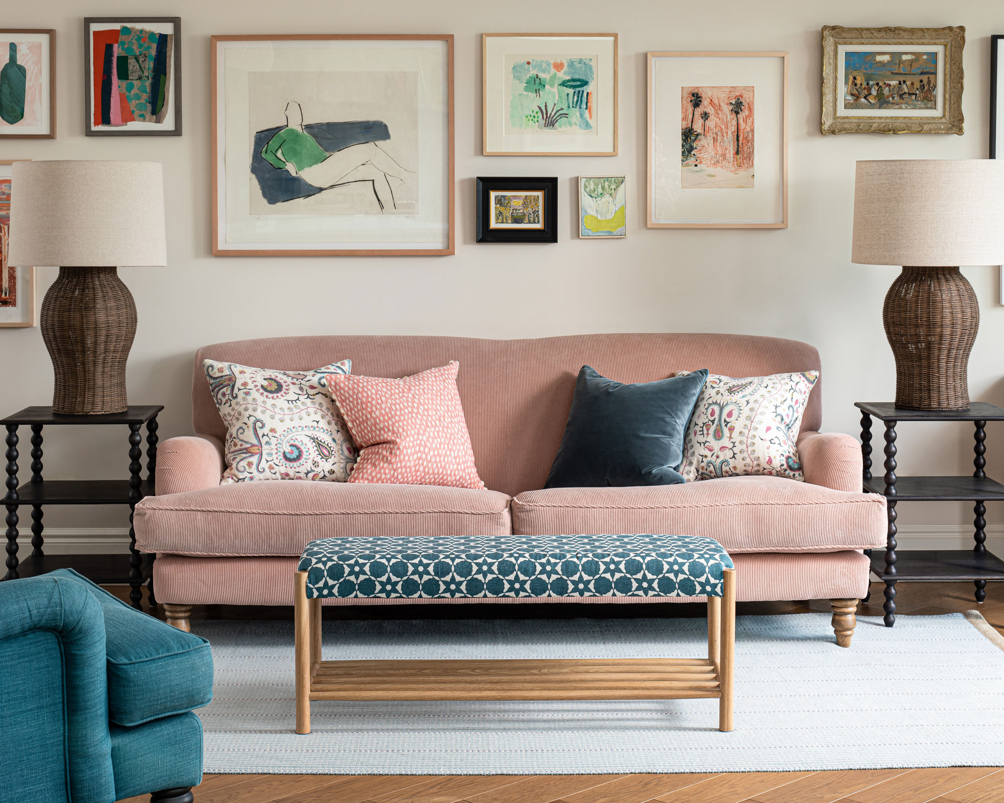
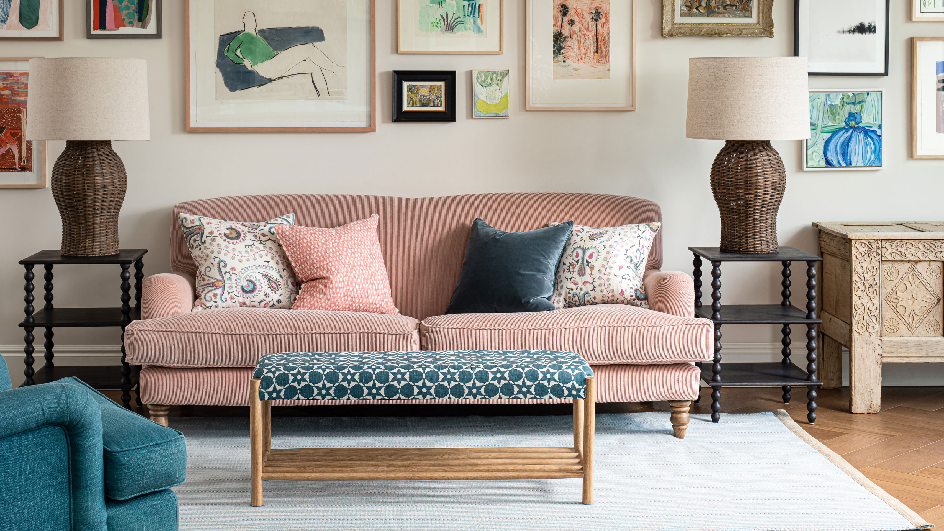
Amelia wanted to create a space that felt inviting as there is lots of glass and large cabinetry in the room. ‘This is a great open plan space to spend time with the children in the daytime as there’s a breakfast bar, a pantry and somewhere to sit. This ticks all the boxes for the family.’
As the client loves pink, Amelia chose a pink cord sofa. ‘The warm tone of the floor and soft furnishings were chosen with the scale of the rooms in mind as we wanted every room in the house to feel comfortable and inviting,' she says.
‘We love a gallery wall as it brings a lot of character to any room and it's also an expression of our clients' taste,’ says Amelia. The client instructed Cramer & Bell to help with sourcing and hanging the art around the house.
Living room
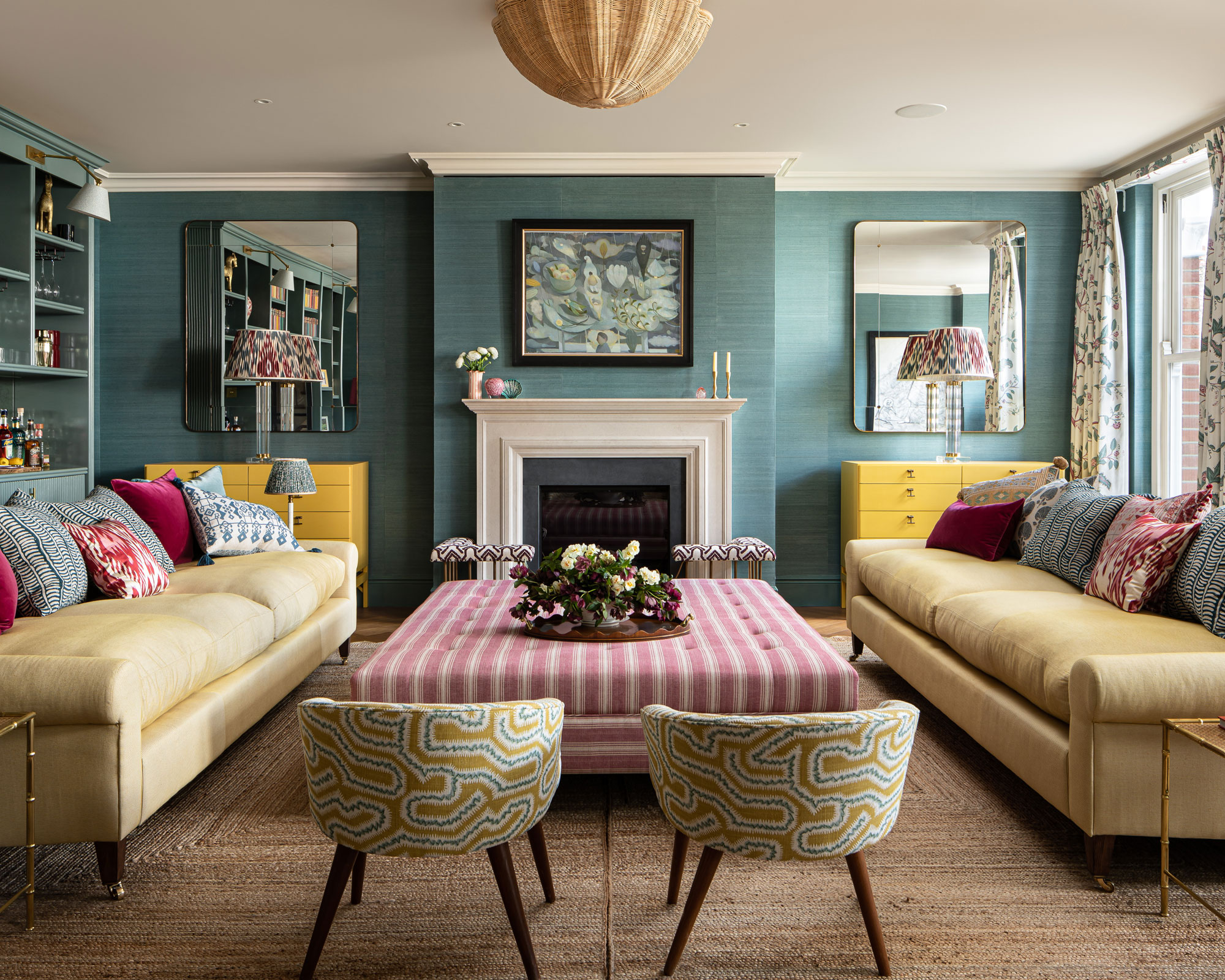
This space was a challenge for Amelia as it is so large. ‘I wanted to make it social, seat as many as possible, allow people to watch TV and make a large room feel cozy,’ she says.
Living room ideas included using a textured silk wallpaper around the room and then continuing the same color in gloss on the reeded joinery. ‘Painting the room all in the same shade meant that the other colors could really pop. I love the fact that the eye is drawn to the cushions on the sofa and to the yellow cabinets.’
In the left hand corner there is a bar with a fridge below. ‘It makes a great entertaining space,’ says Amelia.
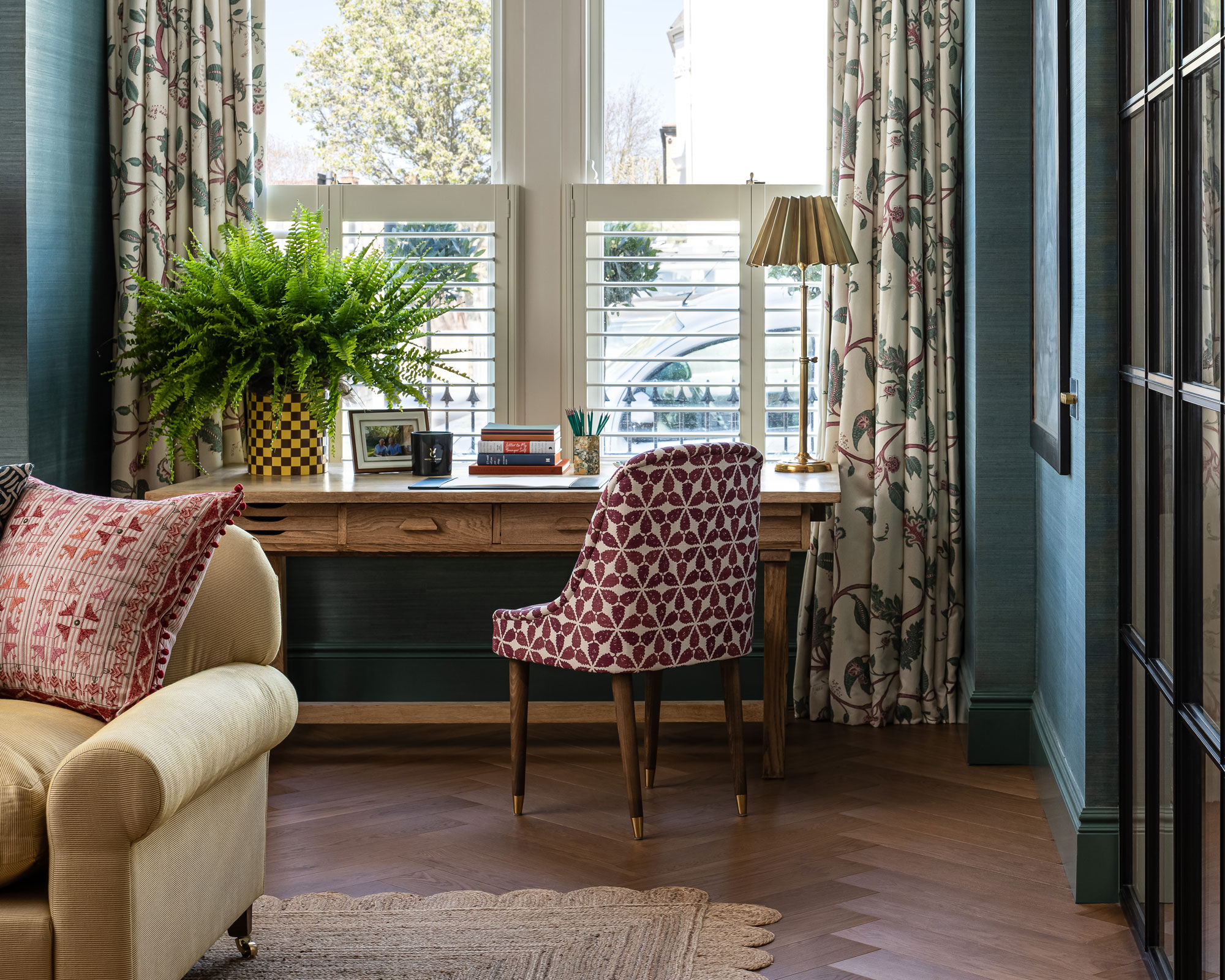
This 1970s desk in the living room is for the client. ‘She didn’t want it to look like an office so we upholstered the seat to make it work with the room.’
The Crittall partition acts as a divider between the entrance hall and the living room and can be closed off to reduce sound, which works well when entertaining and the children are asleep upstairs.
Office
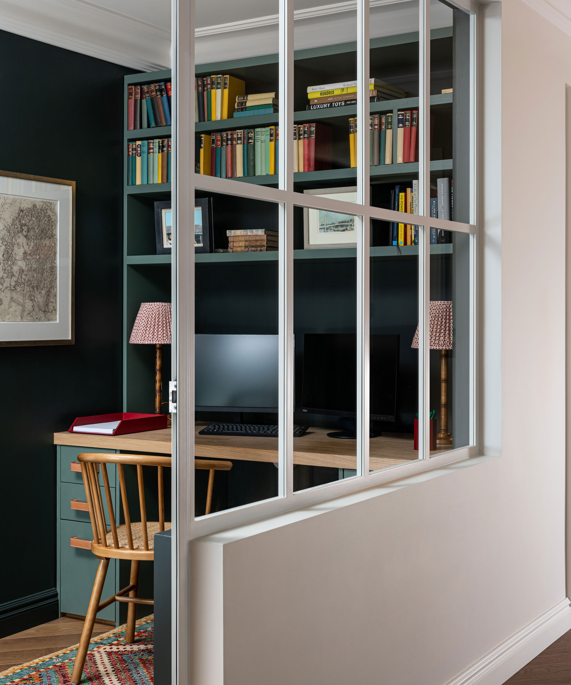
Amelia describes this as an interesting space to design. ‘There are no windows so we installed white Crittall to continue the Crittall theme and to bring in light from the corridor as we wanted to make it feel inviting. I felt it was important to opt for white rather than black here to increase the feeling of light and space.’
A mid century chair was chosen for a classic contemporary twist.
Home office ideas included painting the walls an impactful dark green. ‘It’s a small space and I wanted to give it drama and create its own identity. Depth on the wall makes it more interesting,’ says Amelia. A lighter green was chosen for the cabinetry, staying with the same color palette.
Amelia added shades on the lamps to introduce an element of cosiness.
Playroom
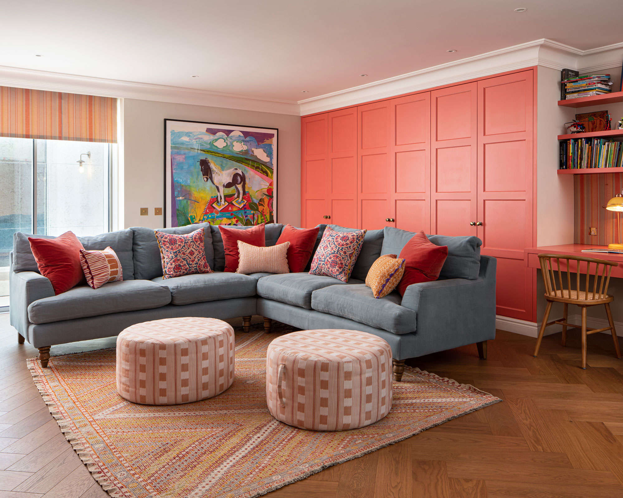
This space was designed to be comfortable for the children and to be a good space for them to entertain their friends. Amelia spent hours choosing the coral color for the joinery. ‘It was a tricky color to find,’ she says. ‘It’s warm and playful without being too garish. I love the pattern on the rug and the swing was a fun addition to include.’ A grey blue sofa cools the scheme down, while patterned cushions inject comfort and fun. The cupboards were designed to hold toys. A rail was installed in a very deep cupboard to store the children’s fancy dress costumes.
Main bedroom
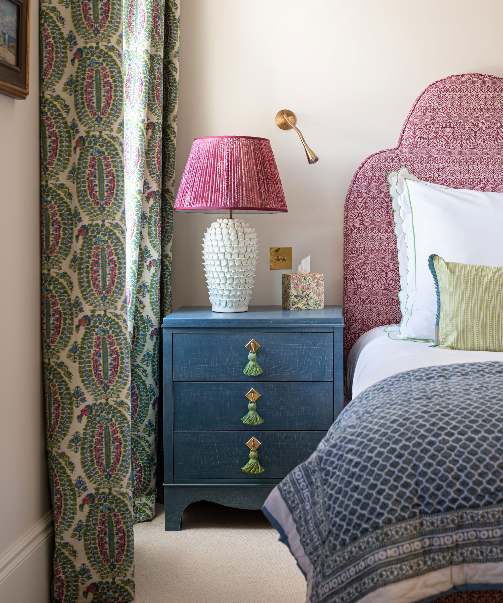
Amelia likes to create a feeling of calm in a bedroom. Here she chose neutral walls and calming tones. Bedroom ideas include introducing warmth and a playful touch with the headboard. ‘I wanted to bring more pink into the scheme but for it not to appear too girly. I really love this fabric,’ she says. Brass wall lights and handles were used to bring in warmth.
Main bathroom
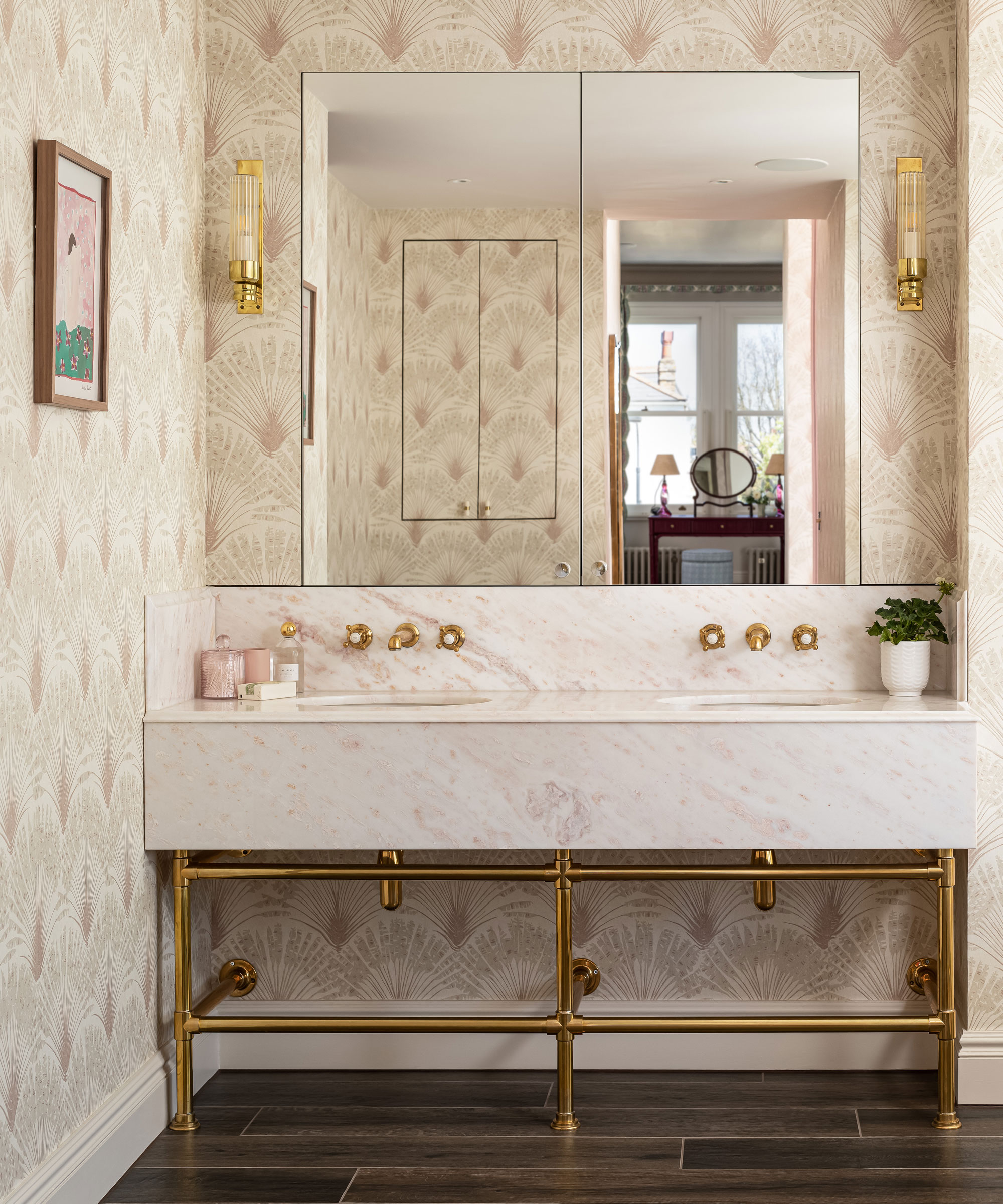
Amelia chose the wallpaper because of its subtle pink pattern. ‘It works well with the marble and is soft yet sophisticated,’ she says. The vanity unit is bespoke. The mirrored cabinets provide high level storage.
One of Amelia’s bathroom ideas was to use wood effect porcelain tiles on the floor to add a natural element, as well as contrast. ‘I wanted to avoid a cold tile finish and this provides warmth,’ says Amelia.
Guest bedroom

This is a generic space with a vaulted ceiling that makes it quite dramatic. The curtain fabric and bedside tables were in place already so Amelia chose a fun mustard yellow for the walls and managed to source a cushion fabric that made it all work together.
Bathroom
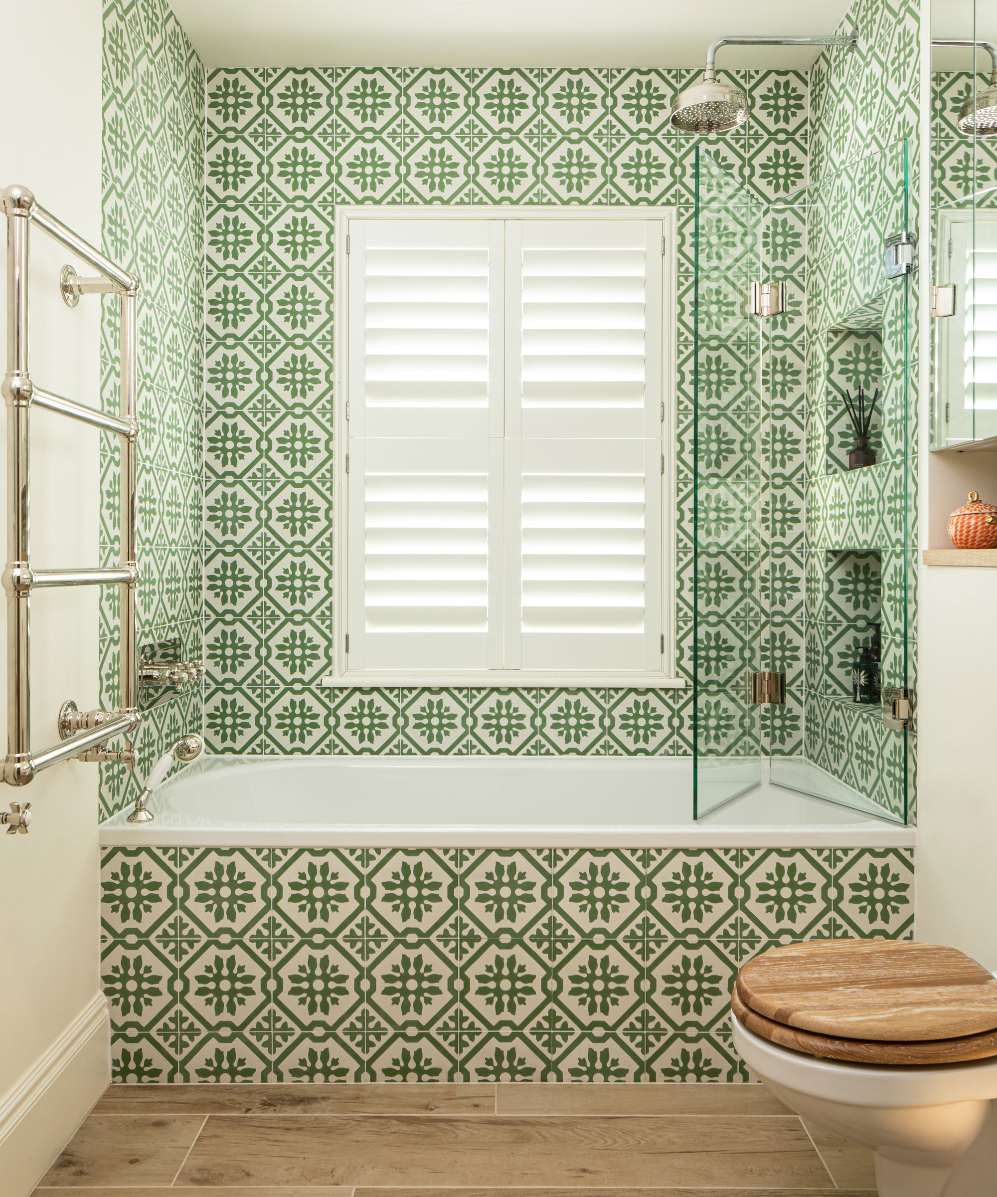
Patterned tiles add impact and a fun touch. Amelia chose imitation wood floor tiles for warmth and a natural touch. White plantation shutters keep the look streamlined.
Girl's bedroom
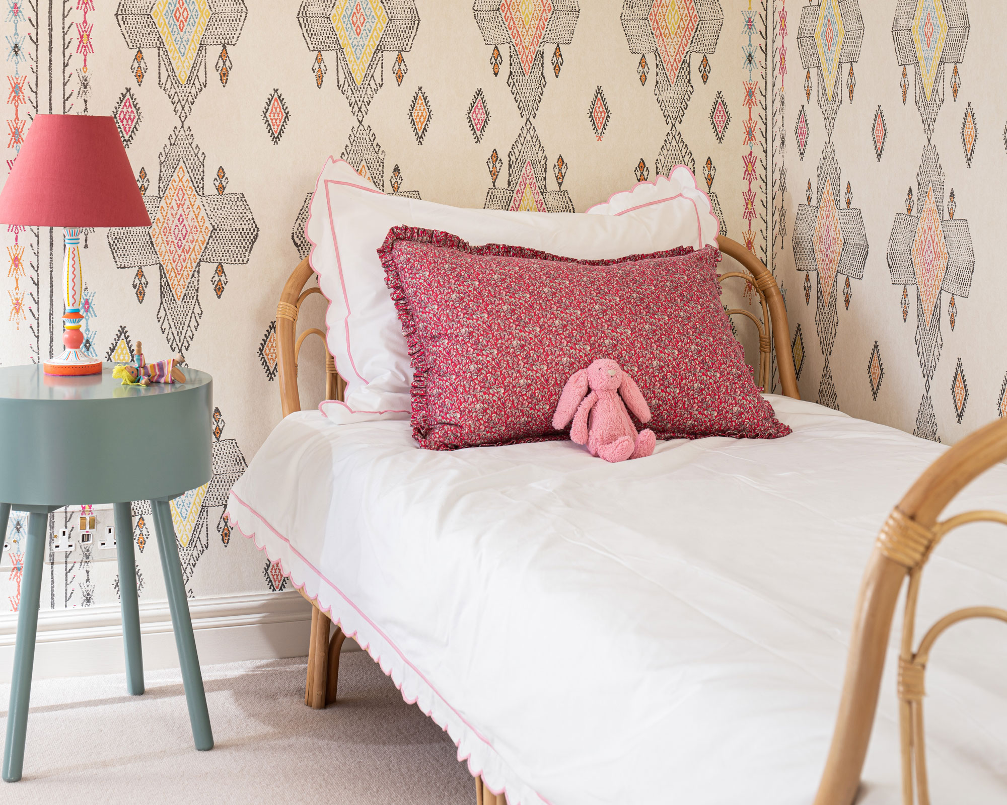
Amelia chose a patterned wallpaper that her clients' daughter wouldn't grow out of quickly. She painted the cupboards in this room with luminous paint for to introduce a fun element. A mid century style table injects a modern twist. As a nostalgic finishing touch, she used fabric from the client’s bridesmaid’s dress to create a cushion.
Interior designer/ Amelia McNeil
Architect/ Lucy Wood
Photography/ David Butler
Sign up to the Homes & Gardens newsletter
Design expertise in your inbox – from inspiring decorating ideas and beautiful celebrity homes to practical gardening advice and shopping round-ups.

Interiors have always been Vivienne's passion – from bold and bright to Scandi white. After studying at Leeds University, she worked at the Financial Times, before moving to Radio Times. She did an interior design course and then worked for Homes & Gardens, Country Living and House Beautiful. Vivienne’s always enjoyed reader homes and loves to spot a house she knows is perfect for a magazine (she has even knocked on the doors of houses with curb appeal!), so she became a houses editor, commissioning reader homes, writing features and styling and art directing photo shoots. She worked on Country Homes & Interiors for 15 years, before returning to Homes & Gardens as houses editor four years ago.
-
 Charred little gem with saffron dressing
This recipe with charred little gem is both easy to make and sure to impress guests. It's the perfect side for fresh spring menus
By Alice Hart
-
 Grilled asparagus with herb and pickled red onion
This grilled asparagus couldn't be easier, and it's a wonderful way to get the best flavor from our favorite spring veg. It's perfect alongside fish or lamb
By Alice Hart