Tour this colorful and creative London apartment – full of clever storage tips
This redesigned London apartment is a masterclass in using color and pattern, and full of clever storage ideas
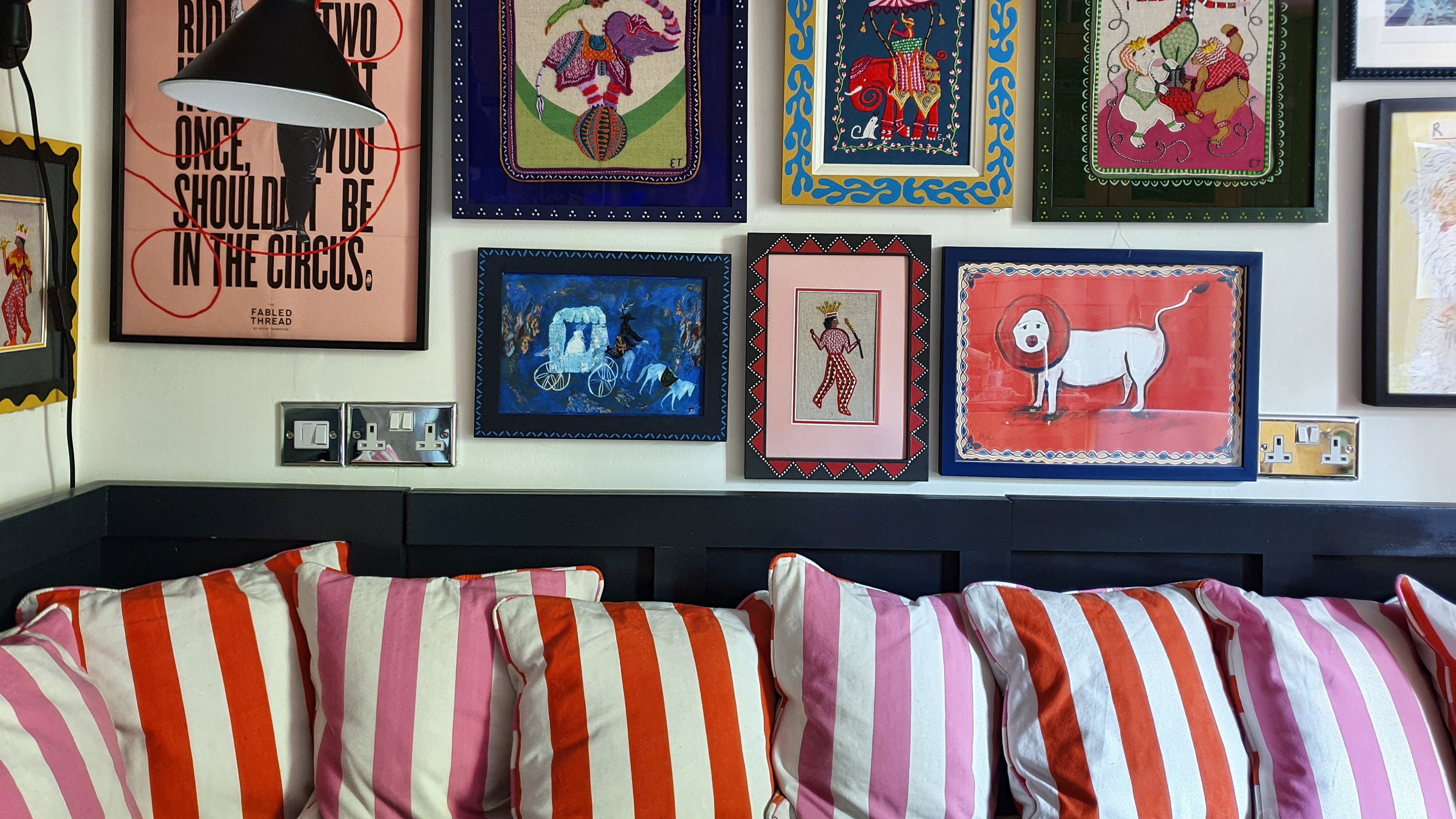
Eppie Thompson knows a thing or two about being creative with color. Her home and her business are all about exactly that – creativity and color.
Her one-bedroom London apartment is like a jewelery box full of sparkling gems. A harlequin patchwork of pattern, color and shape that combine to create a distinctive living space full of interest and personality. These rare qualities truly make this one of the world's best homes, despite its compact size.
Eppie founded and runs The Fabled Thread, producing unique embroidery and sampler kits for fellow craft and needlework enthusiasts. She bought and designed her one-bedroom London apartment, knowing that she would be running The Fabled Thread from there and says the space's dual purpose dictated a lot of the design decisions.
Just like her beautiful sewing kits, the apartment is packed with colorful items. Much of the art, furniture, soft furnishings and upholstery has been made by Eppie or a member of her family, and the result is a strikingly personal – and creative – space.
It's taken a lot of work to get it to this point, however, as although the layout and flow of the space were good, Eppie had to change everything apart from the flooring.
'I ripped out the old kitchen and bathroom meaning I had a blank canvas to begin with. I was working on quite a tight budget so that meant choices were more limited and I had to get creative with how I approached the renovation,' says Eppie.
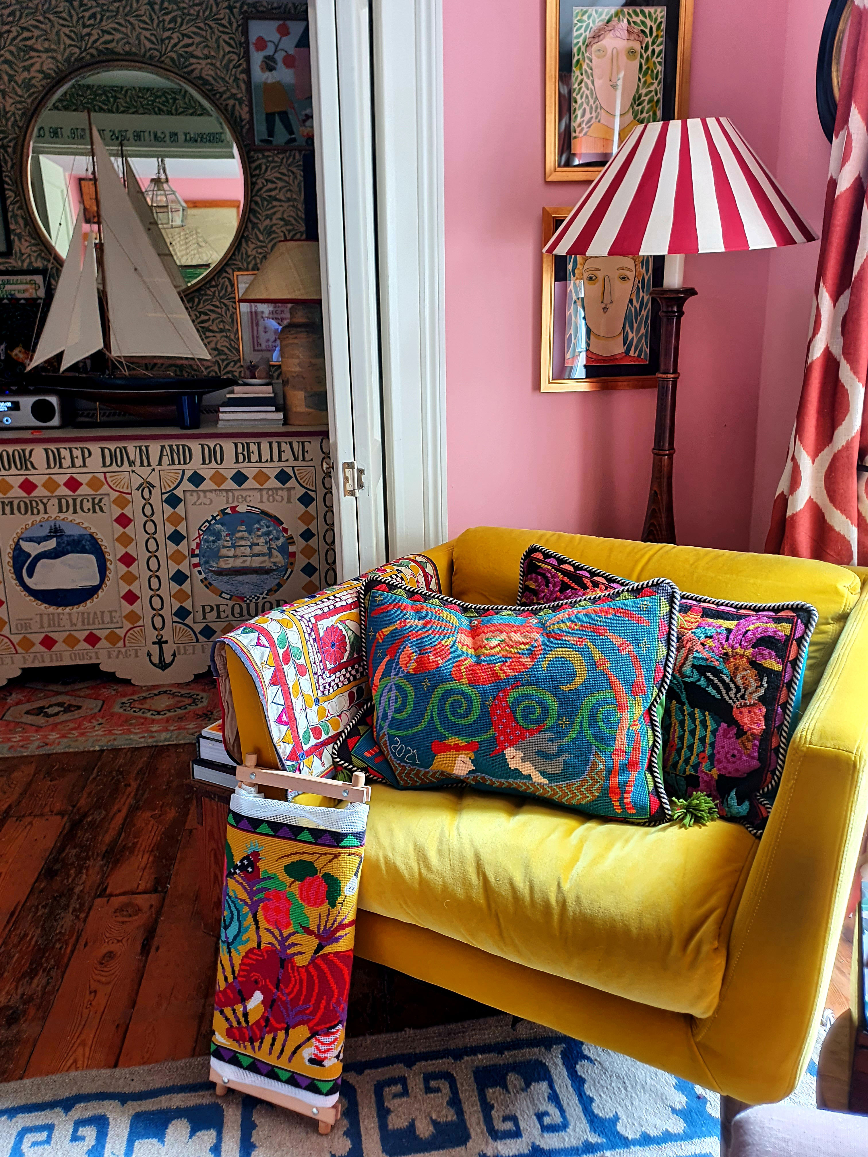
Designing the apartment so that she could successfully run her business and live there at the same time presented some unusual challenges. Among the unusual kitchen ideas, for example, is the fact that the kitchen table and bench are higher to be standing height for cutting fabric, and the bed base was custom made to be extra deep for storing wool. Every inch of the 600 sq ft apartment had to work doubly hard to make it feasible as a home, office, storage space and gallery.
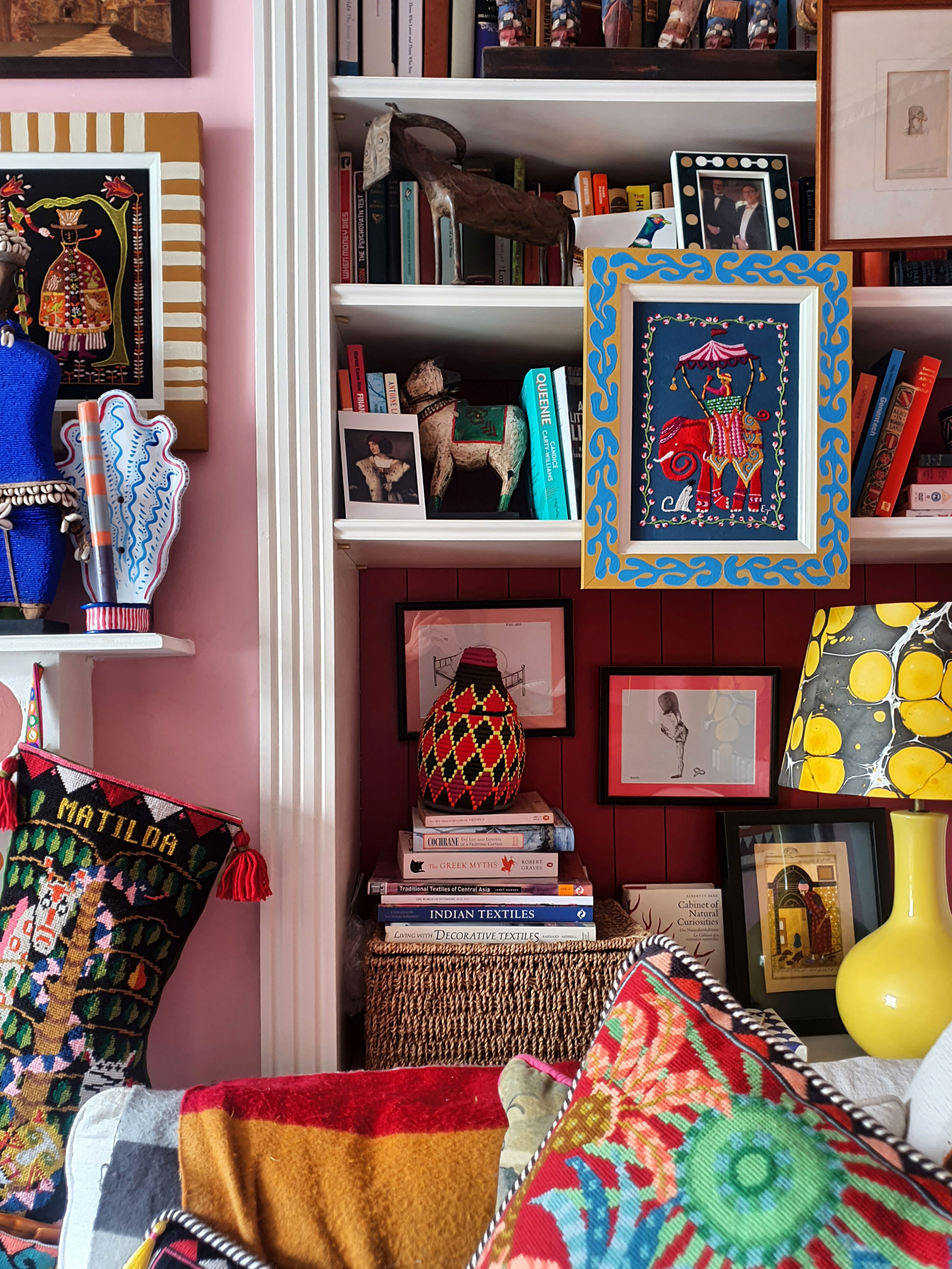
'Even though The Fabled Thread outgrew the flat after only about nine months,' says Eppie, 'I am so grateful for how much storage I created at home. Everything out is intended to be on display and while the walls and shelves are all full, it doesn’t feel cluttered to me.' Indeed there are many inspiring storage ideas throughout the home.
Hallway
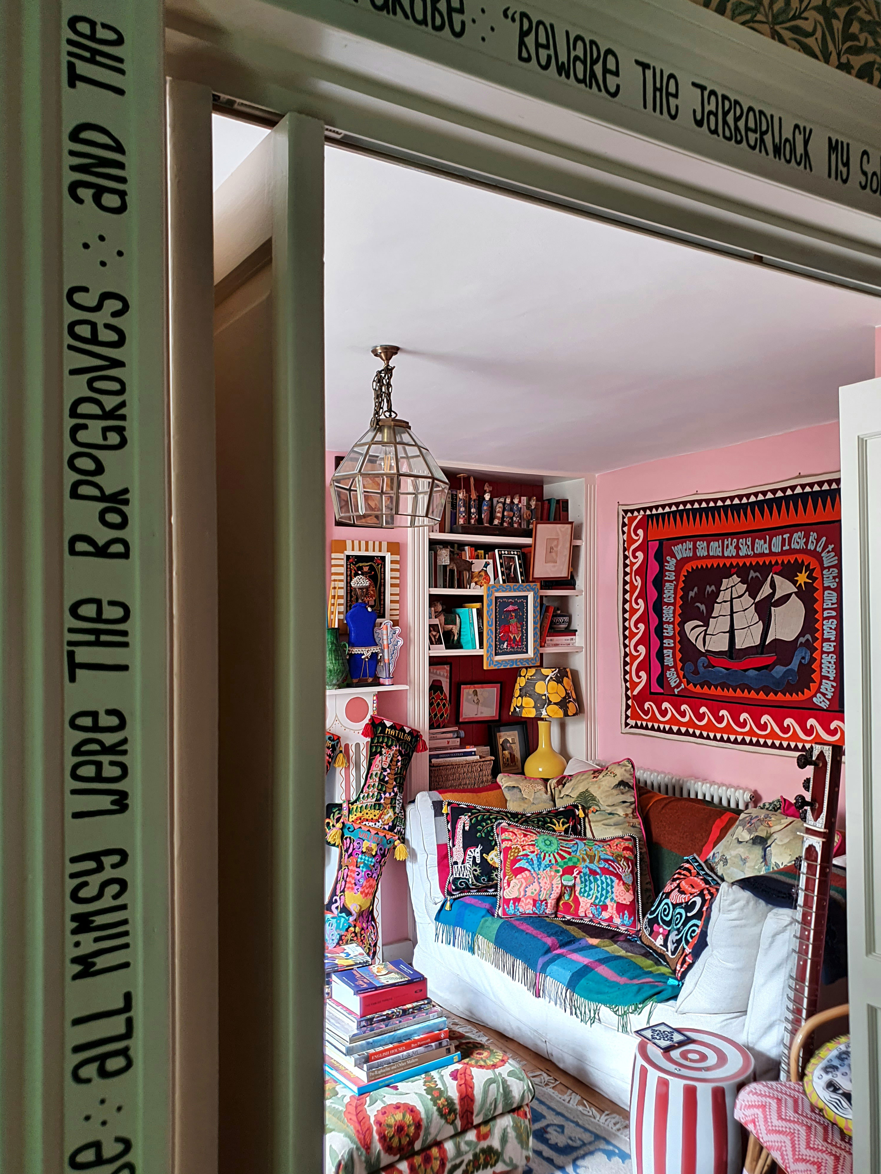
'When I viewed the flat I was so taken with the hallway and double doors into the sitting room – it felt like a little Georgian parlor,' says Eppie.
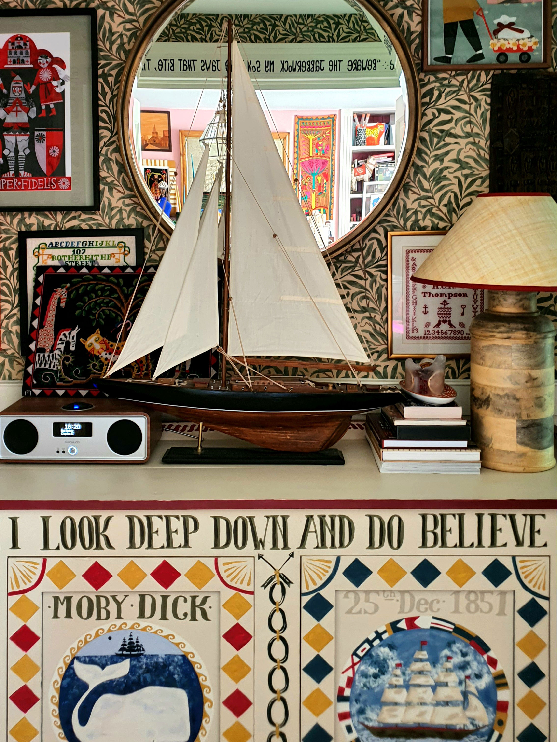
She decided to play to that by panelling the lower part of the wall and wallpapering the upper half in William Morris’s classic Willow Bough wallpaper. A lot of the original features of the flat had been stripped out over the years, so one of Eppie's biggest challenges, when she was thinking of hallway ideas, was to try bring some character back.
'Home to me is like a stage set for my world,' says Eppie. 'So I also wanted it to set the scene for anyone visiting. I painted the opening lines of The Jabberwocky around the door frame which is a wonderful reminder to me that a bit of nonsense is good for the soul, and for anyone visiting it prepares them for the madness within!'
Kitchen
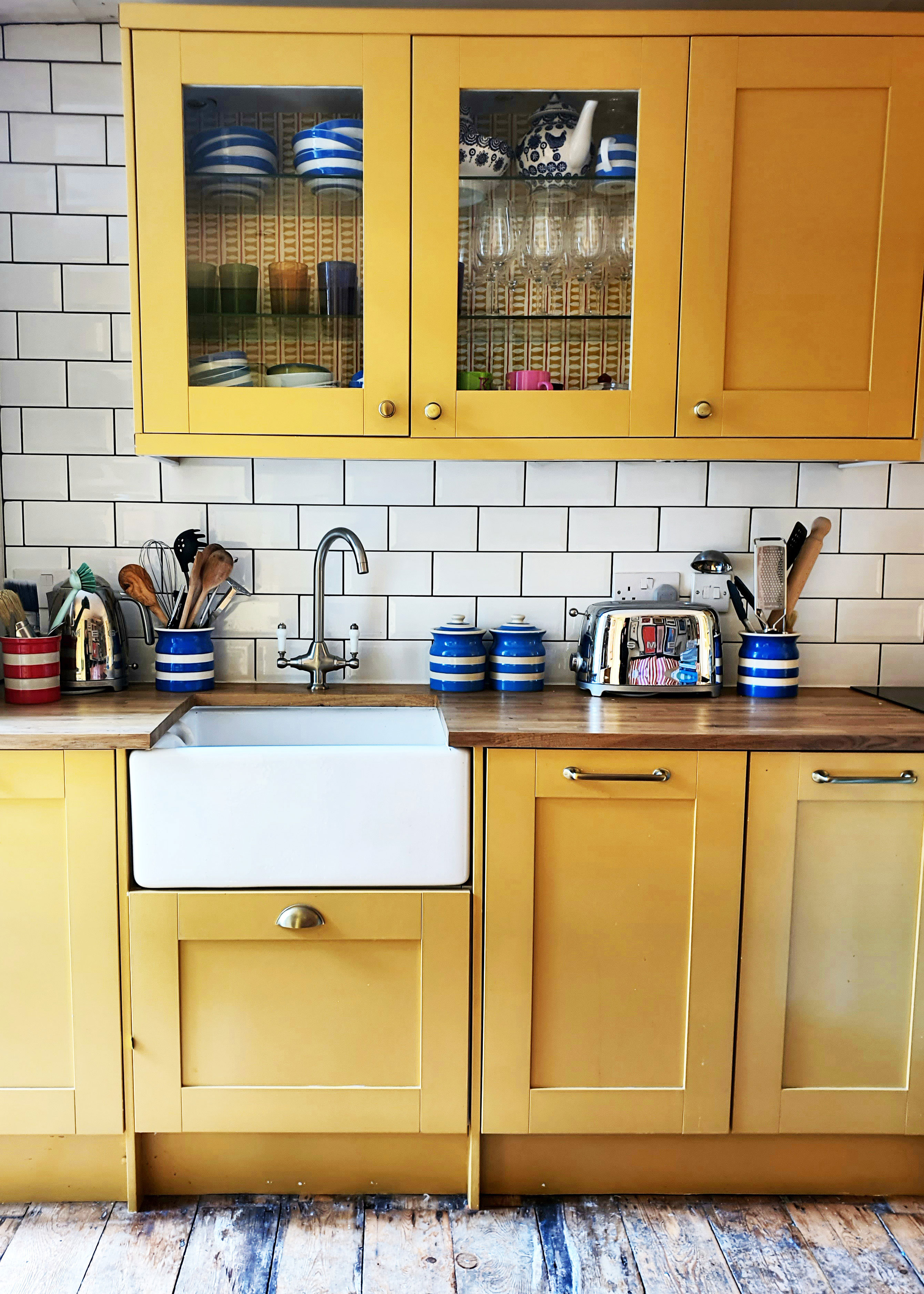
'It’s very hard to decide which space is my favorite, each one has its own unique character,' says Eppie. The kitchen is where she spends the most time as it has the only table in the apartment.
'I love any kind of handicraft and I spend most evenings sat here either sewing, drawing, painting, collaging etc. It’s the space where I feel most invigorated.'
Eppie originally painted the kitchen cabinets white, thinking that would make the room feel lighter but found it looked clinical and stark. 'I repainted them to India Yellow, which tones in wonderfully with the wooden floors, worktops and table, creating an earthy feel to the space,' she says.
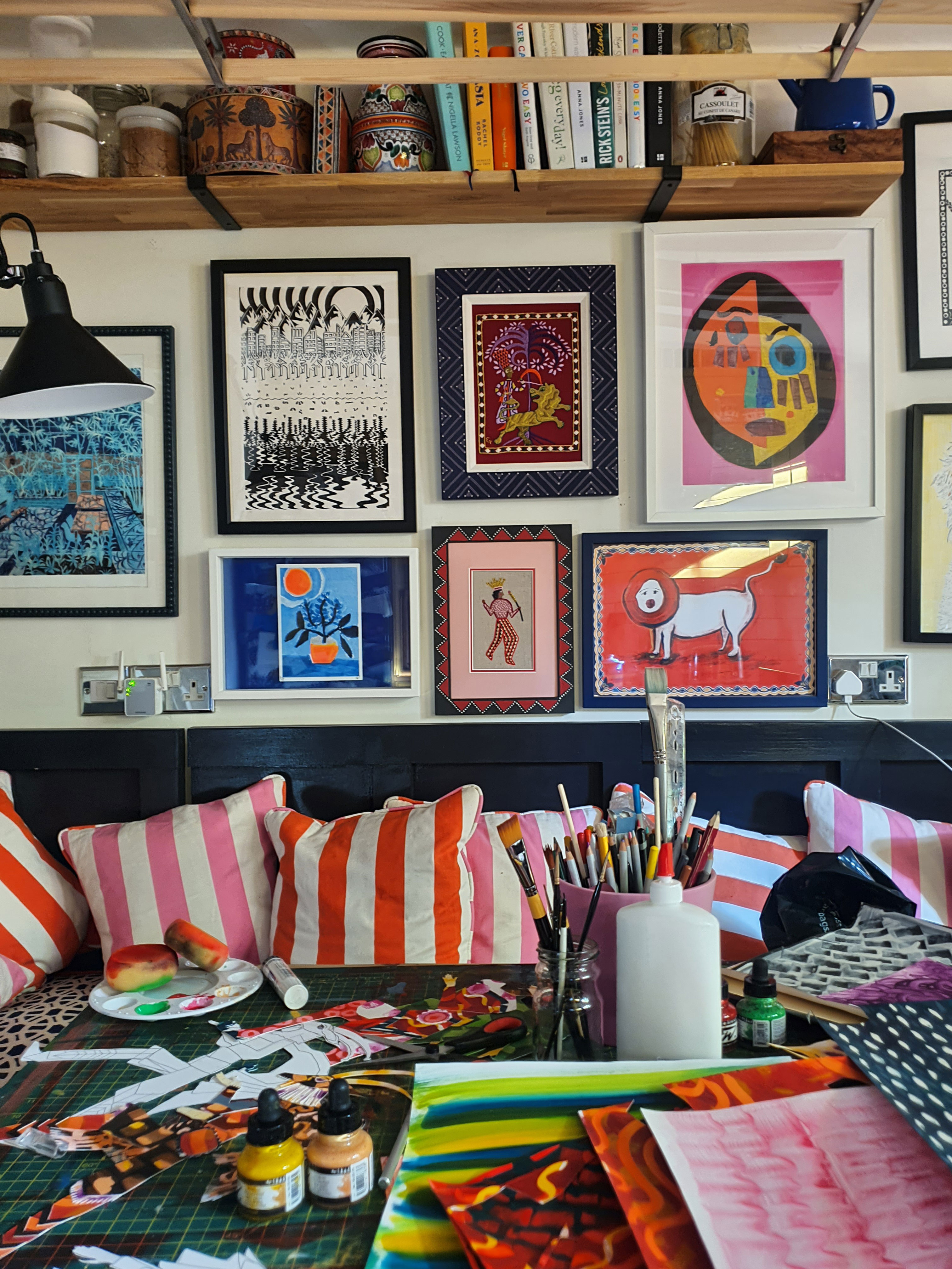
It's rare to find a one-bedroom apartment that can accommodate dinner guests and Eppie is delighted with how the space works.
'The dining area is narrow so I had the corner bench and table made for the space to be only 70 cm wide. It means I can cram a lot of people round for dinner and you only actually start to notice how narrow the table is when you start trying to arrange plates on it,' she says. 'As most of the kitchen cabinets are taken up with appliances, I added the high shelves above the dining area to provide more storage space for food, cookbooks and crockery.'
Sitting room
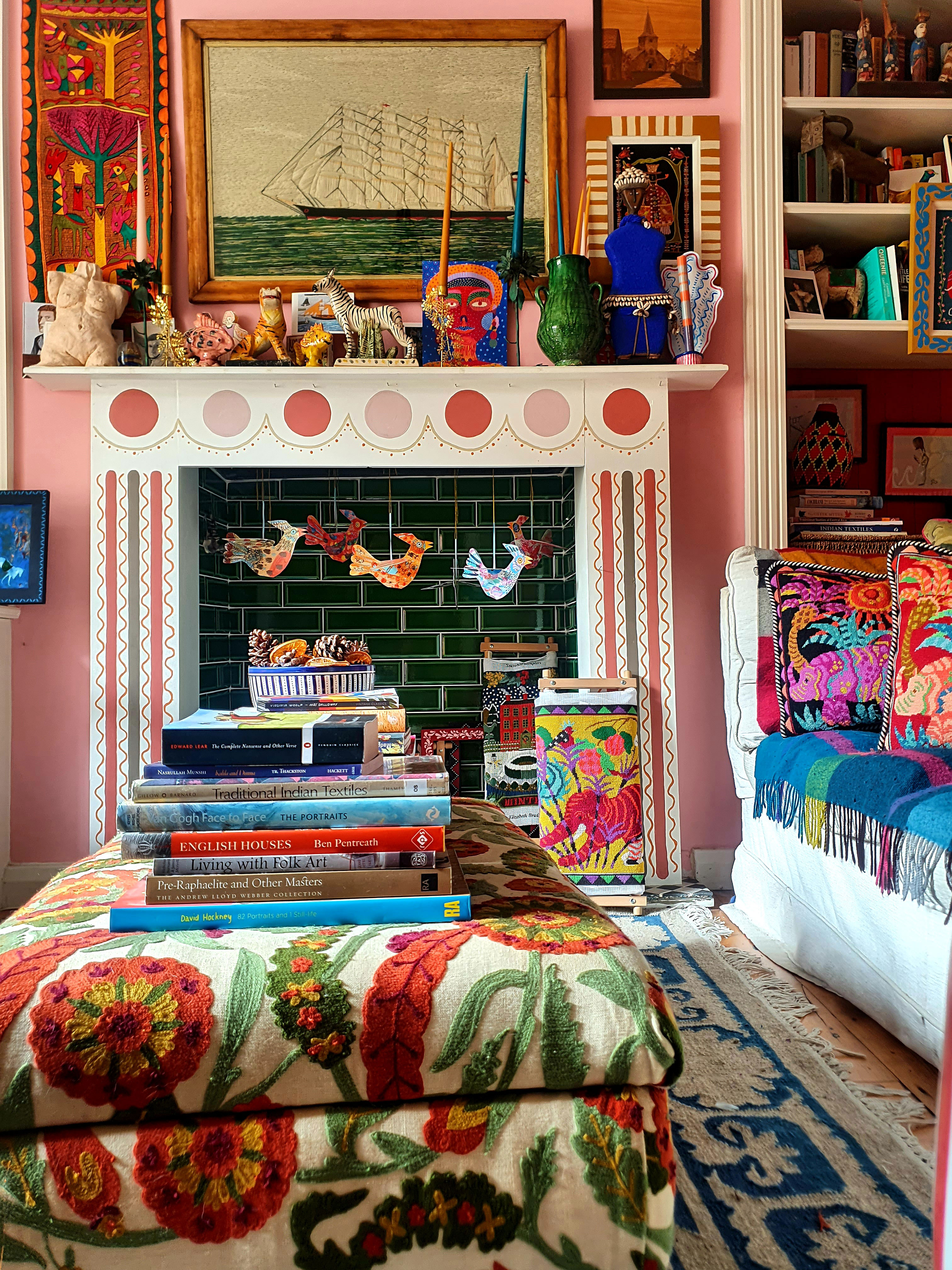
With the deep sofa, layers of textiles and warmth of the pink and orange tones, the sitting room is a wonderfully cozy space. The kind of room to hunker down in with some sewing.
The major change here was building in bookshelves and cabinets on either side of the fireplace. Among the many inspiring living room ideas here, are Eppie's creative and budget-beating touches for the bookshelves and fireplace.
The back of the bookshelves are in a deep red gloss tongue-and-groove which gives the impression of them being far deeper, creating a sense of space, she explains, adding: 'My limited budget meant it wasn’t an option to change the fire surround,' says Eppie. 'So I decoratively painted it in order to disguise the plain MDF boxing. I didn’t want any one element of the room to dominate, so the colors of the fireplace are all just subtle variations on the wall color.'
Bedroom
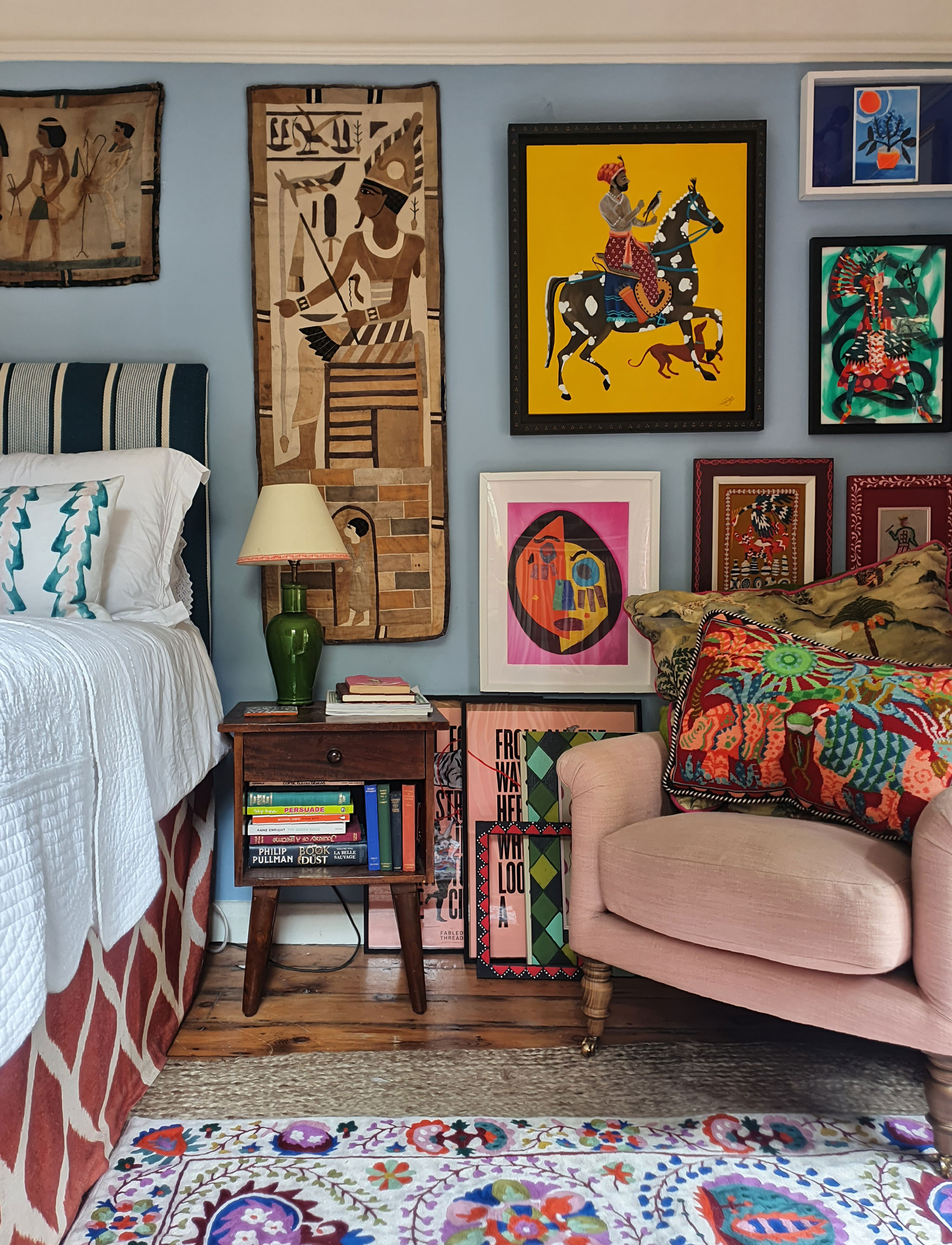
The bedroom was previously Eppie's workspace. There was space in this long room for work benches on either side of the French doors into the garden. Since the business moved, one of the work benches has moved to the studio and in its place is a cozy armchair for reading.
The business may have moved on but there are still plenty of home office ideas worth borrowing from this space. The remaining work bench makes an excellent standing desk, with curtains to hide all the unsightly admin things like the printer, paper, folders and more.
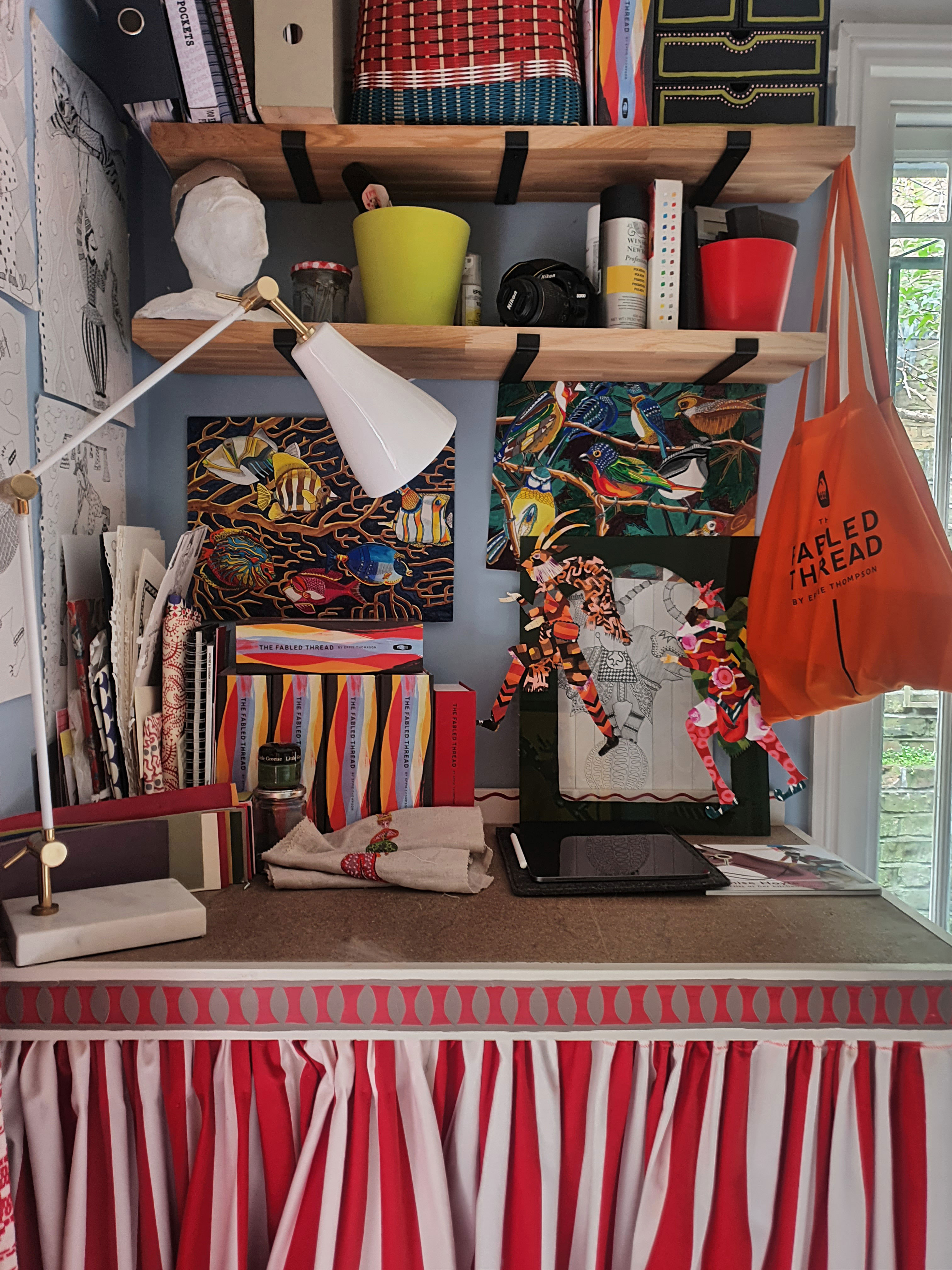
'I completely adore my home,' says Eppie. 'It is the place I am most content and inspired. The more I have developed my apartment, the more my own art practice has developed too. Every time I make a change at home, I built confidence in how to use color and pattern.'
Embroidered artworks, painted frames and cushions by The Fabled Thread
Sign up to the Homes & Gardens newsletter
Design expertise in your inbox – from inspiring decorating ideas and beautiful celebrity homes to practical gardening advice and shopping round-ups.
Karen sources beautiful homes to feature on the Homes & Gardens website. She loves visiting historic houses in particular and working with photographers to capture all shapes and sizes of properties. Karen began her career as a sub-editor at Hi-Fi News and Record Review magazine. Her move to women’s magazines came soon after, in the shape of Living magazine, which covered cookery, fashion, beauty, homes and gardening. From Living Karen moved to Ideal Home magazine, where as deputy chief sub, then chief sub, she started to really take an interest in properties, architecture, interior design and gardening.
-
 Ina Garten's storage pantry is an insightful window into all of the best cookware used by the chef – and it's easy to recreate on your kitchen shelves from $48
The beautiful dishware in The Barefoot Contessa's Hamptons pantry showcases the tools she uses most often to cook – this is exactly how you replicate it
By Sophie Edwards Published
-
 Extend the lifespan of your appliance with 5 simple but crucial washing machine maintenance tips
From cleaning the filters to keeping the door open, experts reveal the washer tips they swear by
By Andy van Terheyden Published