Natural materials and a neutral palette create a timeless interior in this new-build home
There’s a wonderful sense of style and relaxed elegance in this hilltop home in Alabama – all courtesy of designer Sean Anderson
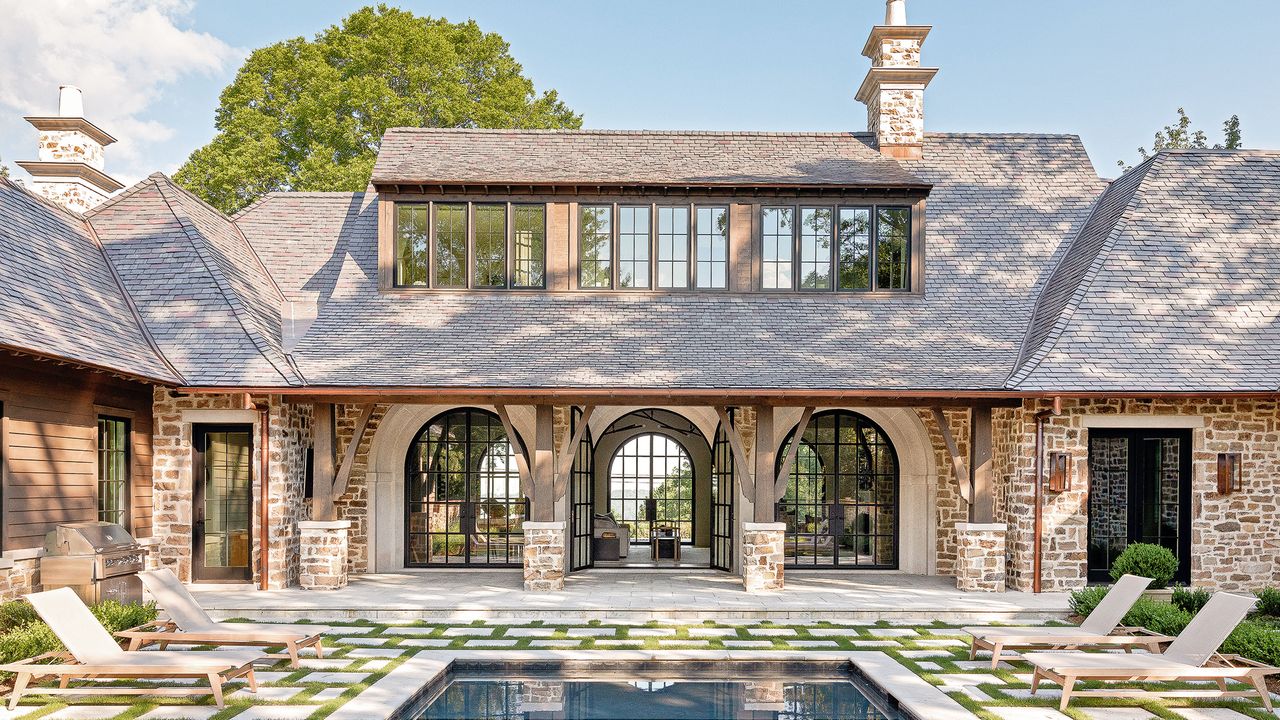

Having struck up a rapport with the owners, a couple of empty nesters looking for a relaxed but elegant home in the US city of Birmingham, Memphis-based designer Sean Anderson knew that he wanted to create a house infused with what he terms ‘Californian organic modern style’, intermingled with restrained, classic touches.
‘The house was constructed on one of the highest points in the city between two stone-built stately homes, both dating back to the early 1900s,’ Sean says. It’s for this reason, he explains, that the owners were keen for the home to have ‘a sense of permanence’, looking as though it had been there all along.
The materials – exposed stone, limestone, slate – used both inside and out give this new build an appealing architectural aesthetic that establishes it as one of the world's best homes.
Entrance hall
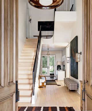
Statement pieces make a good first impression. With this in mind, one of Sean's hallway ideas was to design the organically shaped bespoke staircase in the entrance hall.
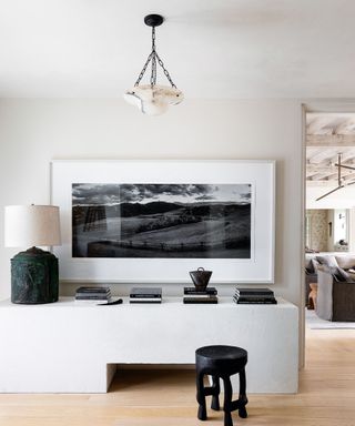
Use of materials such as stone, reflect the owner’s love of nature. ‘The owners spend a lot of time at their ranch in Montana,’ says Sean.
The materials also combine to form the perfect backdrop to showcase the owners' ‘treasures’, accumulated over many years of collecting, including prized pieces of sculpture and wall art.
A framed black and white landscape is carried perfectly by the substantial credenza in the entrance hall.
Living room
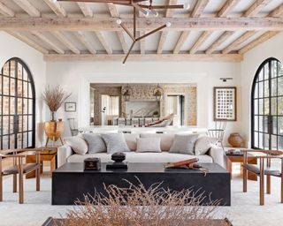
The layout of the house has been designed to be flexible and cope with large groups of visiting friends and family and, as a result, most of the main public spaces are open plan.
‘My clients wanted their home to be a place where anyone who enters could feel comfortable. The intention was to create a space that could feel like a vacation every day,’ says Sean.
A restrained color palette (Sean has largely used Classic Gray by Benjamin Moore and deep pops of Iron Ore by Sherwin-Williams) allows the warmth of the natural blonde stone to sing, complemented by sophisticated touches of white and cream textiles and natural woven rugs.
At the heart of the home lies The Great Room, which, Sean says, proved the greatest challenge.
‘When you, as a designer, are faced with the task of seating, say, 20 people comfortably over the span of a living space that size, while also creating a space where all 20 of those people still feel connected and involved with one another, that can be a tall order.’
A wealth of living room ideas were incorporated here. Raw materials – wood, concrete, steel – look sleek in The Great Room because of their sculptural quality. Slim-steel window frames maximise the glass, showing off the incredible views.
Snug
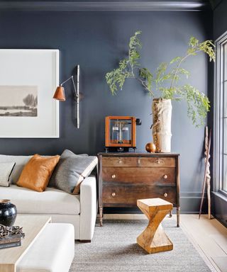
Antiques and collectibles in the snug bring another layer to the modern scheme.
Sun room
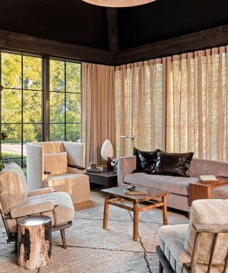
Sean made ‘very few adjustments’ to the architect’s proposed layout for the build. However, it was the addition of a screened porch area off the kitchen into a contrasting dark-painted sun room with floor-to-ceiling windows that, Sean notes, ‘has turned out being one of the most frequently used rooms in the entire home’.
The curtains enhance the golden glow in the sun room and the dark ceiling is a clever twist for a space like this.
Kitchen
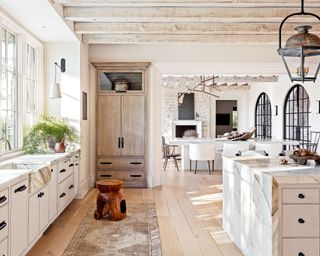
Calacatta Borghini marble elevates the otherwise rustic kitchen. For anyone looking for kitchen ideas, this space provides fabulous inspiration.
Laundry room
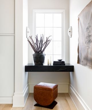
In the laundry room, a tabletop set into a window recess was created using black honed soapstone.
Bedroom
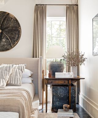
Using texture and furnishings with patina are some of the bedroom ideas implemented to keep the neutral scheme characterful.
Main bathroom
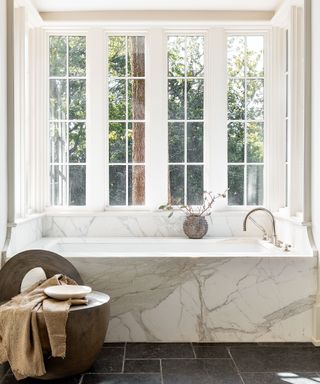
One of Sean's ingenious bathroom ideas was to build the bath into the bay window, complete with a luxurious Calacatta marble surround.
Looking ahead, Sean has an array of residential interior design projects in Florida, New York City and Utah. However, he’s most excited about some downtime. ‘I’m looking forward to my first vacation in nearly two years.’
Let’s hope he can channel some of the relaxed holiday atmosphere he has managed to so successfully instil into this Alabama home.
Interior design/ Sean Anderson
Photographs/ Haris Kenjar
Text/ Rory Robertson
Sign up to the Homes & Gardens newsletter
Design expertise in your inbox – from inspiring decorating ideas and beautiful celebrity homes to practical gardening advice and shopping round-ups.

Interiors have always been Vivienne's passion – from bold and bright to Scandi white. After studying at Leeds University, she worked at the Financial Times, before moving to Radio Times. She did an interior design course and then worked for Homes & Gardens, Country Living and House Beautiful. Vivienne’s always enjoyed reader homes and loves to spot a house she knows is perfect for a magazine (she has even knocked on the doors of houses with curb appeal!), so she became a houses editor, commissioning reader homes, writing features and styling and art directing photo shoots. She worked on Country Homes & Interiors for 15 years, before returning to Homes & Gardens as houses editor four years ago.
-
 Apparently, this is the interior design style that will add the most value to your home right now
All hail the modern organic style as a recent Zillow survey says homes with natural features and organic surfaces sell for more
By Eleanor Richardson Published
-
 7 low-maintenance backyard ideas for maximum impact with minimal effort
Reduce the toil and create a beautiful outside space that you can relax in and enjoy throughout the seasons, with these simple ideas from gardening professionals
By Jacky Parker Published