This Cotswolds manor house has a chalet-inspired interior with a twist
Modern country meets Alpine in this minimalist Cotswolds manor house interior designed by Pippa Paton
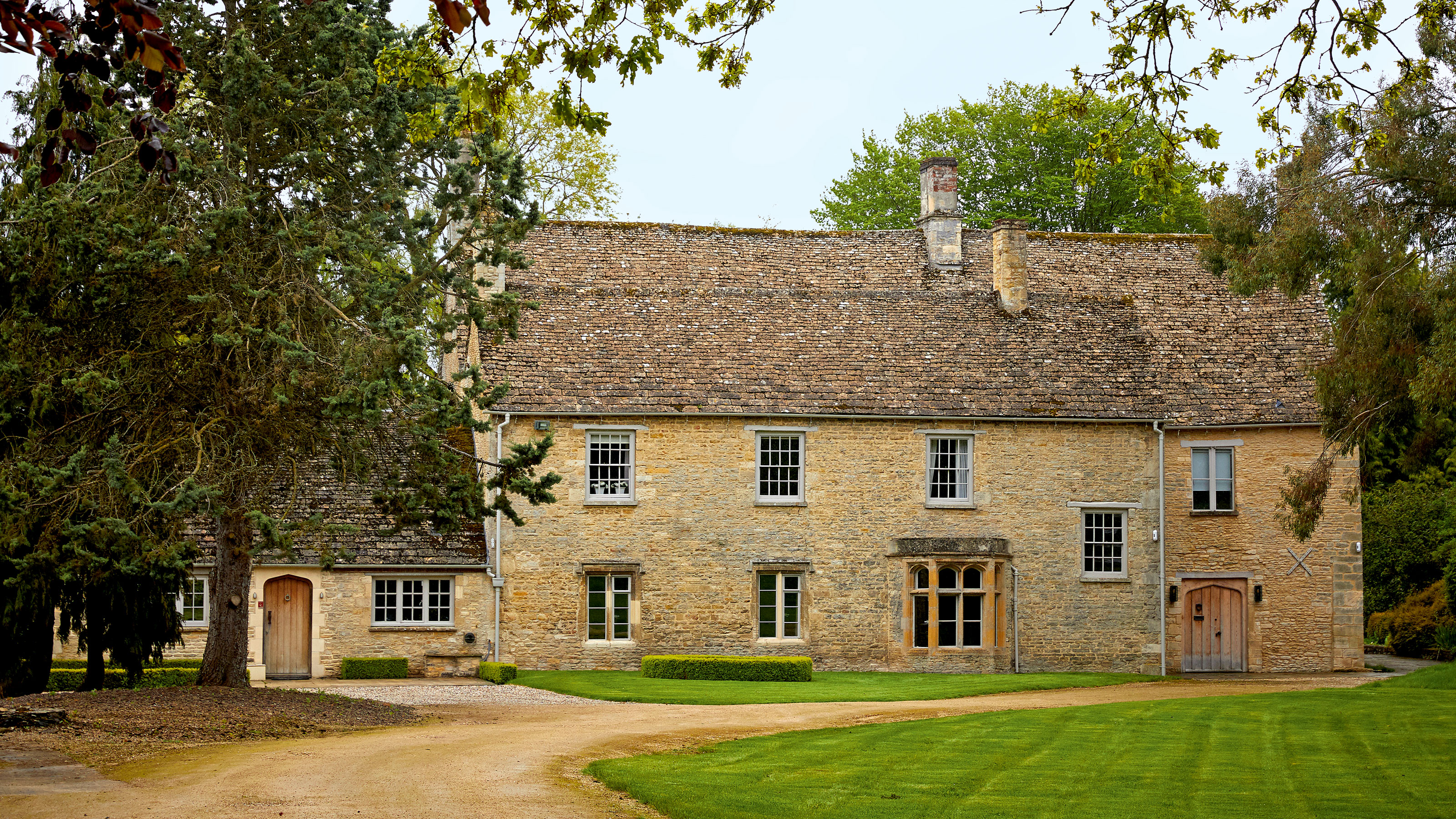

Despite its ancient walls heaving with history, it was the newest section of this manor house in the Cotswolds, an area with some of the world's best homes, that first grabbed beauty entrepreneur Maria Hatzistefanis’ attention.
‘We’d been looking for a couple of years for the right home in the country but when we were shown this one there was absolutely no hesitation. Unlike other period houses in the area, which tend to have small windows, in the kitchen there was a huge sliding window looking out on a beautiful view. If that had been the only part of the house, we would still have bought it,’ Maria, the founder of skincare and make-up brand Rodial, enthuses.
The modern extension has been so expertly combined that from the front of the house it’s difficult to know where the old house ends and the new begins. Pippa Paton, an interior designer synonymous with the Cotswolds look, helped create the extension for the previous owners and was hired by Maria and her husband Stratis as soon as the family had moved in.
Living room
While the family were able to live in the self contained new section of the house, the old section was in need of modernization.
'Much of it hadn’t been touched since about 1947,' explains Pippa. 'There was still the old Cole & Son wallpaper and no plug sockets or heating. We decided to strip it back to the bare bones to make a feature of the beams and walls and reuse what we could. We wanted to retain the crooked charm but level the floors. For the main corridor running the length of the old house we took up the flagstones, numbered and recalibrated them.’
While the imperfect charm of the original architecture did much of the talking, Maria had a specific request for Pippa. ‘She gave me an amazing brief, which was a minimalist ski chalet in the country,’ she says.
‘We weren’t doing winter holidays any more but I’ve always been inspired by a minimal-style chalet look, which would also be an opportunity to bring in the animal prints I love,' explains Maria. 'I know it’s unusual for a house in the Cotswolds.' Her hectic professional life meant that many of her decisions were signed off online with Pippa guided by Maria’s mood boards.
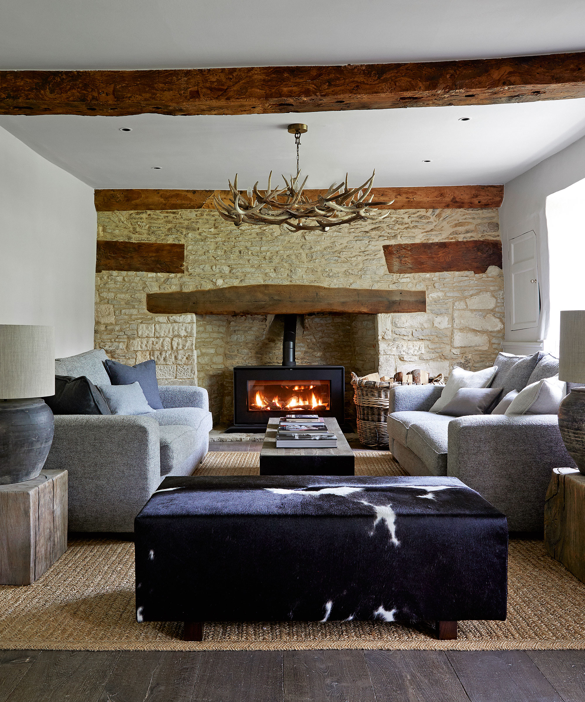
Living room ideas included creating a symmetrical scheme with simplistic lines to deliver a modern-country look, while the chandelier introduces an Alpine flavor.
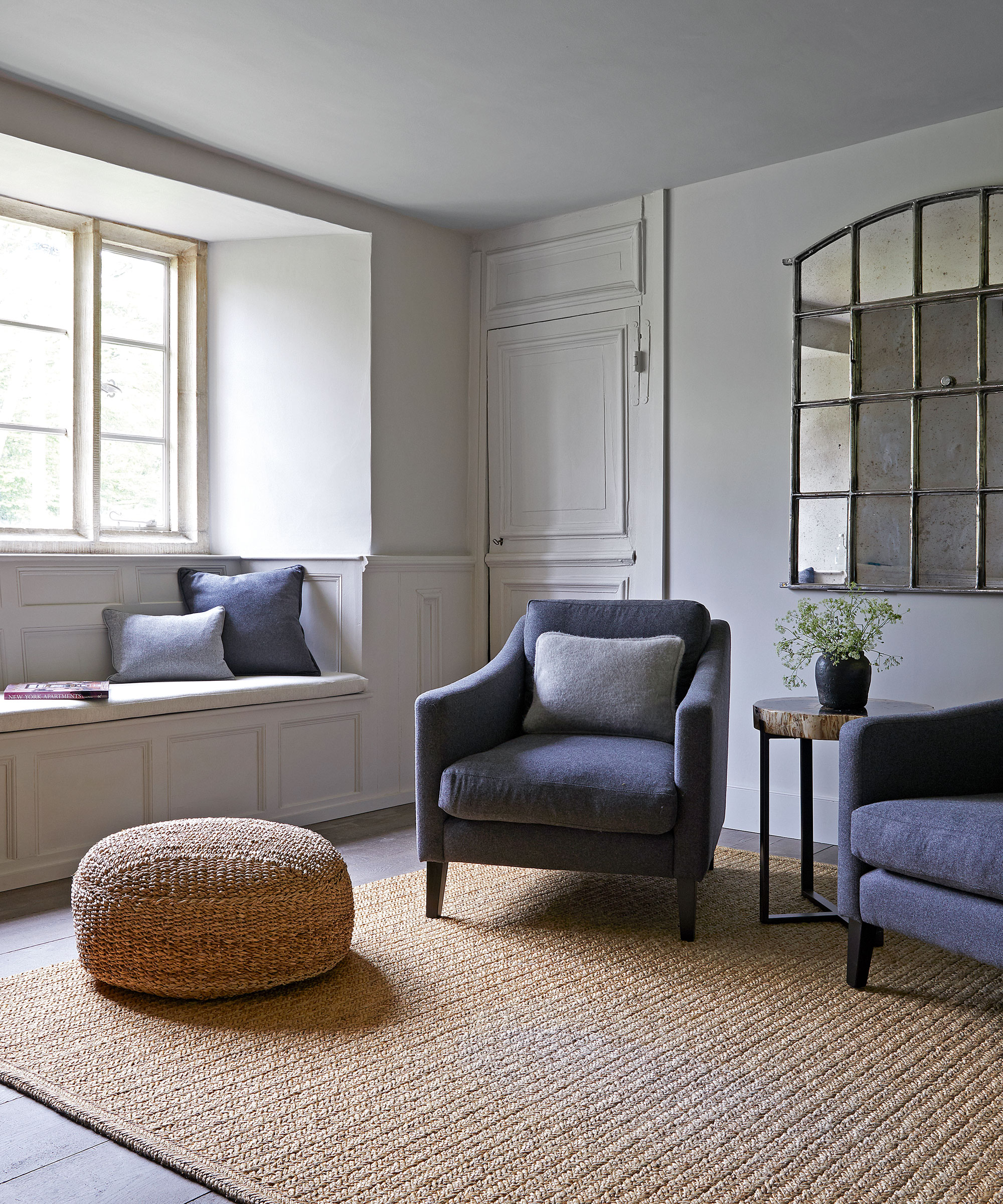
The absence of curtains allows the beauty of the panelling and thickness of the walls to impress.
Dining room
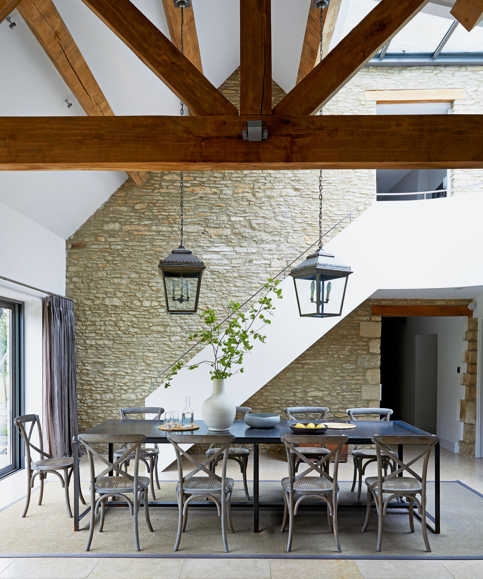
Dining room ideas include a combination of natural jute rugs, fleeces and exposed stonework to ensure the old and new sections carry a cohesive identity. Repointed and cleaned, the impressive exterior stone wall of the old house makes what Pippa describes as a ‘cathedral-like’ backdrop within the open-plan extension.'
In this extension space, the wall of the old part of the house was left exposed to enrich the sleek design. Beams enhance the effect.
Kitchen
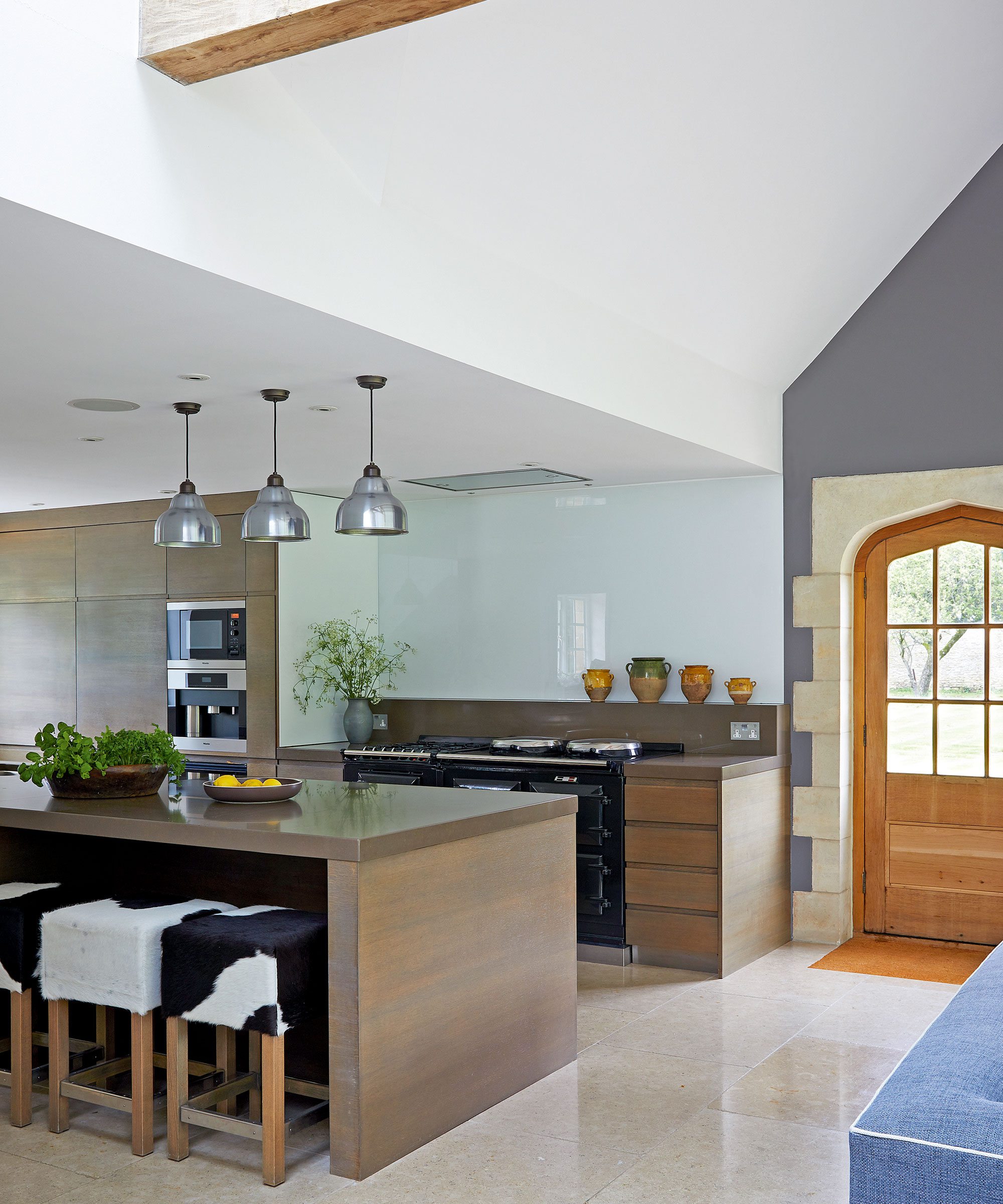
Pippa's kitchen ideas revolved around creating a mix of old and new. The crisp modern lines of the cabinetry relate to the newly built architecture, while reclaimed wooden doors and jamb stones were reused from the old part of the house.
Dining room
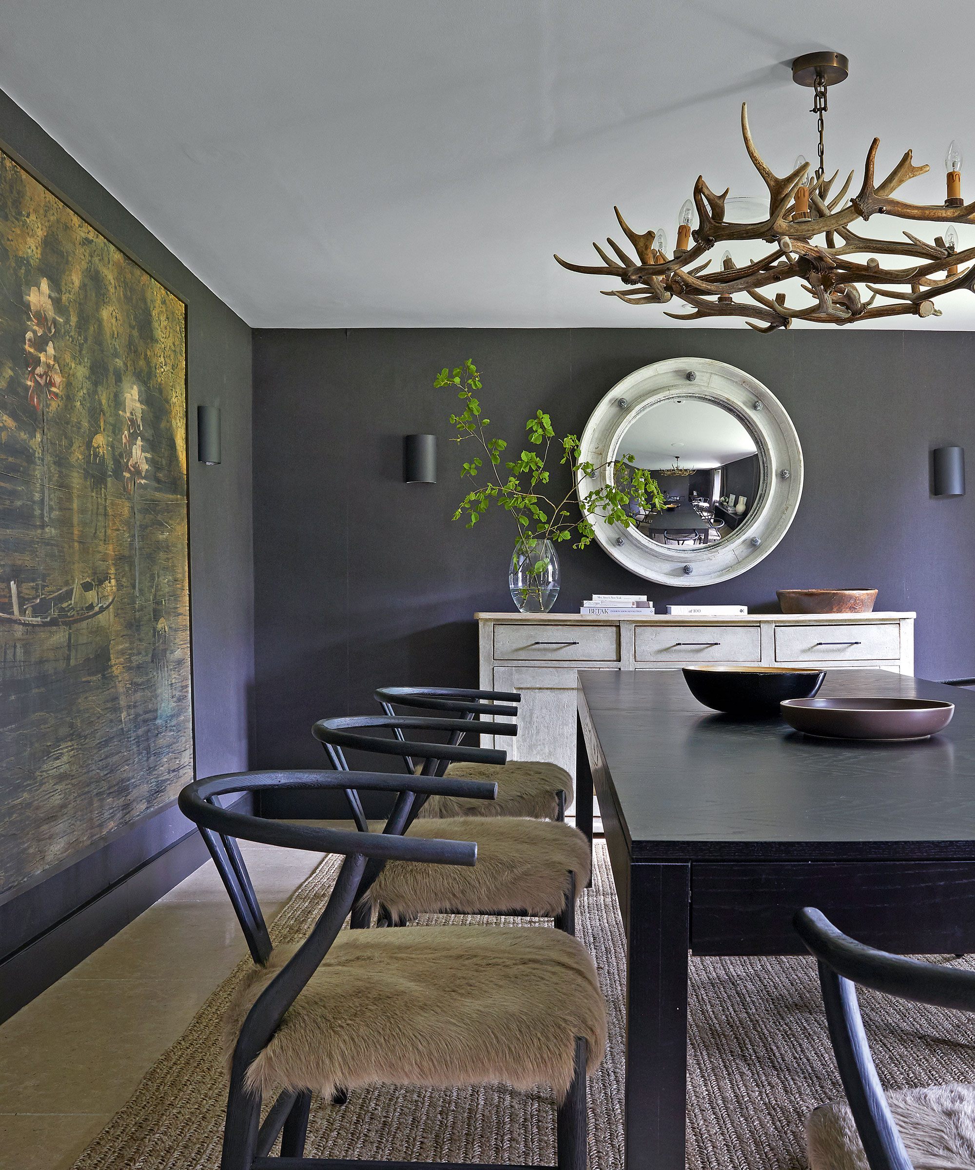
A rich tonal palette of greys become darker further into the old sections of the house, culminating with the dining room where walls as black as the night sky set off the drama of a large antler chandelier.
‘Our idea was that the north-facing rooms could be moody and cosseting, while we used paler shades in the lighter south-facing rooms,’ Pippa explains.
Bedroom
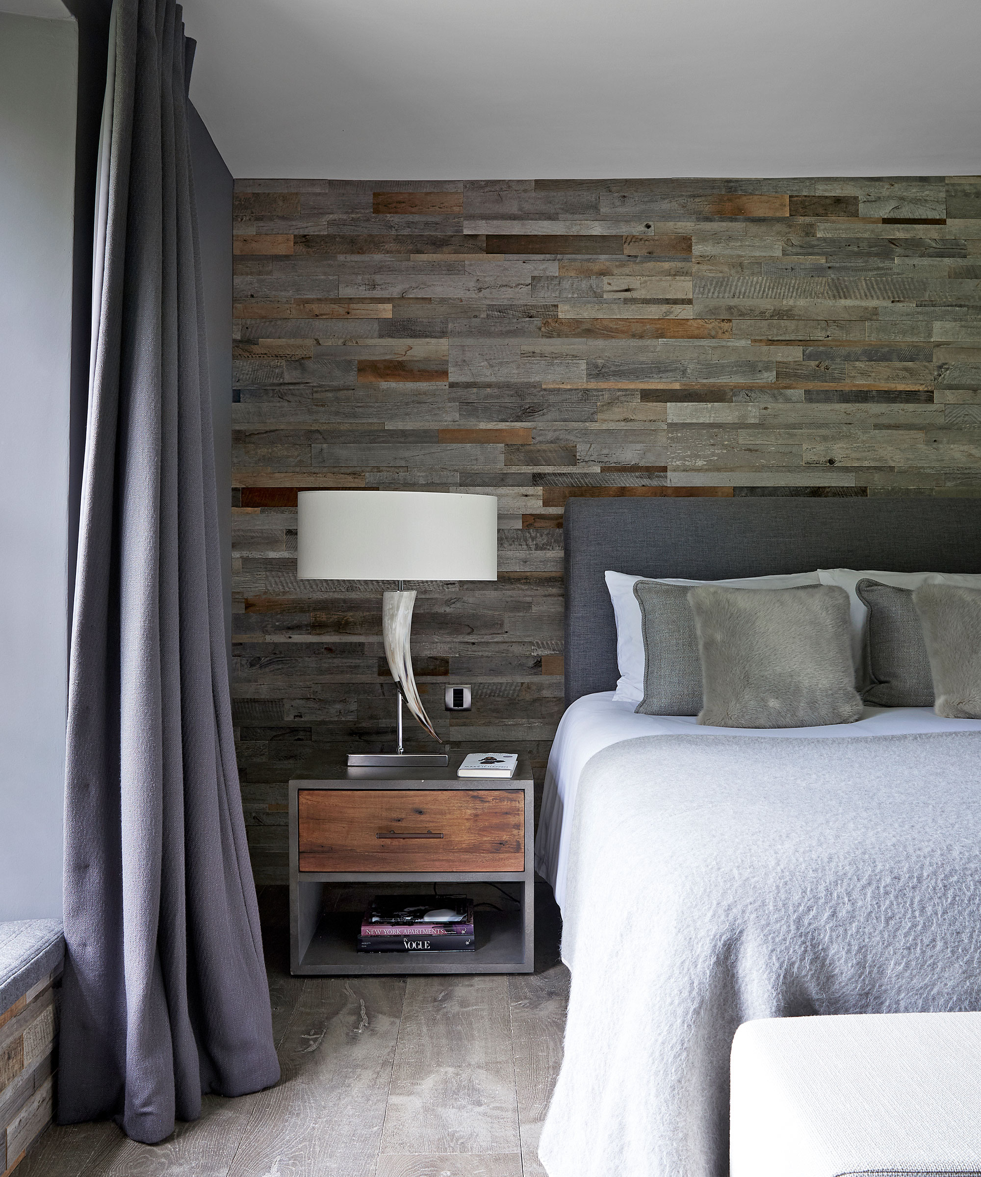
One of Pippa's bedroom ideas was to add reclaimed timber cladding on the walls to evoke the Alpine look Maria wanted, while thick wool curtains and a roller blind provide a restful blackout.
Staircase
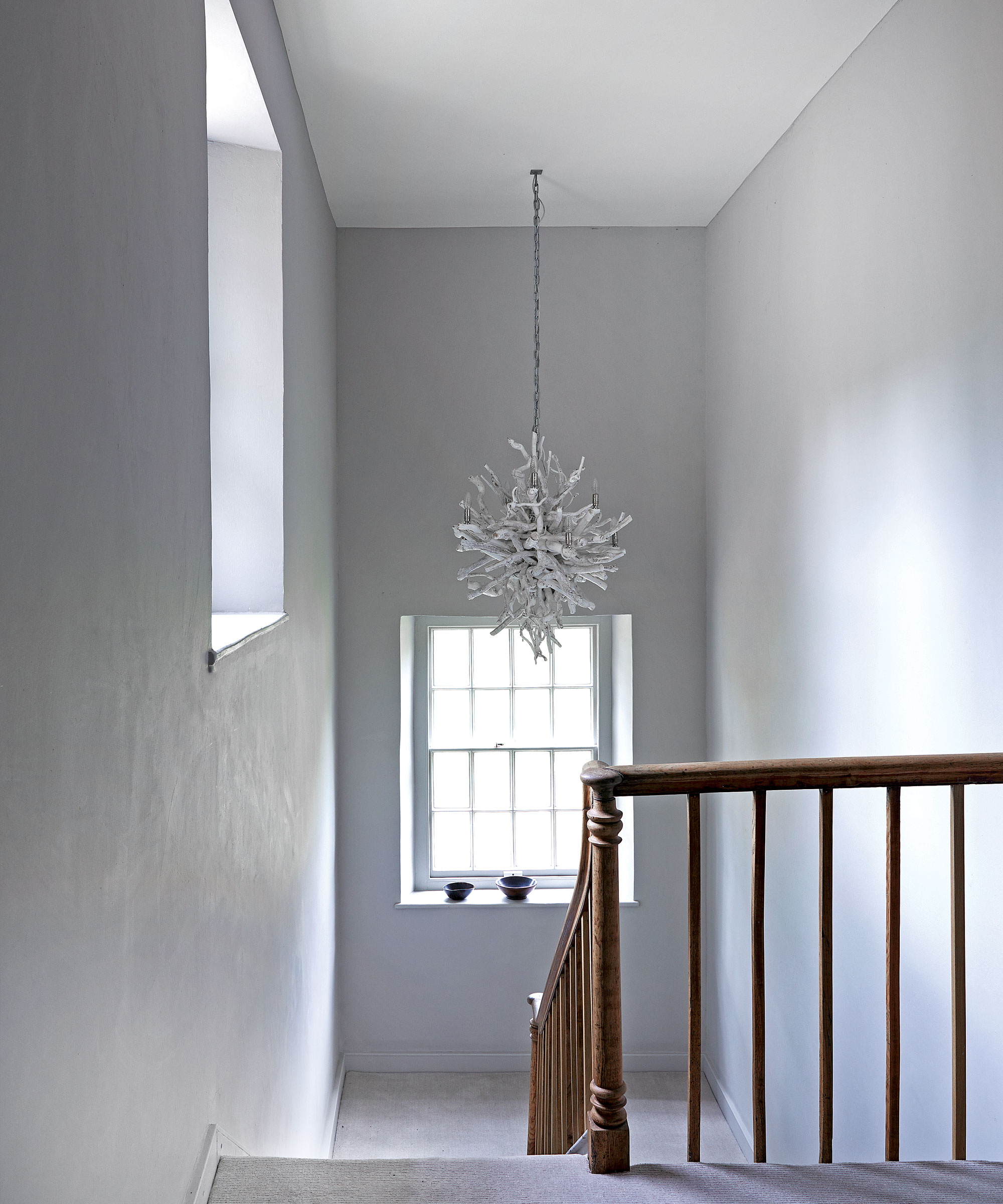
Hallway ideas included starkly minimalist walls, free from art or architectural detail, ensuring this sculptural chandelier is a striking focal point and shows off the beauty of the wooden staircase.
'The whole renovation was seamless,’ Maria says. ‘There was about a week when the wall came down to connect the two parts but other than that we were hardly disturbed.’
With its Alpine flavor quite unexpected in the English countryside, the new era of this ancient manor house pays tribute to its past while inventing a new future.
Interior design/ Pippa Paton Design
Photography/ Paul Massey
Sign up to the Homes & Gardens newsletter
Design expertise in your inbox – from inspiring decorating ideas and beautiful celebrity homes to practical gardening advice and shopping round-ups.

Mary Weaver has had more than 20 years experience in the world of interiors magazines. She is a writer, stylist, art director, video and events producer. She has contributed to Homes & Gardens for many years and was Houses Editor of Livingetc for 14 years. During her career she has worked for all the major magazine titles, and previously enjoyed a career as a fashion editor.
-
 How to choose eggplant companion plants for abundant and healthy harvests – we reveal 7 of the best to pick, plus the ones to avoid
Discover some beneficial vegetables, herbs, and flowers to grow with eggplant
By Drew Swainston
-
 Should you dry your clothes outside if you have hayfever? Allergy specialists warn sufferers to steer clear of this 'major trigger'
Doing so can trigger asthma, coughing, itchy eyes and more
By Sophie Warren-Smith