9 ways to mix contemporary and traditional design – a South Carolina home shows how
Rebuilding from scratch turned a family home into a dream home – where old and new styles get along together just fine
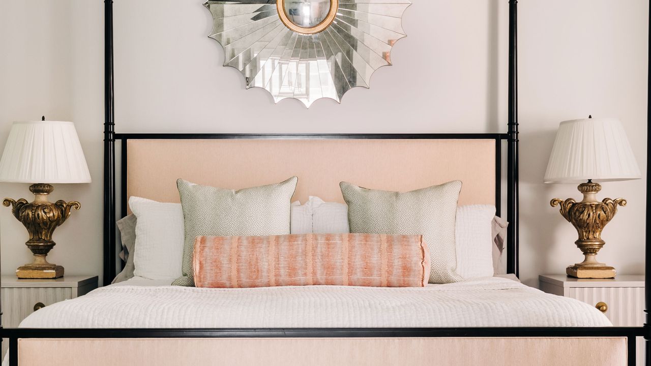
When the Beck family secured a property in the perfect location – Greenville, South Carolina – they were delighted with its situation. The property itself was not so promising, however. It had suffered water damage from flooding and the Becks decided the best way forward was to tear it down and start over, building a new home that would take into account all their practical and aesthetic requirements.
That new home marries elegance with playful touches, and bold contemporary styling with more traditional references. All these elements combine to make this one of the world's best homes.
The family called on architect Bill Huey and designer Caroline Brackett who worked with them to get the look they wanted and showed them how to successfully balance classic period features with contemporary interior styling.
1. Traditional-style windows and reclaimed beams
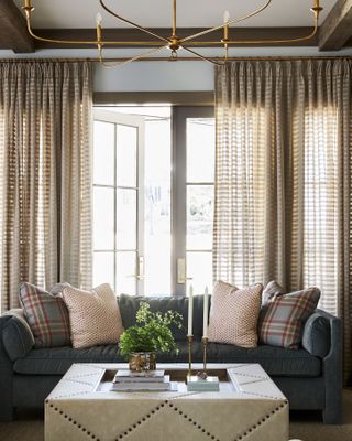
Architect Bill Huey included the period-style details his clients had admired in another home he'd built in Charleston. So the home's tall, multi-paned windows and panelled interior doors give this new-build a firm foundation in traditional styling, exactly the look the clients were hoping for. Living room ideas include reclaimed beams that provide a smart counterpoint to a pared-back chandelier from Currey and Company. Plaid cushions on Highland House sofas tip the balance towards classic country house style.
2. Arched openings
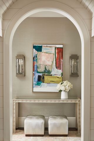
Using an arch to frame a vista in this way, gives the space a sense of old-style grandeur, even though the interior styling here has a contemporary flavour. The classical arch lends the slim console table, cube stools and colorful modern artwork a calm edge. The family were keen to incorporate classic architectural details among their hallway ideas, but also be bold and playful with color. This space shows exactly how well the two styles can combine.
3. Vaulted ceiling
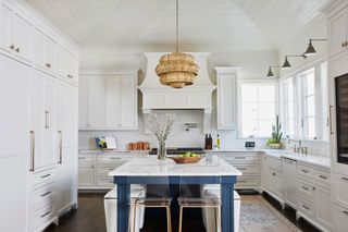
When moodboarding the clients' kitchen ideas, designer Caroline Brackett says the vaulted roof in the kitchen posed an interesting challenge. Applying tongue and groove to the extra-height ceiling wasn't easy, but it was one period detail the client was particularly keen to include. Both the family and the designer are delighted with the room's finished look. 'The craftsmanship is amazing and and the island can fit the whole family, which is important,' says Caroline. The stools are from Lee Industries and the pendant light is by Currey and Company.
4. Paneled stairs and landing
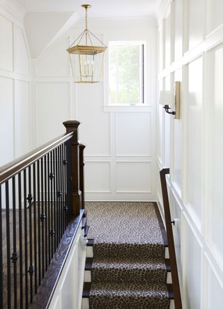
The stairwell is one of designer Caroline Brackett's favorite parts of the home. She says 'designing it was a feat'. Wall panelling may have been around for centuries, but this latter-day interpretation with its monochromatic scheme and cheeky leopard print runner brings the idea right up to date.
5. Drama for the bathroom
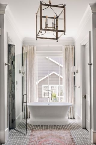
The bathroom showstopper is a beautifully positioned freestanding tub with a nod to art deco that manages to be on trend at the same time. The bath shares the period drama credits with the floor-to-ceiling window. The luxurious finishing touches combine classic, elegant marble with a contemporary zero entry shower door. Designer Caroline Brackett says this 'adds design interest, in that the floor can be continuous and isn't broken up', one of many bathroom ideas in this space that are well worth copying.
6. Sunroom styling
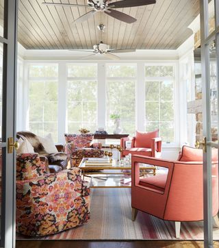
The sun room, just off the master bedroom, was a must-have for the clients and its execution brings the 19th-century glasshouse concept right up to date. A fresh palette with bold floral print and coral accent chairs from Chaddock and Fairfield, and a striped rug from Stark give the space a contemporary edge.
7. Traditional fireplace
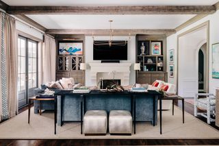
One of the many takeaway living room ideas here, was that this space can be family-friendly or formal, depending on the occasion. The traditional-style stone fireplace surround works just as well for either scenario. With the living room sofas grouped round the fire for cozy evenings together, it feels comfortable, layered, and pulled together. Note the playful but subtle introduction of color in cushions and artwork that lifts and updates the scheme. The smart black console is by Bernhardt.
8. Four-poster with a contemporary twist
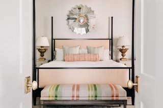
Sweet dreams are guaranteed in the elegant master bedroom. The room picks up the fresh coral shades from the adjoining sun room and the furniture choices reference the traditional, while still keeping a foot in the current decade – it's a good compromise for anyone looking for bedroom ideas. The clean-lined modern take on a four-poster is by Hickory Chair and the bedside tables are by Fairfield, topped with lamps from The Rock House Antiques.
9. Hunting lodge hideout
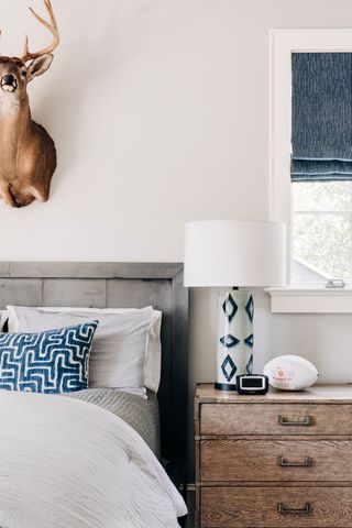
The family's children worked with the designer to come up with the ideas for their own bedrooms. The teenage son's room mixes traditional references – hunting-lodge-style in this case – with a calm, restful palette of weatherwashed contemporary greys and blues for a very livable look.
The design choices made for this room epitomise the approach to the whole of this South Carolina rebuild. The new house is a successful mix of traditional and modern, but with the emphasis on comfort for everyday modern family living, and it's proof that starting from scratch doesn't have to rule out characterful period features.
Sign up to the Homes & Gardens newsletter
Design expertise in your inbox – from inspiring decorating ideas and beautiful celebrity homes to practical gardening advice and shopping round-ups.
Karen sources beautiful homes to feature on the Homes & Gardens website. She loves visiting historic houses in particular and working with photographers to capture all shapes and sizes of properties. Karen began her career as a sub-editor at Hi-Fi News and Record Review magazine. Her move to women’s magazines came soon after, in the shape of Living magazine, which covered cookery, fashion, beauty, homes and gardening. From Living Karen moved to Ideal Home magazine, where as deputy chief sub, then chief sub, she started to really take an interest in properties, architecture, interior design and gardening.
-
 5 patio painting mistakes to avoid – swerve patchy, peeling finishes with these expert tips
Surface preparation is key, experts urge
By Ottilie Blackhall Published
-
 Are work tables the new, easier way to add a kitchen island? Interior designers claim they offer a more lived-in elegance that makes it worth losing the storage
Freestanding and full of character, the work table is 2025's most coveted kitchen feature
By Molly Malsom Published