9 family-friendly design tips to take from this stylish New York apartment
A bright and fun New York home, this family orientated design by Hilary Matt combines spacesaving ideas with chic style
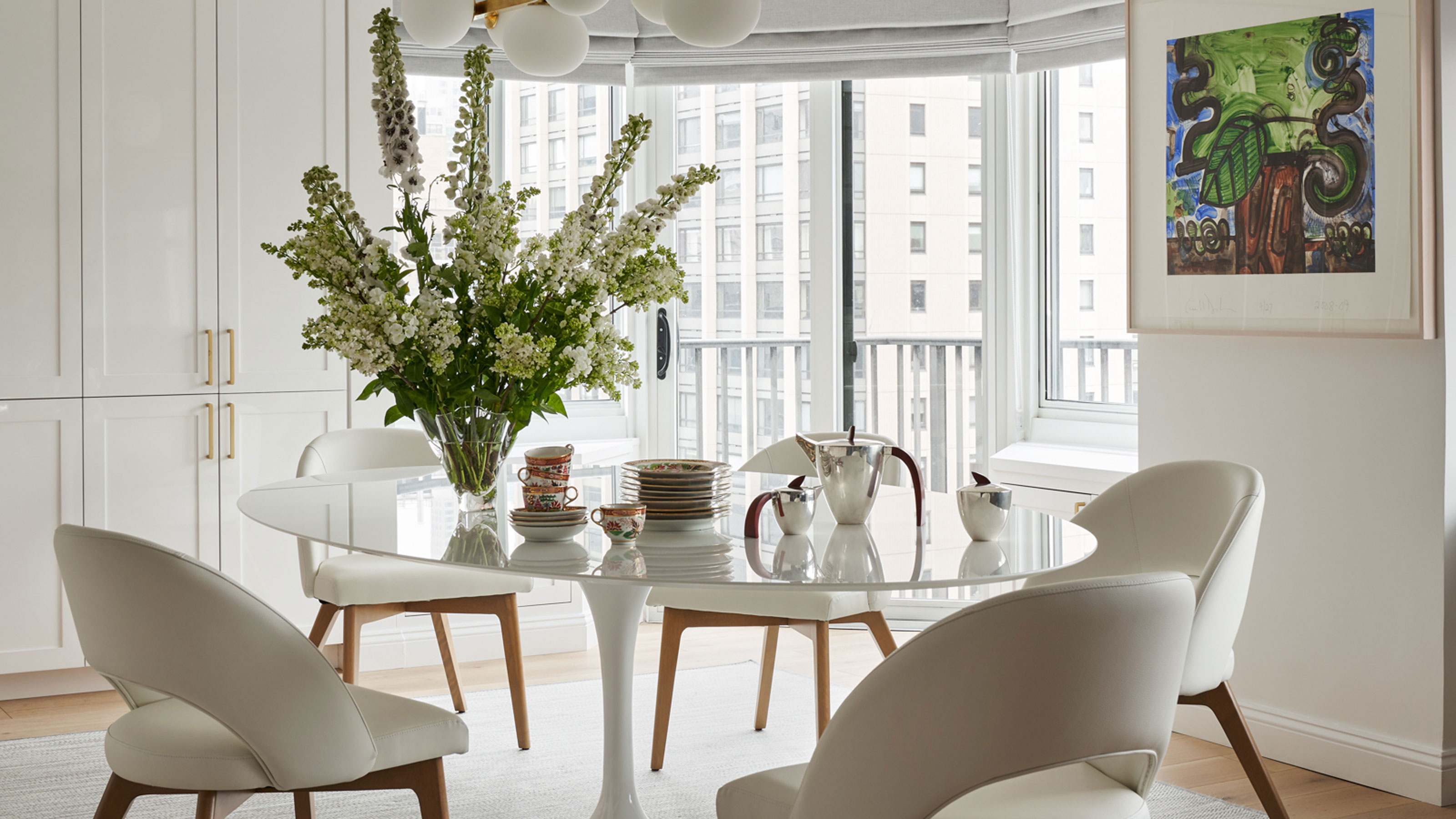

Word of mouth is the ultimate recommendation, and the owners of this New York City apartment came to interior designer Hilary Matt because she had worked on their sister’s apartment.
It was a complete change of lifestyle for them. ‘Our clients had moved their whole lives from a large suburban home in Texas to a New York City apartment, so we wanted to make them as comfortable as possible,’ says Hilary, who is based in New York, a city that's home to many of the world's best homes. ‘We wanted them to be excited about their new place and move to New York.’
The owners, who have four children, chose the area of Lenox Hill because it was close to family and good schools. They found a five bedroomed apartment there that was located in a sought-after co-op consisting of a pre-war Colonial building and a post-war elevatored tower, with the two buildings joined by a glass breezeway bordered by fountains and flowering gardens.
The aim was to make it a bright, young, fun and fresh family space that was easy for them to settle into. ‘Our clients own a beautiful art collection so we used that as inspiration and kept it all in mind when picking things.’
Storage was an important factor. ‘They had a lot of things and we wanted to make as much space as possible for all of it,’ says Hilary. ‘We also added a few hidden closets throughout the hallway to the bedrooms for additional storage.’
Key to the success of the design was making sure each of the children was happy with their bedroom, so while the family and grown up areas are deliberately kept neutral because the owners wanted them to be light and airy, the children's rooms are a riot of color.
Hilary gave us a tour of the home, and shared with us her tips on creating a place that combines fun with space saving and is fit for a young family.
1. Inject pattern in a neutral family room
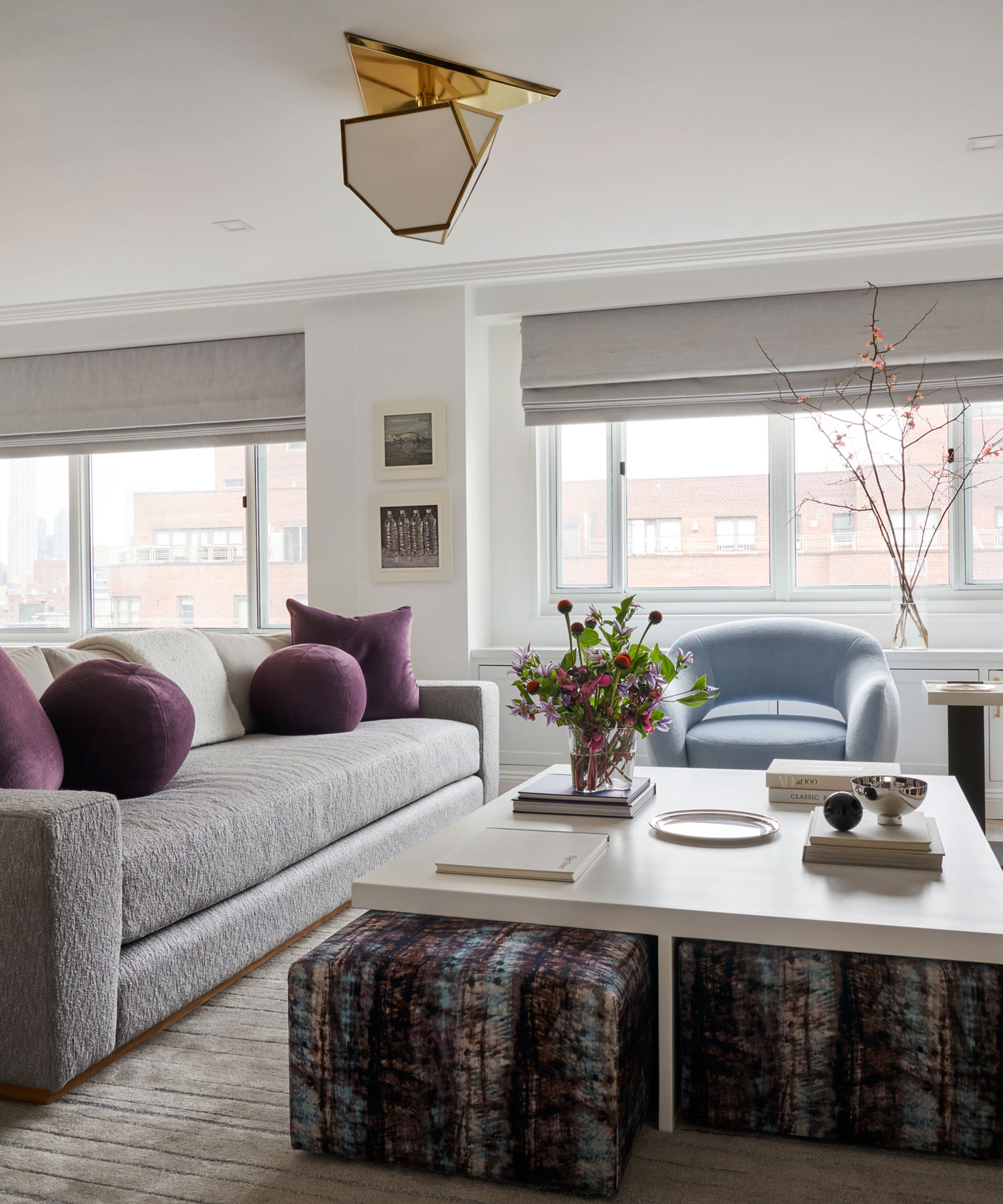
Hilary chose an easy-on-the-eye neutral palette for the family spaces. One of her fun living room ideas was to inject color and pattern with tie-dye pouffes. Because space is at a premium, she chose designs that can be stored under the coffee table but pulled out when extra seating is needed. The colors of the pouffes link with those of the cushions and seating, providing continuity. Hilary's scheme ticks the box for the clients' brief of a cozy, family friendly room that is easy to maintain.
2. Invest in stylish kitchen seating
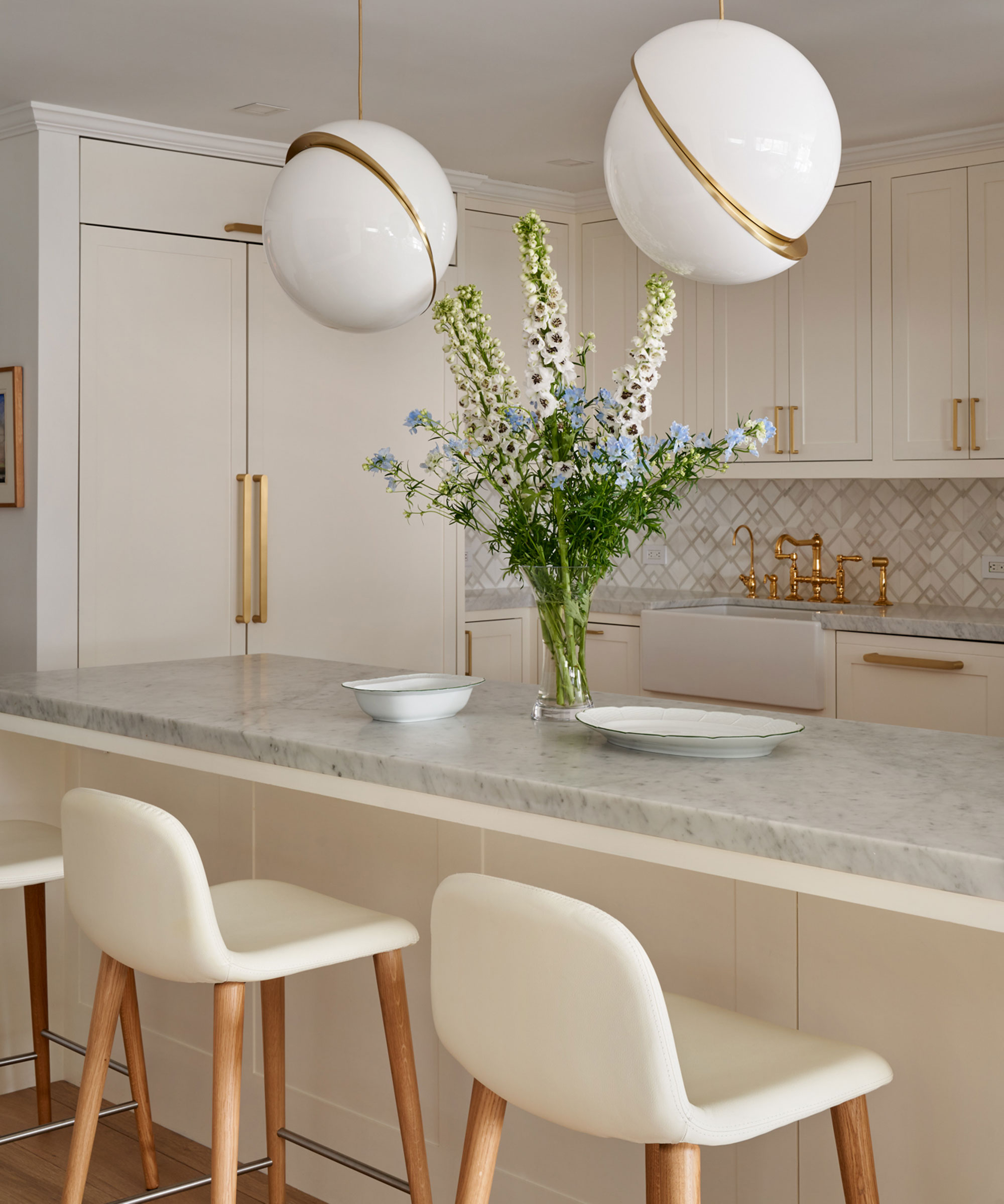
Among Hilary's kitchen ideas was introducing on-trend mid-century-style bar stools under the island breakfast bar. Not only are bar stools a firm favourite with kids (the back on this design is ideal for providing extra safety) but they also provide stylish seating for informal dining. And, even better, they can be tucked away neatly under the countertop after use.
Another way of keeping the kitchen streamlined is by concealing the fridge and freezer behind cupboards doors to keep the look neat. A pantry was also created for more storage.
'The client wanted everything light and airy,' says Hilary. The off white scheme, complete with marble countertops, keeps the look bright. Spherical pendant lights make a statement. 'We loved the simple yet different touch of them,' says Hilary.
3. Choose a family friendly dining table
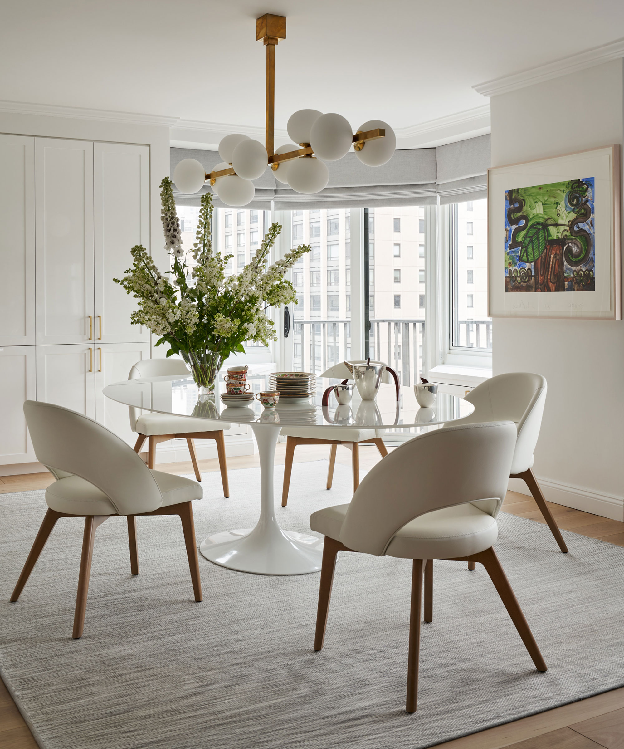
The clients wanted a dining room space that could be both dressy and casual. Family friendly dining room ideas included incorporating an oval pedestal table. Pedestal tables combine both style and practicality. The lack of table legs makes it easier to seat a number of people comfortably, providing extra leg room.
'We picked an oval table because we felt it was more casual for everyday eating and it's easy to squeeze a lot of people round,' says Hilary. 'We also decided to use an outdoor rug that looks like it is an indoor one for under the dining table for durability purposes.'
In addition, Hilary added some extra storage in the dining area. 'The cabinets behind were open book shelves and we enclosed it all and added some more storage for china, silver and serving pieces,' she says.
4. Create a home office in an unused space
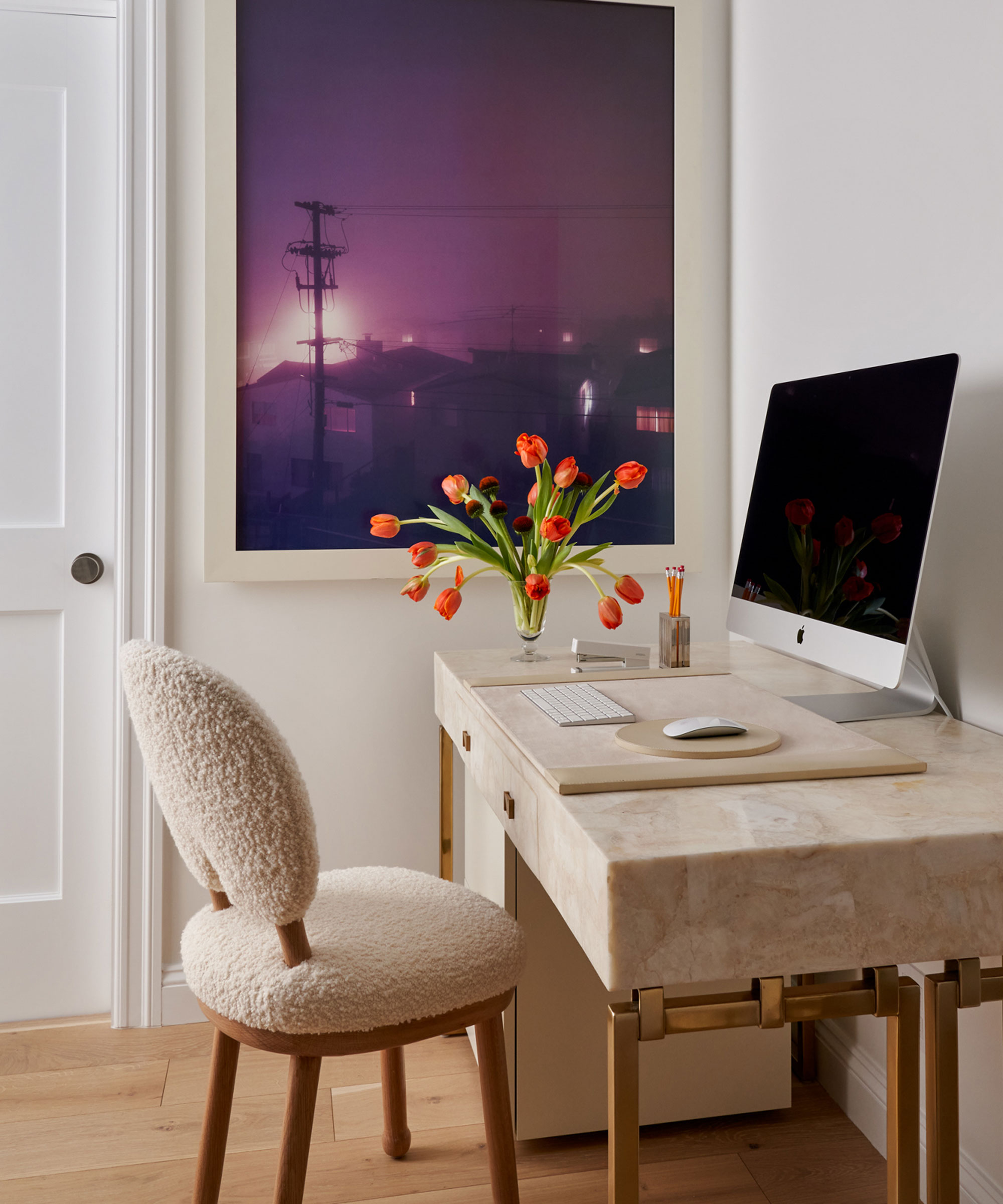
Spare spaces such as landings and corners of rooms can easily be transformed into a handy home office. Here, simply by tucking a desk and chair into a corner outside the main bedroom, Hilary has created a useful work area. Home offices can often be serious spaces, but one of Hilary's home office ideas was to keep the look fresh and stylish, in keeping with the other grown up rooms, so she chose a chic boucle chair and enhanced the sumptuous feel with a crystal stone quartz desk. A filing cabinet beneath the desk provides additional storage.
5. Add impact with a sofa at the bed end
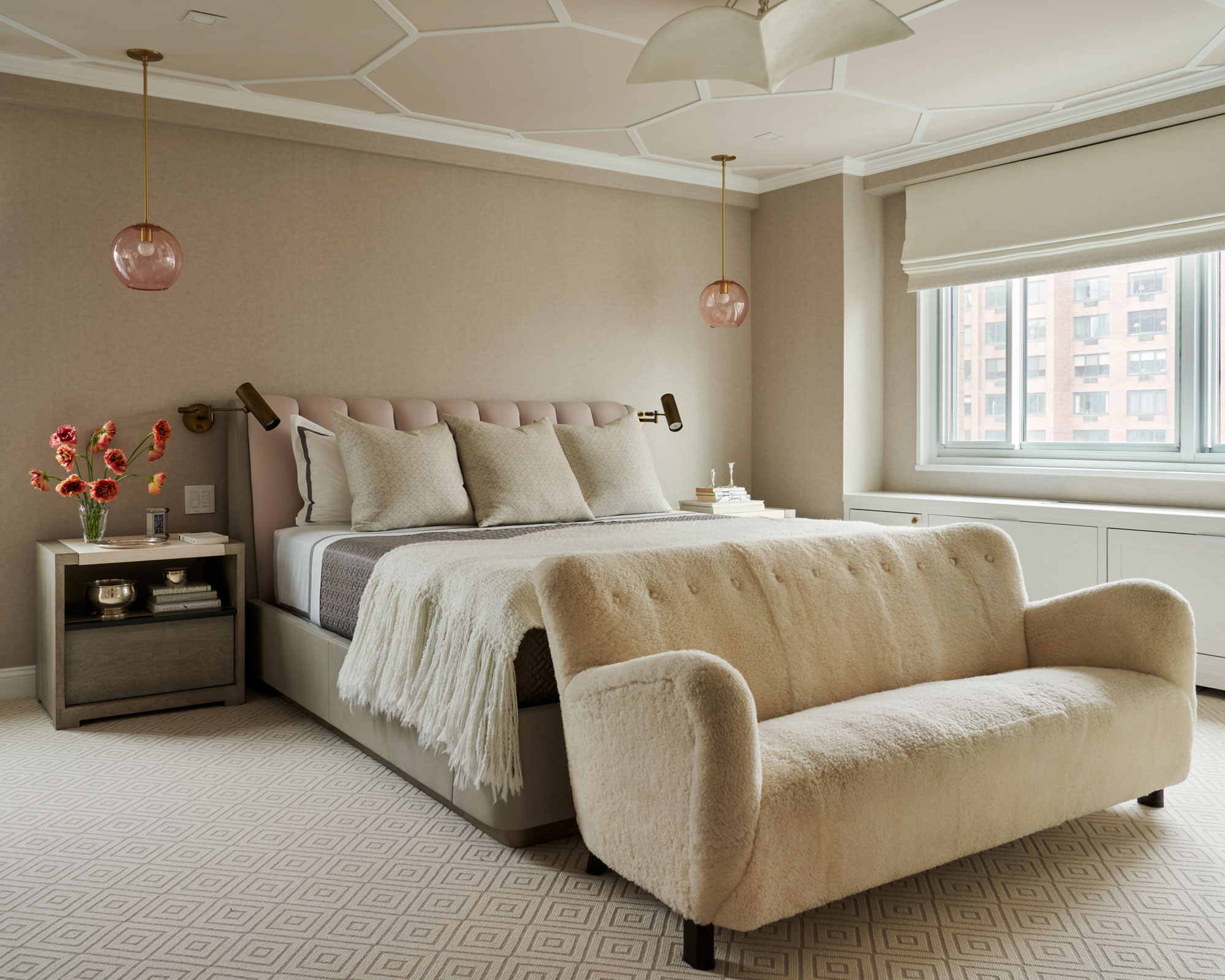
Hilary's client wanted a feminine, soft and young scheme for the bedroom. Among the bedroom ideas was sourcing a statement sofa for the end of the bed. The shapely vintage Fritz Hansen sofa was an early find.
'We loved the sofa because of the texture and fabric and knew it would be a focal point in the room,' says Hilary. 'It was in great condition except for the buttons and the legs that had to be touched up. We kept it in the original shearling fabric. It's my favorite piece of furniture. We used beautiful pieces and fixtures to make the room serene and luxurious.'
Good storage ideas were also key in this space. Hilary created an additional hidden closet for clothing and also added bookshelves for the clients' books. The radiators have hidden storage underneath too.
6. Wrap the bathroom in marble
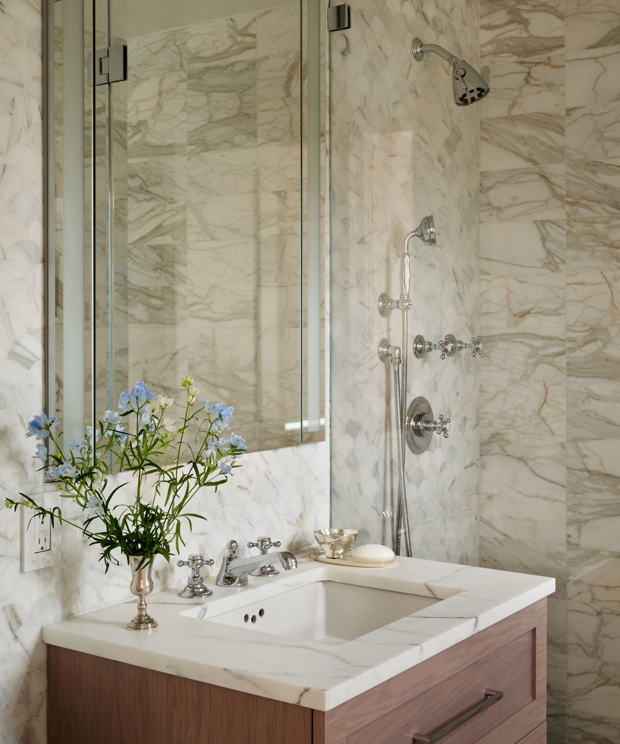
Making this compact space seem larger was key. One of Hilary's bathroom ideas was to incorporate Calacatta marble on the walls, floor and countertop to create the illusion of more space and keep the scheme light and harmonious, as well as to evoke a sumptuous feel.
A mirrored medicine cabinet bounces light around the room as well as providing additional storage to the vanity unit.
7. Anchor a playroom with a bold carpet
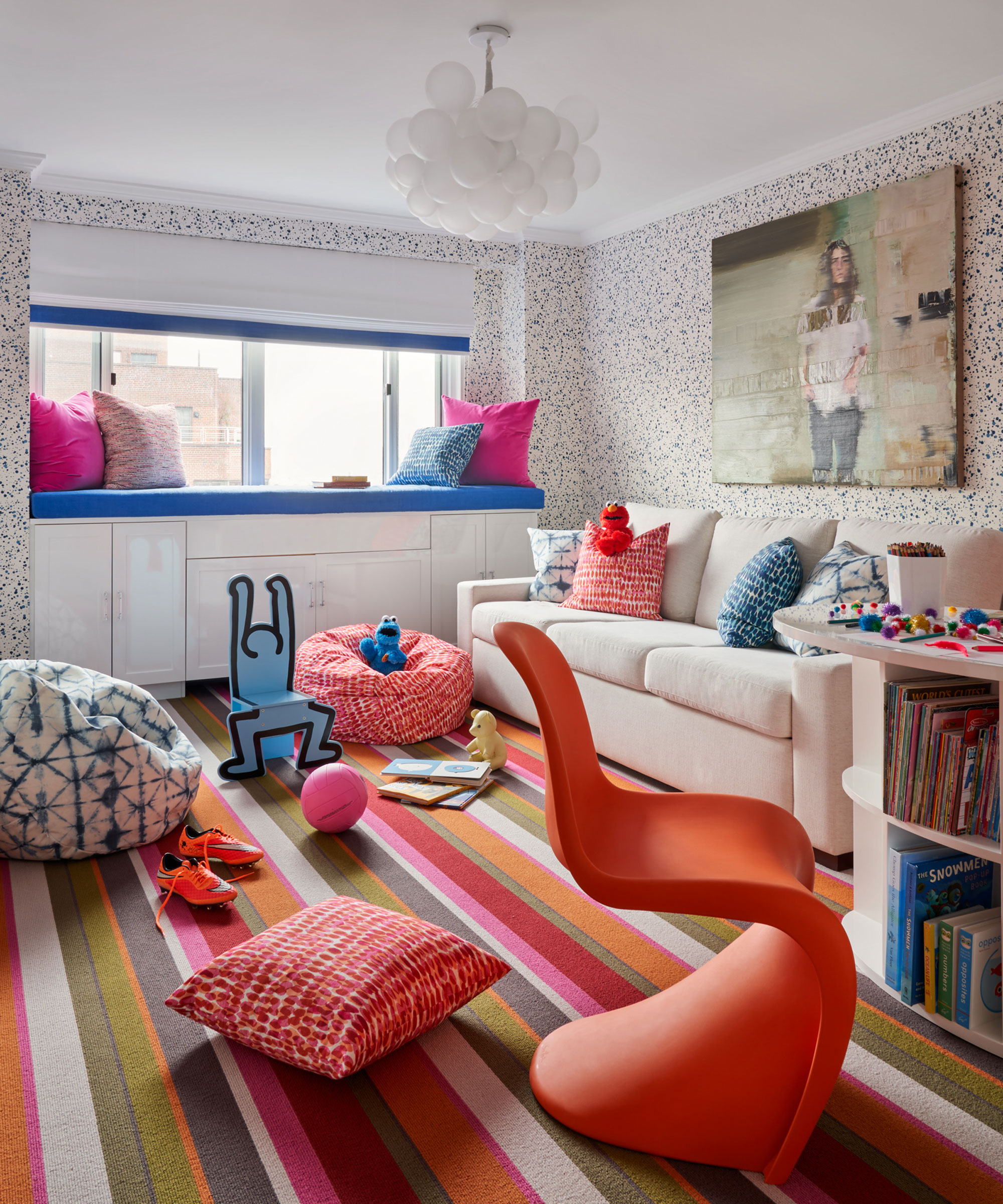
Hilary was keen to create a bright and colorful playroom. She introduced a fun element that underpins the scheme by opting for a boldly striped carpet, teaming it with a toning Vitra Panton chair and injecting extra color and pattern with playful patterned cushions. 'The playroom includes a mix of patterns and colors in the fabrics that mesh so well together,' says Hilary.
8. Make a statement with bright wallpaper
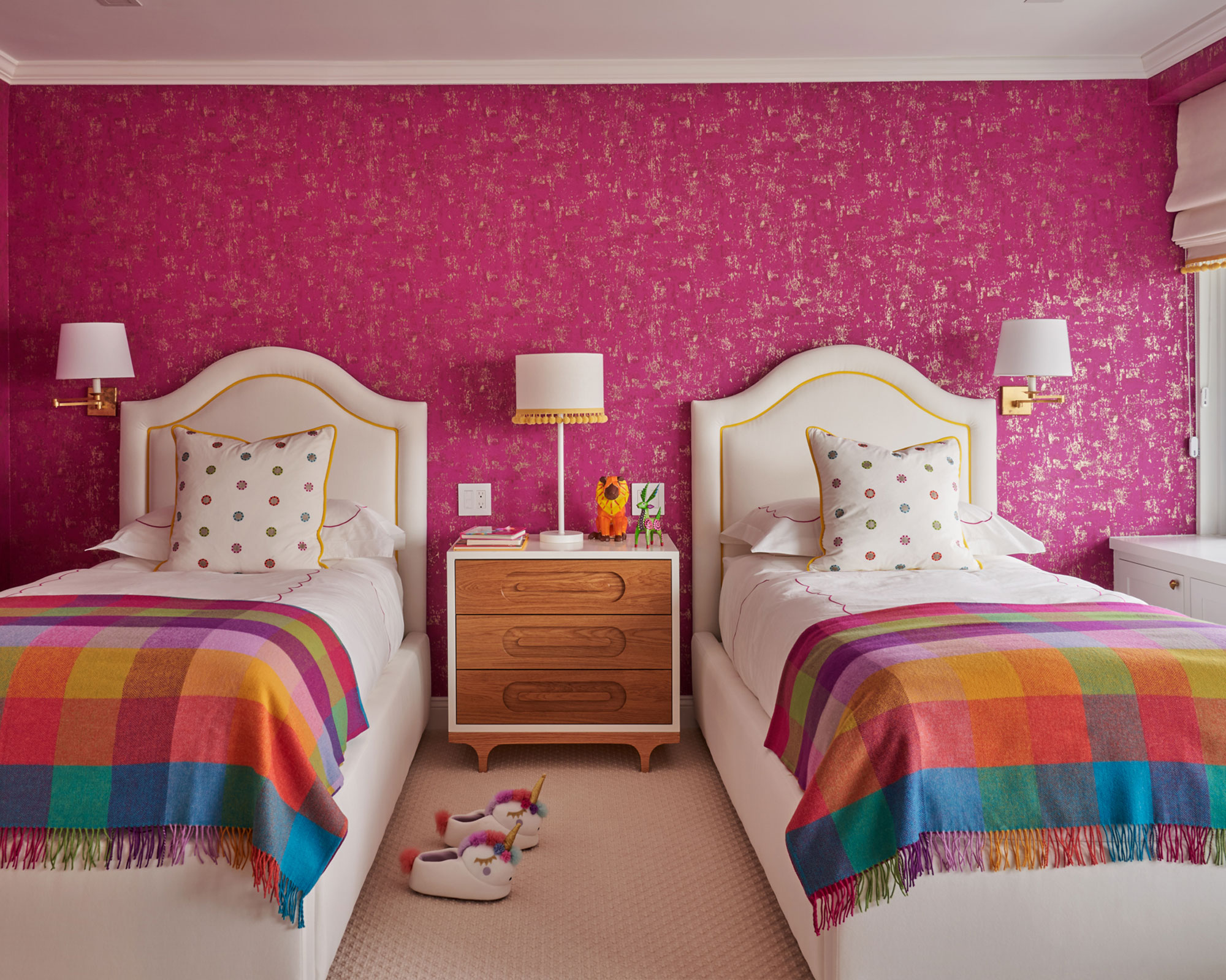
In the girls' bedroom, Hilary introduced a bright pink wallpaper for a punchy backdrop, teaming it with brightly colored checked blankets and pom pom trimmed lampshades. 'It was very important in the two girls' bedrooms for it to be a fun space that they each could call their own,' says Hilary. 'One girl wanted turquoise and the other girls wanted pink – so with that information we took it from there. We got to be playful and unique in each bedroom.'
9. Create a fun homework area
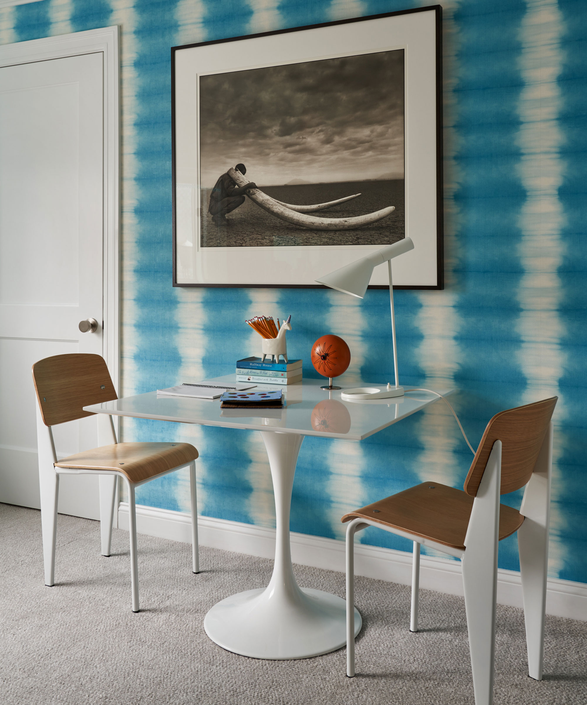
It's important to have a specially designated area where kids can get on with homework without distractions. Hilary solved this by positioning a desk and chairs against a wall in one of the girl's bedrooms. A tie dye wallpaper provides a lively backdrop, while a desk lamp provides vital task lighting.
Interior design/ Hilary Matt Interiors
Photography/ Seth Caplan
Stylist/ Mieke ten Have
Sign up to the Homes & Gardens newsletter
Design expertise in your inbox – from inspiring decorating ideas and beautiful celebrity homes to practical gardening advice and shopping round-ups.

Interiors have always been Vivienne's passion – from bold and bright to Scandi white. After studying at Leeds University, she worked at the Financial Times, before moving to Radio Times. She did an interior design course and then worked for Homes & Gardens, Country Living and House Beautiful. Vivienne’s always enjoyed reader homes and loves to spot a house she knows is perfect for a magazine (she has even knocked on the doors of houses with curb appeal!), so she became a houses editor, commissioning reader homes, writing features and styling and art directing photo shoots. She worked on Country Homes & Interiors for 15 years, before returning to Homes & Gardens as houses editor four years ago.
-
 Charred little gem with saffron dressing
This recipe with charred little gem is both easy to make and sure to impress guests. It's the perfect side for fresh spring menus
By Alice Hart
-
 Grilled asparagus with herb and pickled red onion
This grilled asparagus couldn't be easier, and it's a wonderful way to get the best flavor from our favorite spring veg. It's perfect alongside fish or lamb
By Alice Hart