This colorful New York apartment showcases a blend of old and new
Mixing influences from the past and the present, this New York apartment, owned by fashion designer Wes Gordon, is one of a kind

Behind the vermilion door of Wes Gordon and Paul Arnhold’s New York City apartment lies a wonderland of collected and inherited furnishings, ensuring it is one of the world's best homes.
Having lived with a minimalist and plain white backdrop for years, the pair were driven by the urge to create a new interior setting more appropriate for their exquisite possessions.
The apartment is situated alongside the city’s famous linear park, the High Line, and upon his first encounter Paul, a property developer and glass-blower, was immediately enamored.
‘The location was fantastic and while the apartments were clean and bright, they also incorporated more traditional architectural elements like the casement windows,’ he says. ‘You’re surrounded by nature here so it feels like a calm oasis in one of the world’s busiest cities,’ adds Wes, who is the creative director at Carolina Herrera fashion house.
The pair knew any new interior scheme would have to bridge Wes’s appetite for an old-fashioned look with Paul’s more modern leanings and, having worked with Stephen Sills on their country home in Connecticut, they knew exactly who to turn to. ‘My style is contradictory, blending influences from antiquity with contemporary and minimalist elements,’ says Stephen.
Entrance hall
Using the spring lockdown of 2020 as an opportune time to work on the apartment, Wes and Paul decamped to their country home, leaving Stephen to run the show.
‘No one was doing any renovation work at that time but I remember driving out to Brooklyn to stand in line for three hours to get our paint,’ says Stephen, his resilient nature the perfect match for the job. And his efforts are undoubtedly appreciated by the couple, who loved Stephen’s brilliant ability to combine all the objects that had spoken to them both over the years.
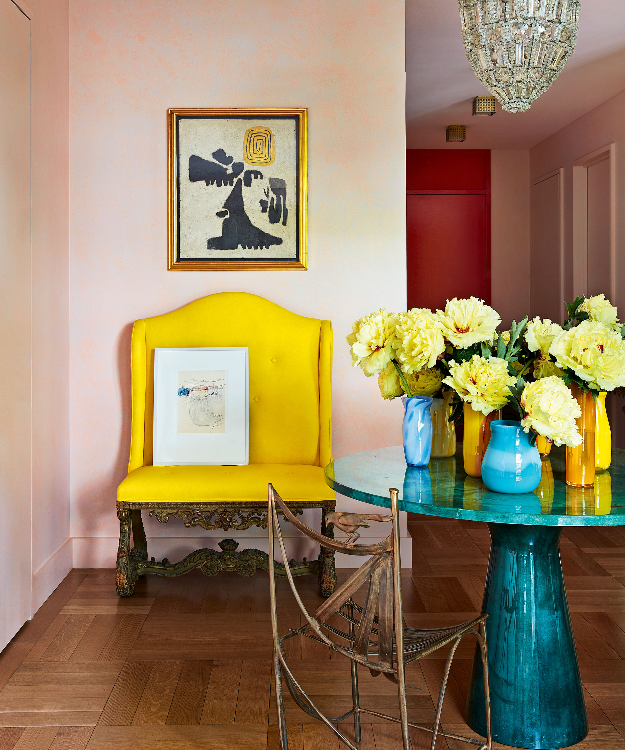
Stephen's hallway ideas included injecting bright colors to provide a modern note, while introducing gravitas with the antique bench and art-deco chandelier.
Living room
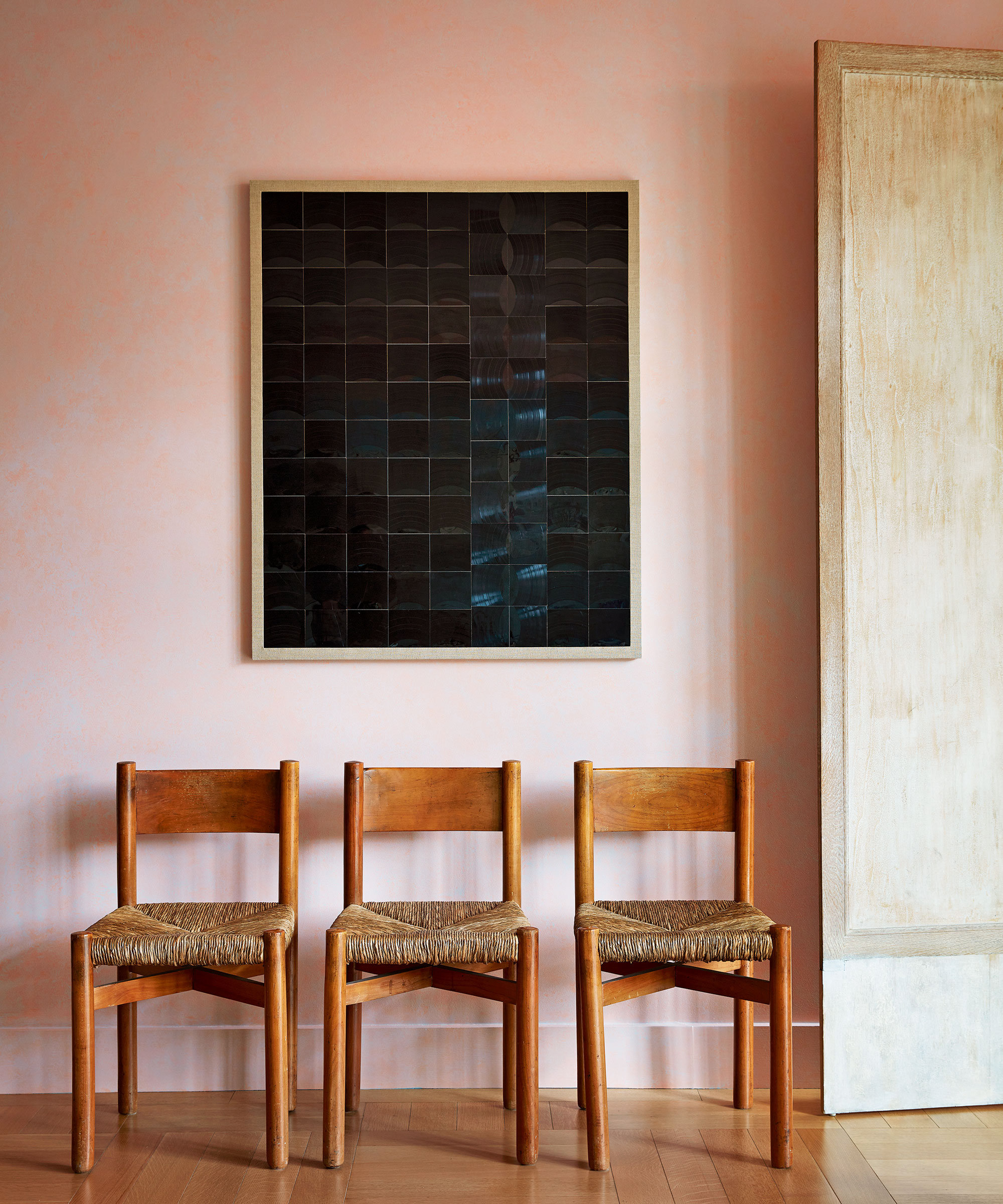
Taking a cue from the terracotta roof of the church that can be seen out of one of the windows, Stephen opted for a gentle pink wall color for the main living areas. ‘It’s the most beautiful flattering color, especially at night,’ says Wes.
An artwork composed of vinyl records makes a striking statement against the pink wall.
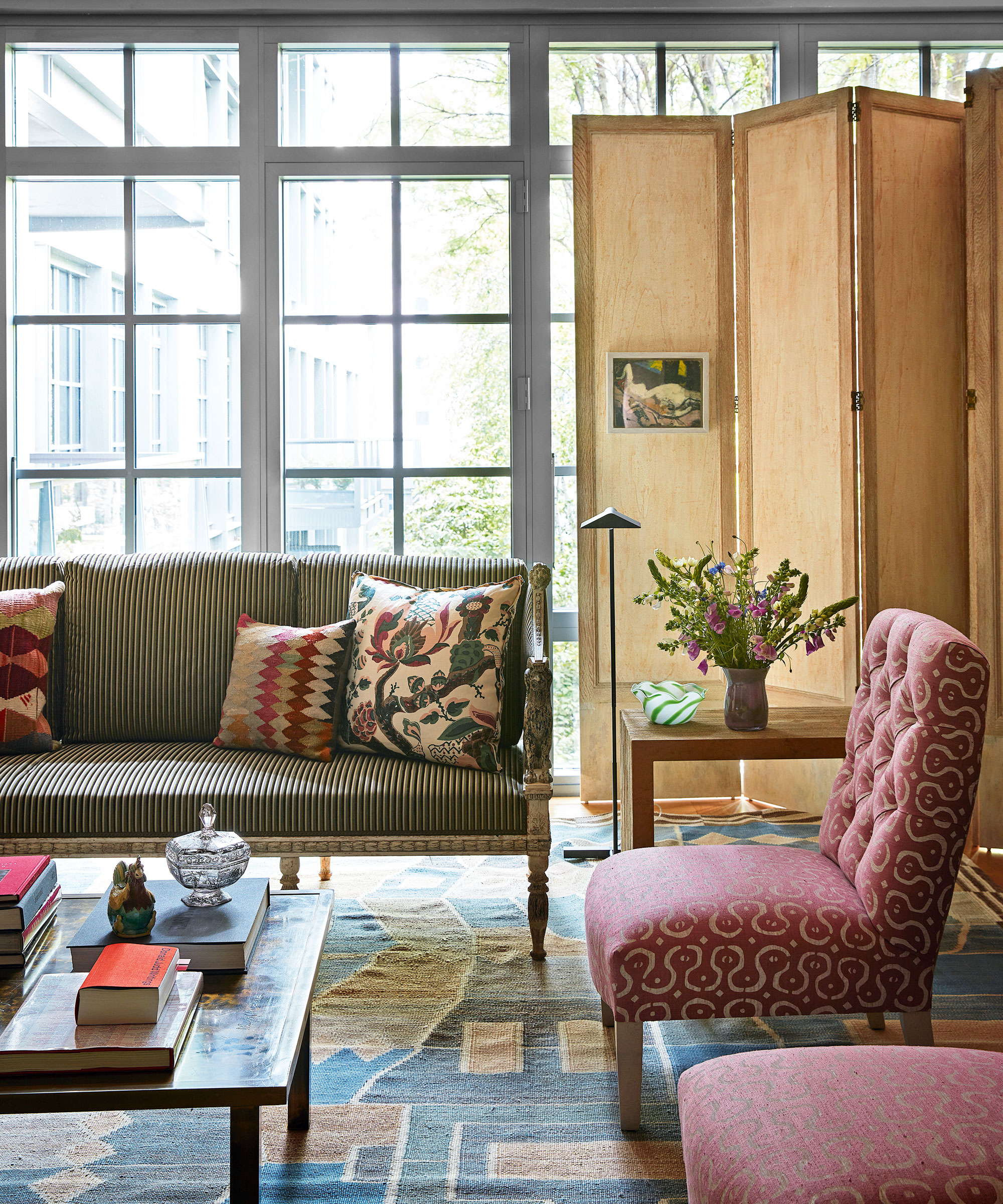
Among the living room ideas was the introduction of two 1940s French oak screens, which add architectural interest and can provide privacy when required in the space.
Den
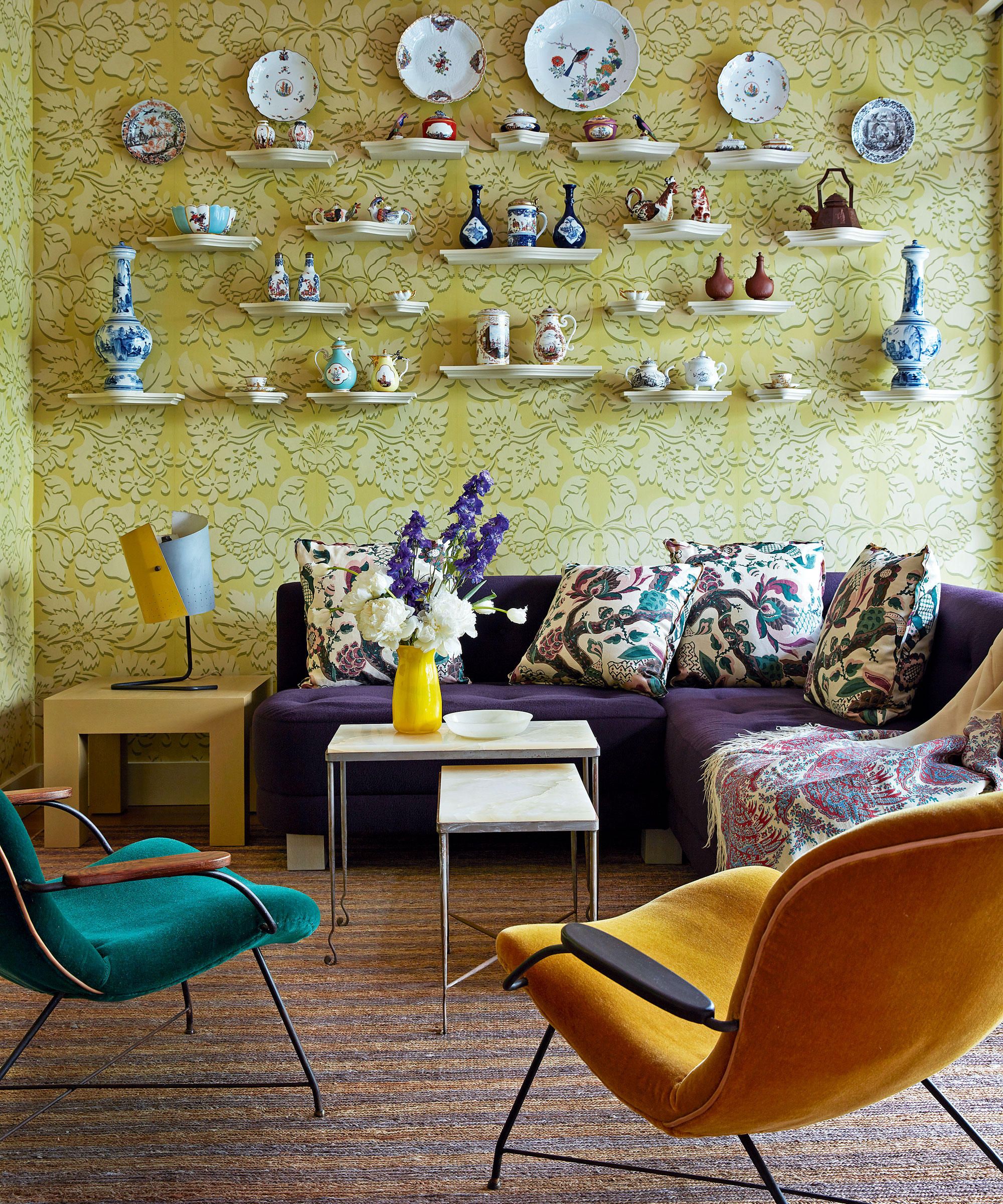
Wes and Paul were in no doubt that their extraordinary collection of furnishings and artwork, spanning from the 17th century to the present day, would be in safe hands with Stephen – not least the Meissen porcelain Paul had inherited from his grandfather. ‘It’s a miracle collection that was saved from Nazi destruction by my great-grandmother. Most of it has gone to The Frick Collection but it’s wonderful to have a small display connecting me to my family history,’ says Paul.
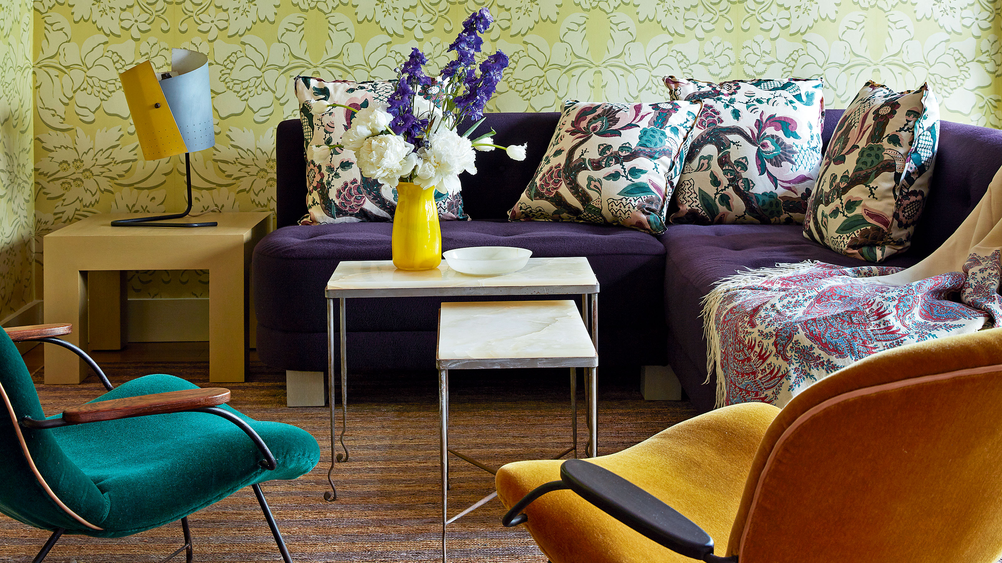
The wall of rare Meissen porcelain in the den is creatively displayed against the striking green and yellow baroque-style wallpaper, which makes an unexpected appearance within the contemporary setting.
Kitchen
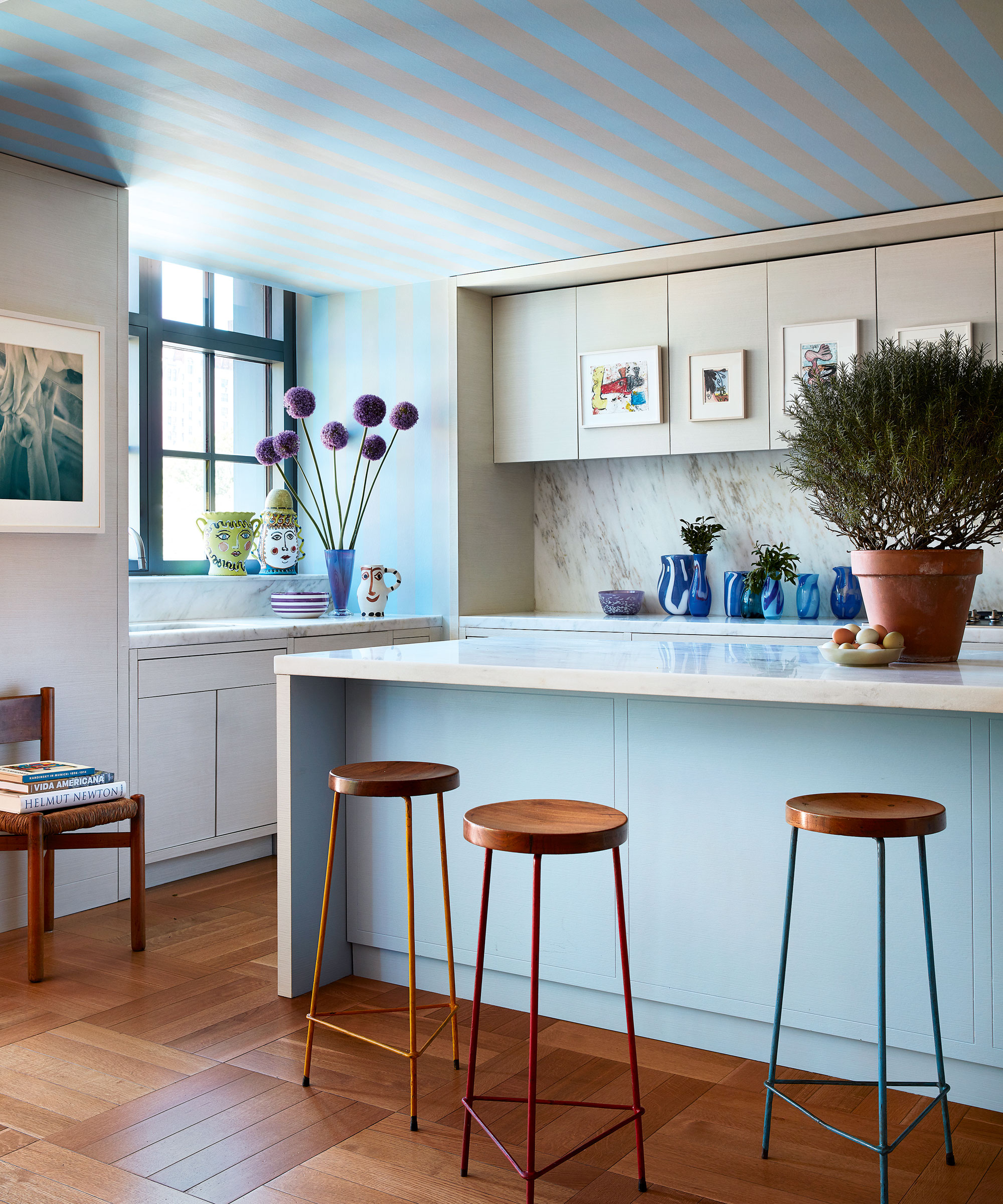
This space is full of clever kitchen ideas. A wallcovering on the ceiling brings the illusion of more depth, while artwork hung on cupboard doors is another of Stephen’s original design choices.
Main bedroom
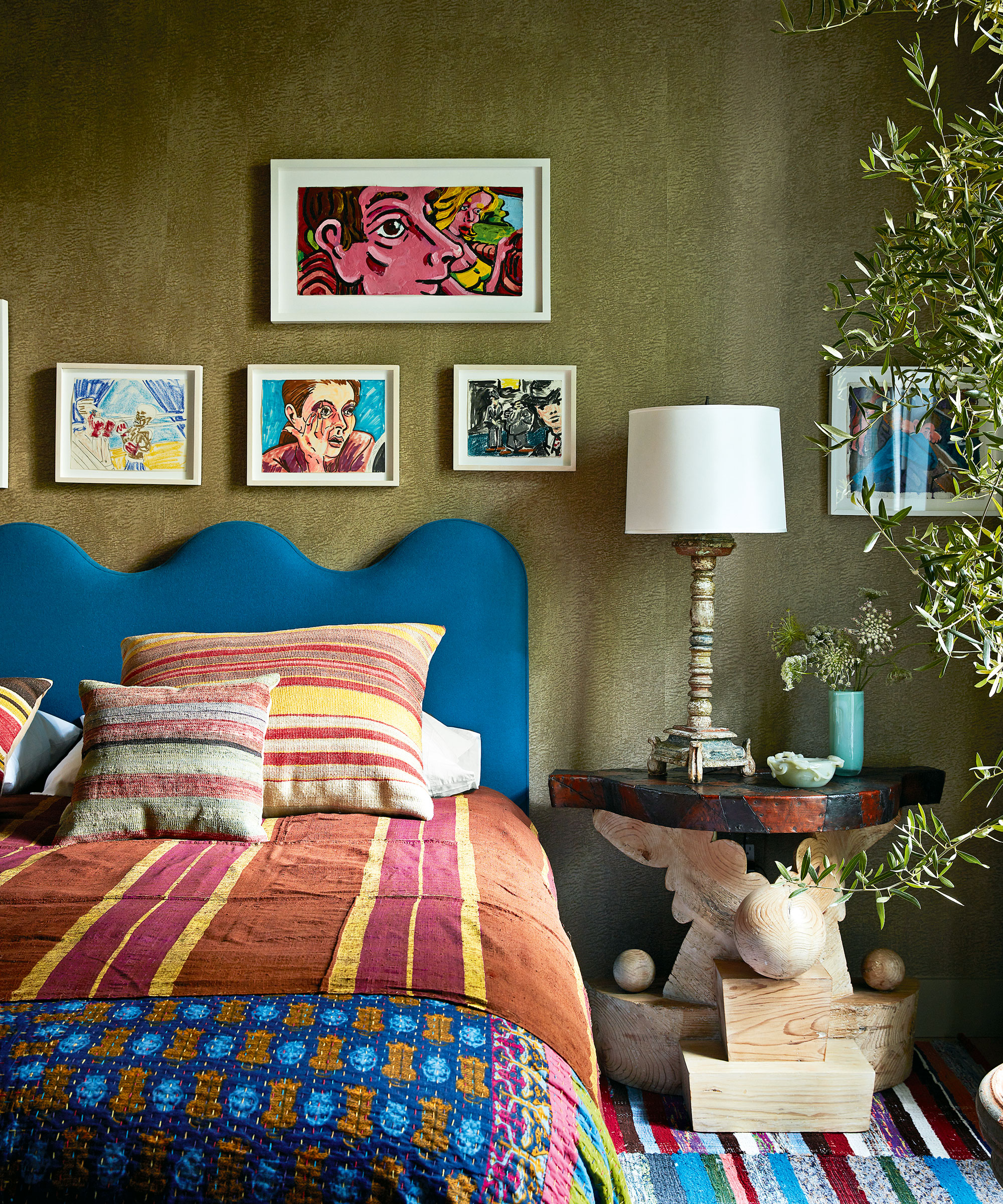
Paul describes the apartment’s look as ‘bold and layered but also serene’. Showcasing a wealth of bedroom ideas, this space is the perfect embodiment of that description.
Bathroom
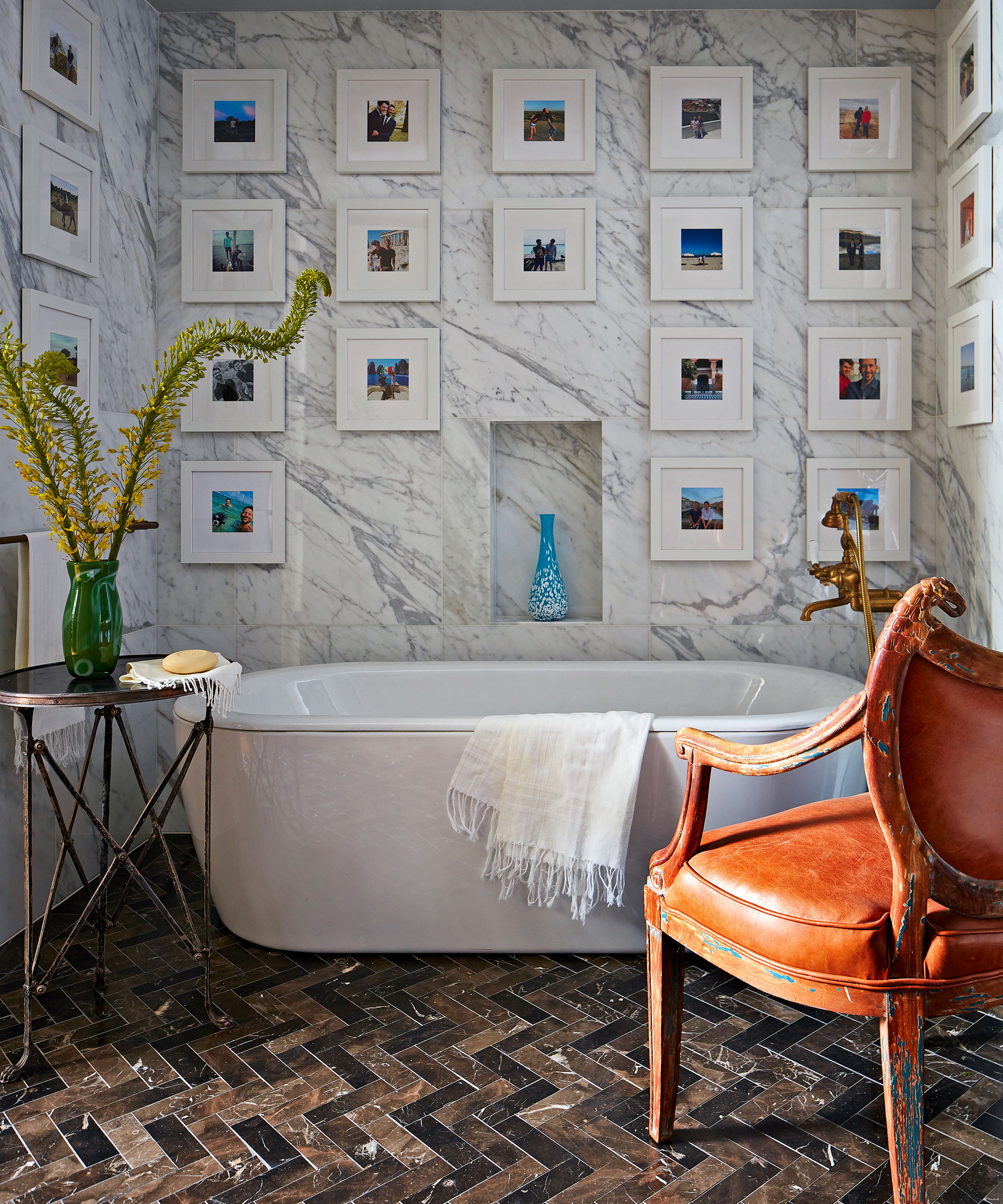
Creating a gallery wall is one of the simple but clever bathroom ideas used in the scheme. Strong adhesive was used to attach the photo gallery to the marble. The painted ceiling strikes a comforting note of enclosure.
The newly styled apartment has become the perfect backdrop for both Wes and Paul’s roving aesthetic minds. ‘Our home is eclectic, brave and individual, bold and layered but serene,’ Paul observes.
While for now the apartment is a brilliant expression of shifting periods in time, its subtle changing face will ensure it remains ever vital and current.
Interior design/ Stephen Sills Associates
Photography/ Stephen Kent Johnson
Text/ Juliet Benning
Sign up to the Homes & Gardens newsletter
Design expertise in your inbox – from inspiring decorating ideas and beautiful celebrity homes to practical gardening advice and shopping round-ups.

Interiors have always been Vivienne's passion – from bold and bright to Scandi white. After studying at Leeds University, she worked at the Financial Times, before moving to Radio Times. She did an interior design course and then worked for Homes & Gardens, Country Living and House Beautiful. Vivienne’s always enjoyed reader homes and loves to spot a house she knows is perfect for a magazine (she has even knocked on the doors of houses with curb appeal!), so she became a houses editor, commissioning reader homes, writing features and styling and art directing photo shoots. She worked on Country Homes & Interiors for 15 years, before returning to Homes & Gardens as houses editor four years ago.
-
 Are you making the most out of the estate sales in your area? These are the 5 most valuable items you should be shopping for
Vintage lovers and antique experts share the objects you should always look out for when you're exploring an estate sale
By Eleanor Richardson
-
 How to grow sassafras – for a low-maintenance native tree that can even be planted in shady yards
For an easy-to-grow North American tree, you will not find much better than sassafras
By Thomas Rutter