Glee creator Ryan Murphy's 'old money' living room focuses on 3 key decorating trends that will never date, say experts
This timeless living space is anything but an American Horror Story...


Ryan Murphy's beautiful West Village living room, fashioned by designers Axel Vervoordt and David Cafiero, features a calm and pared-back neutral interior that's awash with rich materials, quiet luxury colors, and curvaceous design.
Looking for a New York home during the extensive renovation of their LA villa, Ryan Murphy, a television writer, director and producer, and his husband David Miller were delighted to find a property that is homey, cocooning and just what they were looking for.
The mid-19th-century four-story townhouse had formerly been renovated by architect David Bucovy but Ryan and David were eager to give it their own nuanced identity – channeling the 'quiet luxury' look that has taken the fashion and design world by storm.
Having worked with them sourcing furniture for their Provincetown home, the former studio of abstract expressionist painter Hans Hofmann, interior designer David Cafiero was well placed to fill the home with carefully considered 'old money' pieces.
A post shared by Stephen Johnson (@stephenkentjohnson)
A photo posted by on
If you've been paying close attention to interior design trends of late, you'll have noticed that the 'quiet luxury' trend has been at the forefront of many designers decorating agendas.
Quiet luxury is an aesthetic emphasizing understated elegance, timeless appeal, and high-quality materials. It's a movement that prioritizes simplicity and refinement, creating serene, calming spaces that reflect a sense of sophistication without ostentation. It is, in fact, a new kind of minimalism; one that Ryan Murphy appears to have embraced wholeheartedly in his living space.
The living room includes a combination of wood and a distressed plaster finish on the walls, which evokes a calm and monastic ambiance at odds with the fast pace of the city on its doorstep.
Sign up to the Homes & Gardens newsletter
Design expertise in your inbox – from inspiring decorating ideas and beautiful celebrity homes to practical gardening advice and shopping round-ups.
It’s a very peaceful, work-orientated house. But it’s also about comfort and accessibility. Two key factors associated with 'old money' decorating.
It was Ryan Murphy’s decision that the interior had very little color but was more characterized by tone on tone. Here, the space dictates what it wants and often the less you do, the better. It’s about restraint.
Furniture, much of it from Galerie Half in Los Angeles, pays tribute to mid-century designers, such as Charlotte Perriand and Pierre Jeanneret.
This mood of luxurious 'warm minimalism' grounds the living room and lets other objects and furniture sign, such as the fleece chaise lounge and circular coffee table, bringing a charisma of their own.
The evocative feel this space exudes is a result of the masterful combination of rich materials that are made to last – perhaps the most important element to consider when curating a 'quiet luxury' living room.

Jennifer is the Digital Editor at Homes & Gardens. Having worked in the interiors industry for several years in both the US and UK, spanning many publications, she now hones her digital prowess on the 'best interiors website' in the world. Multi-skilled, Jennifer has worked in PR and marketing and occasionally dabbles in the social media, commercial, and the e-commerce space. Over the years, she has written about every area of the home, from compiling houses designed by some of the best interior designers in the world to sourcing celebrity homes, reviewing appliances, and even writing a few news stories or two.
-
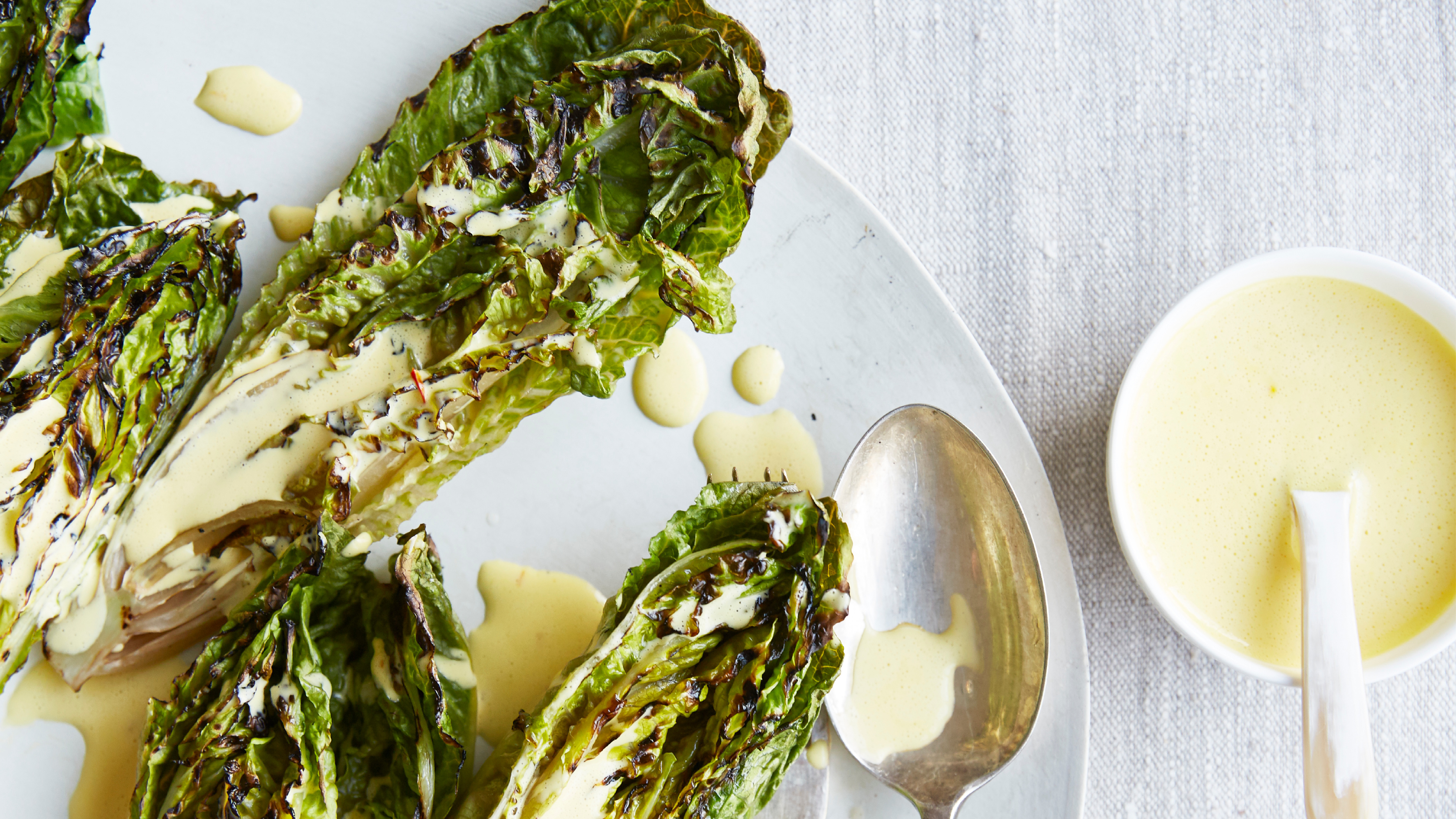
 Charred little gem with saffron dressing
This recipe with charred little gem is both easy to make and sure to impress guests. It's the perfect side for fresh spring menus
By Alice Hart
-
 Grilled asparagus with herb and pickled red onion
This grilled asparagus couldn't be easier, and it's a wonderful way to get the best flavor from our favorite spring veg. It's perfect alongside fish or lamb
By Alice Hart