Ryan Murphy and David Miller's monochromatic laundry room is anything but ordinary – experts agree it's trailblazing 2025 trends
Stephen Shadley revealed his design for the TV writer and photographer's white-on-white laundry room - it proves that single-shade interiors don't have to be boring, they can transcend design trends


Ryan Murphy is on record declaring his lifelong love for vibrant colors and bold interior design choices. By his admission, the Glee creator opted to decorate his childhood bedroom with brown shag carpet and a gold disco ball, after all. But when the famed television writer and his photographer husband, David Miller, purchased a ‘teardown’ family home in 2012, they made the surprising decision to embrace an overarching aesthetic of ‘minimalist luxury’.
The couple's LA home, which they share with their two children, features decidedly edited-down decor and is consciously devoid of saturated color. Under the expert guidance of designer Stephen Shadley, the creative pair achieved this minimalist decor look throughout their home with the clever use of repeated materials in muted shades and plenty of calming, natural hues.
This minimalist aesthetic is perhaps most evident in the couple’s unique white-on-white laundry room, which Shadley shared on his Instagram page.
A post shared by Stephen Shadley (@stephenshadley)
A photo posted by on
The stark white, subway tile-wrapped laundry room is a dead ringer for the couple’s white kitchen, which features the same tiles and custom light fixture, designed by Shadley and fabricated by Santa Barbara Lighting Co.
'We tend to shy away from white-on-white these days in interior design,' says Greg Roth, Senior Designer at Home Front Build. 'This is likely a reaction to the plethora of white interiors, particularly kitchens and bathrooms, that dominated our social media feeds and magazines for such a long time.'
According to Roth, white and neutral tones became 'a bit boring and expected,' which is why so many of us have been craving statement interiors these days. Examples of these include color-drenched rooms and the resurgence of maximalism. However, there is a definite perennial appeal to white interiors.
Roth points out that decorating with white is often 'easier to wrap our heads around' than trying to tackle the complexities of statement color. Furthermore, white kitchens and bathrooms suggest cleanliness in spaces where we want cleanliness and ease of upkeep to be a priority.
Sign up to the Homes & Gardens newsletter
Design expertise in your inbox – from inspiring decorating ideas and beautiful celebrity homes to practical gardening advice and shopping round-ups.
'Which brings us to Ryan Murphy and David Miller's white, white space. This is a room that is at once complex, interesting, and very clean,' says Roth. 'Clean lines, clean surfaces, clean and clear intentions. It is not meant to be a warm, welcoming room – it is a utilitarian laundry room, after all. And yet, its composition and its mixing of grids and lines, of bright white with a smattering of jet-black accents, has a distinct appeal.'
Why does Ryan Murphy and David Miller's white-on-white space work?
'This is not your run-of-the-mill laundry room, by any stretch,' explains Roth. 'It is a carefully considered and planned space that offers high functionality (so many storage ideas), plus a beautifully framed view of greenery that brings nature into an otherwise highly controlled environment. You may not be called to linger here, but the allure and just plain beauty of the execution are undeniable.'
Philip Vanderford, Founder of Studio Thomas James, agrees, adding that this space 'exudes a distinct charm despite its monochromatic white palette.' He explains: 'The secret lies in the thoughtful layering of textures and subtle details. The crisp white cabinetry juxtaposed with the highly textured tile creates a visual rhythm that captivates the eye. Additionally, the use of high-quality materials and craftsmanship, like the hardware and custom lighting, adds an element of sophistication.'
Shop The Edit
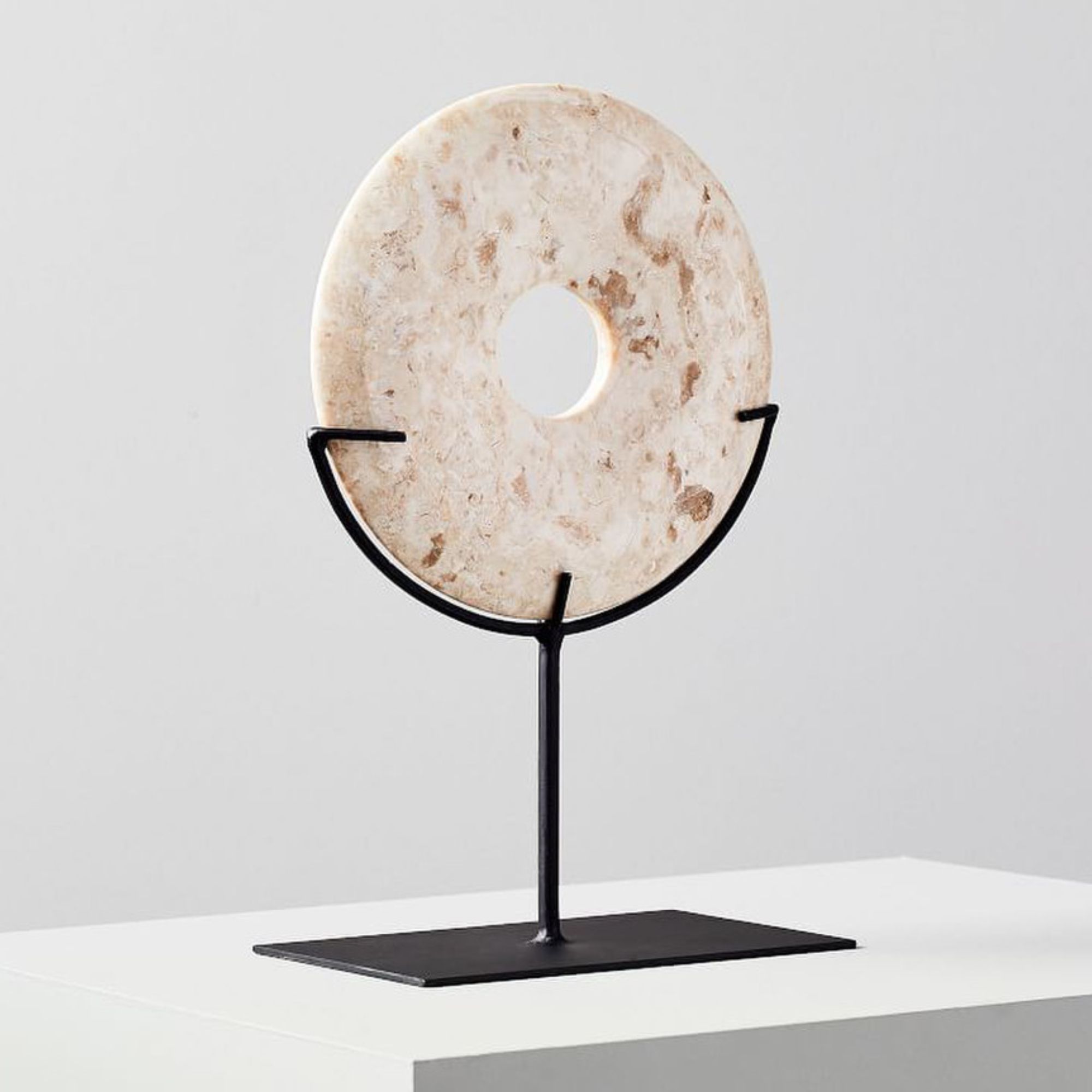
This natural marble disc would compliment an all-white design scheme and is the perfect piece of statement decor to disrupt otherwise clean and minimalist countertops.
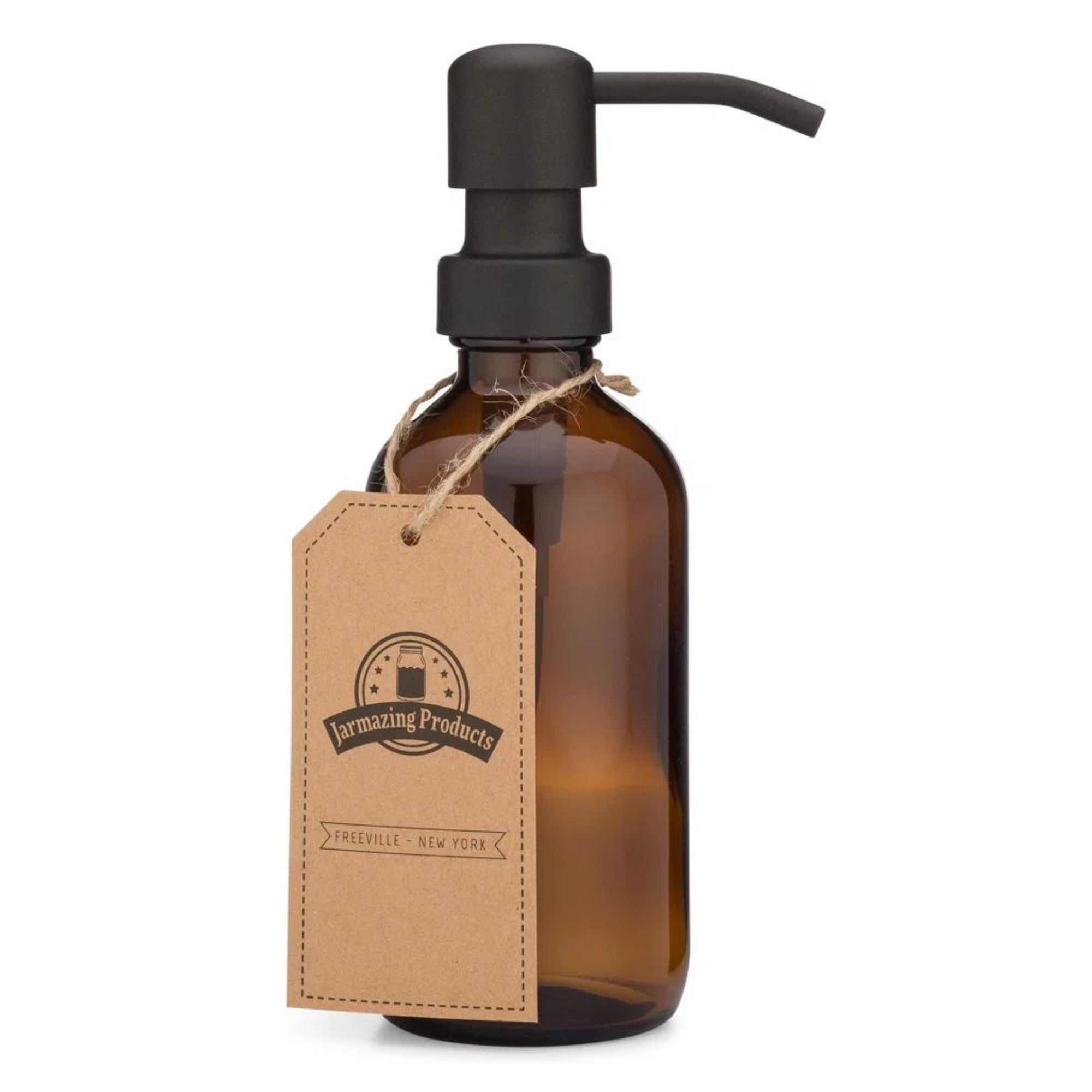
Decanting your favorite liquid soap into a stylish amber dispenser will help you create a cohesive aesthetic in a laundry room.
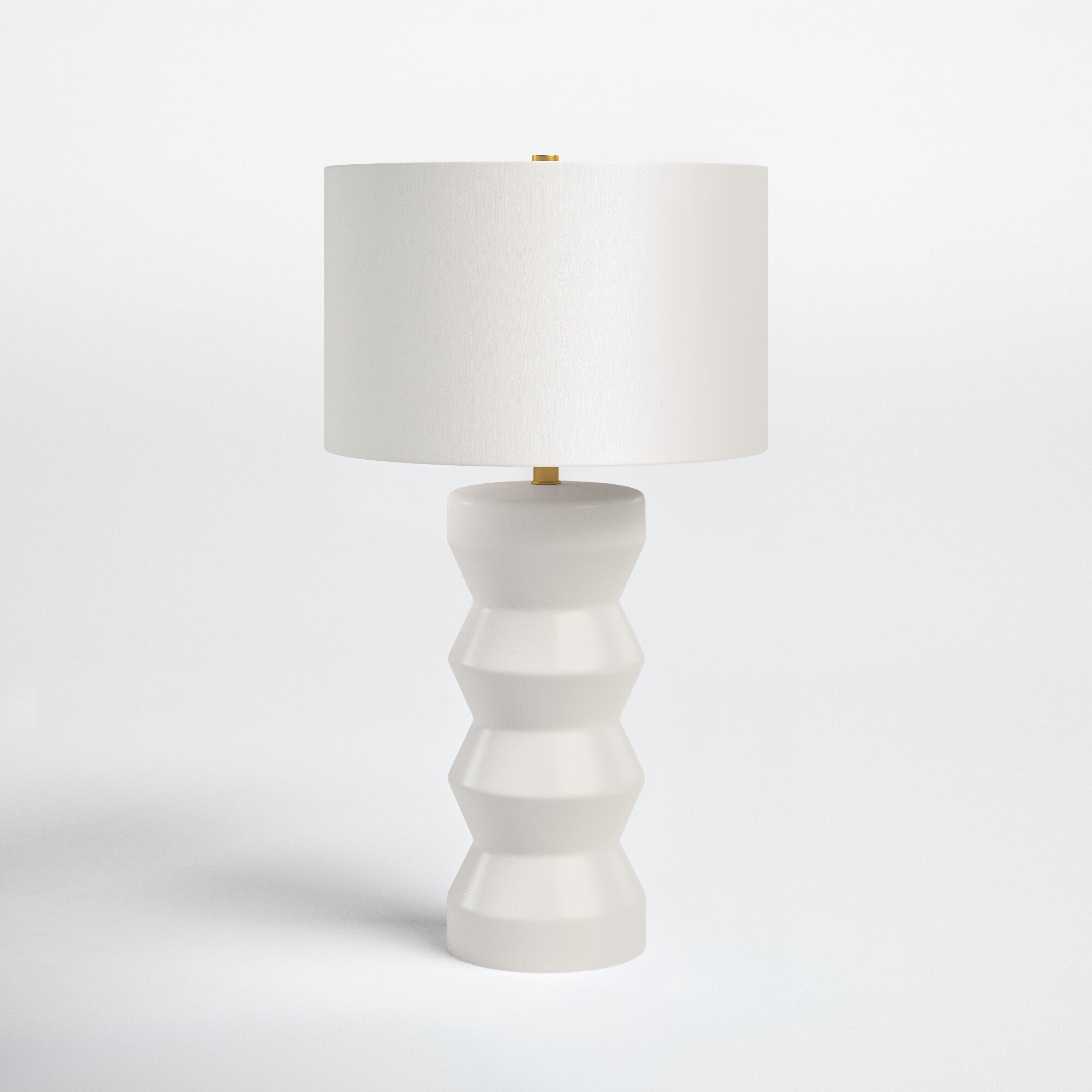
This contemporary ceramic table lamp features a unique ribbed base that's not too dissimilar to Ryan Murphy and David Miller's pair of bespoke geometric lamps.
To recreate the look, practicality is as important as aesthetic. Vanderford advises: 'The room also cleverly incorporates practical yet stylish elements, such as a plethora of various storage cabinets and strategically placed lighting' Vanderford continues. 'These elements not only enhance the rooms' functionality but also contribute to its overall aesthetic appeal. This meticulous attention to detail ensures that even a color-drenched white space feels anything but ordinary, embodying a timeless elegance with a contemporary twist.' Organizing your laundry room will get you one step closer to Ryan Murphy's style.

Gabriella is a freelance contributor for Homes & Gardens. She is a DIY enthusiast and a lover of all things interior design, often found antiquing or browsing the aisles of her local hardware store. She has a particular passion for historic buildings and is in the process of renovating a Victorian coachhouse in the countryside.
For much of the past decade, Gabriella has worked as a freelance writer, crafting copy for national publications and renowned homeware brands. Most recently, she worked for Homebuilding & Renovating Magazine and is the former Head of Solved at Homes & Gardens, focusing on case studies for the magazine and website, as well as writing features about issues surrounding historic and listed building projects.
-
 'Wick away the ick' – 6 things people with clean laundry rooms always do to make this hardworking space shine
These tips on how to clean your laundry room will banish grime
By Seraphina Di Mizzurati Published
-
 Jennifer Aniston’s bedroom is a ‘goldmine of simple sumptuousness’ – it’s 2025’s version of quiet luxury and so easy to recreate
The actress's unique space features James Mont-designed lamps and a raised bed inside a walnut plinth – but you can recreate its understated sophistication
By Megan Slack Published
-
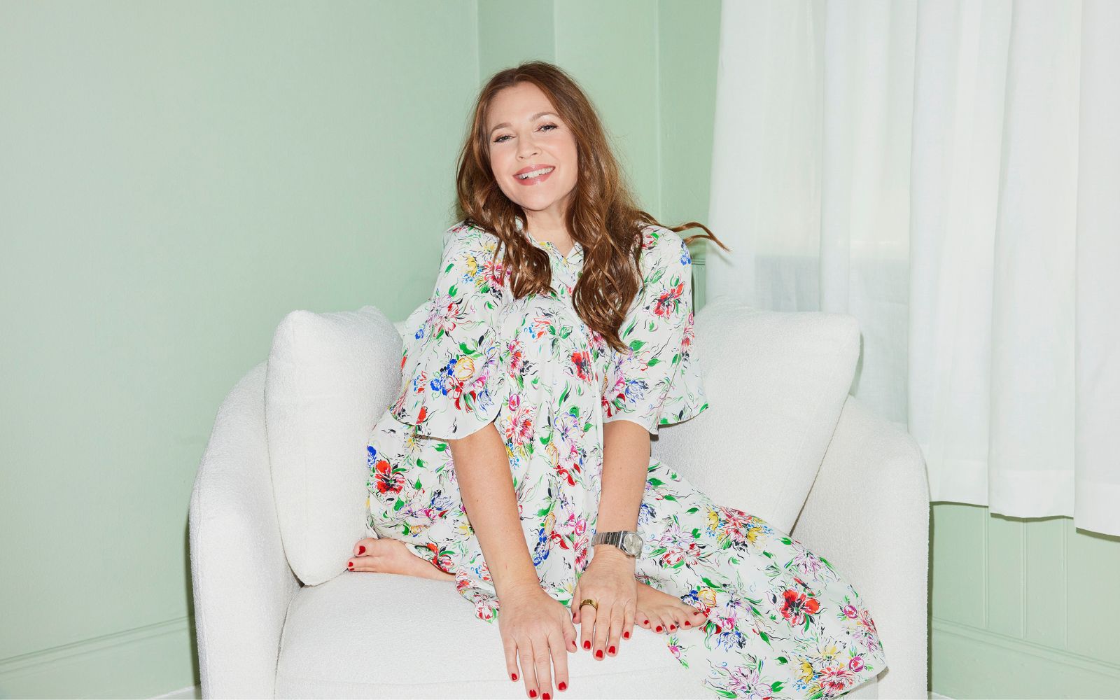 Drew Barrymore's Beautiful collection embraces flower power – this one item literally lights up a room
The latest decor drop includes a vintage-inspired flower lamp, which retails for under $48 – and it was the first thing in our carts
By Hannah Ziegler Published
-
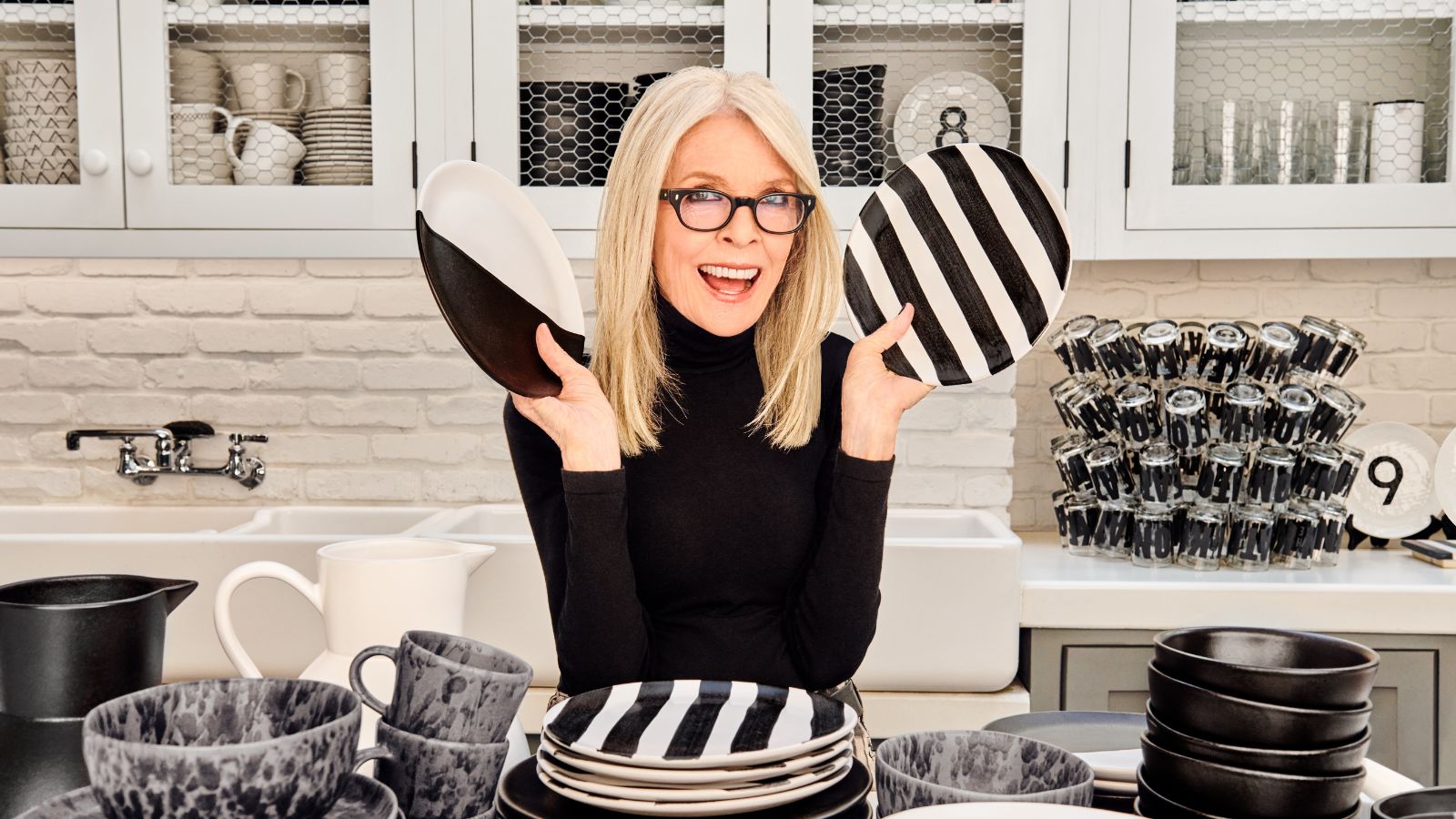 Diane Keaton's new decor collection is a celebration of wit and playful irreverence – directly inspired by her quirky home
The collaboration offers a humorous twist to the most simple color palette of all – bringing Keaton's flare to our entertaining spaces
By Megan Slack Published
-
 RuPaul's kitchen is sleek and sophisticated thanks to this unexpected cabinet color
RuPaul's black kitchen cabinets are undeniably bold, yet have a surprisingly soothing effect that get the expert stamp of approval
By Hannah Ziegler Published
-
 Justin Baldoni's anti-trend kitchen cabinet color serves as the perfect 'blank canvas' – this style will never fade
The actor knows that this color transcends fads, so he used it for his kitchen cabinets - experts swear by the classic, calming shade
By Sophie Edwards Published
-
 Cynthia Nixon's sofa color is a 'cornerstone in modern interior design' – it's a classic for a reason
Cynthia Nixon's gray sofa proves that the neutral hue is anything but outdated, pairing the soft shade with some warm, natural materials for a trendy look
By Hannah Ziegler Published
-
 Pastry chef Dominique Ansel shares the 3 most useful appliances every home baker needs in their kitchen
The celebrity pastry chef swears by these pieces of equipment to level up your home baking - and explains the one item he can't live without
By Sophie Edwards Published
-
 Martha Stewart's dining room taps into this timely trend – here's how to recreate the look
Martha Stewart's Skylands property in Maine has been decked out with a summer-ready tablescape, featuring collectible plates and coveted glassware
By Hannah Ziegler Published
-
 Jamie Lee Curtis's luxurious bedding is a favorite among sleep experts – and it's surprisingly low-maintenance
Jamie Lee Curtis's bedding has benefits for skin, hair, and sleeping temperature - experts say it is exceedingly simple to care for
By Sophie Edwards Published