Reese Witherspoon's powder room is a beautiful homage to the most-talked-about color of 2023
Combine blossom pink and petal-inspired hues to add a luminous quality to your home


Subtle hints of pink and peach continue to define the color choices in our home in 2023, and Reese Witherspoon's powder room remodel is certainly not immune to this divisive color trend.
Few colors have enjoyed a more dramatic or unexpected reinvention than pale pink. Soft, versatile, and subtle, it adds a new layer of depth to modern interiors and furnishings. A natural partner to soft whites and other neutrals, this is a shade that looks set to stay.
In Reese Witherspoon's modern powder room, designed by Kohler, pink packs a subtle boost of energy and femininity. Fans of bold bathroom color schemes will love this look and fans of decorating with pink will love it still more. And for anyone wishing to embrace a pale pink scheme of their own, we have some good advice.
A post shared by Kohler (@kohler)
A photo posted by on
Don't think of it as pink, it's really a neutral – a barely there flush that gives a room a layer of color and blends in rather than contrasts. Use it to add a quiet sophistication and a fresh hint of prettiness that'll upgrade any look, from simple country to upscale glamor.
With its apparent ties to the natural world, pink is used for painting accent walls and brightening a home with splashes of color that symbolize and promote health and vitality.
‘Peach and pale pinks also have a clear connection with nature and represent a set of shades ranging from a light orange pink to a yellow-hued orange,’ Sarah expands. ‘It is often used as a neutral shade instead of beige and warm whites. Encouraging light into a space, enriching it with calming yet refreshing energy, peach pink is great for a bathroom or powder room.’
A post shared by Kohler (@kohler)
A photo posted by on
Ruth Motteshead, creative director at Little Greene, agrees that softer peach hues can act as a neutral base for any decorating projects. ‘They are reminiscent of natural plaster shades, with earthy undertones that add warmth to a space to provide a color highlight or act as a neutral base for introducing bolder colors.’
Sign up to the Homes & Gardens newsletter
Design expertise in your inbox – from inspiring decorating ideas and beautiful celebrity homes to practical gardening advice and shopping round-ups.
If you are looking for color contrast, Andy Greenall, creative director at Paint & Paper Library suggests ‘contrasting peach and pink shades with teals, cool whites, darker blues and grays. Or add natural finishes and combine with warmer neutrals for a sumptuous feel.’
A post shared by Kohler (@kohler)
A photo posted by on
Neither sugary not sweet, this goes-with-anything shade will see you through the seasons gently.
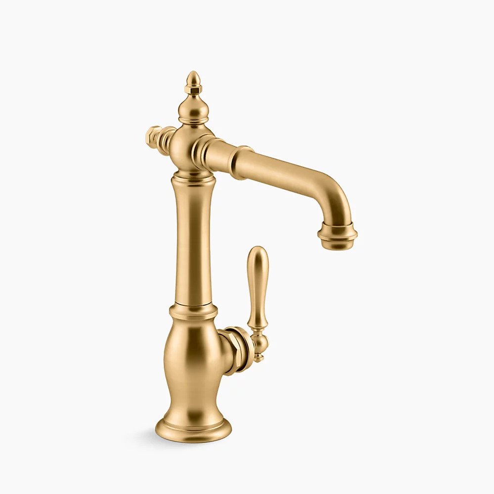
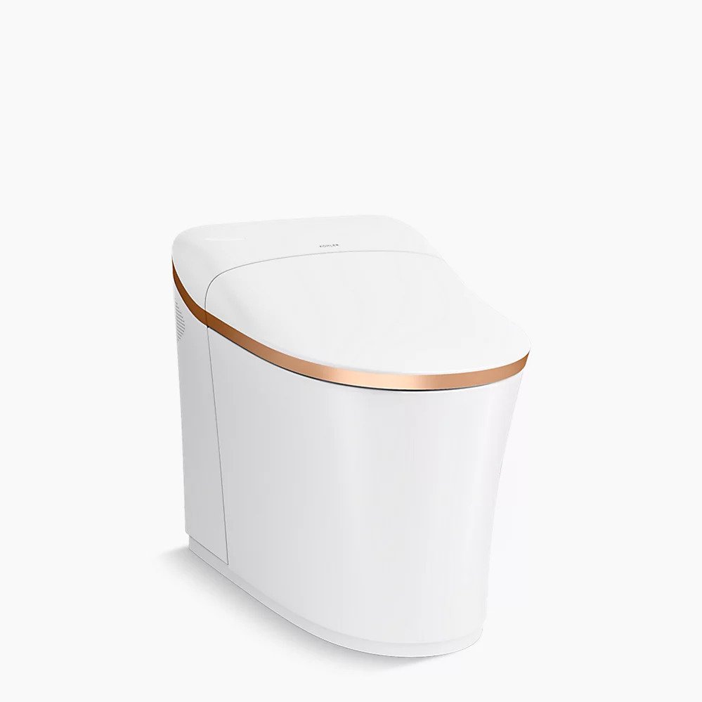
Shop the products in Reese Witherspoon's powder room

Jennifer is the Digital Editor at Homes & Gardens. Having worked in the interiors industry for several years in both the US and UK, spanning many publications, she now hones her digital prowess on the 'best interiors website' in the world. Multi-skilled, Jennifer has worked in PR and marketing and occasionally dabbles in the social media, commercial, and the e-commerce space. Over the years, she has written about every area of the home, from compiling houses designed by some of the best interior designers in the world to sourcing celebrity homes, reviewing appliances, and even writing a few news stories or two.
-
 I've spent over 200 hours testing vacuums and swear by my two Dysons – this is how I properly clean a Dyson vacuum filter for longer-lasting appliances
Your Dyson vacuum will last much longer and clean at its best
By Dan Fauzi Published
-
 Bethenny Frankel calls this $695 machine the 'Rolls-Royce Cullinan of coffee' – it's a must-have luxury buy for iced-coffee lovers this springtime
The Real Housewife swears by a luxurious machine that makes nitro cold brew, cold brew, and cold espresso at the touch of a button – here's why it's worth it
By Sophie Edwards Published

