

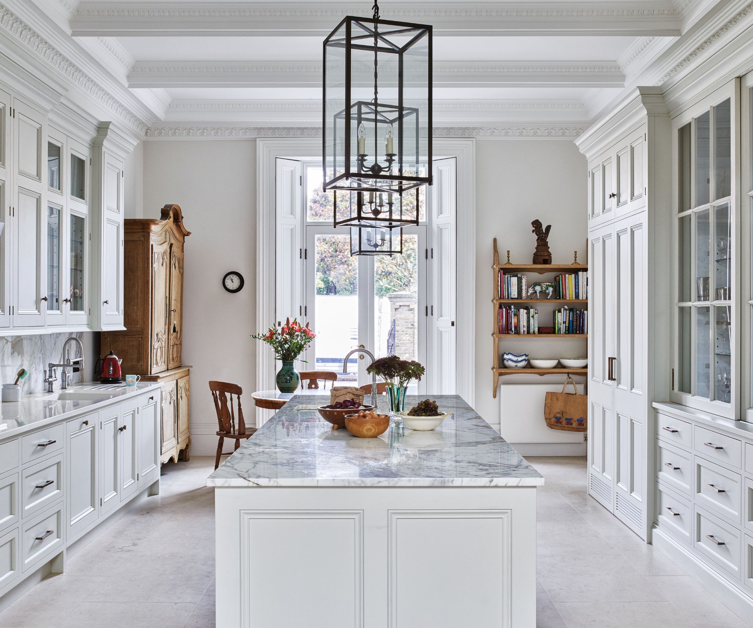
Pinterest named 'butter yellow' one of the top colors of 2025 in their annual trend report, Pinterest Predicts. Though it may technically be a current trend, the stylish, muted hue has been around for ages, and it's not going anywhere. For proof, look no further than the home of Princess Diana, timeless style icon.
The Princess of Wales moved into Kensington Palace after marrying Prince Charles (now, King Charles) in 1981. She worked with the British interior designer Dudley Poplak to create a space that honored the 17th-century architecture of the home while integrating her enduringly stylish tastes. Notably, she decorated with a variety of pastels, especially butter yellow. Light yellow walls feature in the drawing room, the dining room, and the nursery suite.
As demonstrated by the rooms in Kensington Palance, Decorating with yellow will always be on trend. First of all, the subtle, stunning shade has a variety of benefits. Lena Gierasinksa interior designer at Barker and Stonehouse explains: 'Butter yellow has a gentle, soothing effect on the mind. It carries the bright, uplifting qualities of yellow but with a softer, more subtle presence. In color psychology, yellow is linked to optimism and clarity, but when toned down to a butter-like shade, it promotes calm and emotional warmth. It’s often associated with nurturing and comfort, making it ideal for creating a peaceful environment. This color can encourage positivity, reduce stress, and even foster creativity so it’s no surprise that people like to use it in the home. In spaces like bedrooms or living rooms, butter yellow can evoke a sense of tranquillity while still maintaining a light and joyful atmosphere. It’s a wonderful choice for areas where you want to inspire a sense of ease and connection, without overwhelming the senses.'

Shop The Edit

Decorating underfoot is always my first-port-of-call when using a bold color scheme. Arguably, rugs make the biggest difference to an overall scheme – and they are simple to change when fashions come and go.

Olive oil adorns almost every home, and a good olive oil bottle – in a cheery butter yellow – is a must to liven up any scheme. Made from glazed earthenware, you will feel instantly transported to the Mediterranean.

I have a confession to make. I change my pillow cases every season. It usually goes: red in winter, pink in spring, yellow in summer and olive green in fall. However, I am leaving my butter yellow cases on for a little longer – the color is just that delightful.
If you've been thinking about integrating a yellow room into your home, butter is the perfect shade to start with. 'Butter yellow is a versatile and inviting colour that can bring a real sense of optimism and cosiness to any space,' says Cassie Leisz, Interior Design expert at Ruggable. 'It's much softer and muted than bright yellows, making it easier to incorporate into various design styles.'

Princess Diana's yellow living room was the perfect shade to make her stately art and traditional furnishings to pop. Following her masterclass, decorating with this shade is an exercise in ambiance. Cassie advises: 'To determine if butter yellow is right for you, consider the mood you want to create in your space. This hue works well for those looking to add a touch of colour and warmth without overpowering a room. It's particularly suited for rooms that need a lift or areas that don't receive much natural light as it helps mimic the way sunlight bounces off walls, in the same way as a golden hour glow.'

Cassie recommends: 'For those hesitant about committing to butter yellow, start small. Introduce it through accessories, florals or artwork accents, or refine it to just one space in the home like a study, downstairs bathroom or entryway. This allows you to experiment with the colour and see how it complements your existing decor before making a larger commitment.'

Trends come and go, but classics will always be classic. Though butter yellow is a 'trend' it's also an enduring shade that holds an important place in history, and thus in our futures.

You must confirm your public display name before commenting
Please logout and then login again, you will then be prompted to enter your display name.
-
 Are you making the most out of the estate sales in your area? These are the 5 most valuable items you should be shopping for
Vintage lovers and antique experts share the objects you should always look out for when you're exploring an estate sale
-
 How to grow sassafras – for a low-maintenance native tree that can even be planted in shady yards
For an easy-to-grow North American tree, you will not find much better than sassafras

