Nate Berkus and Jeremiah Brent's top 3 tips on how to make neutrals more interesting
The design power couple is not scared of layering neutral colors. They spoke to us about how they keep it visually appealing in their coastally-inspired collaboration with Living Spaces and beyond
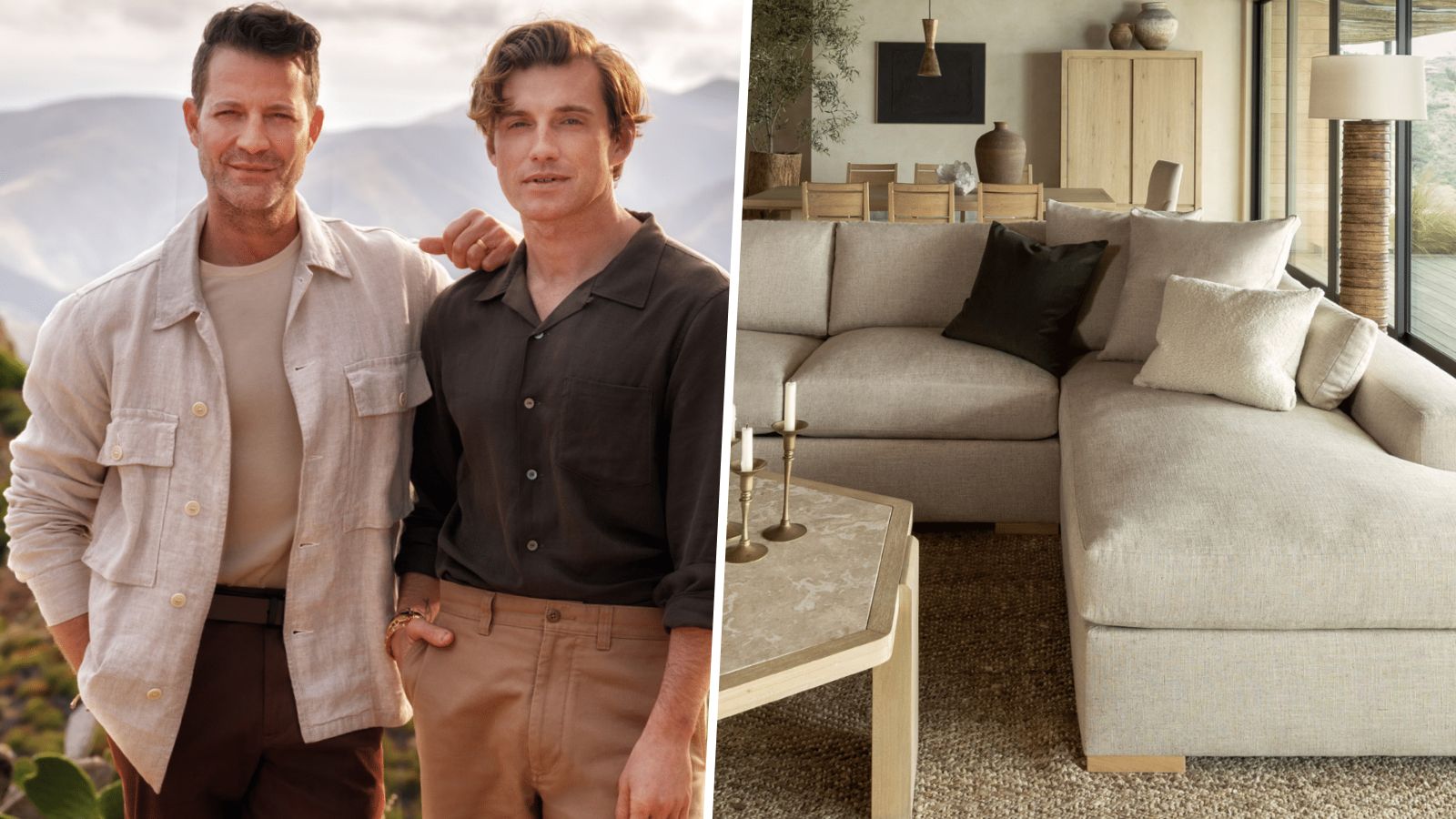

Nate Berkus and Jeremiah Brent are practically interior design royalty. After their own successful careers in design, the couple jointly became co-hosts of TLC's design series Nate & Jeremiah by Design. The beautiful homes they design together tend to have a unique, casually luxurious feel, full of neutral room ideas.
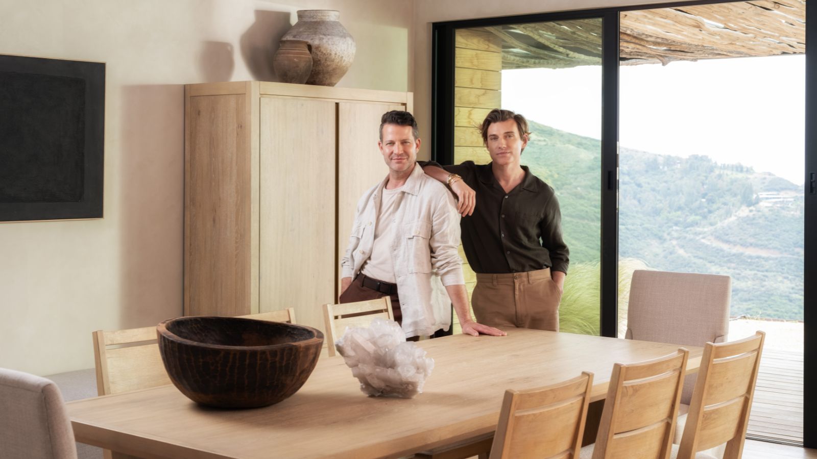
Nate and Jeremiah's aesthetic is perhaps best embodied by their latest project, a coastal-inspired collaboration with Living Spaces, 'Voyage.' The collection is inspired by the couple's travels to the coasts of California, Montaulk, and Portugal and incorporates light, natural materials, for an organic and timeless look. Voyage epitomizes how neutral colors and textures can create a sense of laidback relaxation and seamless tranquility in a home.
In fact, the lookbook reads like a guide on how to decorate with neutrals. In honor of their fabulous work on the coastal living collection, we consulted with Nate and Jeremiah to get their top tips on decorating with neutrals. We distilled the advice from these authorities down into 3 simple tips that can be recreated in any home.
1. Add items with character from different eras
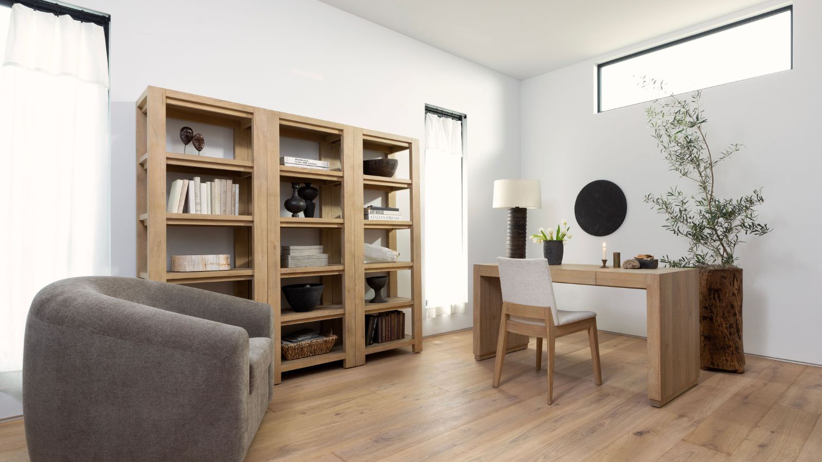
Incorporating objects with history and character can help add visual interest to a room decorated in neutrals. These unique touches elevate a space like a neutral living room from cookie-cutter to ultra-elegant.
Nate Berkus told Homes & Gardens: 'I think the right way to assemble a room that has a neutral foundation is to add a lot of things that have tremendous character, a chipping gilded mirror, a beautiful metal lamp. You know, otherwise, I think it feels really flat and that's not the point.'
He continued, 'One of the reasons why we designed the VOYAGE collection to feel so minimalistic and almost reductionist is that we really wanted people to be able to focus on building a room that had a lot of different finishes in it, had a lot of different eras, had a lot of different things that had patina.'
By decorating with antiques and decorating with vintage, Nate and Jeremiah suggest you can bring your neutral space to the next level.
Sign up to the Homes & Gardens newsletter
Design expertise in your inbox – from inspiring decorating ideas and beautiful celebrity homes to practical gardening advice and shopping round-ups.
2. Incorporate Texture
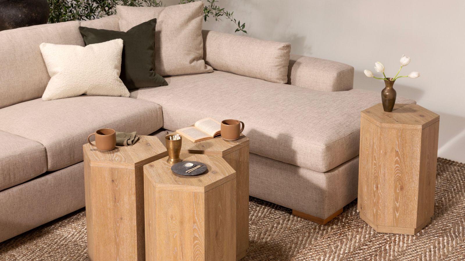
When asked about how he likes to layer neutrals, Jeremiah Brent responded: 'It's all about texture and contrast in the right way. I think a neutral palette is super transitional, but I think there's still a lot of texture you can bring in with that neutrality.'
He added, 'In the collection, we have what almost looks like a travertine with the marble, you know, the driftwood, mixing different oaks. When using neutral colors, I think you can still have a lot of fun and play with the texture in a way that still feels layered.'
By using texture in interior design, you add visual interest to your space without sacrificing the calming color palette.
3. Play with Contrast
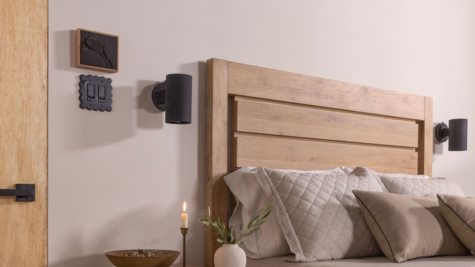
Variety is the spice of life, and apparently, of neutral interior design.
Nate told H&G, ' I think that for me personally, I think any space needs to have contrast. If you're too afraid of colors or if you're nervous about mixing different design areas, I think, you know, a boucle and leather, a pure performance fabric, and a sheer laying or playing around with different fabrics is a really fun way to do it.'
Nate continued, 'We both believe that your home should feel assembled and collected, and even if you're buying, especially if you're buying new pieces, they should blend in really beautifully with any design aesthetic.'
By mixing and matching fabrics, textures, and eras, you can layer your interior design to create a neutral space that is full of character. Nate and Jeremiah wouldn't have it any other way.

Sophie is a News Editor at Homes & Gardens, where she works on the Celebrity Style team. She is fascinated by the intersection of design and popular culture and is particularly excited when researching trends or interior history. Sophie is an avid pop culture fan. As an H&G editor, she has interviewed the likes of Martha Stewart, Hilary Duff, and the casts of Queer Eye and Selling Sunset. Before joining Future Publishing, Sophie worked as the Head of Content and Communications at Fig Linens and Home, a boutique luxury linens and furniture brand. She has also written features on exciting developments in the design world for Westport Magazine. Sophie has an MSc from the Oxford University Department of Anthropology and a BA in Creative Writing and Sociology from Sarah Lawrence College.
-
 My orchid's leaves haven't wrinkled since moving it to this exact spot in my home – it's the easiest hack to keep these flowering houseplants hydrated
Dehydrated orchids can perk up again in the environment of a bathroom
By Tenielle Jordison
-
 Hailey Bieber's curvaceous toaster is an Italian design staple (with roots in the 1950s) – it blends retro style with modern capabilities
This toaster has stood on the countertops of 'It girls' since the '50s, and Hailey Bieber has just resurged the trend – you can follow suit for $250
By Megan Slack