Nancy Meyers's simple kitchen cabinet color perfectly complements her statement countertops – designers say her scheme will never date
A classic color scheme has never looked as chic as in the filmmaker's monochromatic kitchen


We could never tire of a black-and-white kitchen color scheme. Another thing we will never get bored of is Nancy Meyers's films with their warm, romantic plotlines and elegant interior design schemes. The filmmaker's kitchen combines the two for a glorious effect.
Meyers's black-and-white kitchen idea could easily feature in one of her movies. She designed the space with white cabinets against a white marble backsplash. Statement marble countertops stand out against the black wooden slab on her kitchen island; this feels like a welcome change since we're used to seeing countertops that match the island. Silver hardware makes everything pop, from the chrome faucet to the stainless steel hood over the stove. This simple, monochromatic kitchen color scheme will withstand the test of time.
The most notable feature that defines Meyers's space is her white kitchen cabinets. 'The white cabinets make up the base that grounds this space,' says Jennifer Ebert, digital editor at Homes & Gardens. She continues, 'The matte, painted surface of the cabinets is perfectly simple and unadorned, allowing the bolder elements, like the black island countertop and marble backsplash to stand out in sharp relief.'
A photo posted by nmeyers on

Jen is the Editor (Digital) of Homes & Gardens. Before starting this position, she had completed various interior design courses at KLC Design School, as well as working across Ideal Home, LivingEtc, 25 Beautiful Homes and Country Homes & Interiors as an interiors writer.
She continues, 'It's important to note that she's chosen to mix cabinet styles, with a few on the edge featuring glass fronts. This decision brings visual interest to the cabinets. It also lets more light into the space and allows Meyers to display some of her most beautiful kitchenware for all to see.'
The mismatch of slabs on Meyers's countertops and her kitchen island is another element that helps to make the room more eye-catching than the typical black-and-white kitchen. Ebert states: 'Most kitchens have continuity of countertops between the traditional countertops and kitchen island. By subverting this pattern, Nancy Meyers immediately brings a sense of intrigue and originality into her space. Furthermore, by placing the dark countertop in the center of the space surrounded by white, Meyers draws our eyes into the middle of the room, making the white walls appear further away and causing the room to look larger.'
Finally, Meyers's white and gray marble backsplash idea brings a sense of natural warmth and texture into her white kitchen. Ebert adds: 'Marble is a timeless material that almost always benefits the design of a kitchen. The naturally occurring veins bring movement and soothing irregularity to a minimalist, monochrome space.'
The Black and White Kitchen Edit
Classics are classics for a reason, but that doesn't mean they can't be reinvented. There is always a new spin to be taken on a color scheme, even something as traditional as a black and white space. The proof is in the pudding with Nancy Meyers's kitchen.
Sign up to the Homes & Gardens newsletter
Design expertise in your inbox – from inspiring decorating ideas and beautiful celebrity homes to practical gardening advice and shopping round-ups.

Sophie is a News Editor at Homes & Gardens, where she works on the Celebrity Style team. She is fascinated by the intersection of design and popular culture and is particularly excited when researching trends or interior history. Sophie is an avid pop culture fan. As an H&G editor, she has interviewed the likes of Martha Stewart, Hilary Duff, and the casts of Queer Eye and Selling Sunset. Before joining Future Publishing, Sophie worked as the Head of Content and Communications at Fig Linens and Home, a boutique luxury linens and furniture brand. She has also written features on exciting developments in the design world for Westport Magazine. Sophie has an MSc from the Oxford University Department of Anthropology and a BA in Creative Writing and Sociology from Sarah Lawrence College.
-
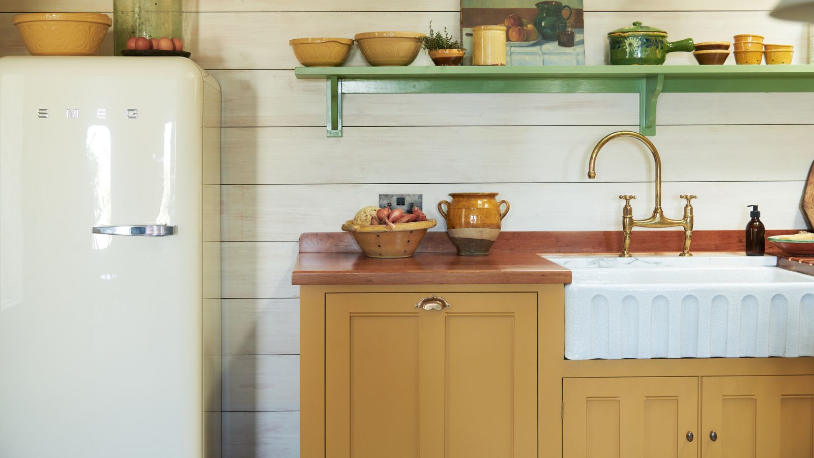 The 5 worst things you can do to your fridge – these will drive up energy costs and result in pricey and regrettable repairs
It's crucial to swerve these blunders, appliance experts warn
By Ottilie Blackhall Published
-
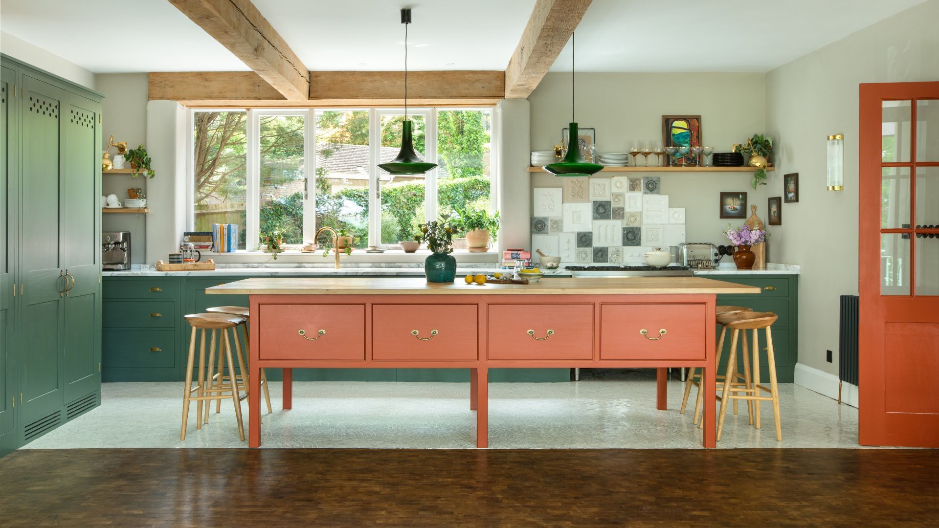 Orange and green is the bold color pairing quietly transforming homes in 2025 – here's 4 reasons why
Interior designers are making the orange and green combination work wonders – this is how you can too
By Sophia Pouget de St Victor Published
