Michael Phelps and wife Nicole keep their gray kitchen color scheme interesting using this designer-approved touch
The Olympic swimmer makes his traditional kitchen look stylish


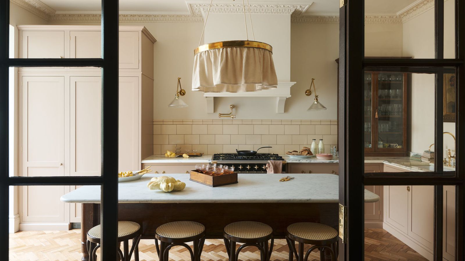
When it comes to adding visual interest to a neutral space, incorporating texture is the golden rule. While adding a few soft furnishings to a living room is easy, incorporating texture in a traditionally colored kitchen is a bit more difficult. It requires building different materials into the countertops, cabinets, and walls. Always up for a challenge, Michael Phelps and his wife Nicole Phelps designed their gray and white kitchen to be perfectly textured for a stylish and unique look.
The couple nailed the textural kitchen decor look with a combination of subway tiles on the walls, a patterned tile as the stove back, white marble countertops with gray veins, and white wooden cabinets.
A post shared by Nicole Michele Phelps (@mrs.nicolephelps)
A photo posted by on
Interior designers love the way that the varied textures in Michael and Nicole Phelps' gray and white kitchen interact to create a cohesive look and make the color scheme interesting. Pamela Hayes, an interior designer based in Marin County, California, says: 'White marble is a classic countertop material. The use of white subway tile for the backsplash compliments the marble while incorporating a patterned accent tile behind the range is an opportunity to add color and depth to the space.'
After an impressive career in commercial architecture with San Francisco's leading firms, Pamela Hayes began her design company in Marin in 2004. She passionately creates beautiful, functional, and flowing spaces.
Jason Yama, interior designer at Parlun Building adds: 'When these materials come together in one kitchen, they create a richly diverse yet harmoniously unified overall effect. Simple geometric patterned tiles in light colors coordinate well with the cabinets and marble, while neutral subway adds fun to the kitchen. Natural marble with fine and smooth texture maintains an elegant feel without being too ornate.'

Jason has been working as a professional interior designer at Parlun Building since 2015. He works on residential, commercial, and hospitality projects to meet clients' unique preferences and needs.
The experts also love how the varied textures of Michael Phelps's kitchen walls add visual interest. Pamela says, 'Balancing a white marble slab with a decorative tile behind the range draws the eye to a feature wall and infuses the wall with a rich color and/or pattern. Using a simple white subway tile in the rest of the backsplash keeps the design from appearing overly busy.'
Furthermore, interior designers say that these materials pair perfectly with white kitchen cabinets. Pamela states: 'Painted white cabinets paired with white marble are a classic and timeless design. Incorporating a decorative tile backsplash behind the range adds a touch of unexpected color and pattern that elevates the whole kitchen.' By incorporating these varied textures alongside classic colors and finishes, Michael Phelps and his wife have created a truly special kitchen.

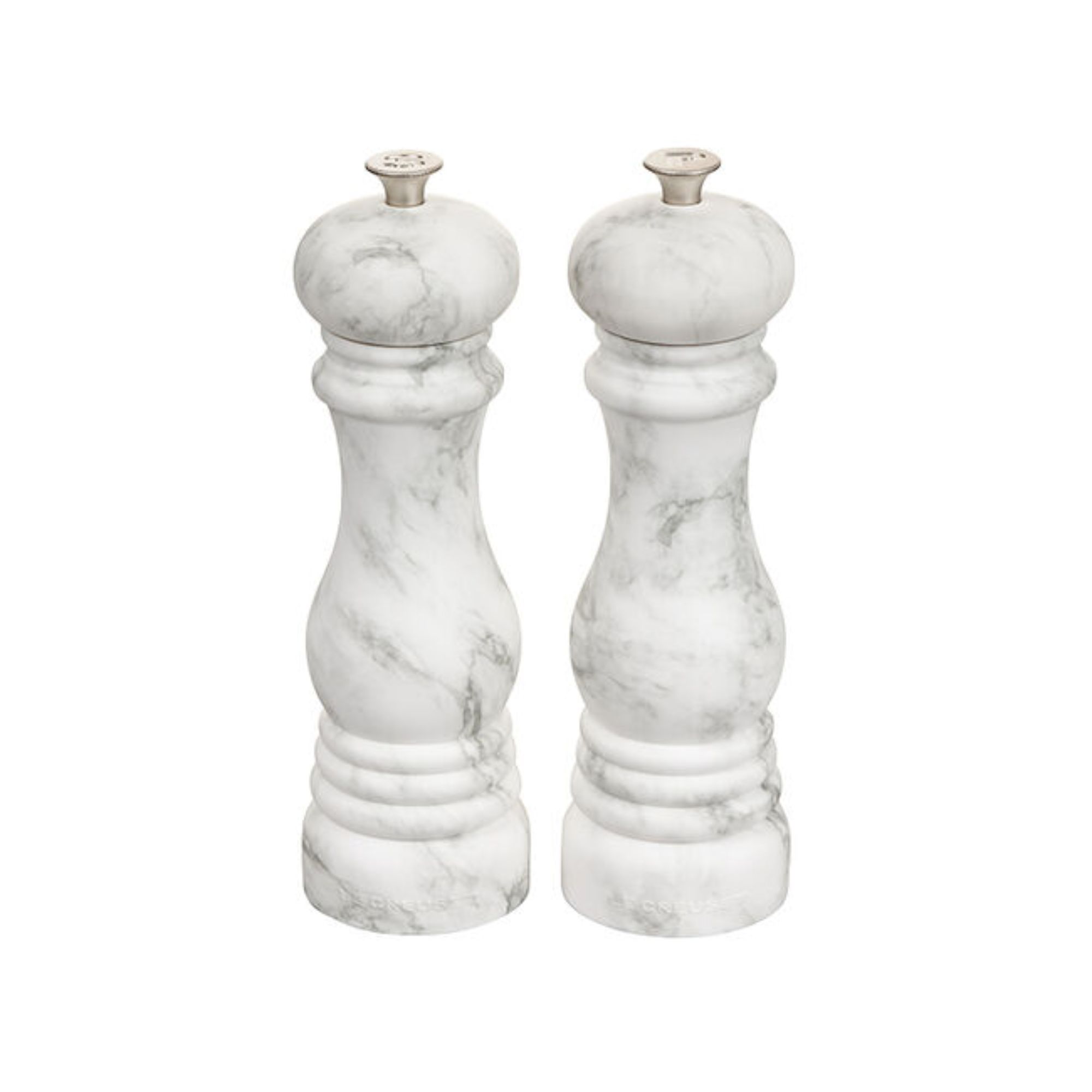
This stylish mill set adds a touch of color coordinated texture to any gray and white kitchen.
Even if you don't have the budget for a full remodel, incorporating textural details through kitchen appliances, curtains, and tea towels can go a long way to spice up a neutral space. If Nicole and Michael Phelps's kitchen is an inspiration, check out our list of kitchen trends for more ideas.
Sign up to the Homes & Gardens newsletter
Design expertise in your inbox – from inspiring decorating ideas and beautiful celebrity homes to practical gardening advice and shopping round-ups.

Sophie is a News Editor at Homes & Gardens, where she works on the Celebrity Style team. She is fascinated by the intersection of design and popular culture and is particularly excited when researching trends or interior history. Sophie is an avid pop culture fan. As an H&G editor, she has interviewed the likes of Martha Stewart, Hilary Duff, and the casts of Queer Eye and Selling Sunset. Before joining Future Publishing, Sophie worked as the Head of Content and Communications at Fig Linens and Home, a boutique luxury linens and furniture brand. She has also written features on exciting developments in the design world for Westport Magazine. Sophie has an MSc from the Oxford University Department of Anthropology and a BA in Creative Writing and Sociology from Sarah Lawrence College.
-
 Jeremiah Brent's new NYC-inspired rug collection has got to be the easiest way to bring his modern Manhattan style into your own home
Jeremiah Brent has teamed up with Loloi Rugs to create a contemporary collection of home furnishings inspired by his city
By Eleanor Richardson
-
 I tried this one easy dishwasher trick and made the annoying need for manual drying a thing of the past
If you hate those little pools of water left on your cups and crockery, this towel trick is for you
By Punteha van Terheyden