Michael Douglas and Catherine Zeta-Jones' simple kitchen cabinet color is a masterclass in balance and contrast
A classic cabinet color shines in the actors' kitchen. The actors space proves why this traditional look is always in style


The black and white kitchen will never go out of style. The traditional look is endlessly on-trend, no matter how long it has been around. There are countless examples proving this theory, but Michael Douglas and Catherine Zeta-Jones's kitchen is one of the chicest we've seen.
The actor power couple's kitchen features classic white cabinets with gold hardware. Their backsplash is made up of white subway tiles, and the countertops are matte black stone. In front of the cabinets, a glossy black circular table and organically shaped chairs boldly contrast the rest of the space.
Rather than being an interior design trend, the white kitchen idea is grounded in classic design history. Interior designers are in love with the simple but elegant style.
A post shared by Michael Douglas (@michaelkirkdouglas)
A photo posted by on
'This kitchen cabinet combination works so well because it fulfills so many basic principles of good design, like balance, contrast and emphasis,' states Gaia Guidi Filippi, principal designer at her Dallas-based interior design studio. The color opposites reflect off of one another, making both shades look more dramatic. Balance comes in through the careful equilibrium between black and white; an abundance of white with touches of black makes the room feel bright and contemporary, rather than crowded and dark.

Gaia Guidi Filippi is the owner and principal designer of Gaia G Interiors in Dallas, TX. She founded her interior design firm out of a love of combining her innate creativity, discerning eye and endless resourcefulness to help people create spaces they can’t stop looking at. Her creative process merges beauty and functionality, culminating in bespoke, design-forward yet welcoming spaces.
Douglas and Zeta-Jones's kitchen color combination is also popular for its versatility. Filippi continues, 'It’s applicable to kitchens across so many design styles from rustic to transitional and modern, depending on the cabinetry details and other elements in the space. By adding other layers, like wood floating shelves or a vintage-inspired range, you can make this classic look entirely bespoke.'
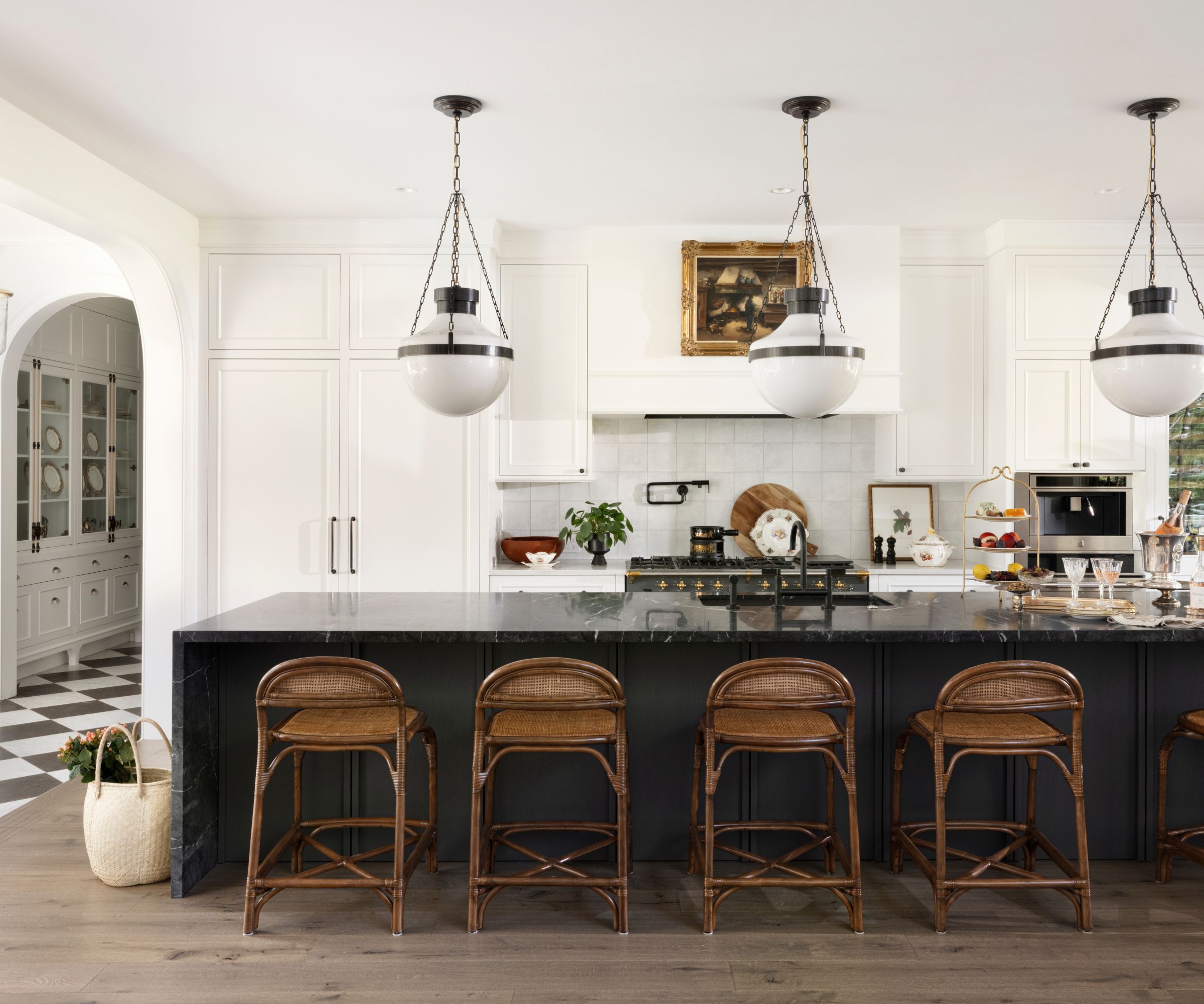
Aside from the built-in elements of the couple's kitchen, the decorative accents and furniture complement the space. Filippi says, 'Placing a black table in a kitchen with these elements further grounds the space and is be a nice contrast to the cabinetry.' Jennifer Ebert, color expert at Homes & Gardens adds: 'The organic lines of the countertop sculpture and open back chairs artfully mix with the clean straight lines of the countertops and subway tiles adding visual interest to the space.'

Jen is the Editor (Digital) of Homes & Gardens. Before starting this position, she had completed various interior design courses at KLC Design School, as well as working across Ideal Home, LivingEtc, 25 Beautiful Homes and Country Homes & Interiors as an interiors writer.
Shop the Black and White Kitchen Edit
If you're looking for a timeless scheme that will never age, a black and white kitchen is the perfect match. The style relies on tried and true design principles like balance, contrast, and rhythm. For the ideal example, look no further than Michael Douglas and Catherine Zeta-Jones's kitchen.
Sign up to the Homes & Gardens newsletter
Design expertise in your inbox – from inspiring decorating ideas and beautiful celebrity homes to practical gardening advice and shopping round-ups.

Sophie is a News Editor at Homes & Gardens, where she works on the Celebrity Style team. She is fascinated by the intersection of design and popular culture and is particularly excited when researching trends or interior history. Sophie is an avid pop culture fan. As an H&G editor, she has interviewed the likes of Martha Stewart, Hilary Duff, and the casts of Queer Eye and Selling Sunset. Before joining Future Publishing, Sophie worked as the Head of Content and Communications at Fig Linens and Home, a boutique luxury linens and furniture brand. She has also written features on exciting developments in the design world for Westport Magazine. Sophie has an MSc from the Oxford University Department of Anthropology and a BA in Creative Writing and Sociology from Sarah Lawrence College.
-
 The instinct-based Toddler Decluttering Method will reduce clutter by half in seconds – and it's not for children
It's a simple but effective method to cull clutter quickly in your home
By Ciéra Cree
-
 How to grow sesame plants and harvest nutrient-rich seeds for snacking, cooking, or baking
Sesame plants are easy to grow, provided you have a warm climate
By Drew Swainston

