Meryl Streep shared a throwback photo from The Devil Wears Prada – and this room is still desirable 18-years later
This classic combination can completely alter the feel of a room but getting the balance right is key
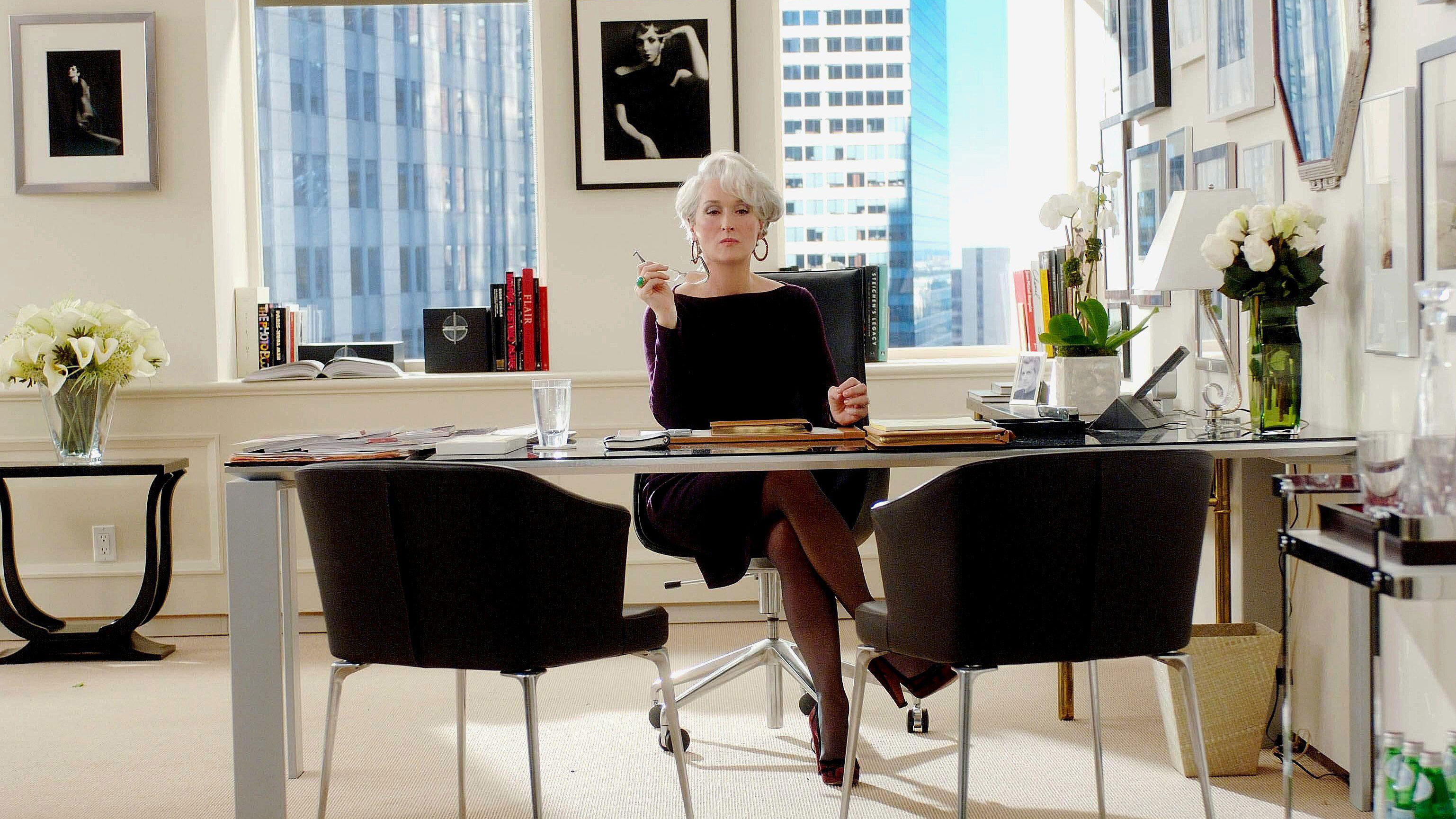

Whenever I think about redesigning my home office, my mind will forever turn to images of Miranda Priestly's expansive monochromatic space in The Devil Wears Prada. I was 17 years old when this movie came out, and it cemented my desire to pursue a career in journalism. It wasn't necessarily the fashion I was interested in – albeit beautiful – it was the interiors.
So when Meryl Streep, the actress who brilliantly played the titular role, shared a throwback photo from the set on her Instagram feed, with the iconic office in the background, it reminded me that although fashions and tastes change over time, some interior design trends remain eternal. In this case, the color trend for decorating with black and white is one of those timeless color combinations for rooms that will never fade.
The black-and-white palette is as timeless as civilization itself; think chalk on a blackboard, black-and-white films – the list goes on. It's almost as though monochrome – and the tones that separate its two opposite parts – is not really a palette at all, but rather a default option that we turn to when we're unsure of treading a more 'interesting' path. But that would be to underestimate what this combination can do.
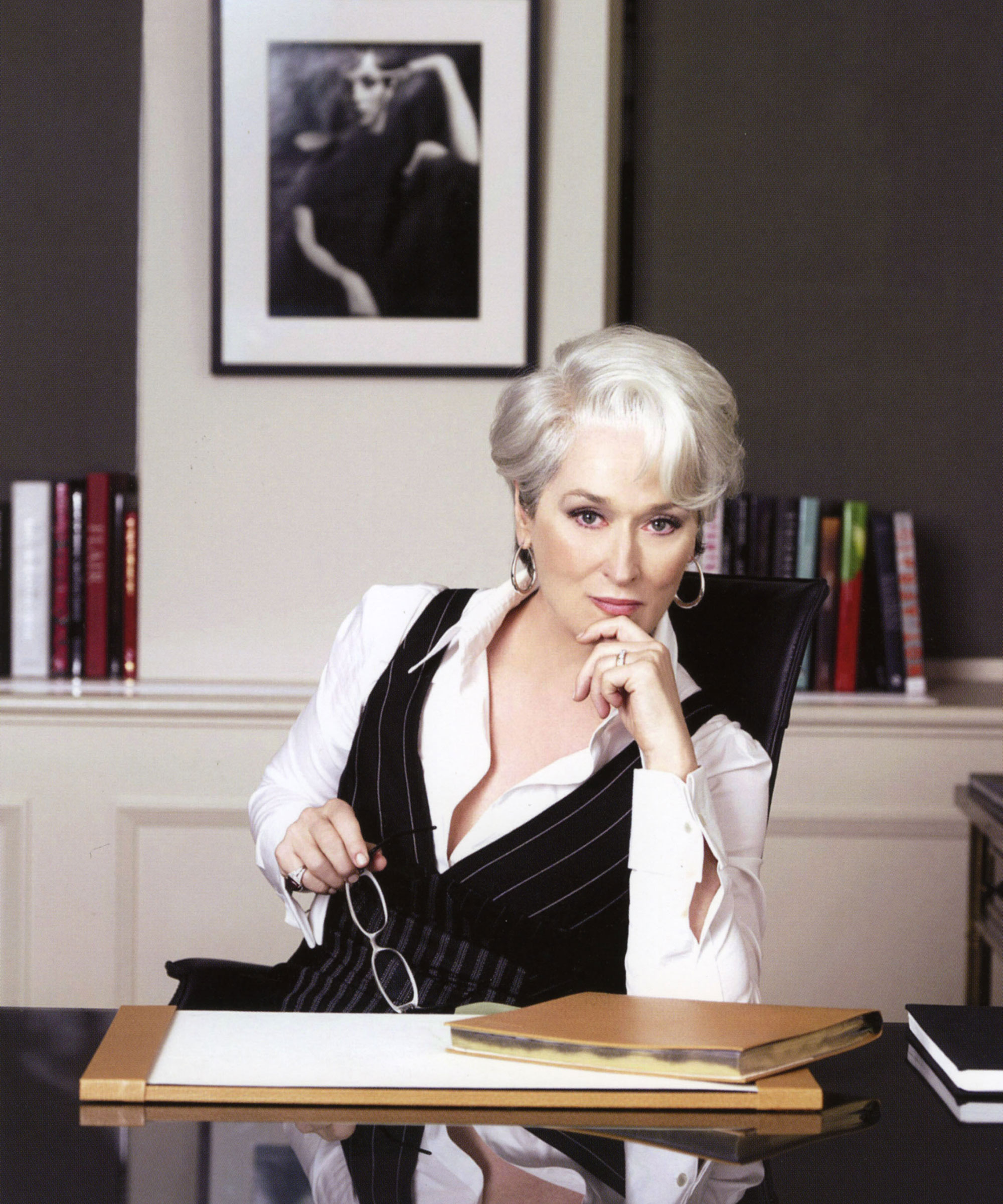
Black and white can be used anywhere in the home, but choosing the right shades is crucial. A sharp, clear white and black feels powerful, timeless and strong, whereas a softer white and charcoal is a gentler incarnation of monochrome.
Texture is perhaps more important than ever when using monochrome – a play of different surfaces will add that all-important personality and vivacity to a scheme. Follow Priestly's lead and decorate with glass, wood, linens, leather and chrome, while keeping the palette tight.
Black and white has always had a degree of graphic detail, but it's vital to ensure the base notes are harmonious. For example, not all whites are the same. Think of the cold blue-white of ice or the greenish hints of apple blossom. They're both white, yet can clash in a much more jarring way than some other colors.
Just as there are shades of white, there are also shades of black; consider the earthiness of ebony compared with the luminous quality of jet. So before you use the color pairing in your home office, use samples of fabric and wallpaper, cover large pieces of card with paint, and then put them all together. Instantly you will see which shades feel harmonious and which look and feel 'wrong'.
Sign up to the Homes & Gardens newsletter
Design expertise in your inbox – from inspiring decorating ideas and beautiful celebrity homes to practical gardening advice and shopping round-ups.
Shop the look
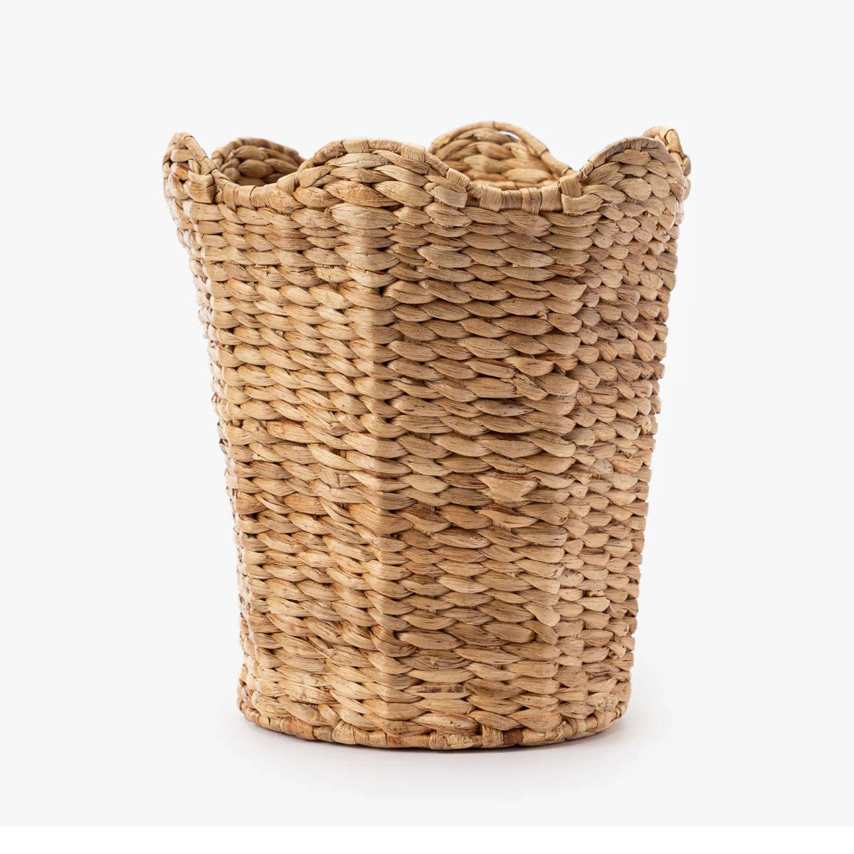
The new requisite for furniture and textiles is that they bring texture to a scheme, sparking a revival in woven forms. Woven from water hyacinth, this waste bin features a scalloped rim that gives it a playful feel and adds detail and dimension to your space.

Everyone loves to receive bouquets of roses – it’s a classic gift that never goes out of fashion. This arrangement might only be faux, but at least you'll know it will be everlasting.
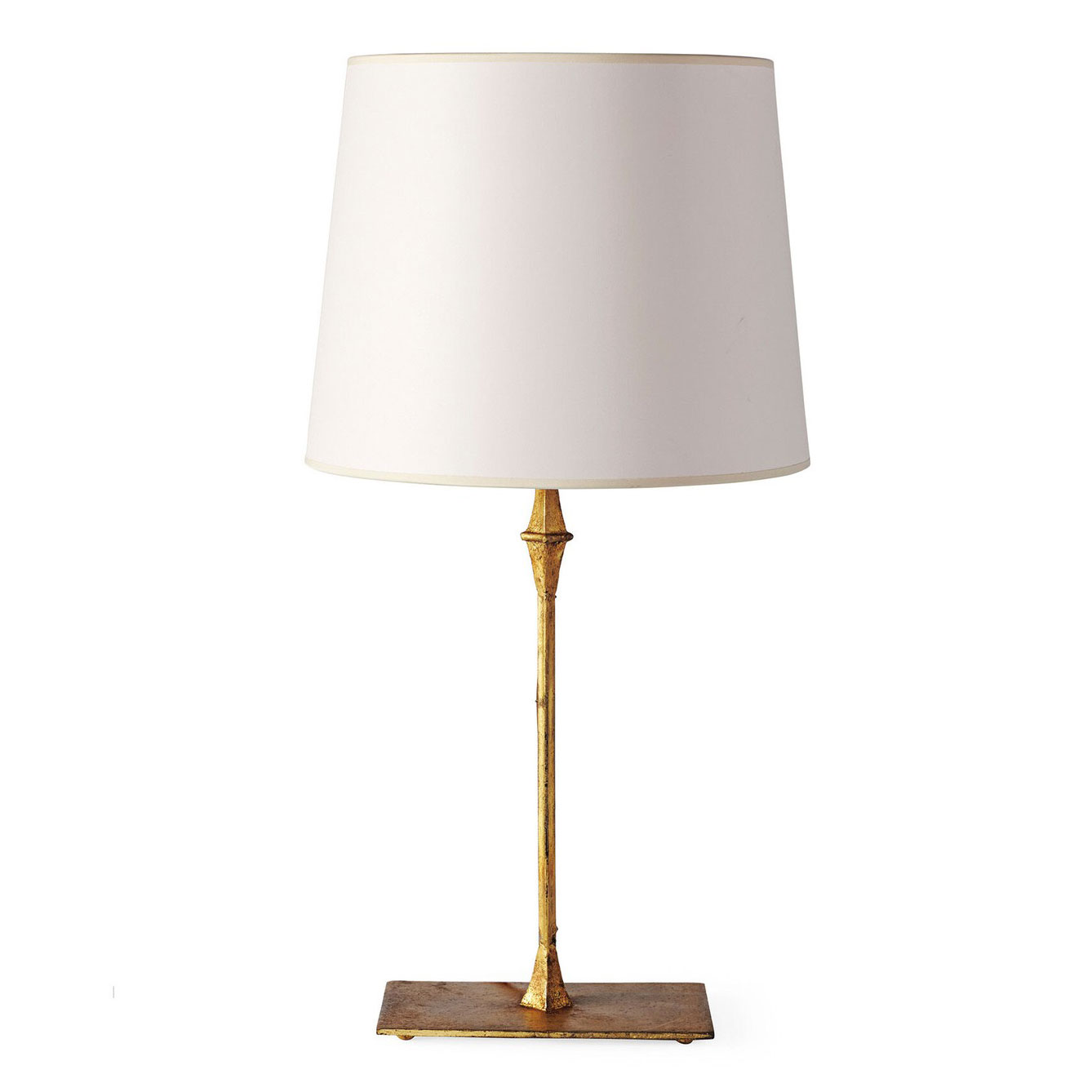
Besides the desk and chair, a table lamp is one of the most fundamental elements of a home office. Serena & Lily is one of my favorite stockists for lighting, especially if you are after the most classic, timeless designs.
Even a room that’s lacking in bold color can still be bursting with visual appeal. Many interior designers love working with a black-and-white color palette because it can really translate to any design style. The key to doing is successfully is to embrace a variety of elements that will add interest. You’ll want to combine materials and textures, which will create contrast and a sense of dimension.

Jennifer is the Digital Editor at Homes & Gardens. Having worked in the interiors industry for several years in both the US and UK, spanning many publications, she now hones her digital prowess on the 'best interiors website' in the world. Multi-skilled, Jennifer has worked in PR and marketing and occasionally dabbles in the social media, commercial, and the e-commerce space. Over the years, she has written about every area of the home, from compiling houses designed by some of the best interior designers in the world to sourcing celebrity homes, reviewing appliances, and even writing a few news stories or two.
-
 Triangular shaped garden ideas – landscape designers share 9 ingenious ways to redesign your corner plot
Expert tips for planning, planting and finessing a triangular shaped plot, so you can savour the space year round
By Jill Morgan
-
 These are the 6 things designers say you should never put in a small living room
The items that should be banned from a small living room are right here along with what you should opt for instead
By Sarah Warwick