Before and after: Meg Ryan's kitchen went from outdated to fashionable – with a focus on 4 key trends for 2024
A simple color change, contemporary cabinetry, and a focus on flooring and storage turned this space into a modern marvel


American actress Meg Ryan has graced our TV screens for many years as everyone's favorite celebrity crush, from When Harry Met Sally to Sleepless in Seattle, City of Angels, and You’ve Got Mail, she certainly knows a thing or two about world-class style, especially when it comes to designing a kitchen.
To help pull the final space together, Meg Ryan enlisted the expertise of Becker Studio to help her reimagine her Californian home.
In Meg Ryan's kitchen makeover, warm wood accents and subtle veining on the backsplash and countertops help to create depth and dimension. We think these popular kitchen trends will go the distance in 2024.
A post shared by Becker Studios (@beckerstudios)
A photo posted by on
1. Expensive color combination
Decorating with black and white is brave, requiring careful editing and a strong design eye. This type of interior can also appear ‘flat’ if you don’t introduce texture and subtle tonal variety. But put together carefully, it’s a great way to add drama and style, as Ryan's modern farmhouse kitchen beautifully demonstrates.
While monochrome decorating can be tricky to master, a considered approach will be rewarded with a simple but impactful scheme. Monochrome interiors can work especially well in period or farmhouse-style homes, where a one-tone canvas highlights and complements the original features.
But tone and texture are important – remember that the most successful monochrome interiors combine movement and depth with tactile pieces to create an interesting narrative.
Before, the kitchen consisted of gray cabinetry, blue wall tiles and cream walls – a jarring color combination best avoided in the heart of the home.
Sign up to the Homes & Gardens newsletter
Design expertise in your inbox – from inspiring decorating ideas and beautiful celebrity homes to practical gardening advice and shopping round-ups.
A post shared by Meg Ryan (@megryan)
A photo posted by on
2. Marble surfaces
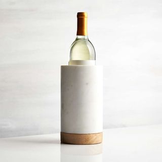
Few materials can create a feeling of luxury in kitchen design that marble can. Elegant, understated and effortlessly beautiful, marble is a worthy investment if you want to make a kitchen look expensive.
Marble is more versatile than many people realize, believe Angus and Charlotte Buchanan of Buchanan Studio. ‘We love to use it to elevate details and touchpoints around the home such as on a kitchen backsplash, or countertop’ they say. ‘But you can also use offcuts for displaying objects such as on shelves or side tables.’
Let the color and veining of the marble dictate your space. ‘I choose the marble before anything else in the room and then the scheme evolves from there,’ says interior designer Sarah Southwell. ‘I then pick out colors and textures to create a scheme that complements the marble.'
There is a point at which it is possible to overdo the use of one material, however. To avoid the space looking sterile and cold, add a warm finish in a material such as wood or metal as a subtle touch.
3. Warm wood accessories
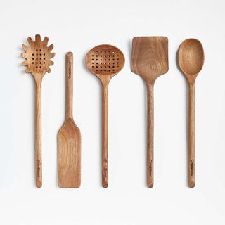
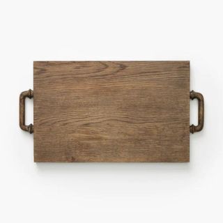
If there is one material that will never date, it is wood. Introducing warm wood and timber accents into your kitchen ideas is nothing new – they have been a popular choice for years because of their timeless appeal, not to mention the fact wood is a durable material that gets better with age.
The beauty of wood is undeniable, and if you love modern kitchens but also don't want the cold or clinical feel that often accompanies modern design, then investing in timber accessories will warm up your room in an instant. Here, Meg Ryan and designer Monique Gibson have chosen dark wood for its old-meets-new charm.
'The dark wood trend has much to do with the popularity of beige and the general distancing from gray in which we seem to be collectively partaking,' says interior designer Bethany Adams. And if there are any color lessons to take away, it's to err on the side of warmth.
4. Arches on alcoves
A popular interior design trend since 2020, architecturally inspired curves are of the moment, with soft, rounded lines cropping up everywhere of late. They can visually draw attention to the height of your walls, making any room look more spacious.
Arches have been a prominent feature in architecture since Roman times. Fast forward to 2024 and indoor residential arches are once again an incredibly popular feature. It’s easy to see why – they’re romantic, full of character and help soften the more angular lines of a room, especially in a modern kitchen, similar to Meg Ryan's.
If you have the opportunity to start from scratch, a storage arch is a compelling way to introduce architectural character, as demonstrated in this striking build by architect Joel Barkley. The arch, embodying both form and function, serves as a visual anchor, grounding the room with its timeless appeal.
Shop the look

Jennifer is the Digital Editor at Homes & Gardens. Having worked in the interiors industry for several years in both the US and UK, spanning many publications, she now hones her digital prowess on the 'best interiors website' in the world. Multi-skilled, Jennifer has worked in PR and marketing and occasionally dabbles in the social media, commercial, and the e-commerce space. Over the years, she has written about every area of the home, from compiling houses designed by some of the best interior designers in the world to sourcing celebrity homes, reviewing appliances, and even writing a few news stories or two.
-
 How to remove yellow wood sorrel – expert advice on ridding your garden of this explosive weed
Discover the best methods of removal and prevention of yellow wood sorrel
By Ellen Wells Published
-
 I’m a homes editor and these are the 4 vital storage items I’m 'adding to cart' this spring – and why you should too
I've learned a few hard lessons in recent weeks and these storage solutions will help
By Punteha van Terheyden Published


