Martha Stewart’s boho chic table has a unique color scheme – and experts say the combination has surprising effects
The lifestyle guru debuted a new table-setting color idea and the psychology behind it is fascinating


Martha Stewart is the reigning lifestyle queen and her propensity for hosting is an excellent example. Recently, the former Martha Stewart Show host held a dinner party at her home where she and Chef Lazaro served a Mexican-inspired feast. Alongside photos of mouthwatering margaritas, toasty tamales, and perfectly seasoned carnitas, the 82-year-old Sports Illustrated cover model shared pictures of her beautiful table setting.
A post shared by Martha Stewart (@marthastewart48)
A photo posted by on
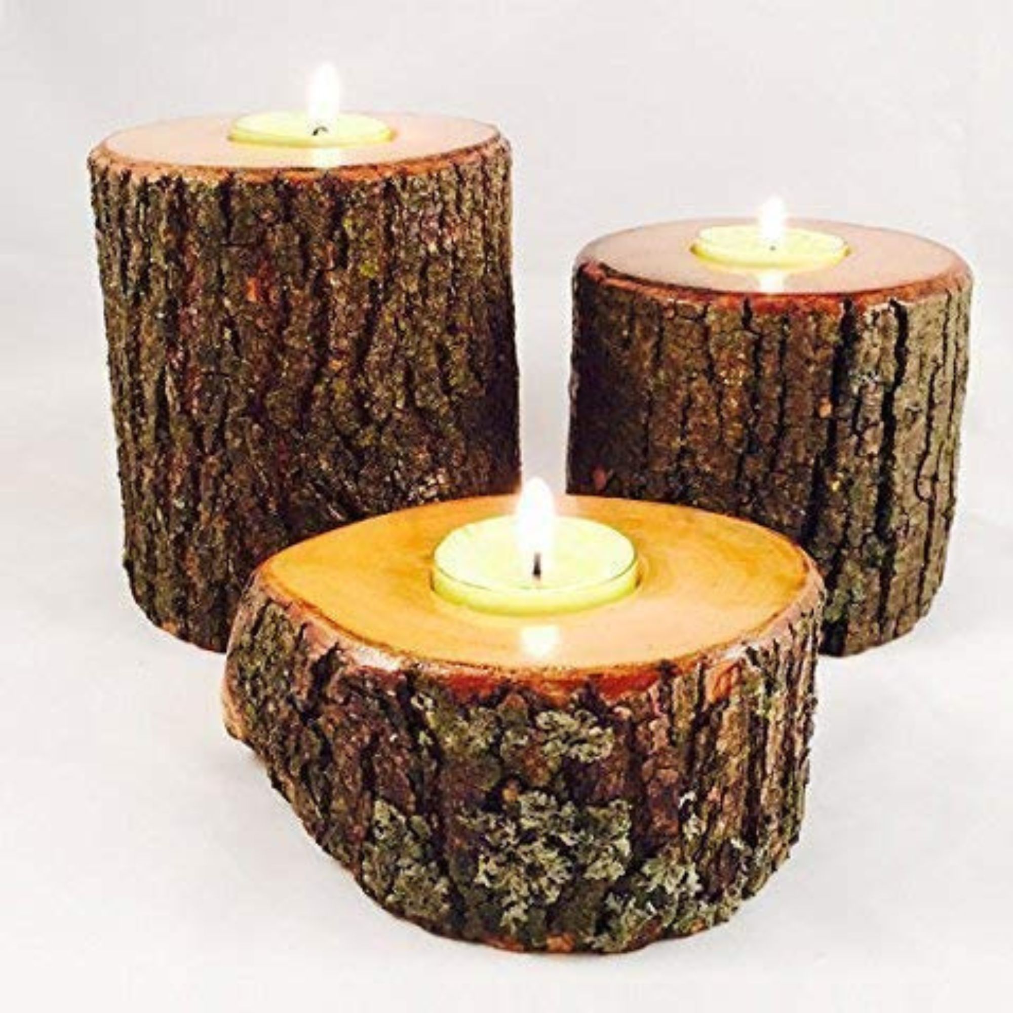
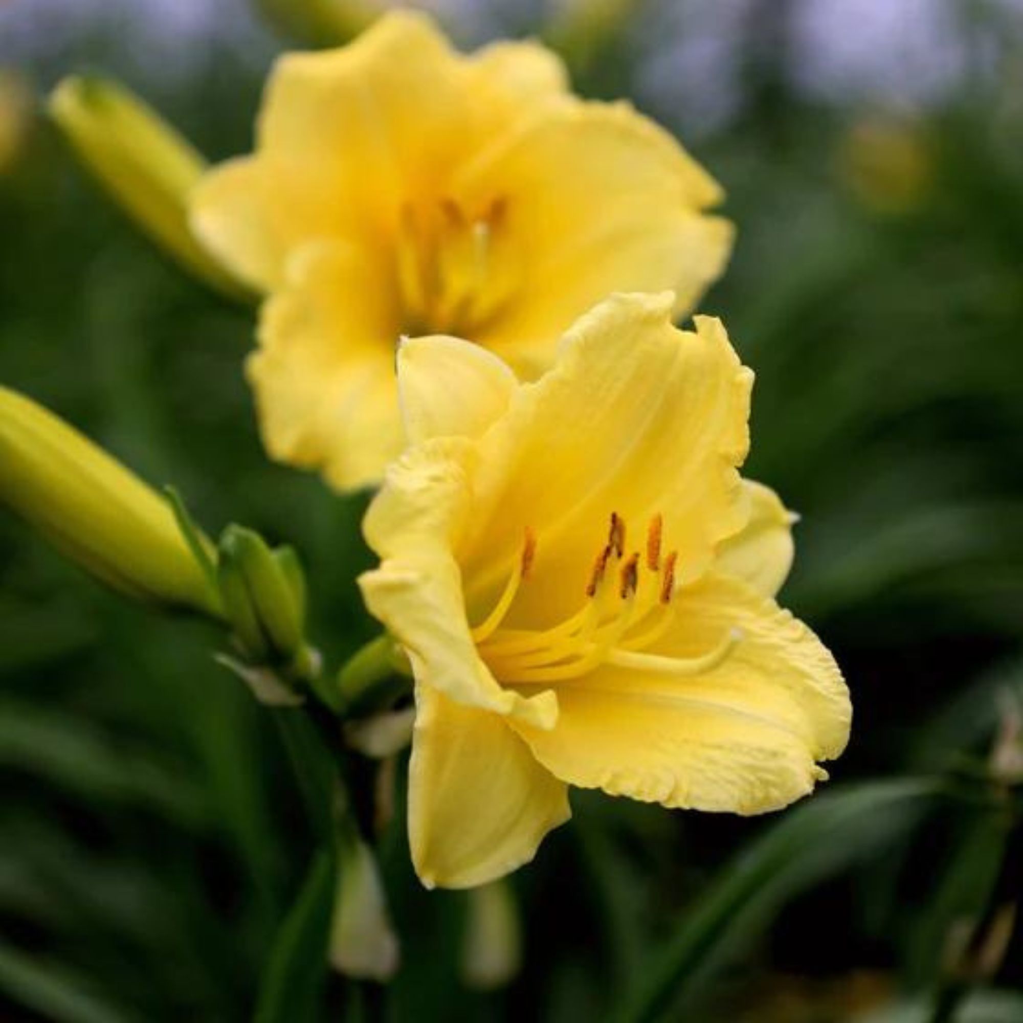
Martha’s beige granite table is oblong, with natural brown rattan placemats at each place setting. The table includes dusty rose pink napkins with Martha’s initials ‘MS’ embroidered in a matching thread in the center. Yellow lilies in a brown pot are the perfect centerpiece and pinky brown clay glasses emphasize the natural elements of the space. Though the whole room is stunning, the interesting pink and brown dining room color scheme is the star of the show in Martha Stewart’s rustic chic home.
Entertaining experts love the neutral color combo for its versatility. ‘This color combo is gender neutral and works well ALL year round – for all seasons. This will work great for a couples dinner party, any time of the year!’ says Amy Sue DuBois, event calligrapher, and table setting expert. Though brown alone might make for a more fall table decor, the addition of pink brightens the look to be appropriate year-round. Amy emphasizes the impressive function of this color combination stating that ‘the stark color contrast will make everything pop on your table, especially when you have brown linens with pink floral, or brown place cards with pink writing.’ This is also an easy dining table decor idea, because many dining rooms already include brown, so the trick is just to emphasize what is already there. For instance, Martha’s dark brown table settings emphasize the stylish dark wood beams on her ceilings.

Amy began Amy Sue designs started in 2017 as an established party and wedding calligrapher in Dallas. She has extensive experience creating beautiful place cards and menus for stylish table settings.
Hosts who are interested in color therapy will also love this color scheme for its calming benefits. Tia Mula, Founder of liveandwed.com says that ‘brown symbolizes earth, warmth, healing, and stability. The color combo is cozy and comforting with pink. This makes it popular in boho chic and rustic houses. Brown conveys natural and organic, wholesome emotions nicely.’ The grounding elements of this neutral color make it excellent for a dinner party with close friends, like Martha Stewart’s, where the warm shade will contribute to an intimate feel. ‘Pink symbolizes passion, love, romance, caring, warmth, nurturing, understanding, safety, calm, and hope’ adds Tia. This subtle addition adds to an even warmer and more loving feel in the home.
Tia Mula is the Founder and Editor-in-chief of LIVE&WED. She created the blog after her own wedding planning journey, during which she struggled to find information and resources that were specific to African weddings. She decided to create a space where other African women could come for advice, inspiration, and tips on how to plan their own perfect day.
Next time you are planning a dinner party, break out your brown placemats and pink napkins for a mood-boosting effect. Shop the edit below to shop a Martha Stewart-inspired tablescape.
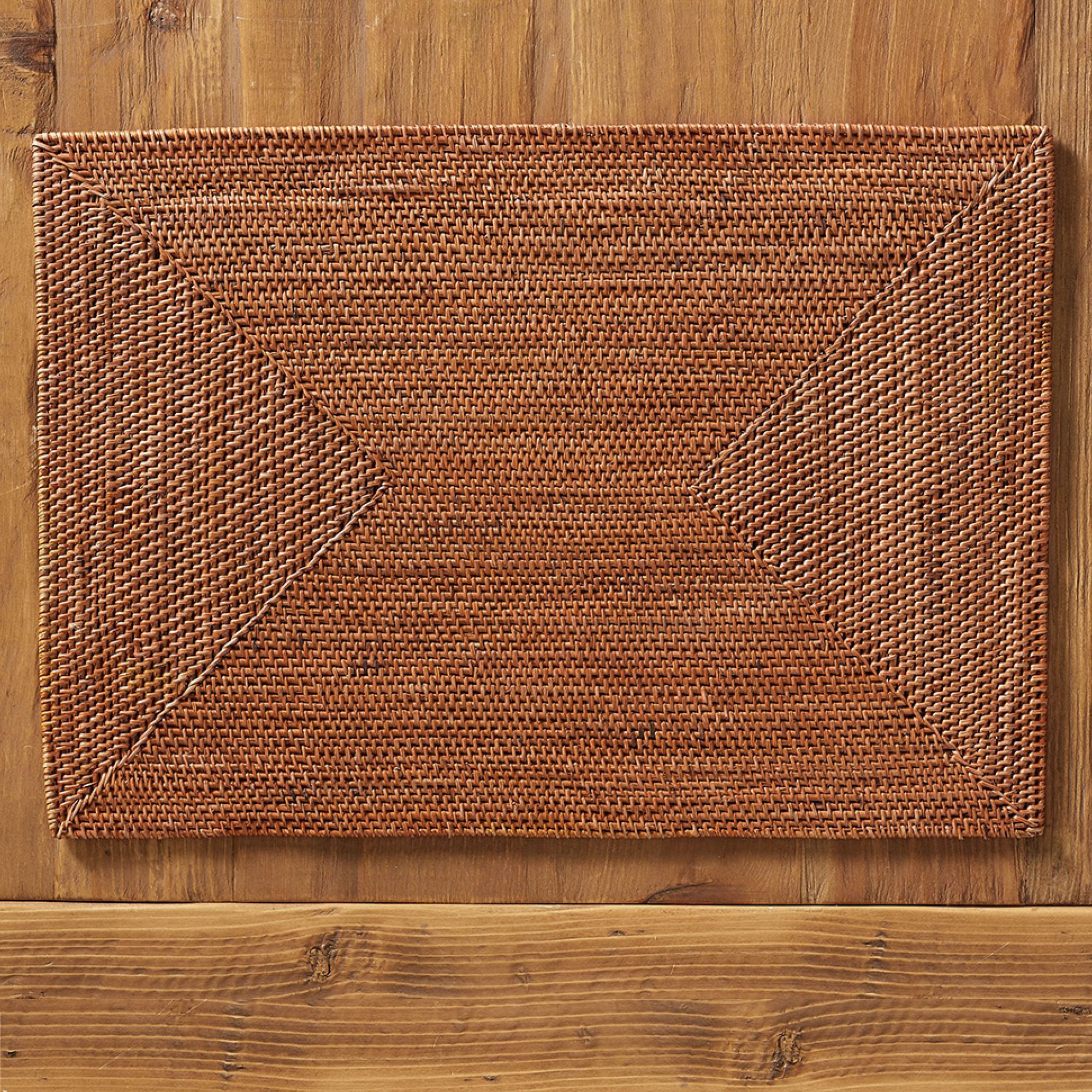
Pottery Barn's Tava placemats are handwoven of natural rattan. Made in three gorgeous colors in the perfect size of 20" by 14."
Sign up to the Homes & Gardens newsletter
Design expertise in your inbox – from inspiring decorating ideas and beautiful celebrity homes to practical gardening advice and shopping round-ups.

Sophie is a News Editor at Homes & Gardens, where she works on the Celebrity Style team. She is fascinated by the intersection of design and popular culture and is particularly excited when researching trends or interior history. Sophie is an avid pop culture fan. As an H&G editor, she has interviewed the likes of Martha Stewart, Hilary Duff, and the casts of Queer Eye and Selling Sunset. Before joining Future Publishing, Sophie worked as the Head of Content and Communications at Fig Linens and Home, a boutique luxury linens and furniture brand. She has also written features on exciting developments in the design world for Westport Magazine. Sophie has an MSc from the Oxford University Department of Anthropology and a BA in Creative Writing and Sociology from Sarah Lawrence College.
-
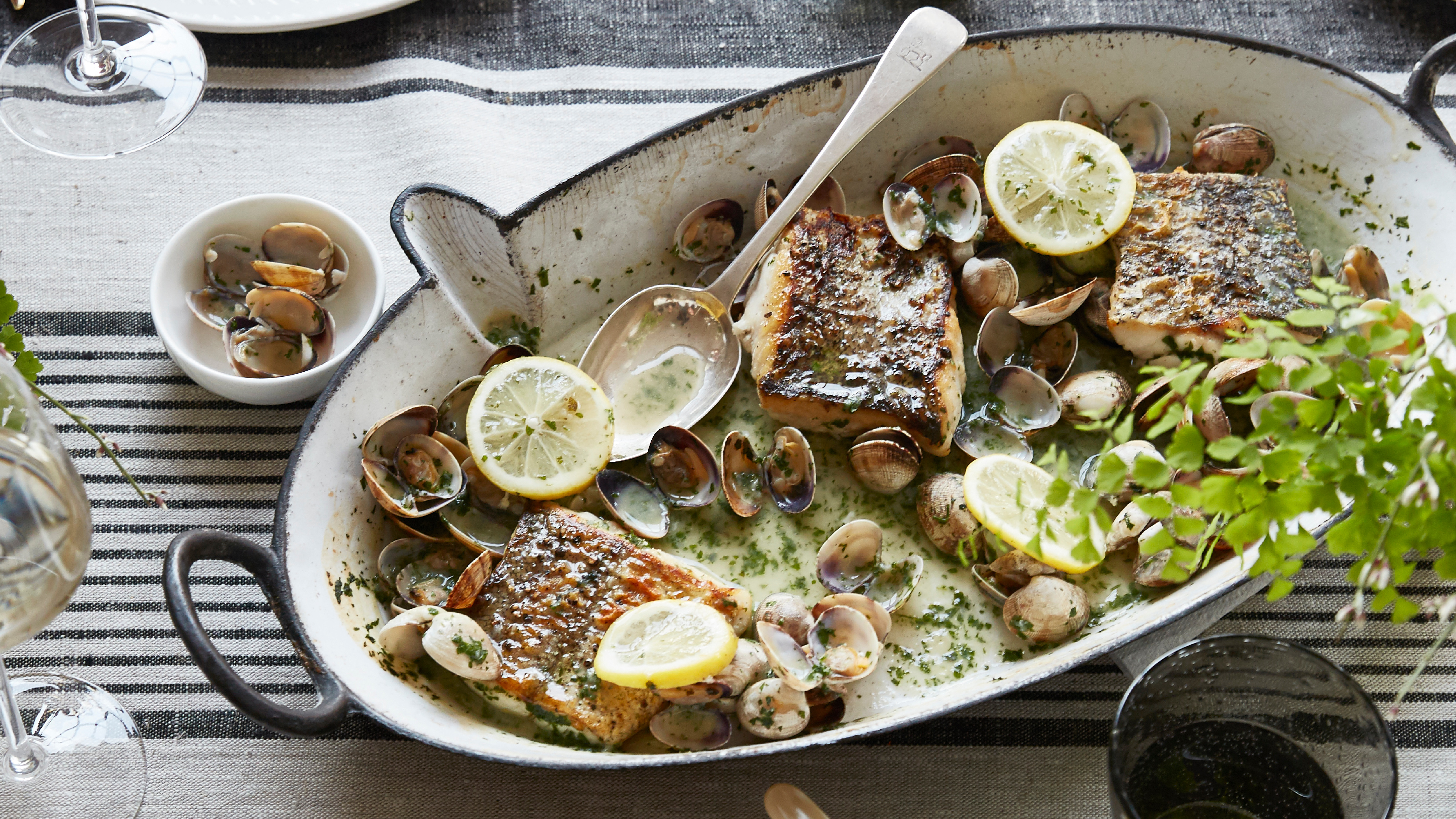 Hake and clams in parsley and wine sauce
This one-pan hake and clams recipe is light, flavourful and made for spring — perfect for impressing Easter guests without the stress
By Alice Hart
-
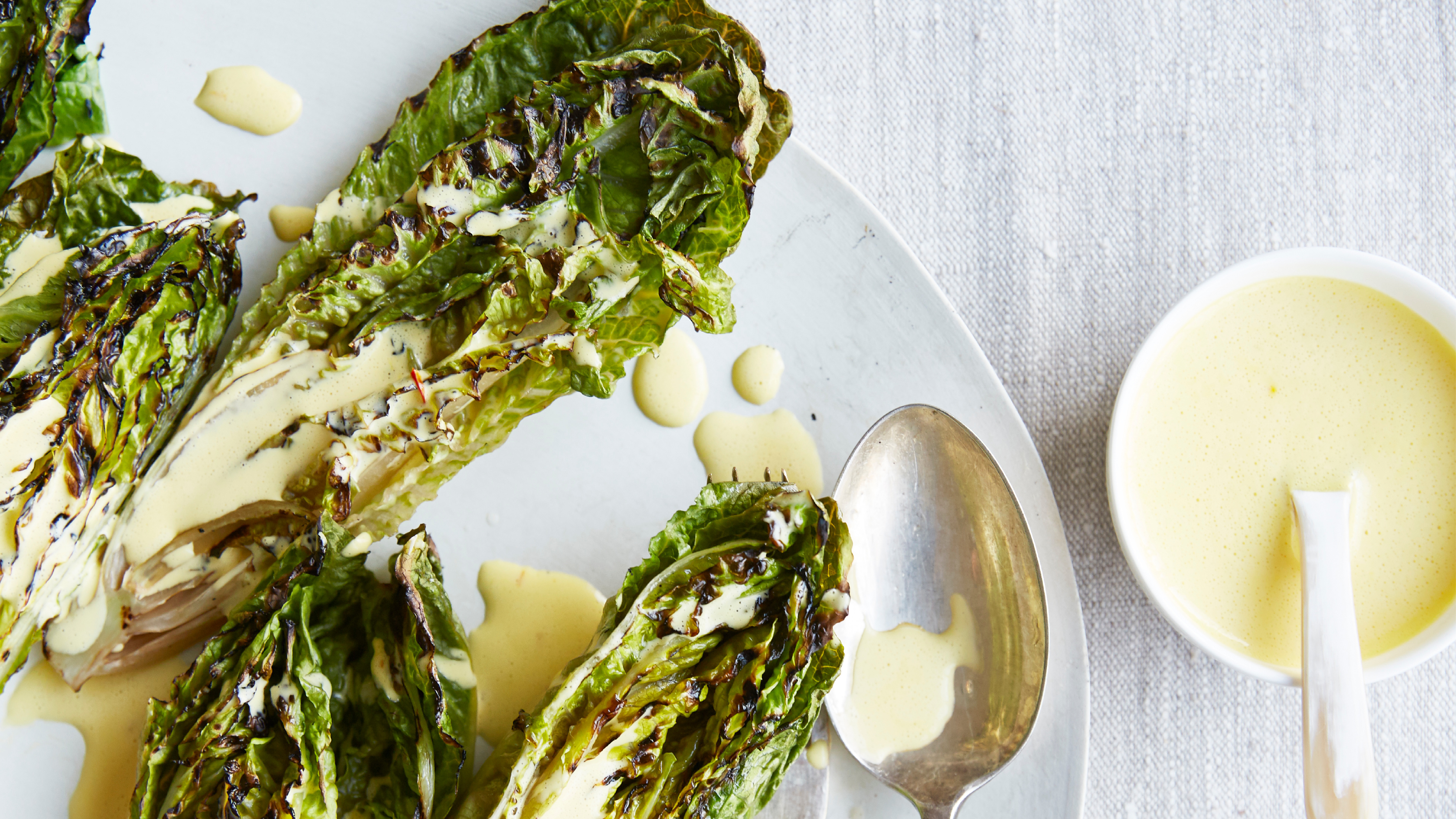 Charred little gem with saffron dressing
This recipe with charred little gem is both easy to make and sure to impress guests. It's the perfect side for fresh spring menus
By Alice Hart
