Martha Stewart's three-season room is a masterclass in harnessing space and using clever combinations
Featuring vintage green furnishings and teal Mexican tiles – this multi-functional space is the pinnacle of Martha's former Hamptons home


When Martha Stewart moved into her 1870s Hamptons cottage, it was in need of renovation – and that was exactly what it received. Together with celebrated contractor Ben Krupinski, Martha created a home that closely resembled the original property – with a modern, multifunctional twist. And nothing showcases this ideology quite as successfully as her cottage porch.
Though Martha sold the Lily Pond Lane property in 2021, the open porch remains a source of inspiration for anyone looking to extend their living (or dining) spaces – especially in homes with more compact room proportions.
In sharing the porch (below), Martha explained that she created a three-season room with a dining area by enclosing an open porch off the kitchen – and it offers a lesson in dining room design, whether we're working with a cozy cottage or not.
A post shared by Martha Stewart (@marthastewart)
A photo posted by on
Martha incorporated a floor made from teal-blue Mexican cement tiles to decorate her dining space while allowing the porch's natural wooden tones to take center stage on the walls. She dressed the room with vintage Grange, painted in a pale green hue, to complement the teal floor further.
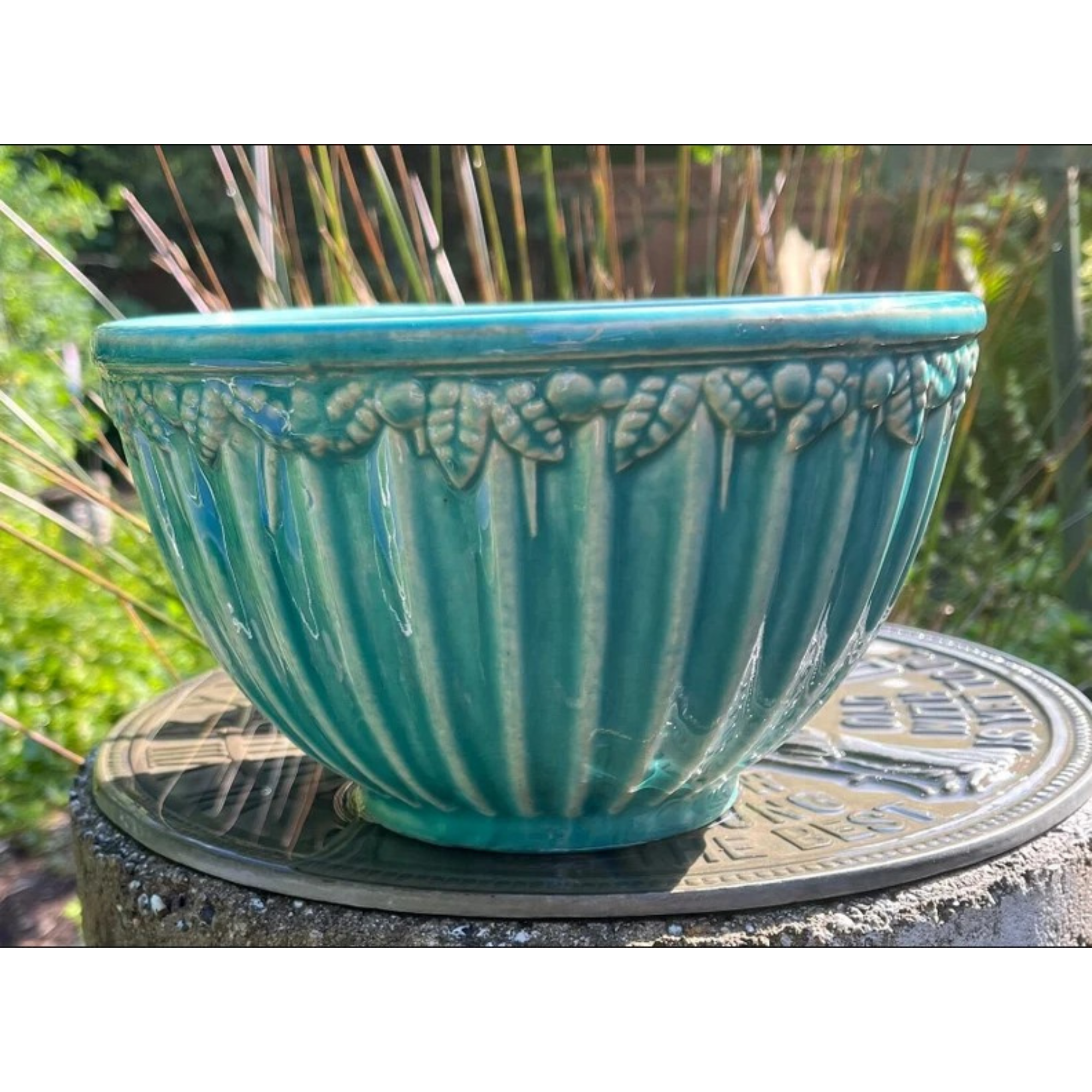
In terms of accessories, Martha adorns her mahogany shelves with her trove of aqua McCoy pottery that sits above American-made shop-style metal cabinets.
But how did the space come to exist in her cottage? Martha's blog explains that she and Ben Krupinski 'enclosed a covered porch off the kitchen to create a dining area' before wainscoting many of the ceilings. They also 'knocked down walls to create a larger living room and luxe primary suite' – accentuating the cottage space yet further.
'It's an old-fashioned house, but it has a clean, pristine vibe,' she says. To furnish this space (and every other room), Martha shopped at yard sales and antique shops that gradually filled the home 'with collections of mercury glass, McCoy pottery, and jadeite dishes.'
Sign up to the Homes & Gardens newsletter
Design expertise in your inbox – from inspiring decorating ideas and beautiful celebrity homes to practical gardening advice and shopping round-ups.
A post shared by Martha Stewart (@marthastewart48)
A photo posted by on
Between coffee alongside her pottery-filled shelves and dinner parties on her pale green chairs, Martha adds that she spent her Hamptons days at the beach, having lunch, and visiting Amagansett or Montauk nearby her cottage – usually all accessed by bike.
'We'd ride everywhere – to Nick & Toni's, to the Clam Bar on Montauk Highway, to the ferry to Shelter Island,' Martha says.
To get the Martha-approved look, we're investing in McCoy pottery, just like the ones seen on her shelving, via Etsy below.

Megan is the Head of Celebrity Style News at Homes & Gardens, where she leads the celebrity/ news team. She has a history in interior design, travel, and news journalism, having lived and worked in New York, Paris, and, currently, London. Megan has bylines in Livingetc, The Telegraph, and IRK Magazine, and has interviewed the likes of Drew Barrymore, Ayesha Curry, Michelle Keegan, and Tan France, among others. She lives in a London apartment with her antique typewriter and an eclectic espresso cup collection, and dreams of a Kelly Wearstler-designed home.
-
 ‘It leads to more headaches than it's worth’ – 4 reasons you should never store things in your oven, including fire risks and serious illness
Your oven is for cooking, and cooking only, experts urge
By Chiana Dickson
-
 Urban gardening ideas – 7 creative ways to grow in small spaces, balconies, containers, indoors, and more
Make the most of your space with these innovative ways to garden
By Tenielle Jordison
