Martha Stewart's gray-green entryway will dominate color trends in 2024 – its calming benefits are unmatched
Designers are saying gray is dead – I say long live gray-green
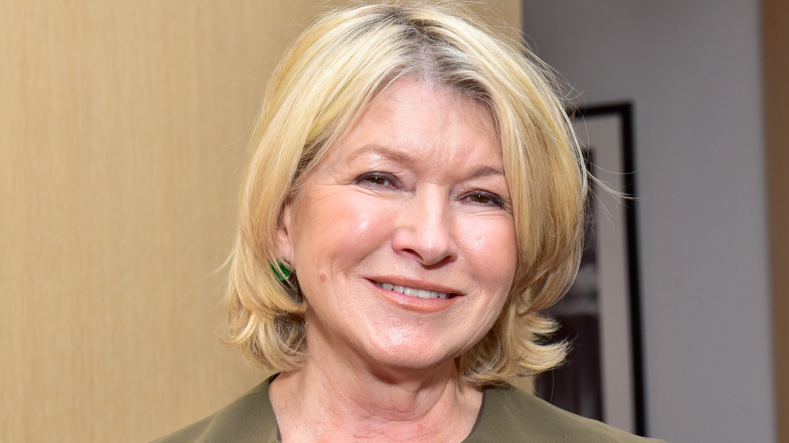

Easter might be over for another year, but America's favorite TV personality Martha Stewart is still inspiring our home decorating choices. This time, it is Stewart's entryway color idea that has caught our attention. A gray-green color that designers and forecasters predict will dominate color trends in 2024 and beyond.
Pale green, also known as gray-green, is having a moment. And no wonder: post-pandemic, cooler neutrals such as gray and white are being replaced by warmer, more inviting neutrals. Timeless, elegant, calming – there is a lot to love about a serene gray-green color scheme.
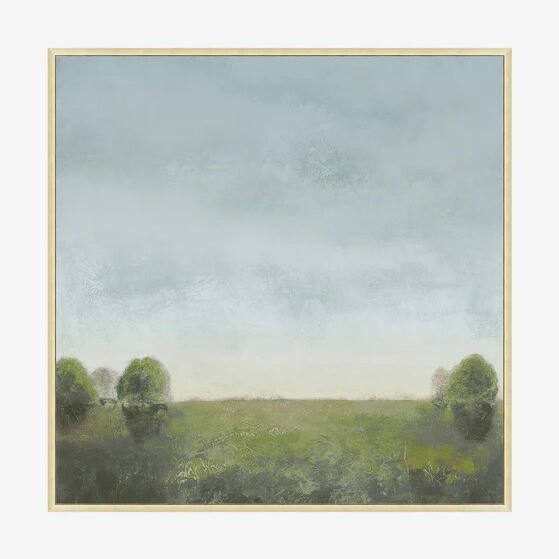
An amalgamation of gray, green and blue-brown, this shade has a moody, sophisticated feel and adds great depth to interiors. It is perfect for entrances and landings, and would work well as a background color for artwork. Color is a remarkable decorating medium and is an easy way to make your entryway more inviting.
A post shared by Martha Stewart (@marthastewart)
A photo posted by on
Classic, calming and synonymous with nature, pale green is a hue that keeps the peace, making it the ideal choice for the entrance to your home.
The color acts as an effective bridge between outdoors and inside when used in threshold spaces. When seen in enclosed rooms on wallpapers or furnishings, the color brings relief and reassurance and elegantly reminds us of the living world beyond our four walls. Pale green can refresh any room while adding a hint of nature. It works all year round, so don't be afraid to use it in the colder months too.
‘Decorating with neutrals, similar to one in Martha Stewart's home, while avoiding a minimal or stark atmosphere is a delicate balancing act between the natural light, artificial lighting and the other textures and tones used throughout,' says Deborah Bass, director, Base Interior. 'Sampling on site, in various lights including artificial lighting, and at different times of day cannot be underestimated.’
Pale green color schemes have enormous scope as a mindful décor mainstay, and is also seen as an effective backdrop for other organic shades.
Sign up to the Homes & Gardens newsletter
Design expertise in your inbox – from inspiring decorating ideas and beautiful celebrity homes to practical gardening advice and shopping round-ups.
‘We are noticing a change to the use of softer hues, such as gray-green, being used all over as a base color, just how neutrals have been used traditionally,’ says Ruth Mottershead, creative director at Little Greene. ‘These are very calming, positive shades with a timeless quality, that are muted but not enough that they fade into the background, so they work beautifully as a foil for similar earthy tones and richer colors, which can give a more dynamic effect.’
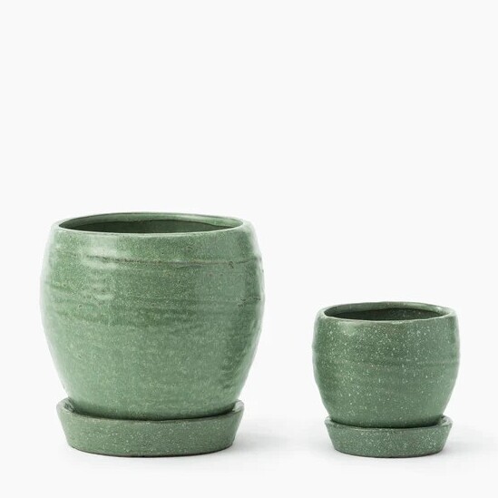
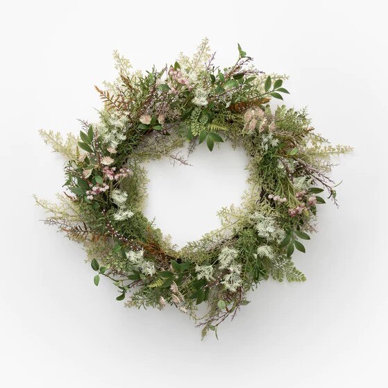
Shop the look

Jennifer is the Digital Editor at Homes & Gardens. Having worked in the interiors industry for several years in both the US and UK, spanning many publications, she now hones her digital prowess on the 'best interiors website' in the world. Multi-skilled, Jennifer has worked in PR and marketing and occasionally dabbles in the social media, commercial, and the e-commerce space. Over the years, she has written about every area of the home, from compiling houses designed by some of the best interior designers in the world to sourcing celebrity homes, reviewing appliances, and even writing a few news stories or two.
-
 My grandma's 'chimney effect' bedroom cooling trick brought goose-pimple inducing relief to help me sleep on the hottest nights in Iran
Use air pressure and temperature differentials to your benefit and beat the heat
By Punteha van Terheyden
-
 Lidl's brand-new garden lounge chair is so good they've had to limit it to only 2 per a customer – it is low in stock, so you'll need to act fast
Hampton's style is hiding in the Lidl aisles thanks to this budget-friendly recliner
By Jennifer Ebert
