Martha Stewart uses this intelligent paint trick to give her mismatched furniture a unified look – her decade-old formula is just as powerful today
Stewart penned the 'Color it Black' theory over twenty years ago – but contemporary designers still swear by a similar decorating technique


In 2001, Martha Stewart introduced the 'Color it Black' theory to the world – and more than 23 years later, its power is yet to waver. The idea, which was first penned in an issue of Martha Stewart Living, is the act of painting mismatched furniture in a single color for a unified look – in this case, black.
.When designing her Turkey Hill Road guest house (above the garages and studio kitchen), Stewart introduced the 'Color it Black' in abundance. She introduced black via the furniture, window treatments, hardware, and other accessories that, together, created a streamlined, contrasting aesthetic that looks just as good now as it did that fall.
According to 'Martha's Moments' (an Instagram account that pays homage to archival photos from Stewart's life), the home was already light and open, but Stewart painted the walls a cream-colored walls (with a putty-tone trim) – a decision that allowed the black accents to stand out further.
While decorating with black can come with its challenges (considering this hue is so powerful), Stewart's theory makes things simple. The secret is in how you unify your furniture pieces so they feel coordinated – while a lighter base is always a failsafe way to go.
A post shared by Martha Moments (@martha_moments)
A photo posted by on
Shop the look

Classic and streamlined, this console table lends a modern coastal feel to your entryway or living room. It's one of the closest matches we could find to the one in Stewart's guesthouse above (and, of course, it comes in a rich black hue).

Made from high-quality cast iron material with a lacquered process, this candle holder is rust-proof and ultra-long-lasting. It's a similar alternative to the one we spotted atop Stewart's console and looks great in a set of three, just as she demonstrates.
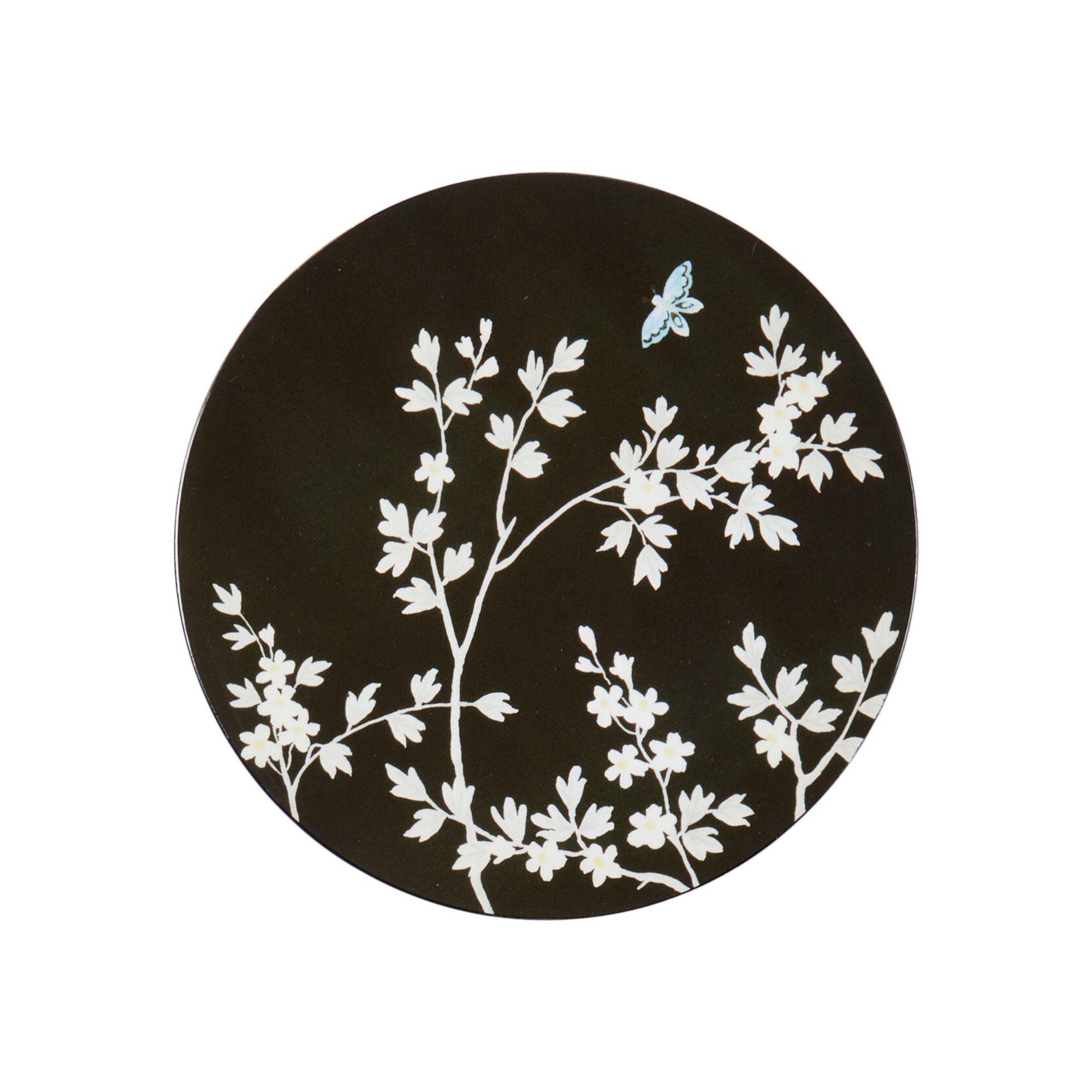
This black ornate coaster results from Addison Ross's original Chinoiserie collection with celebrity-favorite designer Martyn Lawrence Bullard. It's the perfect way to introduce black in a space where you might want to start with small pockets (but we're sure you'll move to painting your furniture soon after that).
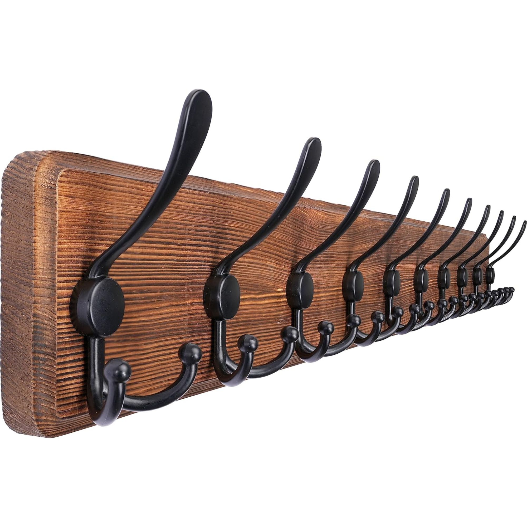
The black hooks seen in Turkey Hill just got even more accessible. With ten triple hooks, this wall-mounted coat rack has space for whatever you want to hang in your entryway. However, we confess these black accents are almost too good-looking to cover up with coasts or umbrellas.

We admit, this isn't black, but it is still inspired by Stewart's space. The traditional, ornate-style frame gives any artwork a vintage feel, and it looks perfect when paired alongside black-painted furniture, just as the design guru has done.
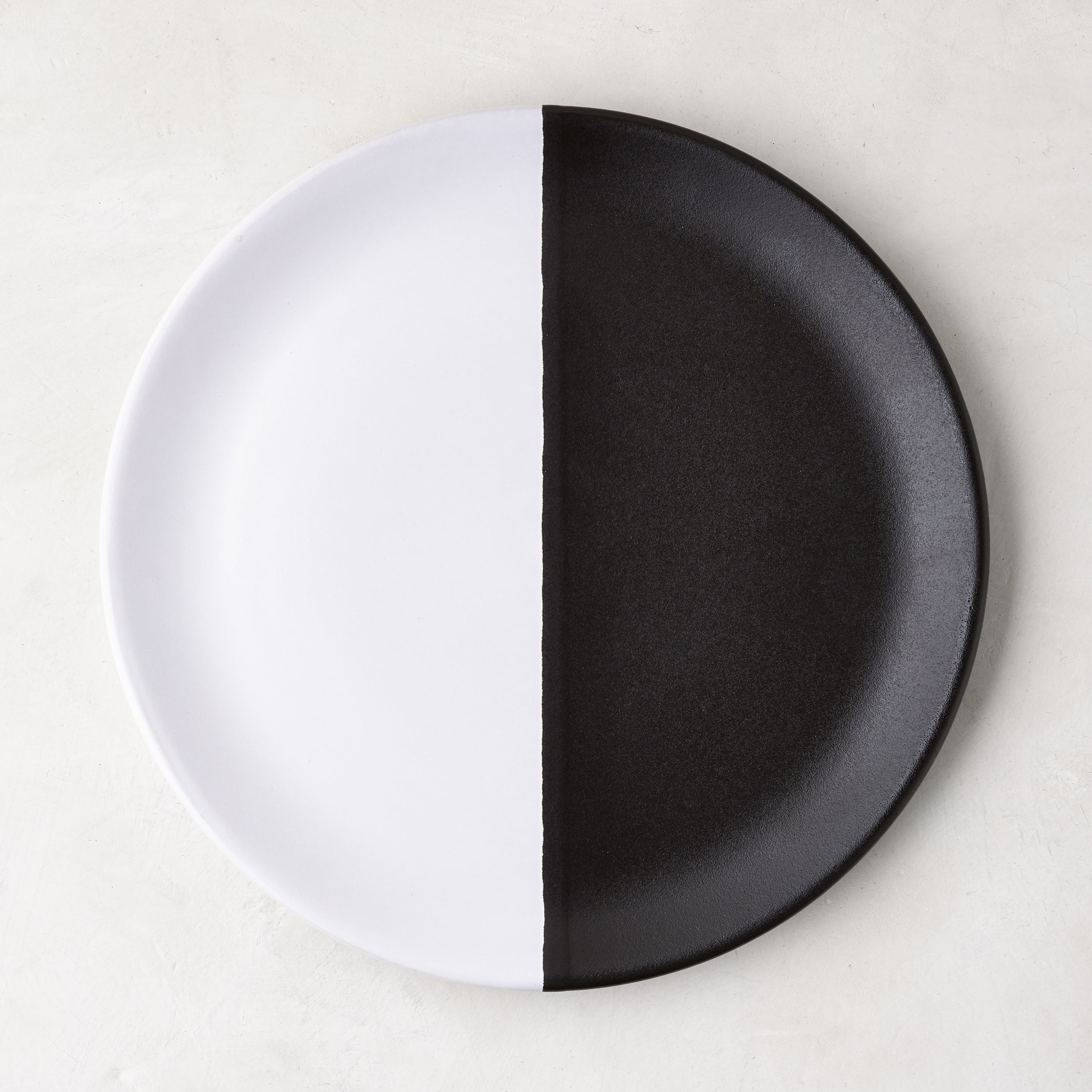
What happens if you take the black and white plate in Stewart's Turkey Hill home but then make the contrast even bolder? You're left with a statement piece such as this. It looks perfect on any console or coffee table but is just as impactful as part of a dinner party tablescape.
Considering Stewart is responsible for the theory, we do not need any convincing to follow suit. It's unsurprising, therefore, that top designers agree with the concept.
'Adding a black accent to a room – whether it’s a piece of furniture or artwork – can instantly ground the space and make it feel more balanced. It creates depth and contrast while also adding a touch of sophistication,' comments Jethro Huie, the founder and principal architectural designer at Huie Designs.
'Black works especially well to highlight textures or to bring out the character of lighter tones around it. Even in small doses, it draws the eye and gives the design a timeless, modern edge.'
Sign up to the Homes & Gardens newsletter
Design expertise in your inbox – from inspiring decorating ideas and beautiful celebrity homes to practical gardening advice and shopping round-ups.
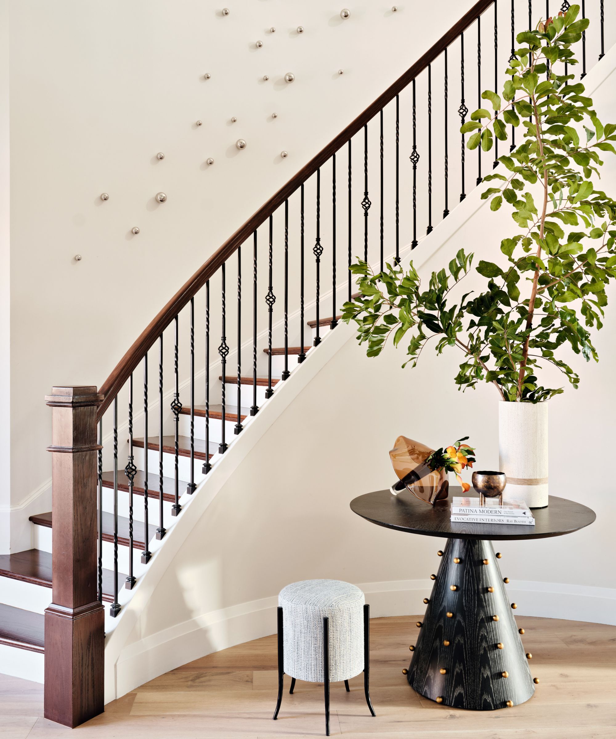
Claire Garner, the director of Claire Garner Design Studio, agrees – emphasizing further how the surrounding color is important in allowing the black accents to pop.
Black acts as a grounding element in interior design, creating a visual anchor that helps define the space and prevent it from feeling too soft or washed out. Even subtle touches, such as a piece of artwork, a lamp, or a piece of furniture, can draw the eye and add a crisp, modern edge to the design. Black accents also emphasize surrounding colors and textures, making them appear more vivid.

Megan is the Head of Celebrity Style News at Homes & Gardens, where she leads the celebrity/ news team. She has a history in interior design, travel, and news journalism, having lived and worked in New York, Paris, and, currently, London. Megan has bylines in Livingetc, The Telegraph, and IRK Magazine, and has interviewed the likes of Drew Barrymore, Ayesha Curry, Michelle Keegan, and Tan France, among others. She lives in a London apartment with her antique typewriter and an eclectic espresso cup collection, and dreams of a Kelly Wearstler-designed home.
-
 Plants never to grow next to fruit trees
Expert advice on which plants to keep away from fruit trees to encourage a healthy harvest
By Jacky Parker Published
-
 Martha Stewart's tips for arranging daffodils are unbelievably simple and effective – it's the only flower advice you need this springtime
Martha shows us that we can create gorgeous bouquets of this seasonal flower by simply trimming the stems and placing them in specific vases
By Hannah Ziegler Published
-
 Martha Stewart's smart laundry room shelving makes exceptional use of every inch of wall space – it will turn your smallest area into an ultra-functional space
'You can greatly expand the usability of your space by just installing some of these great shelving units': You can follow her technique for under $34
By Megan Slack Published
-
 Martha Stewart's pale pistachio entryway is not just for Easter, it's for life – designers swear by this unique take on my favorite color for year-round calm
The trend for pistachio green shows no signs of waning
By Jennifer Ebert Published
-
 Martha Stewart's houses – inside her most iconic properties, from Cantitoe Corners to Turkey Hill
The lifestyle guru built her legacy around her homes, some of which are the most recognized homes in modern American history – we explore her portfolio
By Megan Slack Published
-
 Martha Stewart's genius hack for keeping a cutting board in place is going into our kitchen manual – it will ease your food prep woes
Martha's trick for keeping cutting boards and trays secure on slippery counters requires just one accessory: a terry cloth towel
By Hannah Ziegler Published
-
 Martha Stewart designed a statement velvet armchair specifically for urban living – it brings a vintage charm to small spaces (and is under $337)
Martha just made small-space design simpler – this stand-out piece is one of our favorites, and it's secretly reduced on Wayfair now
By Megan Slack Published
-
 Martha Stewart uses this multi-purpose bag 'all the time' on her Bedford farm – 'it’s so useful for carrying, organizing, and storing'
Martha designed a durable tote for collecting grass clippings and weeds – she's labeled it a 'must-have' for your home and yard (and it's currently $35)
By Megan Slack Published
-
 Martha Stewart's Easter display features orchids, tulips, and glass bunnies – 13 years later, it's still as whimsical (and surprisingly easy to recreate)
In 2012, Martha set the standard for eccentric yet accessible Easter decor – and her displays are just as inspiring this springtime
By Megan Slack Published
-
 Martha Stewart's 1970s butter yellow kitchen is back in style, and will dominate color trends in 2025 – its mood-boosting benefits are unmatched
Embrace the warmth and mood-boosting power of sunny tones for a happy, vibrant feel in the kitchen
By Jennifer Ebert Published