Lewis Hamilton's living room features the must-have trend of 2023, and experts love its understated elegance
For a tranquil, low-key look keep to pale hues and timeless timber...


Formula One race driver Lewis Hamilton may be better known for his speed on the track and his fashion sense off-track, but it is his elegantly-decorated 'quiet luxury' living room, filled with sumptuous neutrals and textural details, that is giving us some serious design envy.
Decorating with a 'quiet luxury' or 'old money' aesthetic, using colors from the natural world, adds a gentle and soothing touch to interiors that can be layered with textures and tones to ebb and flow with the changing of the seasons.
In the living space below, Lewis Hamilton has mastered this popular interior design trend. Here's how to achieve the look in your own home.
A post shared by Lewis Hamilton (@lewishamilton)
A photo posted by on
The power and beauty of a neutral room color palette to add warmth and elegance to a room should not be underestimated. Lewis Hamilton's living-cum-music room is testament to the everlasting, timeless elegance of a predominantly 'smart' neutral or beige space.
‘What we call a “smart neutral” has a pared-back aesthetic which is ideal for using alongside stronger colors, including terracotta and shades of brown,' says Rob Whitaker, creative director, Claybrook. In Hamilton's case, he uses plenty of timber to curate that feeling of warmth and comfort.
‘A neutral needs to be paired with other materials to sing: timber and marble work well. I also love teaming them with suede and woollen rugs,' says Charu Gandhi, founder and director, Elicyon. 'Ceramic, clay and colored glass are great for decorative elements.’
However, the biggest concern many people have with neutral spaces is accidently crafting a space that is devoid of character or soulless.
Sign up to the Homes & Gardens newsletter
Design expertise in your inbox – from inspiring decorating ideas and beautiful celebrity homes to practical gardening advice and shopping round-ups.
Deborah Bass, director of Base Interior suggests: ‘Using a neutral tone while avoiding a minimal or stark atmosphere is a delicate balancing act between the natural light, artificial lighting and the other textures and tones used throughout. Sampling on site, in various lights including artificial lighting, and at different times of day cannot be underestimated.’
A post shared by Lewis Hamilton (@lewishamilton)
A photo posted by on
There's plenty of debate as to how to define ‘neutral’ colors. We tend to think of them as tones such as white, beige, gray, ivory and khaki that don’t appear on the color wheel. In general, neutrals are calming and easy to use – they work with almost every other color, but it’s important to consider how pigments are affected by light.
‘The light in a room is key to deciding whether to choose warm or cool tones,’ says Ruth Mottershead of Little Greene. There is a difference between warm neutrals (with a green or yellow undertone), which work well in north-facing rooms as they bounce light around, and cool ones (with a bit of pink, violet or blue).
When decorating with neutrals, texture and layering are essential. Mix warm metallics such as brass or bronze and natural wood with linen, velvet, sheepskin and chunky knits.
A post shared by Lewis Hamilton (@lewishamilton)
A photo posted by on
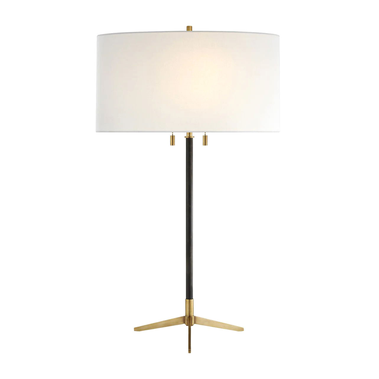
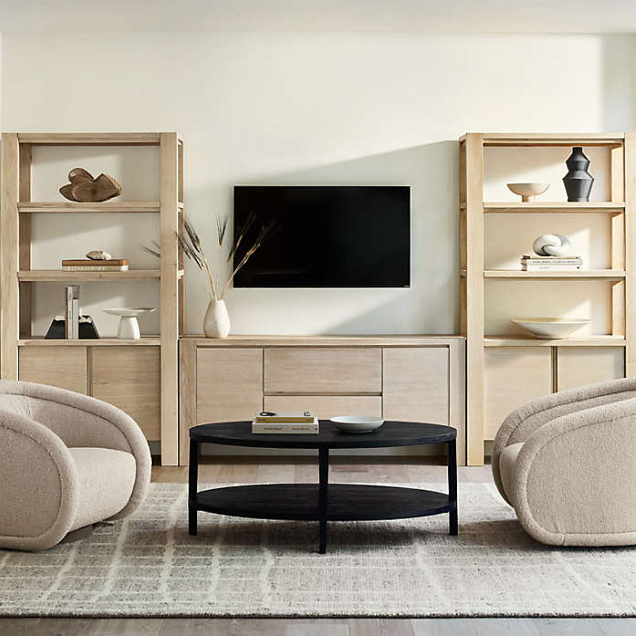
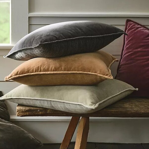
Shop the neutral edit
The soft neutral – we love it for its quiet beauty and versatility, and there are furnishings to suit all rooms.

Jennifer is the Digital Editor at Homes & Gardens. Having worked in the interiors industry for several years in both the US and UK, spanning many publications, she now hones her digital prowess on the 'best interiors website' in the world. Multi-skilled, Jennifer has worked in PR and marketing and occasionally dabbles in the social media, commercial, and the e-commerce space. Over the years, she has written about every area of the home, from compiling houses designed by some of the best interior designers in the world to sourcing celebrity homes, reviewing appliances, and even writing a few news stories or two.
-
 Bryce Dallas Howard's bedroom is the most creative, social space in her entire home – she uses 'conversational seating' to create a multifunctional 'salon'
The actress's bedroom doubles as a home office thanks to its clever layout and furnishings, proving that this area is much more than a sleep space
By Hannah Ziegler
-
 7 questions to ask yourself before moving house – realtors promise answering these questions will prevent buyer's regret
Don’t make your move harder, ask these questions before moving to avoid mistakes
By Chiana Dickson


