Lainey Wilson's contemporary kitchen walls provide a unique alternative to subway tiles, experts say
Here's how the country singer makes her white kitchen walls more interesting


Are you bored of seeing subway tiles in almost every kitchen? If yes, then Lainey Wilson, CMA entertainer of the year, might have an alternative for you. The country singer took to Instagram to share a video of her adorable dog, revealing her kitchen design in the process.
Lainey's kitchen has white cabinets, white countertops, and a stainless steel refrigerator with gold handles. Modern black light fixtures above the kitchen sink window provide ample brightness. However, the star of the show is the white chevron backsplash running along the kitchen walls. The white tile juxtaposed with gray grout creates a striking, textural look in the otherwise neutral kitchen decor.
A post shared by Lainey Wilson (@laineywilson)
A photo posted by on
Interior designers love Lainey's kitchen wall design. Alice Chiu, San Francisco-based designer at Miss Alice Designs says, 'White chevron tiles as a backsplash add texture, dimension, and visual interest, especially in an all-white kitchen.'
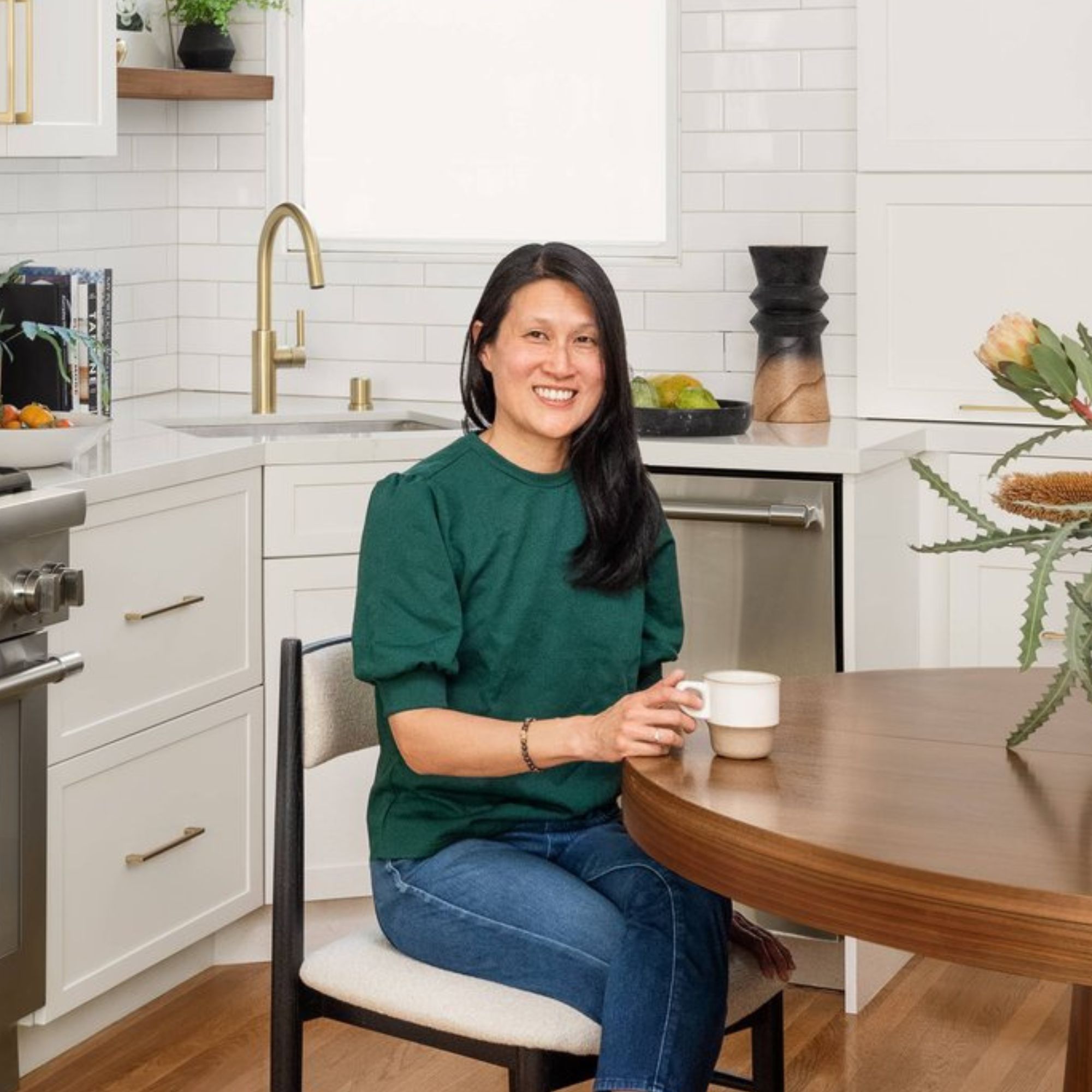
Alice Chiu – the principal designer and strategist behind Miss Alice Designs — creates modern, serene interiors tailored to each client’s functional needs and aesthetic taste. Alice and her team of trusted professionals creatively re-imagine new and existing spaces while integrating current architectural features to craft cohesive, custom final products that not only look beautiful but also feel like home.
Vivianne Chow, interior decorator and owner at Viv and Tim Home adds: 'Installing a white tile chevron backsplash creates visual interest through its unique pattern. It’s a great way to change up the look instead of the normal subway tile. Choosing a kitchen color like white adds a clean and minimalist feel and easily complements other design elements in the kitchen.'

Vivianne Chow is an interior decorator and the founder of the home decor blog Viv and Tim Home. Vivianne, along with her husband, Tim, recently built a dream custom home and are tackling decorating room by room and sharing design tips and everything they’ve learned along the way.
The experts say that Lainey's kitchen tile grout is aptly chosen. 'Since the grout is a shade darker than white or even dark gray and black, it adds contrast, allowing the chevron pattern to pop and become a natural feature and focal point of a space,' says Alice.
Furthermore, Alice adds that this kitchen wall tile design can work in any space. She says, 'Chevron patterns are more common in modern and contemporary spaces but can be incorporated into more traditional styles. If the tiles are not flat but have some movement to them, it can create a fun and edgy look, adding visual interest and depth to any space.'
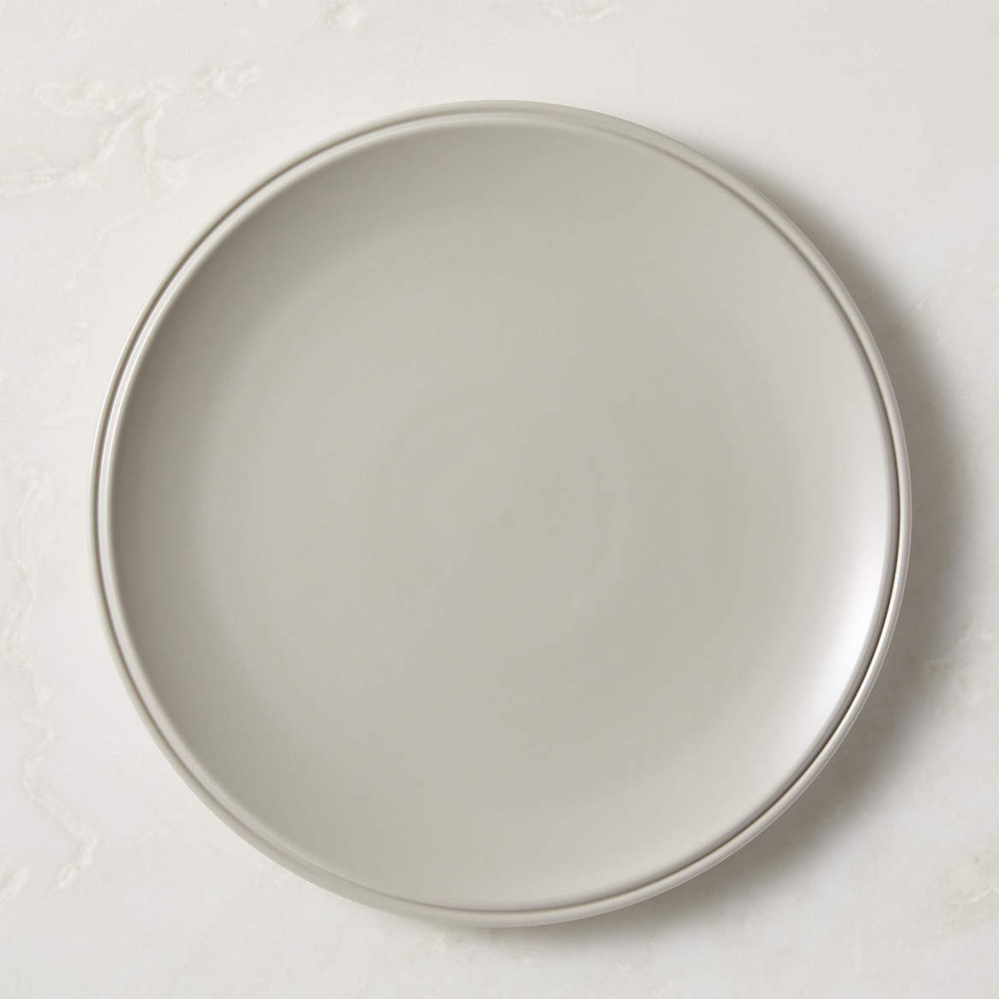
This beautiful ceramic collection by Brooklyn-based designer Natalie Weinberger is finished in a glossy satin gray glaze. The pieces are dishwasher and microwave-safe.
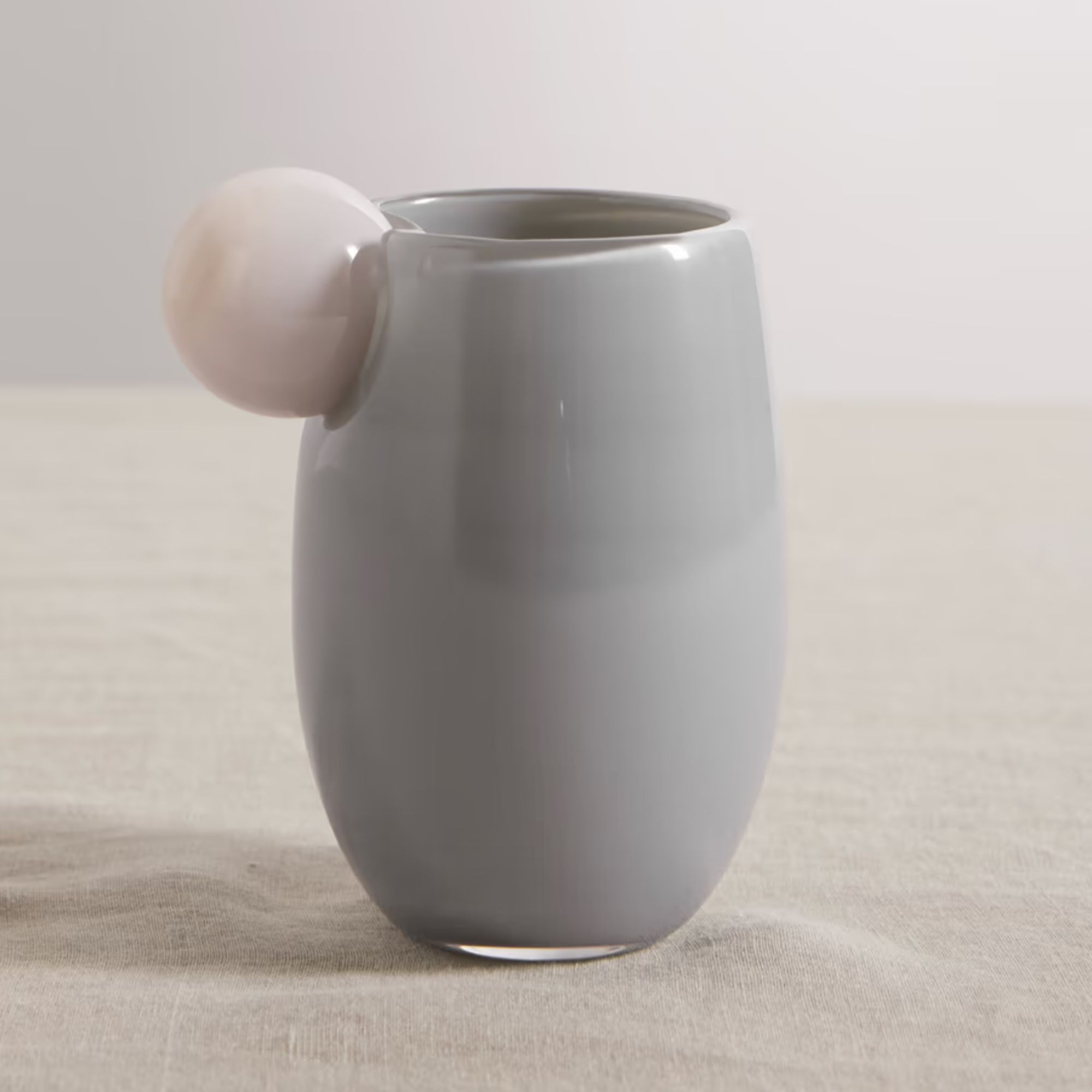
These gorgeous glass cups are designed by Helle Mardahl and created with mouth-blowing techniques. You'll definitely want open shelves to showcase them.
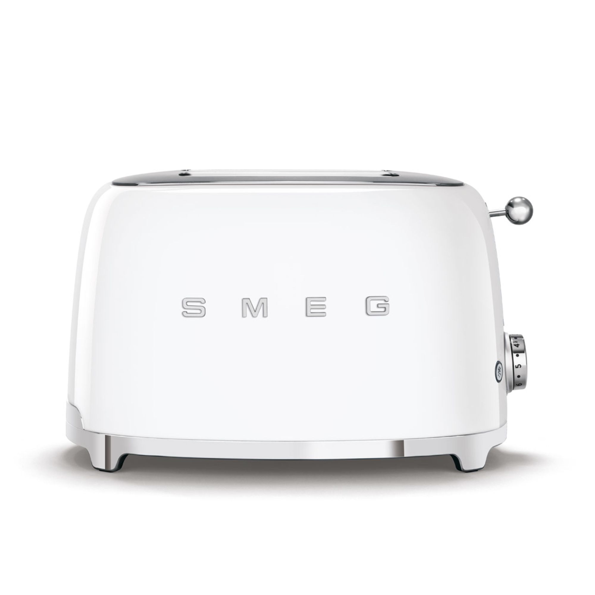
We can't get enough of Smeg's 1950s throwback appliances. A throwback to the early days of white goods, their retro appliances include this toaster, coffee makers, and even a refrigerator, so you can harmonize style and color at once. It's available in 16 different shades and patterns, so there's plenty for everyone, with both understated neutrals and bright, bold hues.
If you are looking for ideas to spice up your white kitchen design, look no further than choosing chevron tiles. If it's good enough for Lainey Wilson, it works for us.
Sign up to the Homes & Gardens newsletter
Design expertise in your inbox – from inspiring decorating ideas and beautiful celebrity homes to practical gardening advice and shopping round-ups.

Sophie is a News Editor at Homes & Gardens, where she works on the Celebrity Style team. She is fascinated by the intersection of design and popular culture and is particularly excited when researching trends or interior history. Sophie is an avid pop culture fan. As an H&G editor, she has interviewed the likes of Martha Stewart, Hilary Duff, and the casts of Queer Eye and Selling Sunset. Before joining Future Publishing, Sophie worked as the Head of Content and Communications at Fig Linens and Home, a boutique luxury linens and furniture brand. She has also written features on exciting developments in the design world for Westport Magazine. Sophie has an MSc from the Oxford University Department of Anthropology and a BA in Creative Writing and Sociology from Sarah Lawrence College.
-
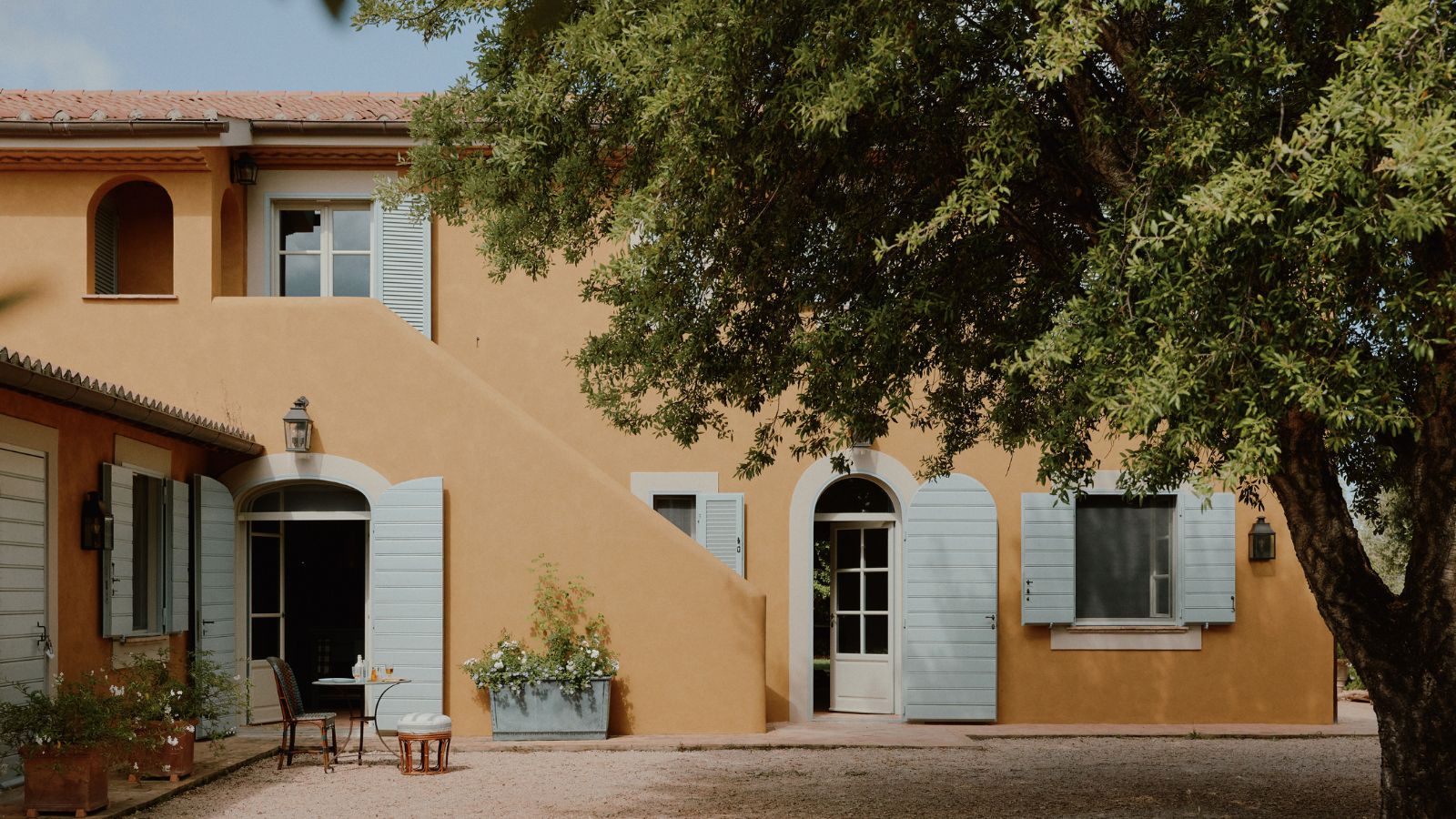 How a British designer brought together the different tastes of a couple wanting to create the dream future-proofed home in the idyllic Italian countryside
‘They wanted a house that would feel immediately like home the minute they arrived, and somewhere relaxing to spend time together as a family and entertain friends.’
By Fiona McCarthy
-
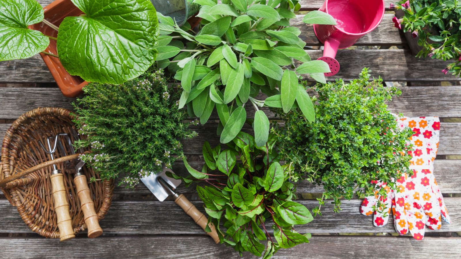 What is your birth month herb? Discover the symbolic meaning behind yours
Herbs offer symbolic wisdom, and play to the natural rhythms of the season
By Lola Houlton