Kris Jenner uses a luxurious focal point to elevate her simple white entryway – I love the bold impact of this easy-to-recreate upgrade
A white entryway gets an impactful upgrade in the socialite's foyer – a blue vase, greenery, and pedestal table completely remake the space


I have a confession: I hate white painted spaces. I know the shade is popular because it's versatile, and simple, resaleable, but it often comes off looking too soulless for my taste. Luckily, in my time as an interior design journalist, I've learned that there are simple ways to upgrade these plain schemes to make them look more interesting and attractive. Kris Jenner's technique is my favorite to date.
The matriarch of the Kardashian clan took to Instagram to share her white entryway idea, which she has elevated with a pedestal table. Her simple white and marble piece of furniture brings visual interest and a sense of history due to its intricate carving. Atop the table, a hand-painted blue and white planter is home to several arching dried green leaves. It adds color, warmth, and personality to the otherwise unadorned space.
What is so visually interesting about Jenner's entryway makeover? Most importantly, the table creates emphasis as a striking 'focal point.' This is a design technique that directs the eye within a space. Since our brains process the things that are easiest for us to compute based on patterns as the 'most beautiful,' this is a surefire, psychological way to enchant your guests. In this case, the pedestal table and plant add height and interest. The 'focal point' technique is especially useful in an entryway where you are looking to make an immediate impact on visitors.
A post shared by Kris Jenner (@krisjenner)
A photo posted by on
Shop the Look
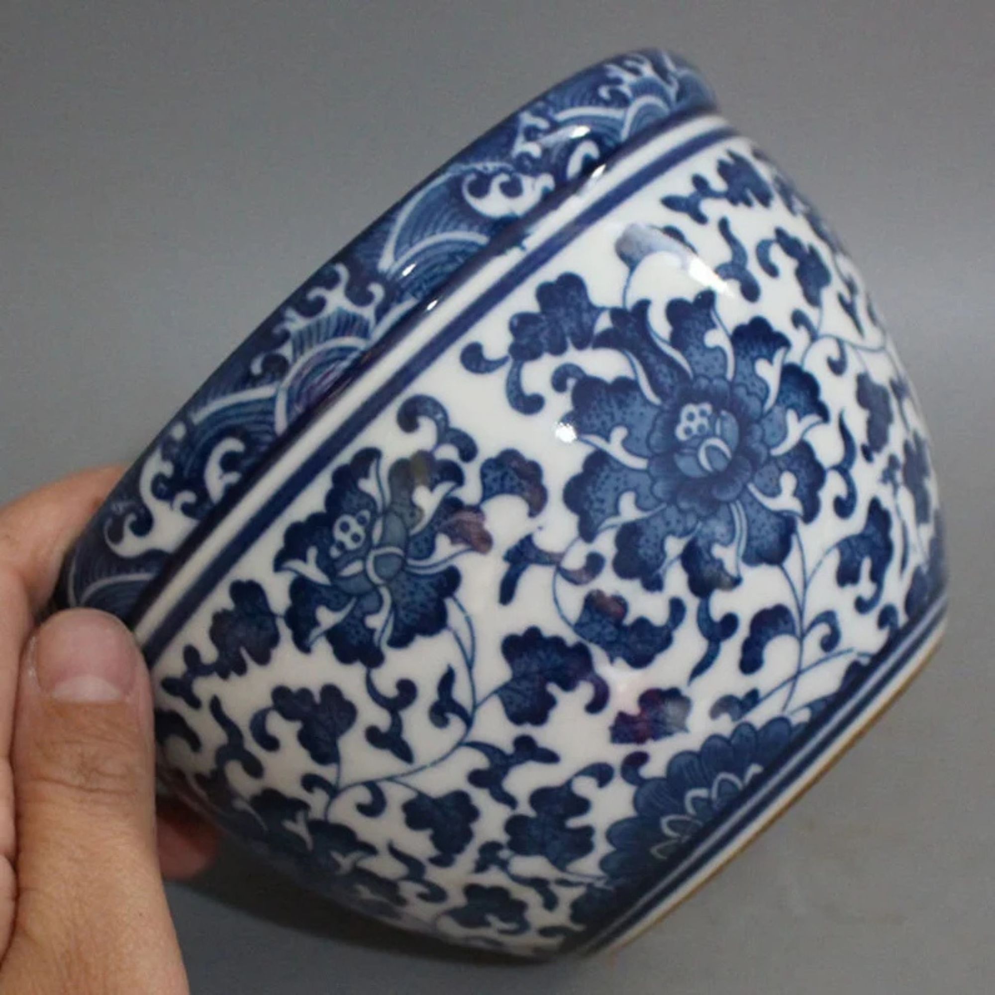
An antique planter like this is great for adding character to a pedestal table in an entryway. I love this antique one from Etsy, but there are also lots of great options at 1stDibs and on eBay.
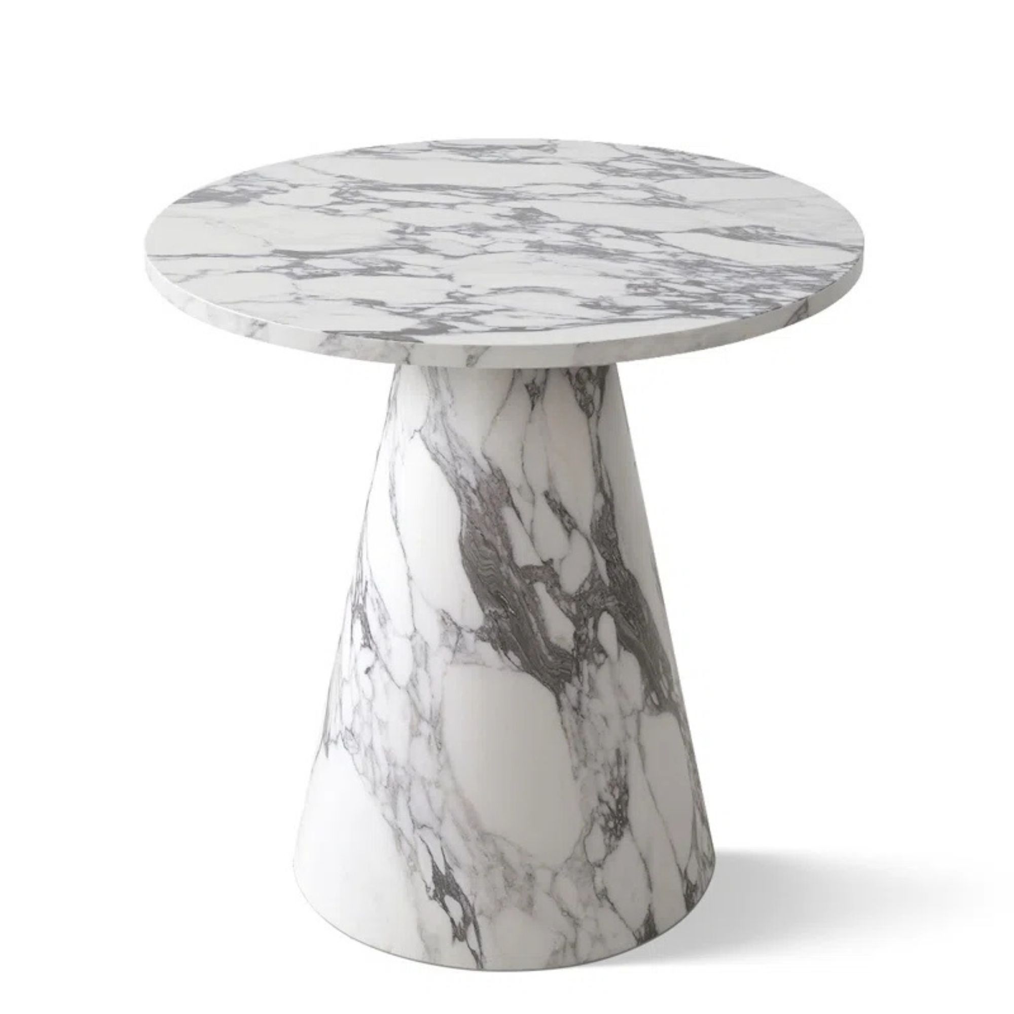
This gorgeous faux marble table has a luxurious look at the right price. The modern shape adds a little something extra – it's hard to believe it's actually so affordable.
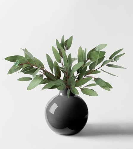
Grace the vase in your entryway with faux eucalyptus stems for a beautiful, evergreen greeting for your guests. I love that eucalyptus is slightly more gray for a subtle appearance.
Considering the interaction between the pedestal table and staircase is also essential for designing a similar space. Jenner has worked with the shape and colors of her staircase to create a look in which all of the elements work harmoniously with one another. The curve of the table plays off of the curve of the staircase, creating an inviting and attractive symmetry. Jenner's colorwork is equally apt; though the focal point adds color to the space, there is nothing particularly dark. Instead, she lets the black staircase railing be the only black accent in the space, making its delicate, dark color all the more impactful.
To recreate this look, it's important to choose an artful blend of modern aesthetics and decorating with antiques. Contrast is key. For instance, in Jenner's entryway, the antique marble of the pedestal table and the vintage plater perfectly meshes with the modern white and cream color scheme. Against one another, both elements make the other appear more interesting. In my opinion, a mix of elements is the most important part of a beautiful design, and it's extra impactful in Kris Jenner's simple entryway.
Using a focal point, paying attention to shape and color, and blending a variety of design elements are the simplest ways to elevate a neutral room. With techniques like these, white-painted spaces aren't so bad.
Sign up to the Homes & Gardens newsletter
Design expertise in your inbox – from inspiring decorating ideas and beautiful celebrity homes to practical gardening advice and shopping round-ups.

Sophie is a News Editor at Homes & Gardens, where she works on the Celebrity Style team. She is fascinated by the intersection of design and popular culture and is particularly excited when researching trends or interior history. Sophie is an avid pop culture fan. As an H&G editor, she has interviewed the likes of Martha Stewart, Hilary Duff, and the casts of Queer Eye and Selling Sunset. Before joining Future Publishing, Sophie worked as the Head of Content and Communications at Fig Linens and Home, a boutique luxury linens and furniture brand. She has also written features on exciting developments in the design world for Westport Magazine. Sophie has an MSc from the Oxford University Department of Anthropology and a BA in Creative Writing and Sociology from Sarah Lawrence College.
-
 Charred little gem with saffron dressing
This recipe with charred little gem is both easy to make and sure to impress guests. It's the perfect side for fresh spring menus
By Alice Hart
-
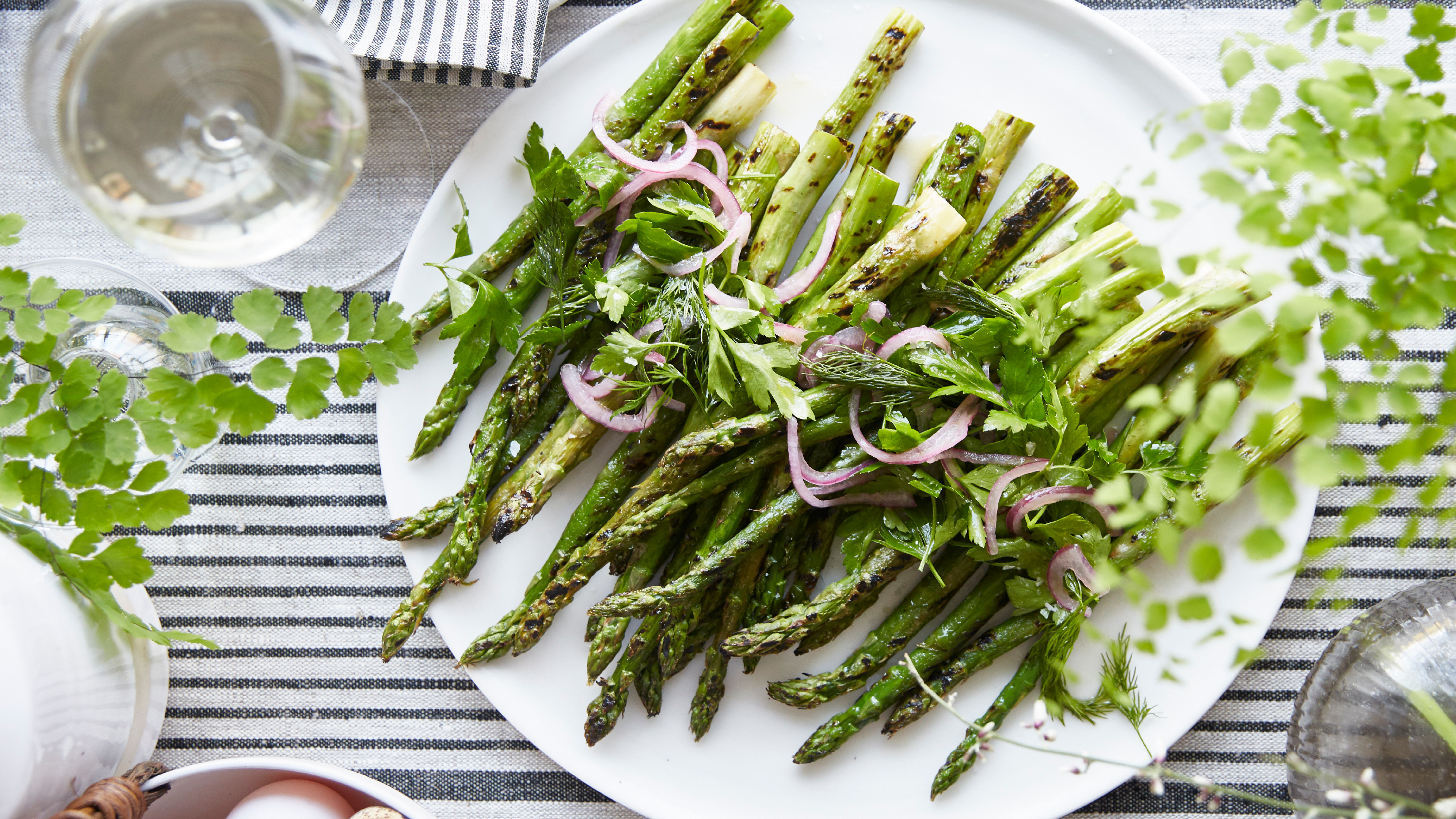 Grilled asparagus with herb and pickled red onion
This grilled asparagus couldn't be easier, and it's a wonderful way to get the best flavor from our favorite spring veg. It's perfect alongside fish or lamb
By Alice Hart
-
 Kris Jenner's favorite air fryer, the Ninja Crispi, is the perfect small kitchen solution – it deserves a place on the most compact of countertops
Kris approves of this compact yet powerful air fryer, and so do our own kitchen appliance experts, praising it for its multifunctionality
By Hannah Ziegler
-
 Kris Jenner's 'organic modern' living room champions the most talked-about trend of 2025 – it's the new way to do luxe-minimalism
Simple silhouettes, organic textures, and industrial nuances infuse functional pieces with elegance to create an effortlessly chic and easy-to-live-with living space
By Jennifer Ebert
-
 Kris Jenner uses this organizing essential to 'avoid sad, forgotten spinach' in her refrigerator – she's mastered food storage (for under $12)
Kris Jenner's immaculate fridge and freezer feature plastic storage containers for optimal visibility, including a Lazy Susan for ice cream
By Hannah Ziegler
-
 Kris Jenner's living room mixes 3 colors I never thought I'd see together – but the rare combination is shockingly chic and cozy
These colors are rarely seen together, but the socialite combines them stunningly in her home through artwork, a textured sofa, and coffee table accessories
By Sophie Edwards
-
 Kris Jenner's unorthodox coffee table accessory promotes quality time with family – and it embodies effortlessly cool design
The Kardashian Empire manager recommends using this non-traditional piece to liven your coffee table – it's exceedingly easy to recreate in any space
By Sophie Edwards
-
 Kris Jenner uses this candle to make her room 'instantly cozy' – it smells expensive, but it's available for under $50
The socialite's candle smells like tobacco, amber resin, and mahogany – and its encasing doubles as a flower pot
By Hannah Ziegler
-
 Kris Jenner's favorite robot vacuum 'leaves no crumbs' – the innovative appliance is half-price right now
The socialite approves of the Shark PowerDetect Self-Empty Robot Vacuum, and it just so happens that this powerhouse cleaner is currently on sale
By Hannah Ziegler
-
 Kris Jenner uses a collection of natural Christmas trees and festive figurines to create a winter wonderland in her entryway
Jenner uses lit Christmas trees, a green garland, and a bright Santa figurine to turn her entryway into a festive oasis instantly
By Hannah Ziegler