Kim Kardashian's 'warm minimalist' living space is the 'quietly classy' look designers want us to embrace in 2024
Decorating with new neutrals, inspired by colors from the natural world, adds a gentle and soothing touch


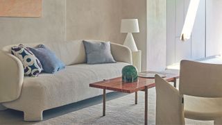
It comes as no surprise that Kim Kardashian is a lover of the color greige. The reality sensation and business mogul constantly gravitates towards neutral color schemes and minimalism, not just in her fashion choices but also within her home.
In the below Instagram post, Kim Kardashian offers an inside look at the chic workspace-cum-living area, which was designed by Tommy Clements and Waldo Fernandez in collaboration with Michèle Lamy of Rick Owens.
Despite its expansive size, Kardashian's cavernous living area is approximately 40,000-square-foot, the room doesn't feel cold or clinical. The designer has echoed the same muted color scheme that Kim used for Skkn's packaging – her own brand of successful beauty products.
The power of this neutral color palette will add warmth and elegance to a room – and should not be underestimated. A soft scheme of harmonious neutrals creates a reflective backdrop to the ever-changing light of the seasons. But how can you incorporate this 'warm minimalist' aesthetic in your own home?
A post shared by Waldo Fernandez (@waldosdesigns)
A photo posted by on
You don't have to go for an entirely neutral or beige room either. In fact, the beauty of a neutral scheme is that it provides a wonderful scaffold upon which to hang accents of color, adds Deborah Bass, founder of Base Interior.
‘This is especially true in a home office where a neutral wall or a textured plaster or wallpaper wall finish creates a background for books and art, both of which can take the decorative center stage.’ She recommends grounding subtler shades with a deeper, richer natural timber to create a balance. ‘Neutrals offer an elegant, timeless response to the working from home dilemma, likewise versatile in the sense that different family members might be using the space at different times of day and for a variety of functions,’ she adds.

Interior designer Tamsin Johnson shares this love of decorating with neutrals. 'I love the calmness that you create when you have a neutral palette in a room. But this choice definitely doesn’t have to mean boring: you can create an interesting and exciting space by layering different tones, such as off-whites and beige, then introducing a range of caramels and even accents of black if you wish.'
Sign up to the Homes & Gardens newsletter
Design expertise in your inbox – from inspiring decorating ideas and beautiful celebrity homes to practical gardening advice and shopping round-ups.
'If I’ve got a calm color scheme, similar to Kim Kardashian's, then I focus on texture to bring different layers of interest,' she says. 'You have to think about how to introduce variations and things that feel different to the touch without just focusing on color, and often that creates a more interesting scheme. Varying glossy, shiny surfaces with matt ones adds an extra layer of texture and tactility.'
'Natural textures, whether they are stone, wood, or linen, can help to anchor a neutral color scheme. It means that the overall look doesn’t feel too contrived uptight or overly designed. They bring a laid-back quality that always works well.'
'Sofas and armchairs that are covered in white fabrics of varying textures, for example, a linen a boucle, or a canvas, continue the lightness of touch that the floors, walls, and ceiling provide.'
'Having said that, you shouldn’t be afraid of adding in a single bold statement piece, even in a room that’s neutral. I think a strong black metal or ebonized wood statement design can work brilliantly as the centerpiece in an otherwise pared-back room. It makes all the other elements come together around it.'

Jennifer is the Digital Editor at Homes & Gardens. Having worked in the interiors industry for several years in both the US and UK, spanning many publications, she now hones her digital prowess on the 'best interiors website' in the world. Multi-skilled, Jennifer has worked in PR and marketing and occasionally dabbles in the social media, commercial, and the e-commerce space. Over the years, she has written about every area of the home, from compiling houses designed by some of the best interior designers in the world to sourcing celebrity homes, reviewing appliances, and even writing a few news stories or two.
-
 How to get nail polish out of carpet – 5 simple solutions to successful stain removal
All is not lost, experts assure
By Ciéra Cree Published
-
 How to grow gaura – and boost your yard with glorious, dancing beeblossom
Gaura adds a delicate touch to any summer yard display with its slender, arching stems and endless flowers
By Jill Morgan Published
