Kevin Hart's office is a 'masterclass in modern sophistication' – experts love his luxurious spin on a classic color scheme
An unexpected color scheme creates an ultra-stylish look in the comedian's office. Interior designers explain what makes the style and how to recreate it


If a black and gray color scheme doesn't sound particularly inspired, then you haven't seen Kevin Hart's office space yet.
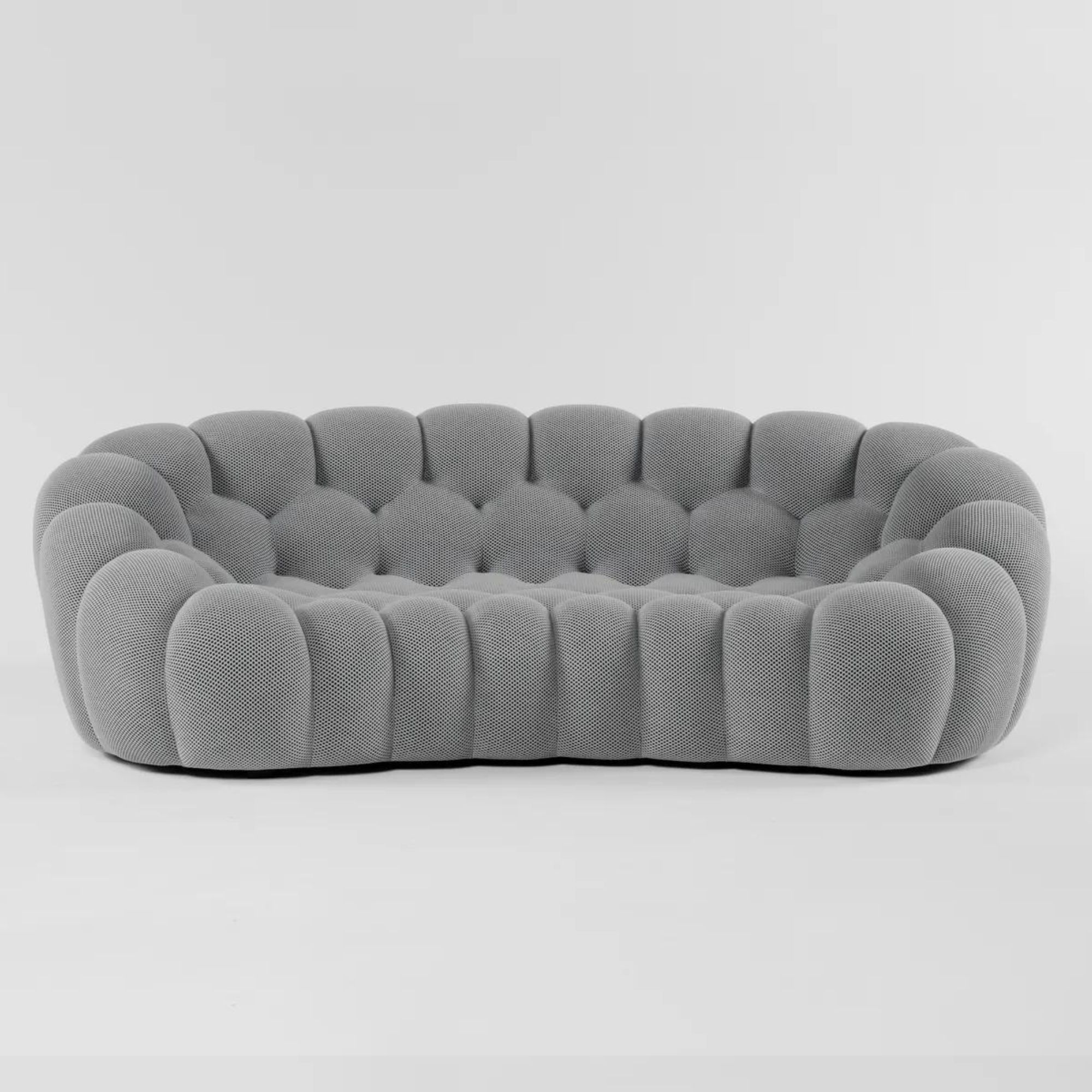
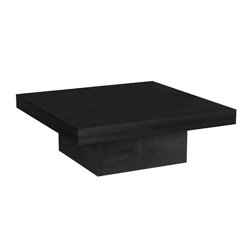
LA-based photographer Ye Rin Mok shared images of the comedian's office idea for his company Hartbeat, and it's a modern, stylish take on this neutral color combination. The photographs show Hart perched on a Roche Bobois Bubble Sofa in a room with white walls. A black coffee table holds stacks of colorful coffee table books, while a sparkling, black, beaded piece of artwork reflects light around the room.
The overall effect is rich, opulent, and contemporary. Though this neutral color scheme is difficult to pull off, when done right, it certainly pays off.
A post shared by Ye Rin Mok 목예린
A photo posted by yerinmok on
Experts love Hart's take on the home office color. Nina Lichtenstein, Westchester-based interior designer states: 'Step into Kevin Hart's office, and you'll find a masterclass in modern sophistication. The design of this space breathes new life into a classic gray and black color scheme, demonstrating how strategic elements can transform a palette into a captivating arrangement and visual narrative.'

Nina Lichtenstein is the founder and principal home designer at her eponymous design studio, based in Westchester, NY. Nina believes that home design should capture a family’s unique spirit by how it serves the family's daily needs while nourishing the soul. She has been celebrated for designing, renovating, and building elegant living spaces.
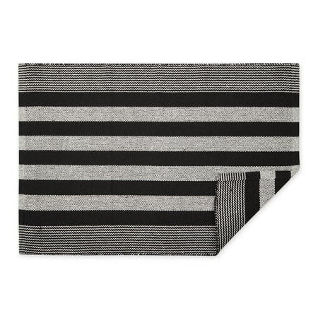
What makes the scheme so stylish here? Lichtenstein tells Homes & Gardens, 'At the heart of Kevin Hart's office is a striking play of contrasts. The black and white veined marble accent wall sets the stage, its intricate patterns echoing the elegance of the space. This backdrop is complemented by a black rug featuring white accent strips, harmonizing with the marble while anchoring the room.'
She continues, 'Amidst this monochrome backdrop, a black and white (heavy on the black) feature artwork commands attention, adding a bold artistic dimension. The choice of wood floors and metal shelves introduces warmth and industrial flair, enriching the aesthetic composition of the room.'
However, its the fusion of different styles that really brings this space together. Lichtenstein continues, 'The synergy between furniture and accents is key to the room's allure. A black desk, chair, and cabinets unify the space, creating a cohesive foundation. A large, statement gray sofa softens the environment, beckoning with its inviting allure, while a glass coffee table preserves an open, airy ambiance.'
Sign up to the Homes & Gardens newsletter
Design expertise in your inbox – from inspiring decorating ideas and beautiful celebrity homes to practical gardening advice and shopping round-ups.
She adds: 'What truly elevates Kevin Hart's office is the strategic infusion of bold pops of color. Books on the glass table and decorative mementos on the shelves inject personality and vitality, breaking the grayscale monotony with vibrant accents. Strategically placed flowers, plants, and green accents lend an organic touch, infusing life into the space.'
For those hoping to replicate the modern interior design idea, Lichtenstein recommends that readers: 'Utilize different shades of gray—from charcoal to dove gray—to create depth and dimension. Ensure adequate lighting, combining ambient, task, and accent lighting to highlight key features and prevent the space from feeling too stark.' She also advises: 'Like Kevin Hart's approach, infuse vibrant accents strategically. Choose a bold hue—such as emerald green, deep blue, or fiery red—for decorative elements like artwork, cushions, or accessories. These splashes of color will enliven the grayscale backdrop.'
Shop the Edit
In Kevin Hart's office, a black and gray color scheme takes on a life of its own for a modern luxury, clean and artistic look.

Sophie is a News Editor at Homes & Gardens, where she works on the Celebrity Style team. She is fascinated by the intersection of design and popular culture and is particularly excited when researching trends or interior history. Sophie is an avid pop culture fan. As an H&G editor, she has interviewed the likes of Martha Stewart, Hilary Duff, and the casts of Queer Eye and Selling Sunset. Before joining Future Publishing, Sophie worked as the Head of Content and Communications at Fig Linens and Home, a boutique luxury linens and furniture brand. She has also written features on exciting developments in the design world for Westport Magazine. Sophie has an MSc from the Oxford University Department of Anthropology and a BA in Creative Writing and Sociology from Sarah Lawrence College.
-
 Do cleaning products expire? Professional cleaners warn time could make them ‘less effective, and in some cases, irritating to use’
For the best results, it pays to stay on top of the timeline of your cleaning products
By Chiana Dickson Published
-
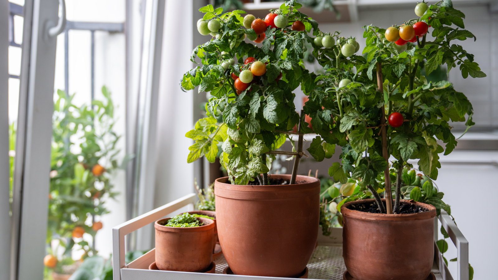 7 of the best tomatoes for growing in pots - expert growers pick their top varieties ideal for large harvests from containers
You can enjoy bumper homegrown harvests in small spaces
By Drew Swainston Published
