Kate Hudson's living space tops trends – but color psychologists approve in ways beyond its aesthetics
Designers predict sage green will influence how we decorate in 2024 – but there's more to this tone than initially meets eye
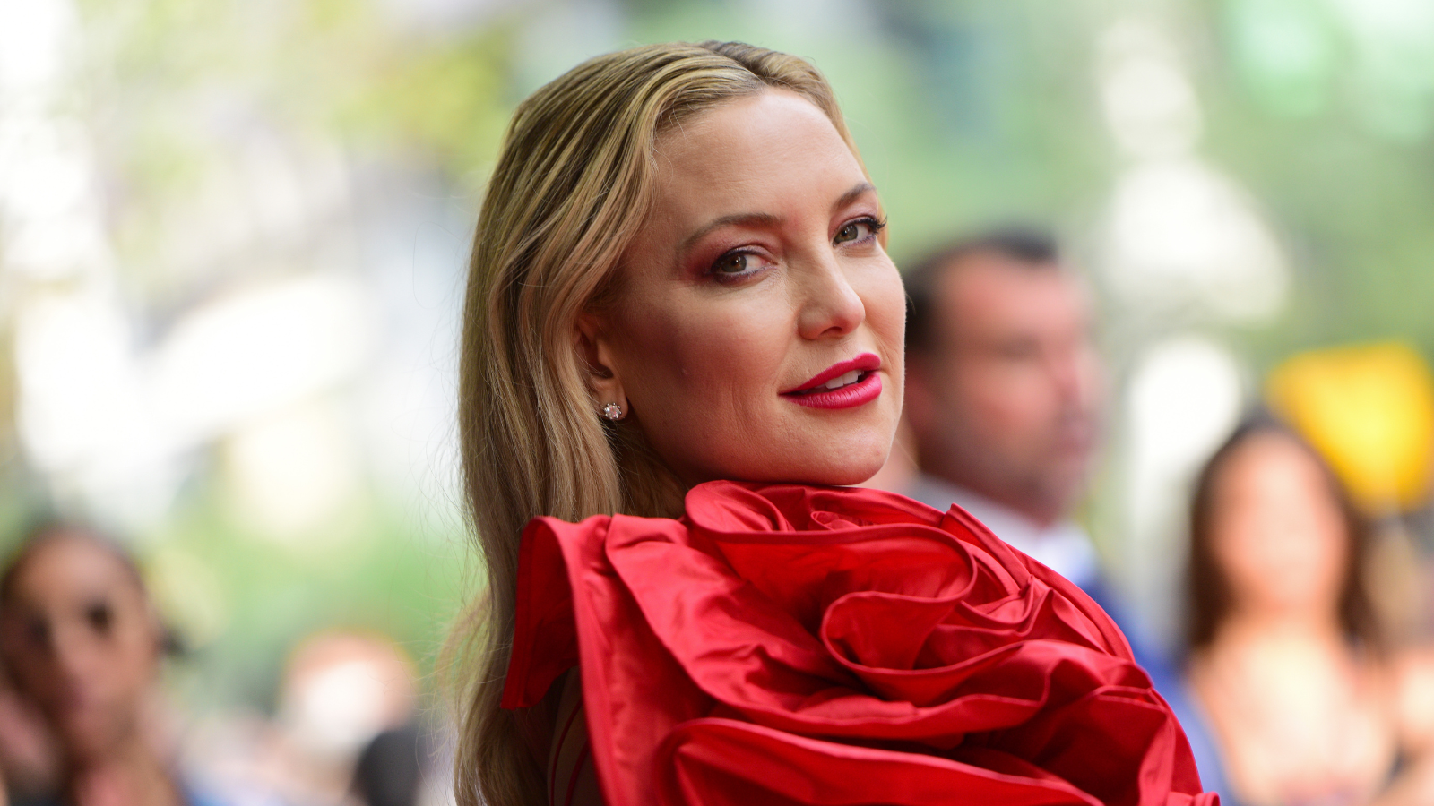

After spending several seasons shaping how we color our homes, the current influence of sage green is already no secret. However, the power of this soothing hue is not set to waver, and if anybody is set to remind us of that, it's Kate Hudson.
Kate's primary living space, located inside her Pacific Palisades abode (the same property where she lived with her mother, Goldie Hawn, in the '80s), is a shrine to sage – from the patterned wallpaper to the bespoke painted cabinetry that all pay homage to this ever-popular hue.
Kate's sage green paint and wallpaper (the latter of which we've found below) are loved by designers for their versatile aesthetic (part of the reason why sage green continues to influence color trends), but psychologists say there's even more to this tone than its good looks.
A post shared by Kate Hudson (@katehudson)
A photo posted by on
'Decorating with green instantly has a calming effect, being a color that our eyes don’t need to adjust to and therefore instantly creating a zen environment,' comments Lick's color psychologist, Tash Bradley.
Tash is trained in color psychology and theory, she helps people around the world bring their dream decorating projects to life and utilize color to impact personal spaces, as well as overall lifestyle and wellness. Tash leverages her expertise in color psychology and theory, as well as interior design, to lead Lick’s design studio and curate the brand’s global paint and wallpaper offerings. To date, she has led 1,000+ color consultations for Lick clients, providing customers the confidence they need to create a home they’ll love.
Sage, like all green tones, is synonymous with nature's palette – enabling us to feel instantly calmer. We love how Kate has taken this a step further via her botanical-printed wallpaper, designed by Morris & Co. The famous foliage pattern is beloved among many art enthusiasts who may instantly associate the print with the nineteenth-century textile designer – but thanks to Kate's endorsement, this print (just like sage) is likely to continue making waves beyond 2024.
'If you’d really like to tap into the foliage and forestry tones that’ll match the design itself, we’d suggest going for Green 02 [the perfect Sage Green] or Green 09 and pairing that with White 06 or Beige 03 to give you a soft and warm nod to nature,' Tash says.
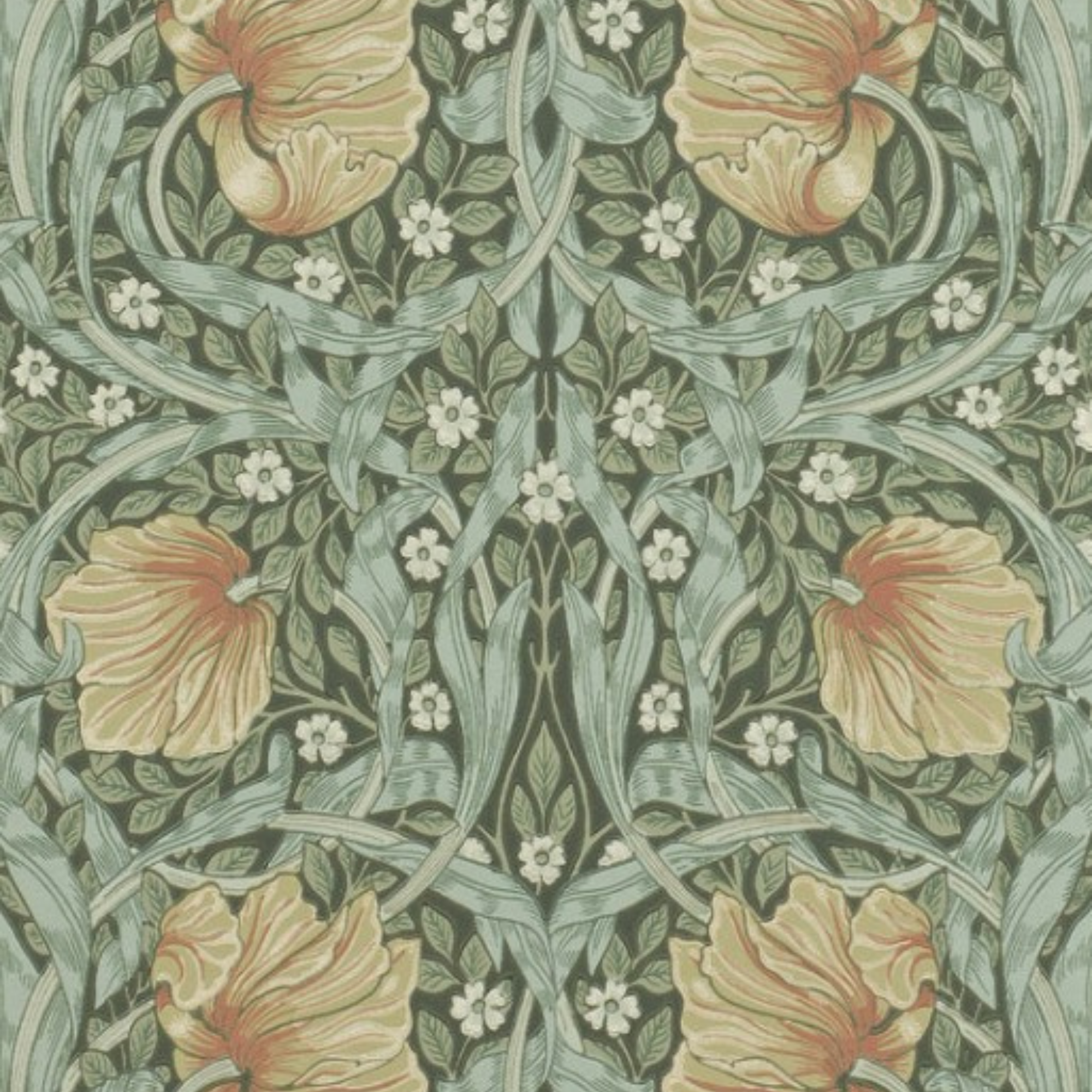
Complex and intriguing and instantly calming, William Morris designed the Pimpernel Wallpaper in 1876. It promises to bring a vintage flair to our space with its robust, feminine colorway.
A post shared by Kate Hudson (@katehudson)
A photo posted by on
Psychological benefits aside, interior designers remind us of green's versatile beauty, meaning it's a failsafe living room color (if we're looking to follow in Kate's lead). However, its power stretches beyond the most sociable room of its home.
Sign up to the Homes & Gardens newsletter
Design expertise in your inbox – from inspiring decorating ideas and beautiful celebrity homes to practical gardening advice and shopping round-ups.
'One trend which is showing no sign of slowing down is the color green. Interior designers and homeowners alike are using this timeless hue in its entirety, from wall color to furniture and kitchen cabinets, notes designer Juliette Thomas.

Juliette Thomas is the founder and creative director of the London-based interior design and luxury furniture retail company, Juliette's Interiors. Juliette has been designing and offering unique exclusive interiors and furnishings since 2005.
'A color that reflects the natural world, green brings a sense of the outdoors and indoors and helps to create a harmonious and calming atmosphere. An extremely versatile color, from soft sage to bold emerald and deep forest green, the color is perfectly suited to a wide range of design aesthetics and looks best when layered together in different tones.'
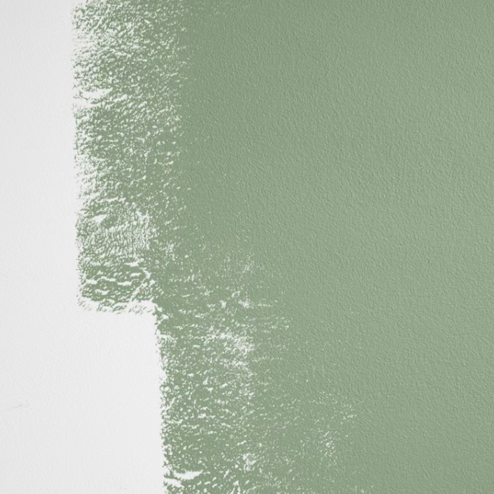
Inspired? We're replicating Kate's style by experimenting with this sample of one of our favorite sage greens, Drive-Thru Safari, available via Backdrop.

Megan is the Head of Celebrity Style News at Homes & Gardens, where she leads the celebrity/ news team. She has a history in interior design, travel, and news journalism, having lived and worked in New York, Paris, and, currently, London. Megan has bylines in Livingetc, The Telegraph, and IRK Magazine, and has interviewed the likes of Drew Barrymore, Ayesha Curry, Michelle Keegan, and Tan France, among others. She lives in a London apartment with her antique typewriter and an eclectic espresso cup collection, and dreams of a Kelly Wearstler-designed home.
-
 I always get my small space storage from Wayfair – and these discounted $35 stackable Martha Stewart storage boxes are the perfect fix for my tiny vanity
I'm going vertical for tiny space storage success with this Early Way Day 2025 bargain
By Punteha van Terheyden
-
 These are the colors that just don't work with purple – 4 shades to sheer clear of if you want to bring this on trend color into your home
Why some colors sabotage purple, and how to get it right every time.
By Sophia Pouget de St Victor
