Kate Hudson perfectly pulls off this intriguing retro color scheme in her living room
See inside the Glass Onion actress's unique living space


Kate Hudson has starred in beloved films such as How to Lose a Guy in 10 Days and Bride Wars. Now, the actress has taken to Instagram to share her ultra-chic living room decor, and interior designers love Kate's retro color scheme.
A post shared by Kate Hudson (@katehudson)
A photo posted by on
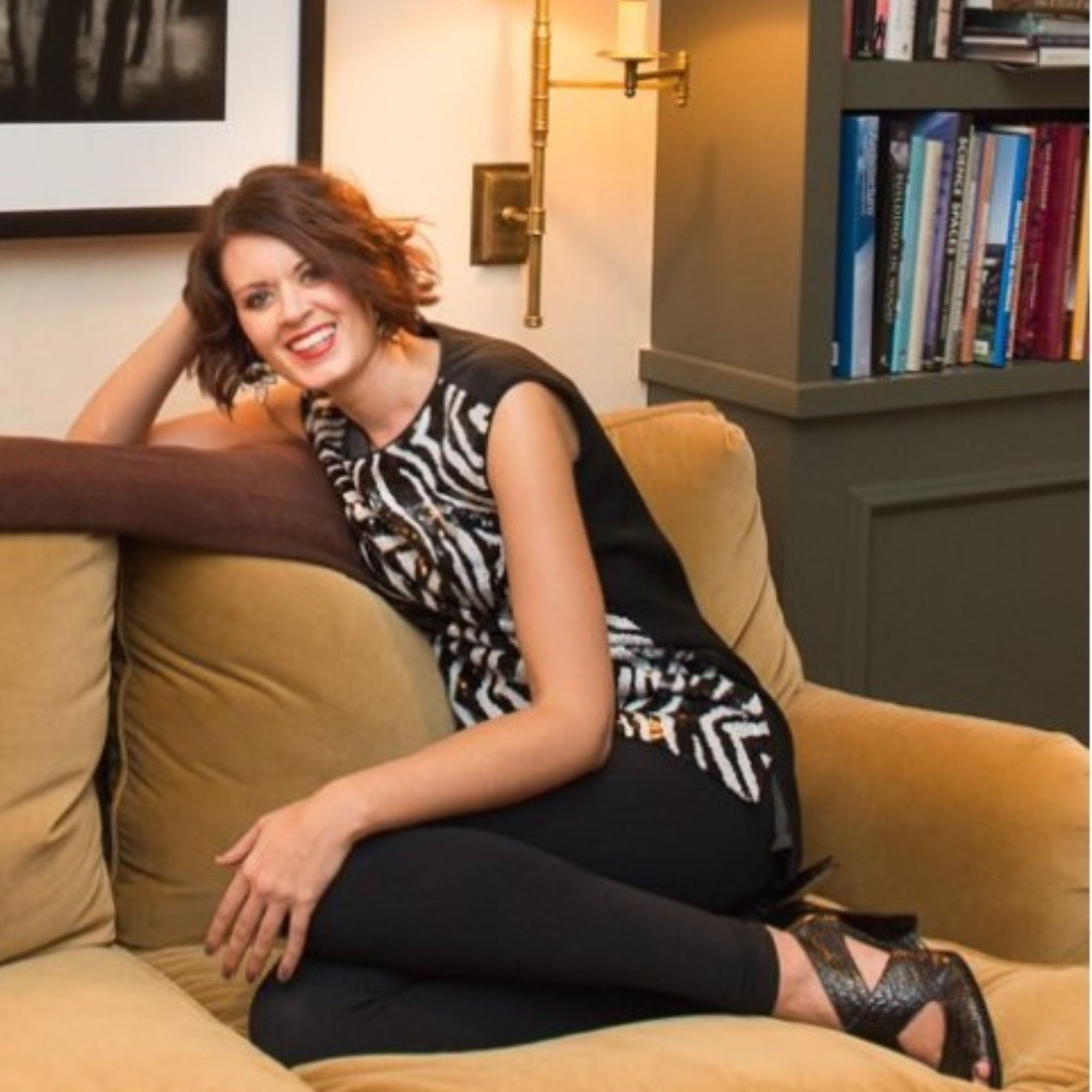
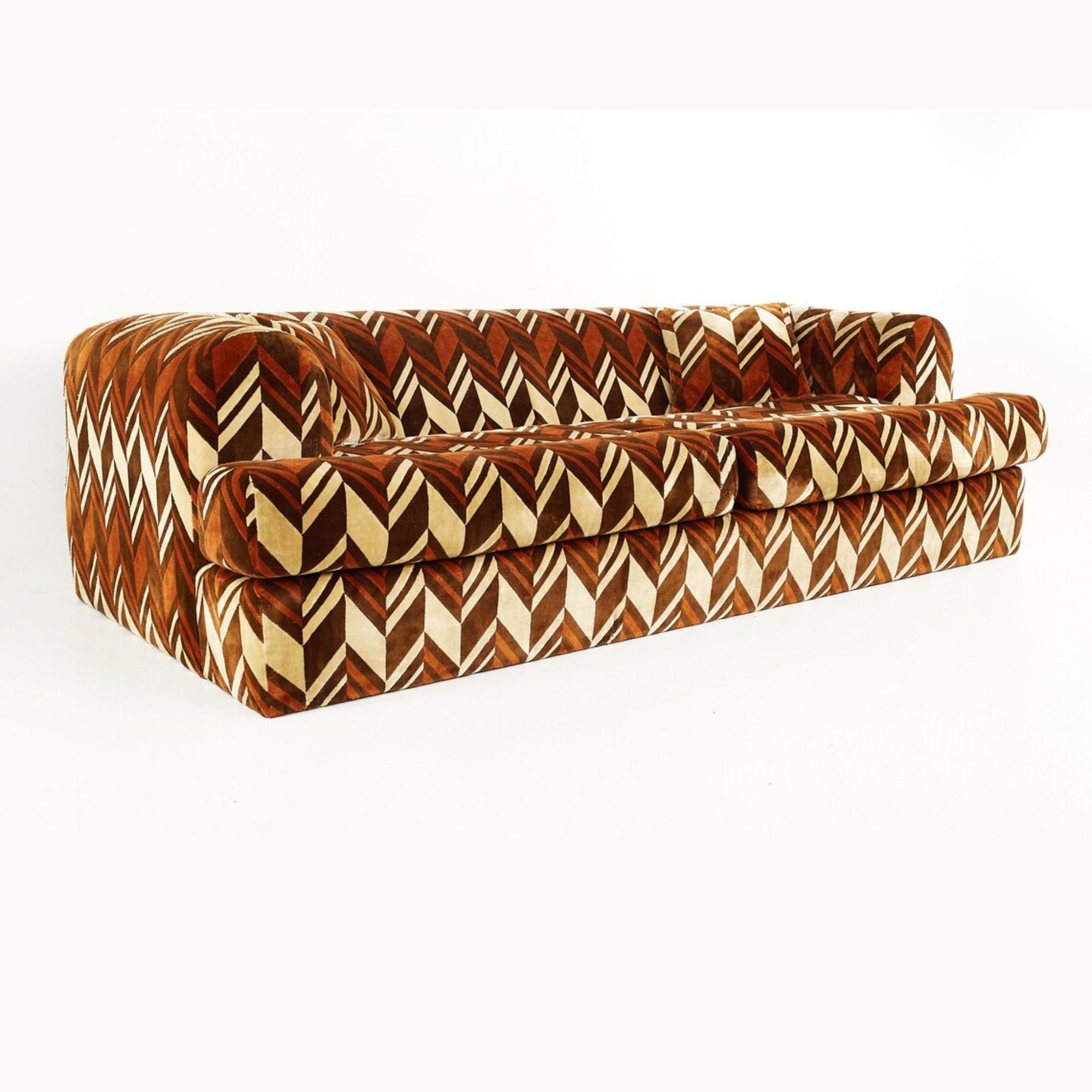
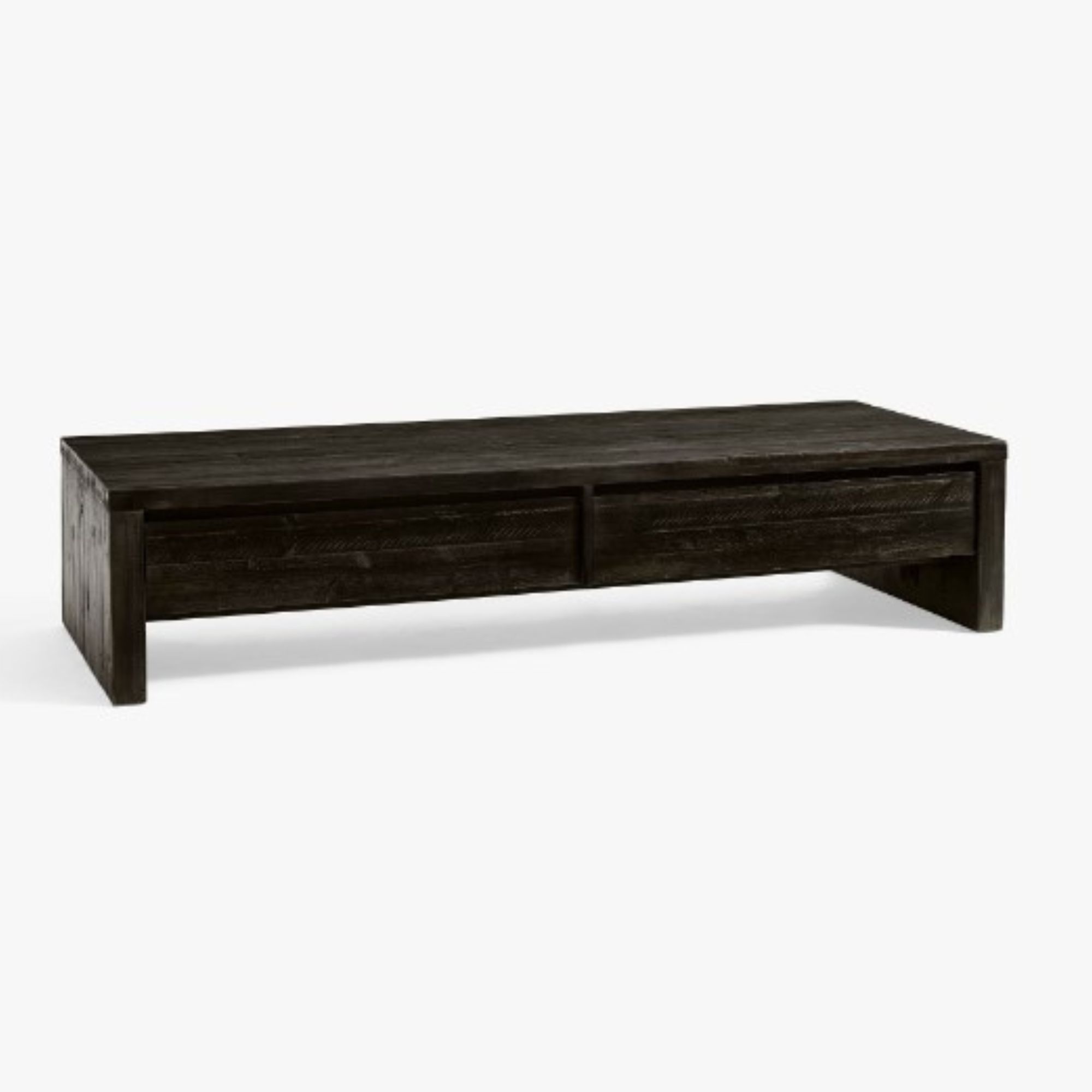
Kate Hudson Poses boldly on a mid-century sofa, upholstered in black, tan, and beige 1970s geometric fabric. The walls are made of warm, toasty natural wood with stylish panels. In front of her, a long black wooden coffee table highlights the black chevron on the sofa (see slide three). Inset lights in the ceiling give the home a more modern feel.
Interior designers especially love Kate Hudson's retro living room color scheme. 'The color scheme works well because it stays neutral and classic using black, beiges and creams,' says Austin-based interior designer Lenore Callahan.

Lenore is an Austin, Texas-based interior designer has over 30 years of design industry experience. Her work includes Roosevelt Square Chicago, City North Scottsdale and the Aqua Tower Chicago, Four Seasons Austin, the Austonian and the W, along with multiple homes in West Lake Hills, Bolivar Cigar Lounge and Bar 2211.
'When using a retro color scheme it's important to use classic colors that never go out of style such as black and wood tones. It's also important to balance out the vintage flair with simple modern accents such as the coffee table and accessories in the image,' continues Lenore.
Artem Kropovinsky, NYC-based interior designer lauds the use of texture and light in Kate Hudson's brown living room. He states, 'It's all about context and juxtaposition. The room might incorporate a nostalgic color palette, but the arrangement, the use of light, and the complementary textures breathe new life into those shades. The balance of retro and contemporary pieces in the space makes it dynamic and layered, preventing the colors from feeling stale or too rooted in the past.'

Based in New York, Artem Kropovinsky, founder of Arsight, has a decade of extensive and considerable global design experience. Prioritizing minimalism, sustainability, and authenticity, Artem, alongside his team of professionals, works on projects in the US and worldwide.
He continues, 'Integrate contemporary design elements or use retro colors in more modern patterns and textures. Think mid-century tones like mustard yellow or avocado green paired with sleek modern furniture or minimalist wall art.'
For those hoping to integrate Kate's retro color scheme into their own homes, Artem offers some advice. He says 'To prevent retro colors from overwhelming the space, pair them with neutrals. This provides an eye-pleasing balance. Furthermore, he says 'Retro patterns can give a nod to the era without being overt. Think geometric shapes or vintage-inspired wallpapers.'
Sign up to the Homes & Gardens newsletter
Design expertise in your inbox – from inspiring decorating ideas and beautiful celebrity homes to practical gardening advice and shopping round-ups.
It's no surprise that Kate Hudson, well-known for her role as Penny Lane in Almost Famous is a mid-century queen. Shop the retro edit below to get started on your own elegantly simple living room idea.

This mid-century sofa is upholstered in a brown and beige chevron pattern for a stylish and warm look. The vintage piece was made in the 1960s of upholstery and wood.

Sophie is a News Editor at Homes & Gardens, where she works on the Celebrity Style team. She is fascinated by the intersection of design and popular culture and is particularly excited when researching trends or interior history. Sophie is an avid pop culture fan. As an H&G editor, she has interviewed the likes of Martha Stewart, Hilary Duff, and the casts of Queer Eye and Selling Sunset. Before joining Future Publishing, Sophie worked as the Head of Content and Communications at Fig Linens and Home, a boutique luxury linens and furniture brand. She has also written features on exciting developments in the design world for Westport Magazine. Sophie has an MSc from the Oxford University Department of Anthropology and a BA in Creative Writing and Sociology from Sarah Lawrence College.
-
 Nate Berkus says slipcovered sofas are back on trend – and I just found a way to create this designer-approved laid-back look from just $86
This classic style is making a strong comeback, but did you know you don't have to buy a whole new couch to get this Nate-approved look?
By Eleanor Richardson
-
 Gardeners are putting pasta in bird feeders this spring – but there is one important warning you need to know before following suit
Cooked pasta can be a nutritious snack for birds, but serving it in the wrong way could cause them harm
By Tenielle Jordison

