Johnny Galecki's 'quiet luxury' kitchen color palette has us reaching for the paint can, but there is an unexpected twist
Unexpected color combinations are proving they shouldn’t be overlooked. Here's why...


There is no doubt that neutrals have been the most popular tones for home use during the first decades of the 21st century – and perhaps for good reason. Many people feel most comfortable when surrounded by carefully balanced colors that create an understated environment and make few demands on the eye.
Neutrals offer infinite possibilities for making spaces airy and relaxing, refined and timeless, or elegantly sophisticated. However, decorating with neutrals alone is not a fail-safe combination and it is all too easy to fall into the trap of using bland, depressing colors that are nothing like the complex palettes featured in Johnny Galecki's home.
Designed by interior design firm Pierce & Ward, Galecki's kitchen features a quiet luxury color palette that beautifully blends warm and grounding beige, taupe, and ochre hues with an unexpected pale blue. This season we are drawn to color quiet luxury colors, but we are mixing it up with unexpected color combinations for rooms.
A post shared by Pierce & Ward (@pierceandward)
A photo posted by on
It is safe to say that we've steered away from Millennial favorite gray and magnolia color palettes. These days, rich, tonal color schemes take center stage, and it is about time.
The interior design duo behind Pierce and Ward, Louisa Pierce and Emily Ward frequently throw out the rulebook with their penchant for unusual color combinations for rooms. Shades of beige, mustard, and brown are rarely the go-to paint and fabric colors of choice for the discerning decorator but, Pierce & Ward, who coined the term 'ugly colors', say every house needs a dose of underappreciated muddy tones to dial down the pretty and perfect.
Along with these so-called ugly colors, pale blue is the one color trend having a moment in the spotlight. It is easily the tone of choice for many, from amateur decorators to interior designers as it's incredibly easy to live with and perfect for layering, believes Patrick O’Donnell of Farrow & Ball. ‘Pale blue also has positive attributes in color psychology, such as enthusiasm, sympathy, warmth, encouragement, spirituality, loyalty, and thoughtfulness.’ It is a good color to have around the home.
Pale blue makes for a calming backdrop for a busy kitchen which can be instantly warmed up with beige, ochre, oranges and yellows. ‘We are very careful when picking blues for a room that doesn’t get too much natural light to make sure that the undertones are not too gray,’ says Liv Wallers and Cath Beckett, co-founders of Yellow London.
Sign up to the Homes & Gardens newsletter
Design expertise in your inbox – from inspiring decorating ideas and beautiful celebrity homes to practical gardening advice and shopping round-ups.
Calm, subtle and surprisingly versatile, this gentle shade – with a hint of steely gray – is the underdog of 2024's biggest color stories.
Shop the edit

Jennifer is the Digital Editor at Homes & Gardens. Having worked in the interiors industry for several years in both the US and UK, spanning many publications, she now hones her digital prowess on the 'best interiors website' in the world. Multi-skilled, Jennifer has worked in PR and marketing and occasionally dabbles in the social media, commercial, and the e-commerce space. Over the years, she has written about every area of the home, from compiling houses designed by some of the best interior designers in the world to sourcing celebrity homes, reviewing appliances, and even writing a few news stories or two.
-
 Martha Stewart's intelligent cabinets 'take every inch into consideration' – their 'visually light' style will solve your small kitchen storage problems
'Every kitchen can be beautiful and functional, no matter what the size': 9 years since sharing her clever storage, Martha's cabinets are just as beautiful
By Megan Slack Published
-
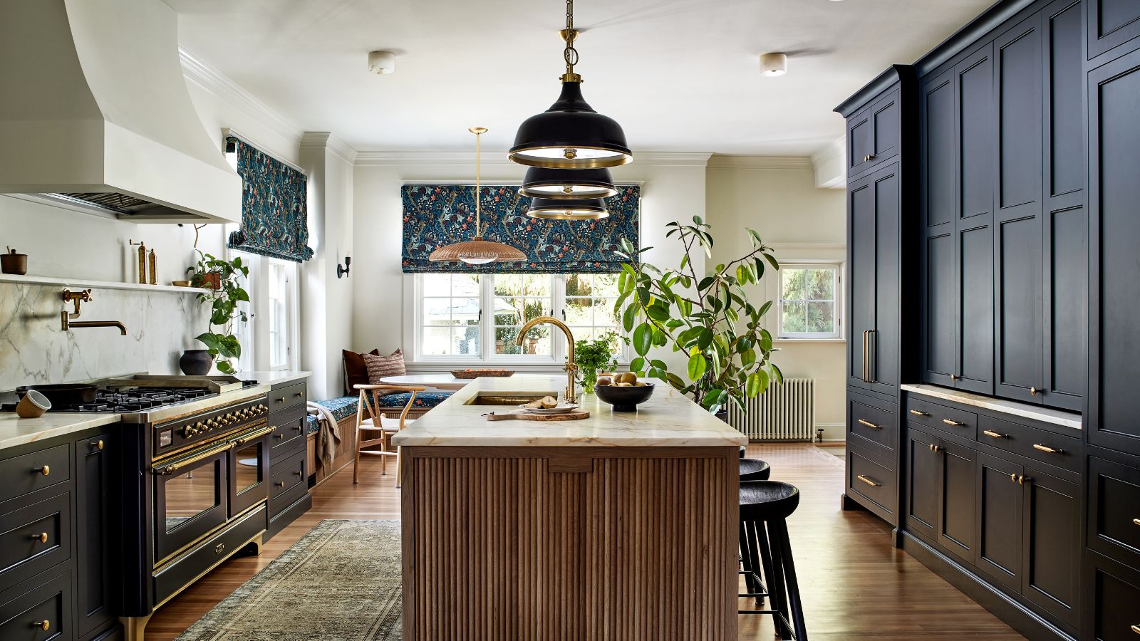 This once-dated kitchen is now a timeless space with the coziest details – and its the classic color palette that's made it a chic, welcoming space
Warming colors and natural materials combine to create this enduringly classic kitchen scheme
By Molly Malsom Published
