

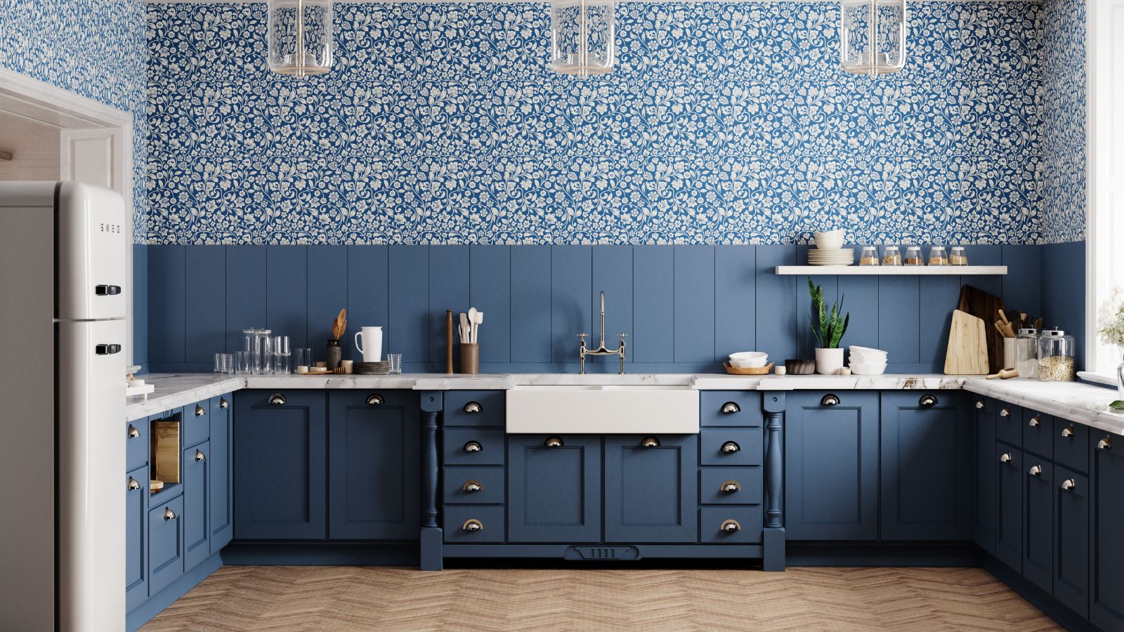
Jeremy Clarkson might not be known for his interior design choices, but his quintessentially English Cotswold kitchen is a thing of beauty. Best known for his role on Top Gear, and more recently as the star of Clarkson's Farm based in Chipping Norton, Clarkson's pale green – almost gray-green – kitchen color scheme is truly something special.
This gray-green room color idea is having a moment. And no wonder: post-pandemic, cooler neutrals such as pure white and steel gray are being replaced by warmer, more inviting neutrals.
An amalgamation of gray, green, and blue-brown, this shade has a moody, sophisticated feel and adds great depth to interiors. It is perfect for busy kitchens and would work well as a background color for artwork. Color is a remarkable decorating medium and is an easy way to make a kitchen look better.
Classic, calming and synonymous with nature, pale green is a hue that keeps the peace, making it the ideal choice for the main room in your home.
The color acts as an effective bridge between the outdoors and inside when used in busy, family spaces. When seen in enclosed rooms on walls or furnishings, the color brings relief and reassurance and elegantly reminds us of the living world beyond our four walls. Gray-green – and any other greens of the paler variety – can refresh any room while adding a hint of nature. It works all year round, so don't be afraid to use it in the winter months too.

‘Spending more time in our homes these past few years has led to prioritizing comfort and relaxation, leading to trends in natural and organic shades in our interiors, as well as houseplants and windowsill gardens,' says Tobie Lewis, senior brand manager at Valspar Paint. 'Pale green, with its biophilic nature, helps to keep us grounded and encourages stress-relieving effects on the mind and body.'
Gray-green is one of those versatile colors that holds a room when paired with white, and also partners well with paler shades of blue and darker green. However, it looks stunning when punctuated with contrasting colors. It has this mercurial quality, it works well with an array of colors. Paddington Bear, I am looking at you.
Shop the look

Crafted from hard maple wood, this sturdy and durable chopping board is the ideal kitchen accessory. You'll need two – one for raw meat and one for cooked.

If painting your whole room green is not on the agenda, why not decorate with green furnishings and accessories instead? These delightful gray-green ceramic pots are just what you need to add a dash of this enduring color.

Botanical art is having a moment in the sun. Mimicking the beauty of nature – with a classic walnut frame – this calming piece is perfect for busy kitchens and family rooms.

-
 Do cleaning products expire? Professional cleaners warn time could make them ‘less effective, and in some cases, irritating to use’
For the best results, it pays to stay on top of the timeline of your cleaning products
-
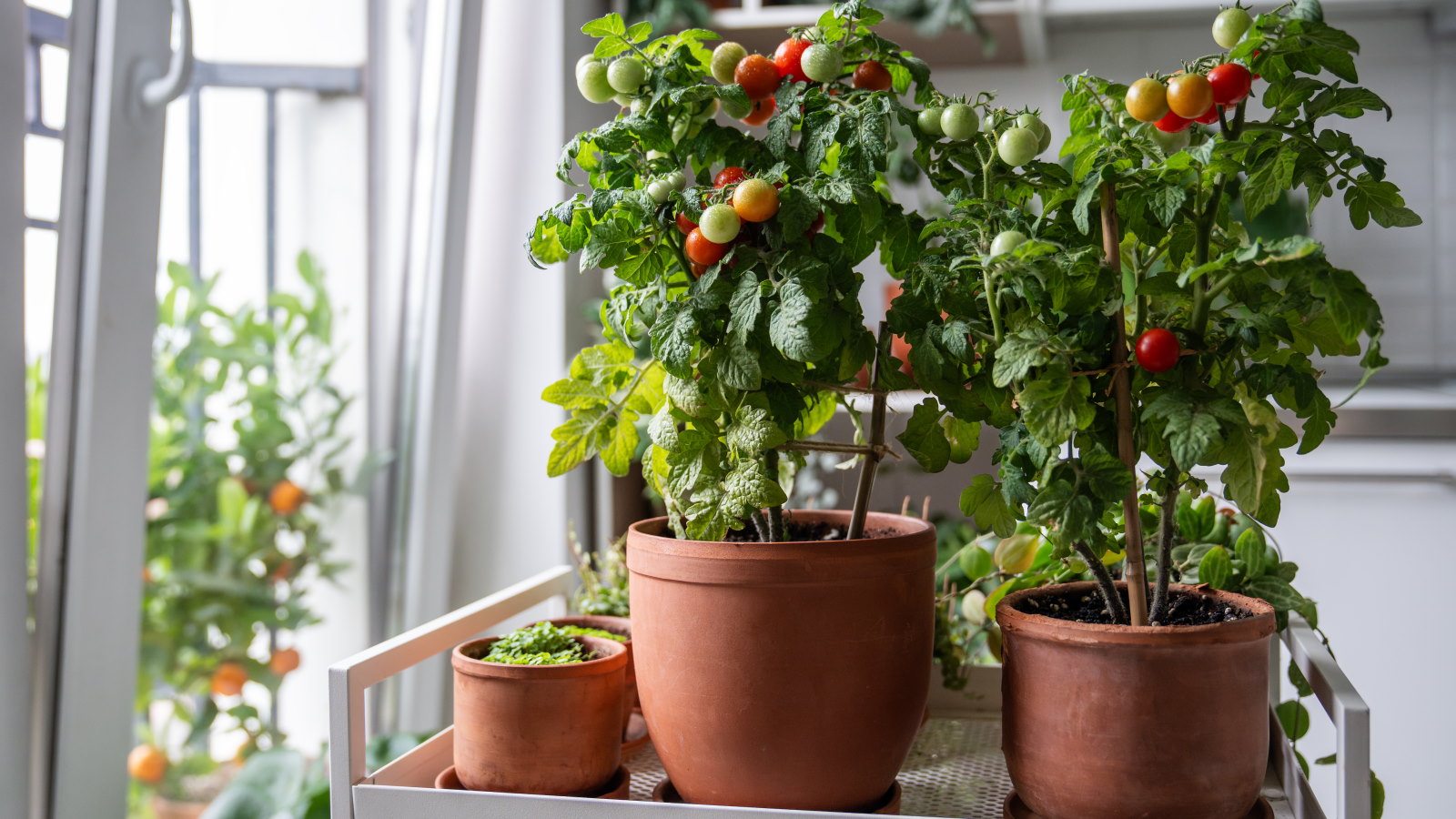 7 of the best tomatoes for growing in pots - expert growers pick their top varieties ideal for large harvests from containers
You can enjoy bumper homegrown harvests in small spaces


-
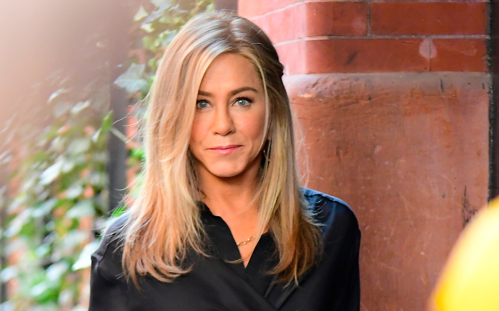 Jennifer Aniston's modern living room proves that the 'Internet's most divisive color trend' will never quite go away – you just have to know how to get it right
Forget what you thought you knew about gray. This sultry shade goes with every color and can be used to add depth and sophistication to any room
-
 Katie Holmes's living room looks straight out of the 1990s – and experts predict this nostalgic look will have a revival in 2025
Holmes's living room takes inspiration from my favorite decade – the 1990s
-
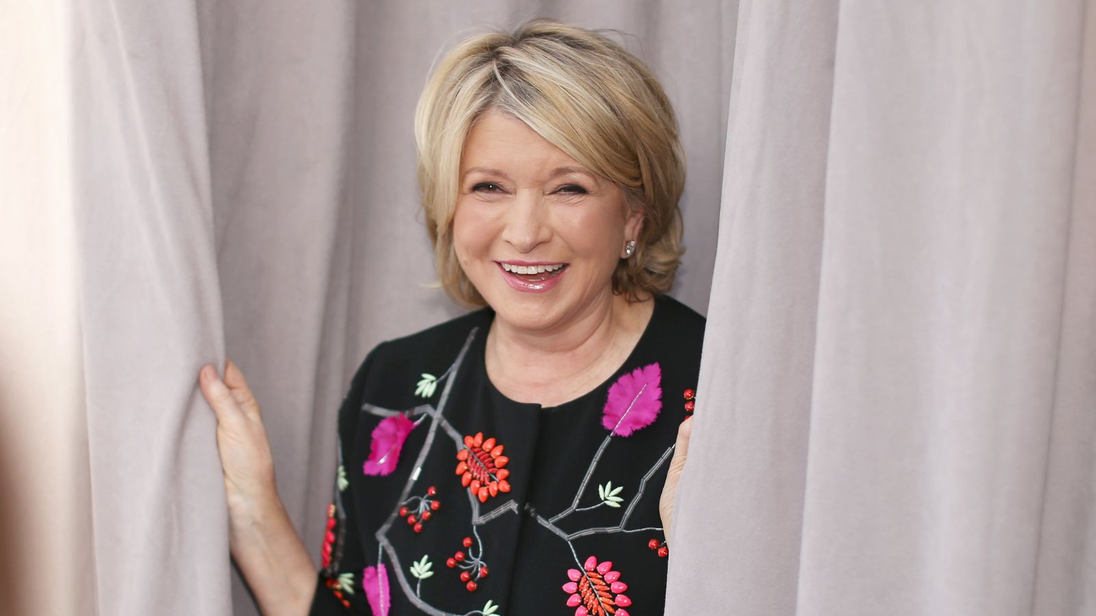 Martha Stewart shared a throwback photo of her 1978 kitchen – the retro kitchenware has reignited my love for this nostalgic trend
Timeless and sophisticated, brown ceramic earthware transcends time in this throwback '70s kitchen
-
 Brooklyn Beckham's kitchen doesn't have upper cabinets – instead, he saves space using the smart storage solution experts champion
A kitchen hanging rack is a great option if you are the proud owner of an impressive crockery collection, want a chef's kitchen, or have a small space
-
 Robert Downey Jr.'s picture-perfect garden pool landscaping is a masterclass in serene Mediterranean style
Robert Downey Jr.'s pool area is a masterclass in making your swimming pool look like part of the landscape
-
 Jennifer Aniston's Japanese garden masters privacy planting without blocking light – and it is easy to replicate
Choose garden screening and privacy planting to keep a yard private, conceal poor views, and divide the space in style
-
 Jennifer Aniston's living room has made me rethink this outdated ‘70s furniture trend – it's back and better than ever for 2025
This retro furniture trend is once again making waves in the design industry, and I predict it is here to stay...
-
 Anne Hathaway's good-looking kitchen storage is stylish, practical and one-of-a-kind – it's the most important thing in a cooking space
Kitchen storage should never be an afterthought. Make the most of this essential element by putting pretty objects on display, and hiding anything less so...


