Hilary Swank's bedroom demonstrates a 'subtle yet powerful' use of color – experts love her unorthodox take on warm neutrals
Neutrals come alive in Swank's rustic modern bedroom – designer Mark Zeff uses a mix of balance, contrast, and visual directing to transform the space


Design expertise in your inbox – from inspiring decorating ideas and beautiful celebrity homes to practical gardening advice and shopping round-ups.
You are now subscribed
Your newsletter sign-up was successful
Want to add more newsletters?
Choosing a bedroom color scheme can be a delicate matter. You want the colors to be calming enough to facilitate sleep, but not boring. You want it to be colorful enough to look intentionally designed, but not so colorful that it disrupts relaxation. Hilary Swank's bedroom perfectly strikes this balance.
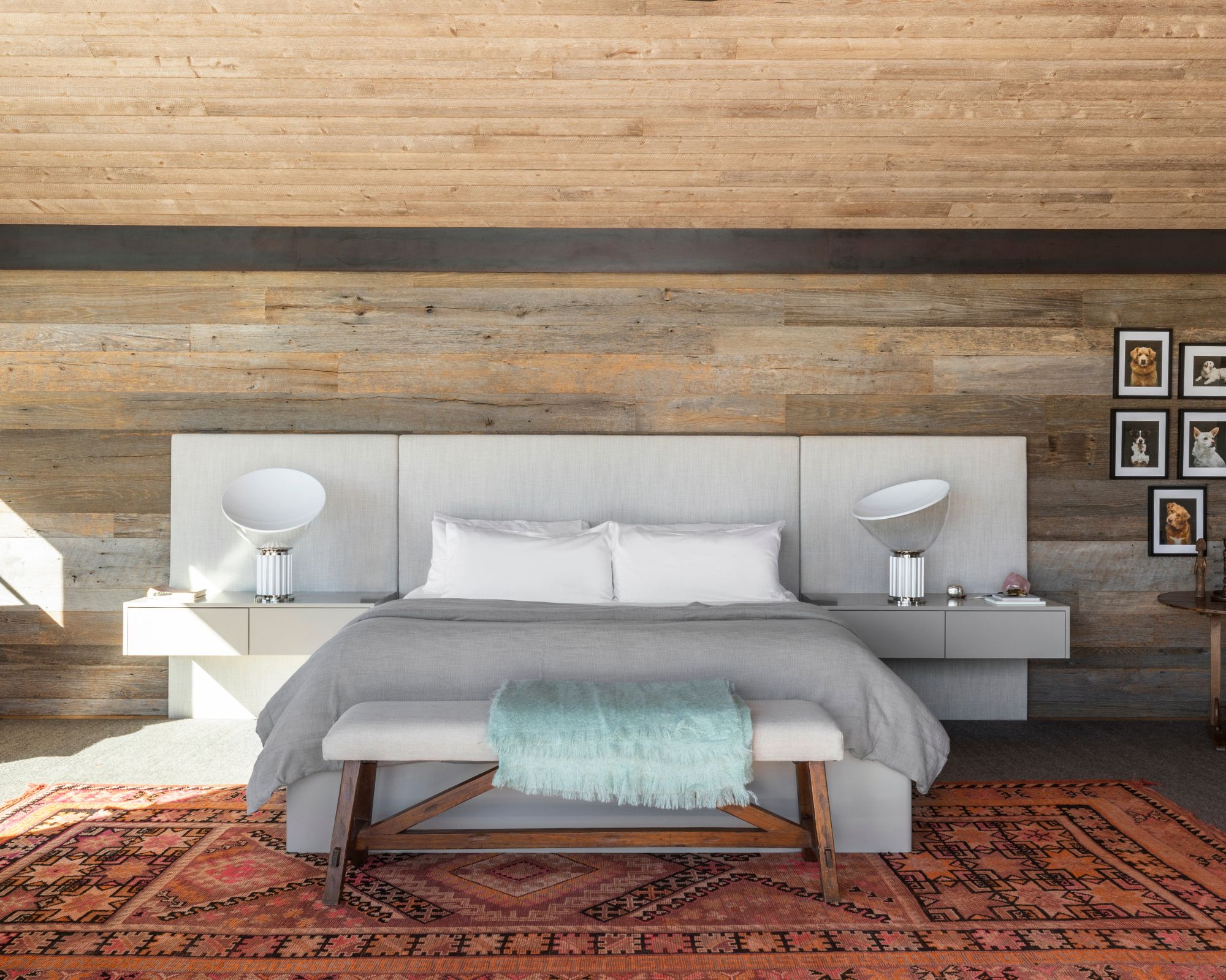
The actress's bedroom color idea is a lesson in decorating with warm neutrals. Her architect and designer, Mark Zeff, outfitted her walls with cozy wood, the perfect contrast against her low, gray headboard. Gray and white bedding brings a calming focal point to the center of the room, brightened by an ice blue throw blanket draped casually at the end of the bed. A red Persian rug infuses the room with luxury, play, and warmth. A black and white gallery wall of Swank's dogs on the right of the bed draws the eye up and connects the upper dark tones of the room with the lower lighter tones.
It's more than a fluke, color theory operates heavily in this neutral bedroom idea. 'I love the way the lighter and bright colors in this bedroom design are right at the center of the space, and they really put a natural spotlight on the bed as the anchor of the room,' says Kathy Kuo, acclaimed NYC-based interior designer. She continues, 'The more your eye takes in the details, you also slowly start to see the beautiful colors in the rug and the wood-planked walls. The lightness of the soft gray bed and the turquoise throw blanket pop in a lovely way without feeling overwhelming or out of place.'
Article continues below 
The color palette turns the space into more than a typical rustic bedroom. 'Hilary Swank’s bedroom is a superb illustration of a subtle yet powerful use of color, with a palette that blends neutral tones and natural materials to create a harmonious, inviting space,' Nina Lichtenstein, Westchester-based designer adds. 'The designer cleverly balances wood tones, whites, grays, and small pops of color to evoke a sense of tranquility and warmth, while still incorporating modern touches that feel fresh and timeless. The color scheme in the bedroom leans heavily on warm neutrals—wood, white, and light gray—making the space feel calm and cohesive.'
The introduction of natural materials in this space is a huge part of what makes it so striking. Lichtenstein states: 'The reclaimed wood wall behind the bed is a striking focal point, providing both texture and warmth. Its natural wood tones are echoed in the ceiling and floor, creating a seamless flow throughout the room. By incorporating a black plank separating the wall from the ceiling, the designer adds a bold, contemporary touch that grounds the room and highlights the organic beauty of the wood. This black detail is mirrored in the black-framed dog photos, which feature black, white, and brown tones—tying them into the overall color scheme. The gallery of dog portraits brings a personal and playful element to the room, while the crisp white matting keeps the display feeling clean and modern.'
Balance is also key to how Zeff decorates with neutrals in Swank's home. 'The large white headboard behind the bed, paired with white floating nightstands and sculptural lamps, creates a crisp contrast to the rich wood tones, while the light gray comforter adds softness without detracting from the natural warmth of the room. The subtle shift in color from white to gray on the bed layers the neutrals beautifully, creating a serene, cozy atmosphere. A light teal throw blanket draped over the white bench in front of the bed introduces a cool tone, adding a refreshing contrast to the warm neutrals and enhancing the space’s layered look,' says Lichtenstein.
Contrast is king in this space. Lichtenstein tells Homes & Gardens: 'Where the room truly comes alive is in the thoughtful use of accent colors. The geometric bedroom rug under the bed incorporates hints of orange and pink, which subtly introduce vibrancy without overwhelming the space. These colors are warm, complementing the natural wood tones, while also adding a playful energy that breaks up the otherwise neutral palette. Similarly, the green snake plant adds a fresh pop of color, bringing a touch of nature indoors and enhancing the organic feel of the space.'
Design expertise in your inbox – from inspiring decorating ideas and beautiful celebrity homes to practical gardening advice and shopping round-ups.
Shop the Look

This Burgandy Persian rug brings a hint of pattern, color, and texture into any room. Its bold style would pair perfectly with neutrals.

These black frames would be perfect for adding a touch of visual interest to a wall beside a bed.

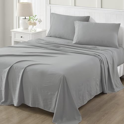
This gray sheet set by Martha Stewart is ideal for adding neutral grounding to a bedroom.
If you are hoping to recreate a similar effect in your own home, Lichtenstein's recommendations make it easy. She advises: 'To replicate Swank’s color scheme in your own home, start by incorporating natural materials like reclaimed wood for walls, ceilings, or furniture. This will create a warm, rustic base that can be balanced with crisp white accents—such as headboards, bedding, or nightstands—to add brightness and modernity. Opt for a neutral palette of whites and grays for larger items like bedding while incorporating pops of color through accessories like rugs or plants. Look for colors that complement the warmth of the wood, such as soft oranges, pinks, or greens, and use them sparingly to add life to the room without overpowering the natural tones.'
Lichtenstein concludes: 'Lastly, tie everything together with personal touches, like black-framed artwork or a gallery wall, to create a space that feels both stylish and personal. The key is to keep the palette neutral and warm, layering textures and subtle color accents to achieve a bedroom that feels balanced, serene, and effortlessly chic.'
Color is an endlessly varied thing, but when you figure out how to use it right for your space, the results are stunning.

Sophie is a writer and News Editor on the Celebrity Style team at Homes & Gardens. She is fascinated by the intersection of design and popular culture and is particularly passionate about researching trends and interior history. She is an avid pop culture fan and has interviewed Martha Stewart and Hillary Duff.
In her free time, Sophie freelances on design news for Westport Magazine and Livingetc. She also has a newsletter, My Friend's Art, in which she covers music, culture, and fine art through a personal lens. Her fiction has appeared in Love & Squalor and The Isis Magazine.
Before joining Future, Sophie worked in editorial at Fig Linens and Home, a boutique luxury linens brand. She has an MSc from Oxford University and a BA in Creative Writing and Sociology from Sarah Lawrence College.