Gwyneth Paltrow masters blending modern and antique design with this one stunning bathroom detail
Gwyneth Paltrow's stylish shower has the perfect mix of modern and traditional design. Design experts weigh in on why it works


Gwyneth Paltrow is known for embodying the 'quiet luxury' trend with her impeccable taste, and her bathroom certainly proves her reputation. The Goop mogul took to Instagram to show fans her hair-washing routine, but the timeless design of her shower room stole the show.
A photo posted by on
The Iron Man actress’s video opens with a view from outside the shower. The doors are made up of clean-lined black panels with glass squares in between. The back wall shows an inset shelf with a selection of curated products carefully displayed. All of Gwyneth’s hardware is matte black, from the handles to the hand-held shower head. The camera pans up to reveal the sleek white and gray marble ceiling featuring a sleek rain shower.
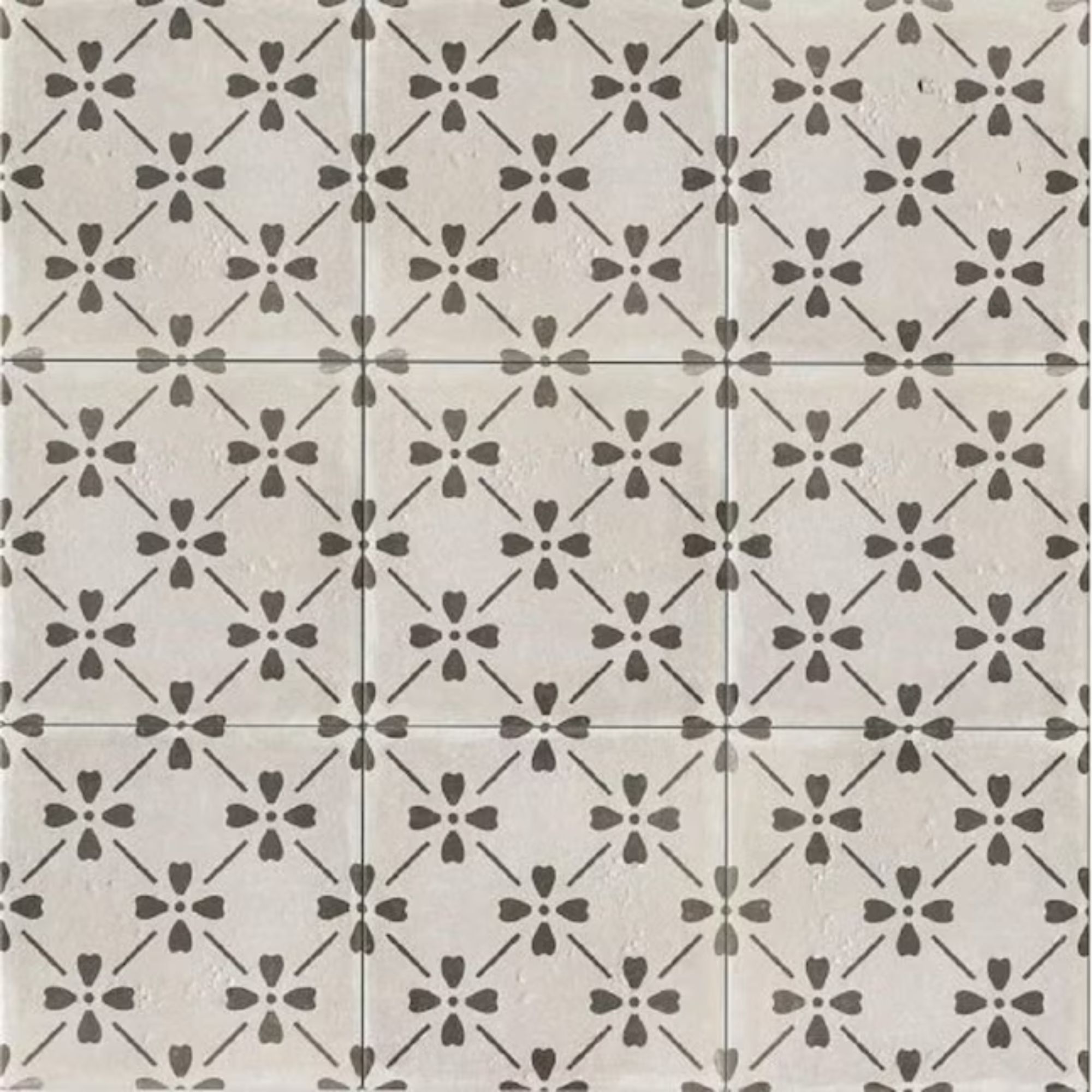
One detail stands out above all others: the antique-looking tiles. Gwyneth’s black and white tiles are unique, and look almost hand-painted in the style of traditional Moroccan design. The edges of each square tile are left unglazed, creating a particularly vintage look.
‘I love a tile that feels like it’s been around for a number of years and has that sort of antique feel to it’ Gwyneth gushes to her followers. ‘I thought it was really nice to offset the other very kind of modern elements in the bathroom’ she says. The look is so iconic, Gwyneth’s shower is likely to spark a new patterned tile trend.
A photo posted by on
The clean lines and glass of the shower combined with the rustic, patterned tiles, mean that Gwyneth’s shower effortlessly blends the antique and the modern.
To create a similar look that is at once contemporary and lived-in in any room, interior designer Swati Goorha recommends ‘mixing in vintage finds with modern furniture, playing with the scale of furniture, and adding fewer larger-scale pieces of furniture in a smaller space to scale the room.
I also advise using fabrics and materials to create an inviting, lived-in feel. Think vintage stools, flea market vases, and materials that patina and age over time, telling unique stories of the people who live in the space.’
Design expertise in your inbox – from inspiring decorating ideas and beautiful celebrity homes to practical gardening advice and shopping round-ups.

Swati Goorha holds an MS in Interior Architecture and Design from Drexel University in Philadelphia, PA. She has designed residences and commercial spaces all over the country from coast to coast. She is a member of the American Society of Interior Designers (ASID) and the International Interior Design Association (IIDA).
By focusing on an artful blend of the old and the new, you can create an effortlessly elegant space that is truly timeless.
Love Gwyneth’s tiles and want to install them in your own bathroom? We found the perfect match to shop below!

Sophie is a writer and News Editor on the Celebrity Style team at Homes & Gardens. She is fascinated by the intersection of design and popular culture and is particularly passionate about researching trends and interior history. She is an avid pop culture fan and has interviewed Martha Stewart and Hillary Duff.
In her free time, Sophie freelances on design news for Westport Magazine and Livingetc. She also has a newsletter, My Friend's Art, in which she covers music, culture, and fine art through a personal lens. Her fiction has appeared in Love & Squalor and The Isis Magazine.
Before joining Future, Sophie worked in editorial at Fig Linens and Home, a boutique luxury linens brand. She has an MSc from Oxford University and a BA in Creative Writing and Sociology from Sarah Lawrence College.
