

Blue and black should NEVER go together. The adage has been burned into my brain for so long that I took it as gospel. However, it only took one glance at Gwyneth Paltrow's home to disabuse me of the (ultimately arbitrary) notion.
The actress's stunning dining room color idea bucks tradition with the bold combination of light blue walls and black floors and furniture. This might not be remarkable if the space wasn't so stunning, but it is. Designed by the acclaimed LA designer Brigette Romanek, it's one of my favorite rooms I've ever seen, and I look at beautiful celebrity-owned spaces for a living. It features intricately patterned tree wallpaper, a long curved dining table, an avant-garde light fixture, and a stone fireplace that look to be invented to go together.
So, why does the taboo dining room color combination work so wonderfully in this space? The first reason is balance. The primary logic for the 'no blue and black together' rule is that it can end up looking too dark. However, Brigette Romanek avoids this pitfall by integrating white with the doorway, ceilings, and dining table to keep it bright and balanced. The movement of the wallpaper also adds a certain equilibrium to the room - it includes both black and blue, uniting the shades in the most striking feature in the space. Furthermore, the blue of the wallpaper is quite light at the top, offsetting the worry that it will look too dark with the black floors. This balance keeps the room looking elegant and organic.
Shop Gwyneth's blue and black dining room look

This uniquely shaped end table is perfect for adding shape and contours to a dining room. It would look especially striking with light blue wallpaper.

This shimmery light blue pillow would be a gorgeous complement to a black sofa. It also coordinates perfectly to Gwyneth's wallpaper.

Bring texture and visual interest to your sofa with this stunning mini cushion. Paired with more traditional blue pillows, it would create an eye-catching constrast.

The naturally inspired pearl chandelier is an icon of the organic modern style, and the exact one that appears in Paltrow's home. It represents unparalleled beauty and luxury.

This unique, individually crafted, table by Robert Kuo uses an ancient lacquer technique for stunning results

This beautiful landscape adds drama and beauty to any space. Available in various materials and sizes.
I also believe that the mixture of textures and curves in Gwyneth's blue dining room makes it look so visually interesting that all color rules go out the window. For instance, every piece of furniture in the room is curved, including the light fixture. Juxtaposed with the straight lines of the wainscotting on the ceiling and at the room's base, this promotes a sense of whimsy and intentional design. The fun artful feel justifies a rejection of rules, as art is wont to do. The contrast of the black floor's shimmer with the matte walls creates difference in the colors, that a designer might otherwise be intimidated to pair.
Rejecting basic interior design rules can be scary, as they often form the basis of everything we know about in design. However, the most truly innovative spaces may lie outside of these boxes. Do you feel ready to cast aside what you've known, in pursuit of greater art? You don't have to be Gwyneth Paltrow to say yes.

You must confirm your public display name before commenting
Please logout and then login again, you will then be prompted to enter your display name.
-
 This is the one place in the home you should never steam clean – and what to do instead
Steam cleaning hardwood could ruin your natural, beautiful flooring
-
 Claudia Schiffer uses a credenza to create a '70s-inspired statement in her entryway – experts say it has surprising wellness benefits
The model's credenza taps into the low-slung furniture trend, evoking a calming ambiance with a retro spirit that experts love


-
 Not beige, not grey – this perfect 'new neutral' is what Josh Brolin, Gwyneth Paltrow, and Martha Stewart are decorating with instead
Butter yellow is a shade that shines, but it also creates rooms that are rich and enveloping – it's a hue that's like a warm embrace
-
 Gwyneth Paltrow's 'butter yellow' walls bring cozy, relaxed luxury to her living room – I wasn't sure about this color trend, but now I'm convinced
Behind the actress's indoor swing, a light yellow wall elevates her earthy and stylish living room – it's a major color trend for 2025
-
 Gwyneth Paltrow's closet is a masterclass in regimented organization – it's the inspiration you need ahead of your spring clean
Gwyneth's wardrobe features tidy rails and bag storage, showing that dividing a closet into sections is a great way to organize
-
 Gwyneth Paltrow's calming wallpaper mural is a versatile statement piece – designers say the trend strikes the perfect balance between bold and relaxing
The forest scene wallpaper in Gwyneth Paltrow's dining room makes a stunning statement mural that's the perfect complement to her black and white furniture
-
Gwyneth Paltrow recommends these Valentine's Day gifts to upgrade your home – and they're not flowers
Give the gifts of comfort and beauty this Valentine's Day with the Goop founder's design-led gift ideas that you've probably never seen before
-
 Gwyneth Paltrow elevates her conventional closet mirrors with an antique twist – it turns her space into a Parisian-style dressing room
The actress-turned-wellness guru uses vintage-style mirrors to 'soften the architectural lines' of her closet – and her look translates to all bedrooms
-
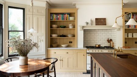
Gwyneth Paltrow's breakfast nook makes smart use of dead space in the kitchen – it's an efficient area where mornings begin
Paltrow's breakfast corner features a spacious wood dining table and a mix of benches and seats – which experts agree is efficient yet stylish
-
 Gwyneth Paltrow's quiet luxury Christmas tree is the most beautiful I have ever seen – and this trend is here to stay for 2024 and beyond
The importance of a neutral color palette should never be underestimated


