Eva Mendes' 1950s-style Americana wall technique is an unorthodox but stunning way to 'add depth and character to a room,' say designers
Hollywood Regency and mid-century America meet on Eva Mendes's kitchen walls – the half height design uses a modern color to avoid looking dated


Wainscoting, or wall paneling, is one of the oldest ways to add visual interest to kitchen walls. This textured, sometimes colorful decorating method can be beautiful when done right but can also look outdated. Eva Mendes's kitchen design falls firmly into the first camp.
Mendes's wainscoting idea combines blue lower walls with white upper walls. As seen on Instagram here, she has hung art higher up to reflect the color from the lower half of the kitchen into the upper half. It corresponds gorgeously with the natural hardwood floors. The white line details running through the panels connect it to the top part of the wall for a cohesive look. It's unique, striking, and original.
We consulted with interior designers to understand why Mendes's walls look alluring rather than dated. 'Half-height paneling is a simple but effective way to add depth and character to a room,' explains Melissa Read, principal designer at Studio Burntwood. The way Mendes has executed the wall paneling idea is especially interesting, nodding to historical design styles. Nicholas Kaiko, a Sydney-based interior designer, states: 'The blue lower panels immediately evoke a 1950s Americana aesthetic with the crisp white trim reinforcing that era’s love for high-contrast yet approachable interiors. The center square boss or medallion on each panel introduces a subtle nod to Hollywood Regency, adding a touch of ornamentation that feels deliberate rather than overly fussy.'
Posted by EvaMendes on
The Blue Kitchen Edit
If now's not the right time to paint, you can still incorporate pops of blue into your kitchen to harness the essence of what makes this look so attractive.

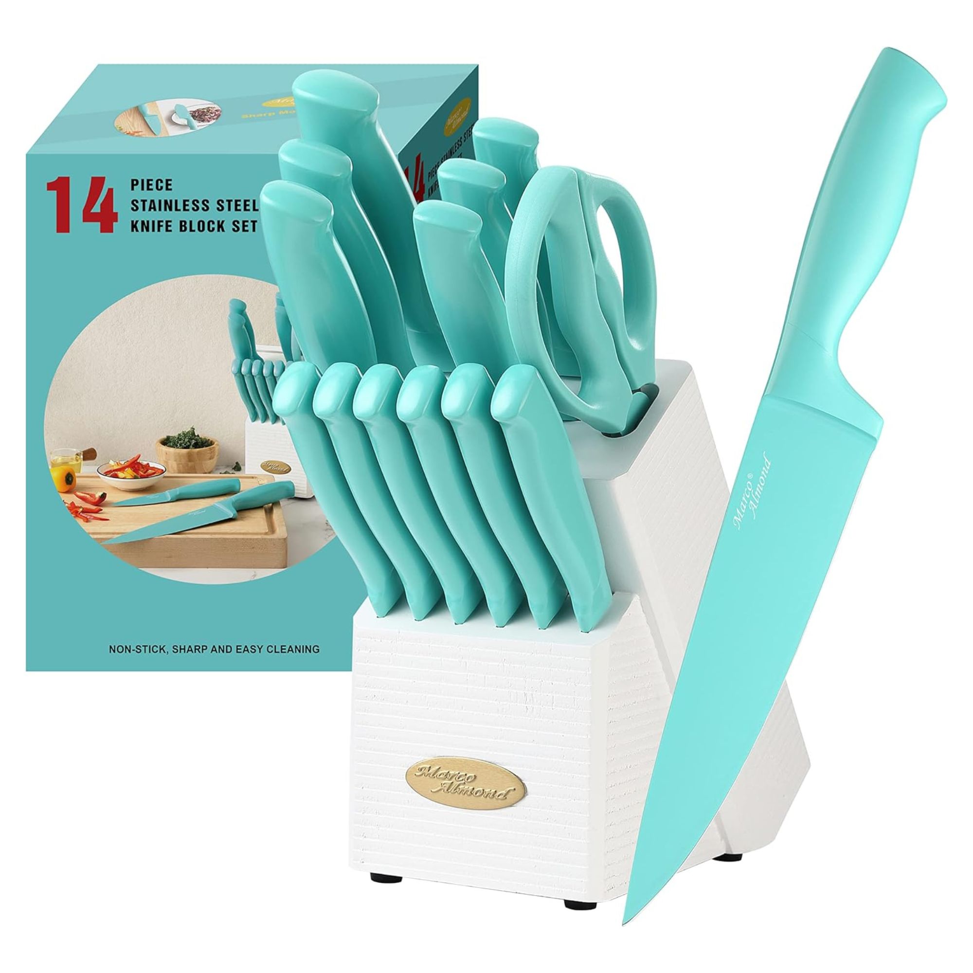
This knife block has an unexpected pop of turquoise, which I predict will be an unforeseen color trend over the next few years. It would be so striking on the countertop against a white backsplash.

This beautiful braiser is a classic for a reason. Le Creuset pots are just as beautiful on the countertop as when tucked away, and an easy way to add a reversible pop of blue to your countertops.

These dark blue drinking glasses are a gorgeous way to incorporate blue if you have glass cabinets. I love how they look next to white plates.
To panel a wall in a similar style, colors are essential. 'To keep it feeling fresh, color is key,' explains Read. 'Deep, muted blue, such as Prussian, Hague, or French navy, work particularly well in living and dining spaces, bringing a sense of depth and atmosphere without overwhelming the room. A satin or matte eggshell finish stops it from feeling too heavy. The height should typically sit between 900-1100mm depending on ceiling height to keep proportions balanced. For balance, contrast the rich blue with the softer, neutral tones above, and bring in texture with linen upholstery, aged woods, or warm metallics like antique brass or bronze. This stops the space from feeling overly formal and ensures the paneling works as a backdrop rather than dominating the room.'
However, if you are considering installing this same look in your home, there are pitfalls to consider. Kaiko cautions: 'Painted wainscoting is one of those elements that requires a very careful hand. It can read as charming and timeless or DIY and uninspired, depending on the color choice and execution. Here, the rich but not overly saturated blue keeps it from feeling like a theme park. It also allows the trim work to remain crisp and architectural rather than veering into kitsch.
Painted wainscoting is unconventional, but it can be gorgeous when done right. Eva Mendes's kitchen is the proof.
Sign up to the Homes & Gardens newsletter
Design expertise in your inbox – from inspiring decorating ideas and beautiful celebrity homes to practical gardening advice and shopping round-ups.

Sophie is a News Editor at Homes & Gardens, where she works on the Celebrity Style team. She is fascinated by the intersection of design and popular culture and is particularly excited when researching trends or interior history. Sophie is an avid pop culture fan. As an H&G editor, she has interviewed the likes of Martha Stewart, Hilary Duff, and the casts of Queer Eye and Selling Sunset. Before joining Future Publishing, Sophie worked as the Head of Content and Communications at Fig Linens and Home, a boutique luxury linens and furniture brand. She has also written features on exciting developments in the design world for Westport Magazine. Sophie has an MSc from the Oxford University Department of Anthropology and a BA in Creative Writing and Sociology from Sarah Lawrence College.
You must confirm your public display name before commenting
Please logout and then login again, you will then be prompted to enter your display name.
-
 Walton Goggins' unorthodox, boho chandelier taps into the lighting trend defining dining rooms in 2025 – here's how to recreate the elegant style
The White Lotus Season 3 may be over, but the actor's pendant lighting represents a timeless style that's sure to last for years to come
By Sophie Edwards Published
-
 5 decorating trends you thought you hated that are making a return in 2025
We spoke with top interior designers, who opened our eyes to how trends we thought everyone hated are actually back for 2025
By Pip Rich Published