Diane Keaton's living room furniture arrangement is perfectly set up for conversation – get it wrong, and a negative layout could ruin your space
Sink into comfort with a hardworking living room seating layout that will enhance the sociability of your space


When you have people over for social gatherings, you notice when you've got the seating arrangements right. Seating plans are very important – and not just at a dinner table. I like to think of seating plans for the living room early on when designing a living room – using what I like to call 'conversational seating'.
Interior designer Stephen Shadley, the mastermind behind Diane Keaton's living room layout, is an expert in creating social spaces that sing.
Furniture arranging mistakes are rife, but you may not even know you are making them. Your space could be beautifully decorated, but unless you give the furniture you fill it with the proper consideration, its design won't look or feel right. But where to begin?
A photo posted by on
Mastering the art of good furniture placement will ensure that your home is practical and sociable, no matter the size or layout. It all comes down to size, placement and styling.
'When planning a failsafe living room, the number one rule before even considering anything decorative is to prioritize functionality first,' explains New York-based designer Kati Curtis. 'The living room is often the most utilized space in a home and often must be multifunctional. Serving as a hub for social gatherings, relaxation, and more recently, even work.'
'Therefore, every element in the room should be chosen with its practical use in mind. This includes selecting versatile furniture that offers ample seating – positioned to make a small living room look bigger and provide conversation seating. By focusing on functionality, you can create a living room layout that is comfortable, welcoming, and adaptable to your needs.'
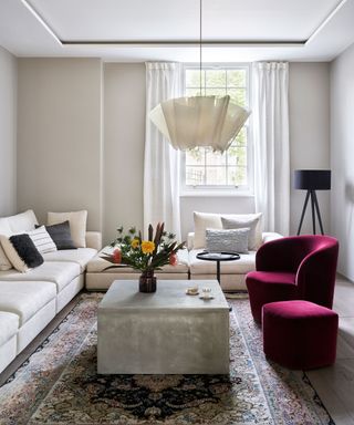
Select living room seating that is in proportion to the size of your room – oversized sofas and armchairs can make a small room feel narrow and claustrophobic. Make sure you arrange your sofa and chairs at an angle to create a sense of depth to the room, as shown here, otherwise, if you place all seating against the walls you might end up with a narrow 'bowling alley' look. This layout is great for intimate conversation, informal entertaining and small living rooms.
Sign up to the Homes & Gardens newsletter
Design expertise in your inbox – from inspiring decorating ideas and beautiful celebrity homes to practical gardening advice and shopping round-ups.
'The number of chairs you set out is an important consideration,' explains design icon, Nina Campbell. 'Odd numbers are good for seating plans in general because it allows for some rotation of guests.'
'The interior designer Elsie de Wolfe wrote in 1913 that you must never place a chair on its own in a room; she was very shy herself and noted that it is always the shy person who arrives first, sits on the lone chair and then is often rooted there for the whole party. But two next to each other does not always work, either. I find that two people sitting side by side do not always speak to each other, so having an occasional chair pulled in at a diagonal can create conversational triangles.'
Shop the look
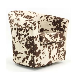
Many designers are hailing animal print as the 'new neutral'. However, when decorating with bolder designs, less is always more. Make do like Diane Keaton, and introduce one strong element, such as an accent chair, to create a unique focal point in your home.
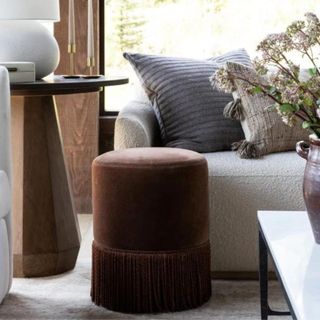
If you have a small living room, but also love to entertain, look no further than a few decorative stools that can be easily moved around and stored in cabinets when not in use. This gorgeous, earthy brown fringed stool is a personal favorite of my own – I already have two.

When designing a living space, it is important to have a focal. Usually that would be a distinctive architectural feature, however, I personally love to use sculptural artwork instead. Place this figurine on a coffee table and let it take center stage.

Jennifer is the Digital Editor at Homes & Gardens. Having worked in the interiors industry for several years in both the US and UK, spanning many publications, she now hones her digital prowess on the 'best interiors website' in the world. Multi-skilled, Jennifer has worked in PR and marketing and occasionally dabbles in the social media, commercial, and the e-commerce space. Over the years, she has written about every area of the home, from compiling houses designed by some of the best interior designers in the world to sourcing celebrity homes, reviewing appliances, and even writing a few news stories or two.
-
 Katherine Heigl uses these exact martini glasses to add instant excitement to her neutral kitchen – and they master 2025's most luxurious trend
The Grey's Anatomy actress expertly exhibits her glassware, turning party pieces into permanent decor (and they've never looked as fashionable)
By Hannah Ziegler Published
-
 I tried the 'Reverse Decluttering' method – it made clearing clutter in my small home stress-free, speedy and guilt-free
It's a simpler way to cut clutter
By Chiana Dickson Published
-
 Diane Keaton turned her kitchen island into a piece of 'artwork' with colorful mosaics – it's the most inventive use of tiles I've ever seen
The actress combines Mexican charm with Californian style to create a kitchen focal point that design experts love – it's the ultimate statement piece
By Megan Slack Published
-
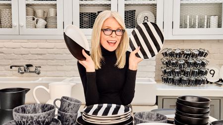 Diane Keaton styled her kitchen island to make the ultimate Spanish Revival statement – it's one of the most aesthetic islands I've seen
Designers are observing a shift in how some use their kitchen islands, and Diane's is the perfect inspiration point – it's changed how I will decorate
By Megan Slack Published
-
 Diane Keaton’s jet-black front door makes a bold, impactful impression – real estate agents weigh in on how it elevates her curb appeal
A black door can sometimes feel heavy and imposing – but Diane's avoids the above thanks to the nuanced architecture and thoughtful surrounding decor
By Lilith Hudson Published
-
 Diane Keaton's kitchen sink is the most unique I've ever seen – she's created a bespoke nook in a Spanish Colonial Revival space
The '90s kitchen uses metallic accents for a practical space with European-inspired undertones – and the sink makes an unexpected statement
By Megan Slack Published
-
 Diane Keaton makes vintage furnishings feel modern in her pared-back 'monastic' dining room – designers swear by this decorating technique
Somehow, Keaton manages to bring a contemporary feel to her black-and-white living space – using nothing but century-old furniture and accessories
By Megan Slack Published
-
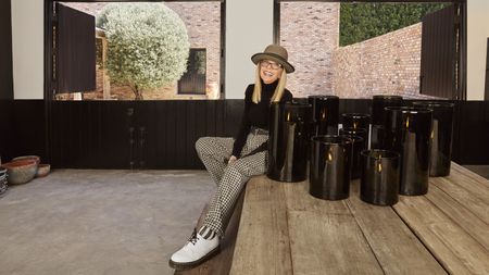 Diane Keaton designed a candle inspired by her home's 'warm, inviting ambiance' – her signature scent is currently on sale (with over $20 off)
The aptly-named HOUSE candle pays the ultimate homage to the actress's distinct taste – while inviting you to 'discover your own iconic style'
By Megan Slack Published
-
 Diane Keaton's arched fireplace uses hand-picked bricks to bring personality to a simple hearth – the result is a designer-approved focal point
The bespoke bricks pay homage to the home's Spanish colonial style and make the fireplace a cozy conversation starter
By Lilith Hudson Published
-
 Diane Keaton's bedroom furniture is the best take on Spanish revival I've ever seen – her black and white reimagining of mission style is so refreshing
Stephen Shadley, the actress's interior designer, embraces a black-and-white vision of the Spanish Revival style – it's equally cozy and chic
By Sophie Edwards Published