Chelsea Handler's bookshelves are some of the busiest we've ever seen – but her styling stops them from looking cluttered
Open, modular shelving has room for error – but with the right styling tips, we can overfill our living spaces with abundant personality


Book shelving units have long offered the opportunity to showcase our personalities in ways beyond our favorite titles – but how many pieces are too many pieces for our shelves? Take Chelsea Handler, who suggests there is no limit to the pieces in which we should exhibit.
The comedian has filled her anti-minimalist bookshelf with countless titles and other personal artifacts, including a framed map and a large gemstone that appears to double as a decorative book stop. Though the modular shelving unit is one of the busiest we've ever seen, it doesn't feel cluttered. Instead, Handler has styled her shelves in a way that feels both intelligent and curated (while simultaneously nailing the bookshelf wealth trend). How can we ensure the same? Designers emphasize that the key is not in the number of pieces we have but in the variety.
'A well-styled bookshelf is all about variety. Mix books with decorative objects like vases, picture frames, and small sculptures. This keeps things interesting and adds depth. Don’t be afraid to throw in some greenery, too – plants bring life to your shelves,' comments Jodi Peterman, the CEO and owner of Elizabeth Erin Designs.
A post shared by WSJ. Magazine (@wsjmag)
A photo posted by on
Alongside incorporating a variety of objects, Handler has unintetionally taught us another key styling rule: go for a combination of horizontal and vertical book placements.
'When it comes to books, go for a mix of horizontal and vertical arrangements. Stack a few books horizontally to create little platforms for decorative items. Then, line up some books vertically to give a structured look,' Peterman comments.' Also, show the spines of some books to add color and character, but don’t be afraid to turn a few around to display the pages for a softer, textured look. Stick to book covers in white or neutral tones to maintain a cohesive and elegant aesthetic.'
Similarly, there's a lot to be said for how we group our titles together. While the number of books on our shelves as a whole doesn't matter – the number of books in our clusters can make an impact. Peterman recommends grouping items in odd numbers like 3, 5, 7, or 9 for the most beautiful impact.
'Odd numbers are more visually appealing and create a natural, organic look. This tip works wonders in making your shelf look thoughtfully styled without being too symmetrical or rigid.'
Sign up to the Homes & Gardens newsletter
Design expertise in your inbox – from inspiring decorating ideas and beautiful celebrity homes to practical gardening advice and shopping round-ups.
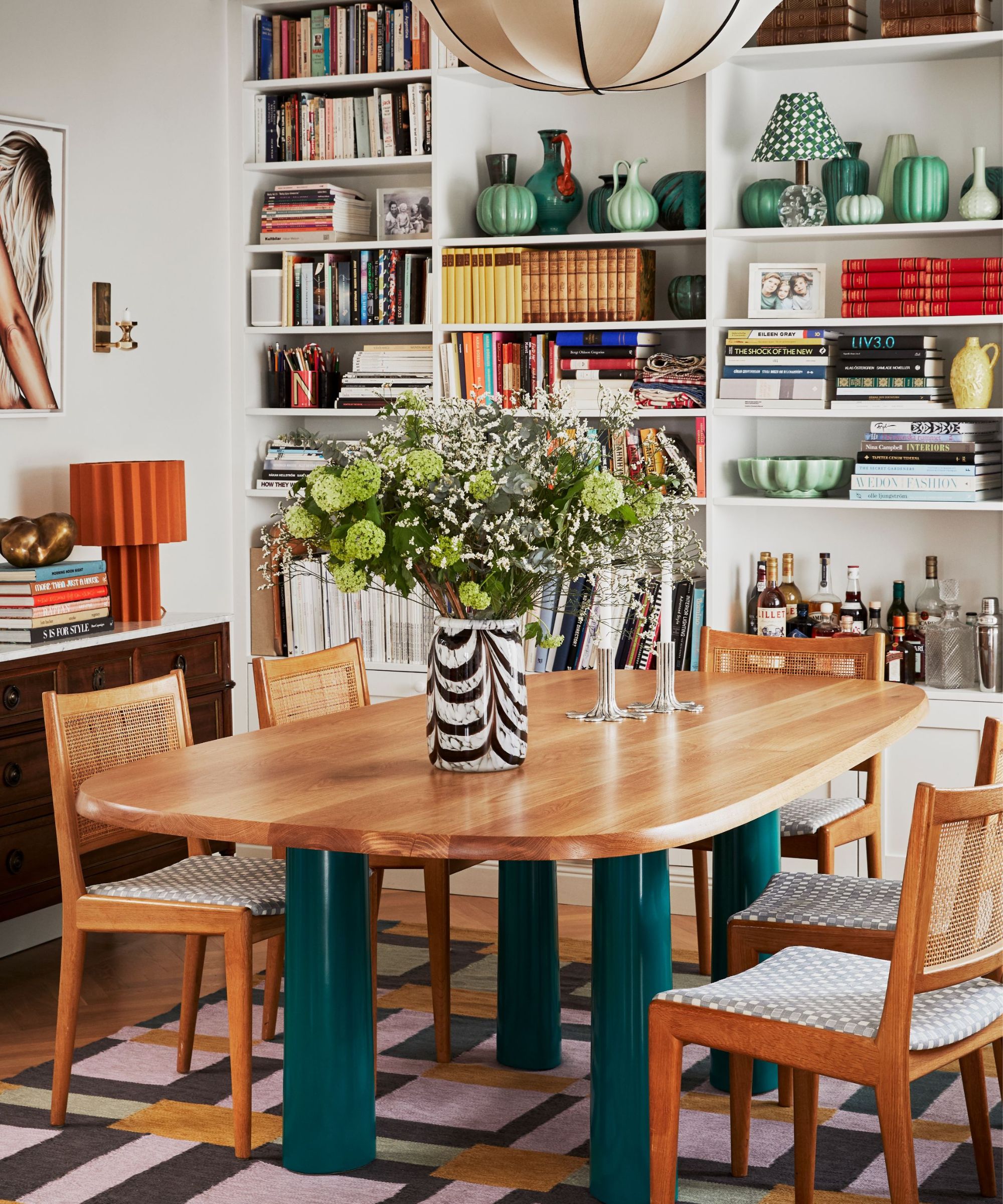
With numbers in mind, it's similarly important to remember how balancing colors and textures in our clusters is also key. 'Distribute colors, textures, and sizes evenly across your shelves. If one side is feeling heavy with books, balance it out with some lighter decor on the other side. Aim for symmetry, but don’t be too rigid – a little asymmetry adds charm,' Peterman comments.
'Varying the heights of your objects adds dimension. Use book stacks to elevate smaller items and place taller pieces like vases or framed photos to create vertical interest. This layering effect makes your bookshelf look thoughtfully curated.'
Shop H&G's bookshelf edit
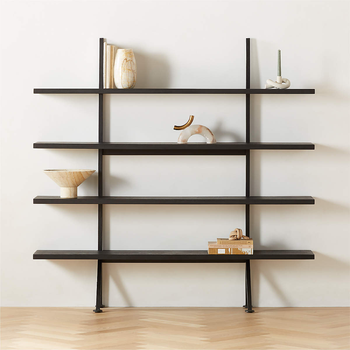
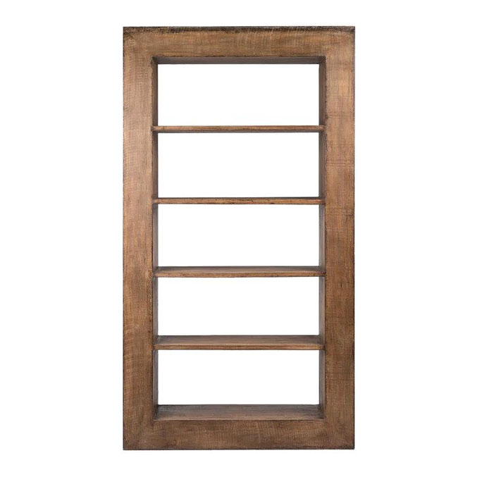
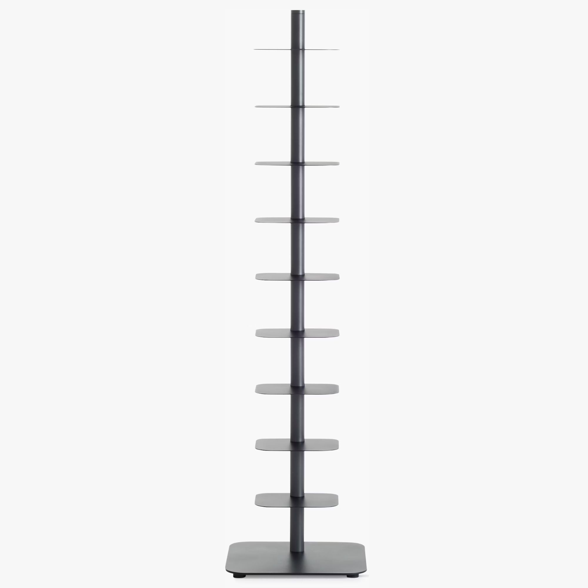
Whether we go for large, modular living room shelving like Handler's, or more compact options (for whatever our space allows), these picks will look great in every type of home.
Handler's bookshelves are a reminder that busy shelves don't necessarily translate to a cluttered aesthetic. One last thing to remember from her space? Bookshelves are used for more than books. Handler recommends adding 'personal touches like mementos from our travels', and other pieces that tell our story. 'This not only makes your bookshelf unique but also adds a warm, personal vibe to your space,' she says.
'Finally, take a step back and look at your shelves from a distance. Is there something that stands out too much or feels out of place? Don’t be afraid to edit. Sometimes, removing one or two items can make a big difference!'

Megan is the Head of Celebrity Style News at Homes & Gardens, where she leads the celebrity/ news team. She has a history in interior design, travel, and news journalism, having lived and worked in New York, Paris, and, currently, London. Megan has bylines in Livingetc, The Telegraph, and IRK Magazine, and has interviewed the likes of Drew Barrymore, Ayesha Curry, Michelle Keegan, and Tan France, among others. She lives in a London apartment with her antique typewriter and an eclectic espresso cup collection, and dreams of a Kelly Wearstler-designed home.
-
 How to design a mini meadow in pots – and welcome birds, bees and butterflies to your urban wildlife garden this summer
Experts share advice on species recommendations, soil, and types of containers to use for meadow planting
By Holly Crossley
-
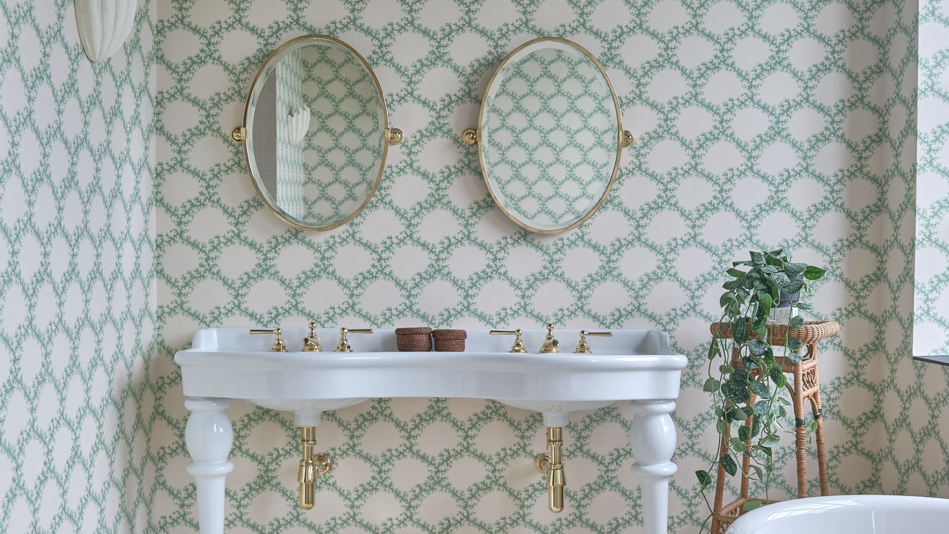 I tried this glycerin hack to stop the mirror in my bathroom from fogging up – and it worked like magic
It instantly fixed one of my biggest pet peeves
By Chiana Dickson
-
 Drew Barrymore's Beautiful collection embraces flower power – this one item literally lights up a room
The latest decor drop includes a vintage-inspired flower lamp, which retails for under $48 – and it was the first thing in our carts
By Hannah Ziegler
-
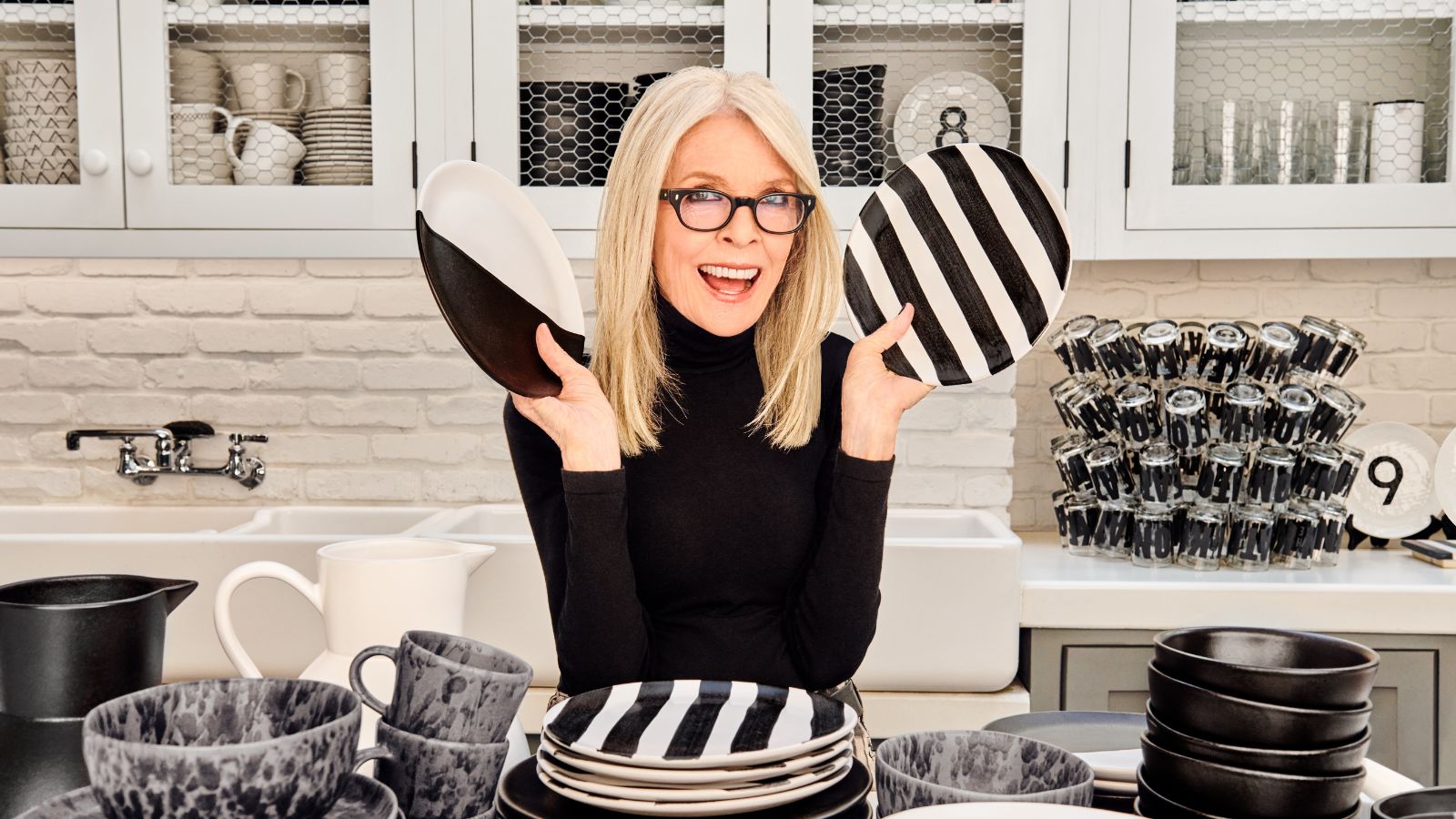 Diane Keaton's new decor collection is a celebration of wit and playful irreverence – directly inspired by her quirky home
The collaboration offers a humorous twist to the most simple color palette of all – bringing Keaton's flare to our entertaining spaces
By Megan Slack
-
 RuPaul's kitchen is sleek and sophisticated thanks to this unexpected cabinet color
RuPaul's black kitchen cabinets are undeniably bold, yet have a surprisingly soothing effect that get the expert stamp of approval
By Hannah Ziegler
-
 Justin Baldoni's anti-trend kitchen cabinet color serves as the perfect 'blank canvas' – this style will never fade
The actor knows that this color transcends fads, so he used it for his kitchen cabinets - experts swear by the classic, calming shade
By Sophie Edwards
-
 Cynthia Nixon's sofa color is a 'cornerstone in modern interior design' – it's a classic for a reason
Cynthia Nixon's gray sofa proves that the neutral hue is anything but outdated, pairing the soft shade with some warm, natural materials for a trendy look
By Hannah Ziegler
-
 Pastry chef Dominique Ansel shares the 3 most useful appliances every home baker needs in their kitchen
The celebrity pastry chef swears by these pieces of equipment to level up your home baking - and explains the one item he can't live without
By Sophie Edwards
-
 Martha Stewart's dining room taps into this timely trend – here's how to recreate the look
Martha Stewart's Skylands property in Maine has been decked out with a summer-ready tablescape, featuring collectible plates and coveted glassware
By Hannah Ziegler
-
 Jamie Lee Curtis's luxurious bedding is a favorite among sleep experts – and it's surprisingly low-maintenance
Jamie Lee Curtis's bedding has benefits for skin, hair, and sleeping temperature - experts say it is exceedingly simple to care for
By Sophie Edwards
