

When styling a gallery wall, you'd be forgiven if your design decisions ended with the size, shape, and color of the frames. However, while frames are inevitably vital, the styling of our wider room is similarly crucial to a gallery wall's sucsess – a fact that's not lost on the likes of Bobby Berk.
The Queer Eye alumni knows just about everything there is to know about gallery wall styling – so much so, in fact, that he collaborated with Frameology to design six wall sets (and 12 unique frames) in a series of versatile colors. Naturally, a beautifully designed wall begins with the frames, but it certainly doesn't end there, as Berk explains.
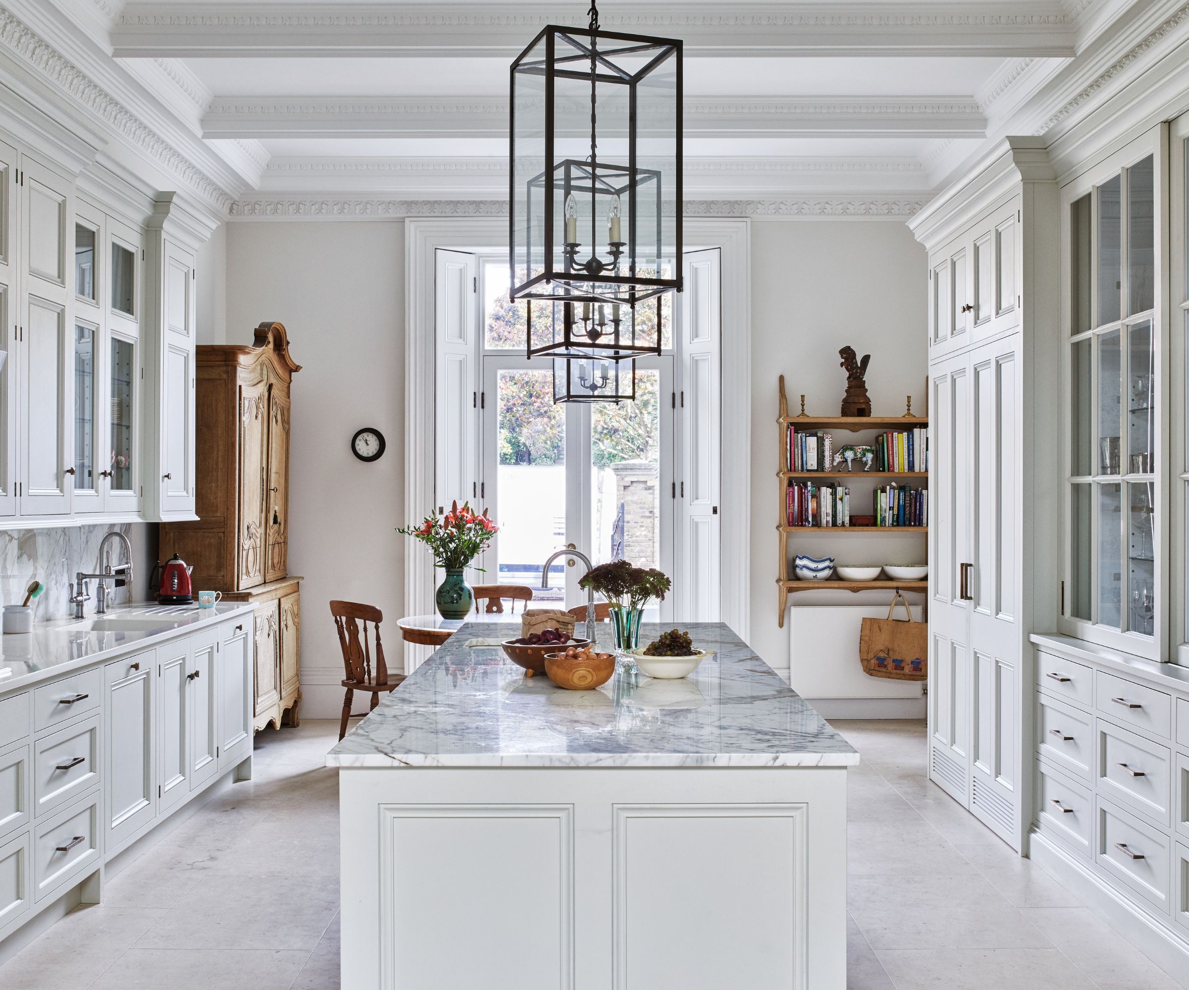
'When it comes to styling a gallery wall, the key is to think about the entire room as one cohesive design moment. You want the wall to feel like an intentional part of the space – not just something you threw up at the last minute,' Berk says in an exclusive interview with H&G.

Arguably, there's nothing quite as impactful as our chosen base hue. For this, Berk recommends a soft neutral (but still gives us permission to go bolder if we so choose).
For paint colors, go for a neutral base that lets your art shine but still creates a cozy vibe. Colors like soft whites, warm grays, taupe, or sage green are my go-to. If you want to add more drama, a rich charcoal or deep navy works beautifully behind a gallery wall, giving the frames extra contrast and making the art pop,' he says.
Next, when it comes to furniture, we should keep things minimal, allowing the gallery wall to make the statement it deserves. 'When styling furniture near a gallery wall, simplicity is key. Stick with clean-lined sofas, benches, or console tables that complement the art but don’t compete with it,' Berk says.
Designing the right environment around Berk's frames is refreshingly simple. These three (below) come in neutral hues, meaning they're versatile enough to work alongside every paint color – even those richer, darker tones.

Featuring museum grade acrylic and a white cotton conservation mat, this black frame may be simple, but it's a classic.

Much like its black-hued counterpart, this white frame is part of a premium line (designed by Berk) that elevate your memories to new levels.

The wood for this wall frame is milled at Frameology's factory in North Carolina, and features a wall safe papered backing, and easy-to-hang wire hanger.
'The goal is to let the art tell your story, but in a way that complements everything around it. When your furniture, paint, and decor feel in tune with your wall, the whole space sings—and trust me, that’s the moment where the magic really happens!'

-
 Are you making the most out of the estate sales in your area? These are the 5 most valuable items you should be shopping for
Vintage lovers and antique experts share the objects you should always look out for when you're exploring an estate sale
-
 How to grow sassafras – for a low-maintenance native tree that can even be planted in shady yards
For an easy-to-grow North American tree, you will not find much better than sassafras

