Blake Lively's bold and inviting entryway colors are a masterclass in tasteful maximalism – experts love the stunning shades
The actress incorporates bright art, a patterned rug, and striking furniture into her foyer – it's perfect for welcoming guests into the home

Design expertise in your inbox – from inspiring decorating ideas and beautiful celebrity homes to practical gardening advice and shopping round-ups.
You are now subscribed
Your newsletter sign-up was successful
Want to add more newsletters?
Blake Lively and Ryan Reynolds's entryway is a vision in blue, red, and green. In their foyer, bright colors and bold patterns are expertly grounded by natural wood floors and exposed brick walls for a welcoming energy. The space is a masterclass in using maximalist color to create calm.
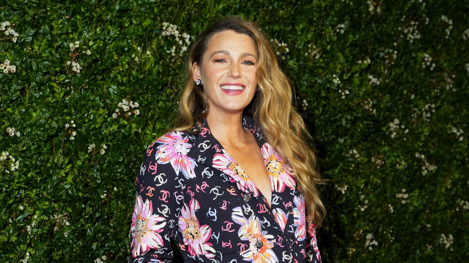
Lively debuted the entryway on an Instagram post about her new film, It Ends With Us, wearing a sparkling floral dress that perfectly matches the space. Behind her, a line-drawn painting full of pink, yellow, and organic flowers with a green background brings the foyer to life. A bright blue sideboard echoes the neon leanings of the painting, while a red and cream oriental runner rug brings in a traditional twist. It's wholly original, striking a stunning balance between fun and sophistication.
'I absolutely love the bold, unexpected use of entryway colors in Lively's space,' says Jennifer Ebert, color expert and digital editor at Homes & Gardens. 'It's the sort of space if you just imagined it, you might think wouldn't work, but looks so beautiful and bold when you see it all together. The bright blue sideboard is the standout piece for me, creating a solid, colorful break between the pattern of the artwork and the pattern of the rug.'
Article continues belowA post shared by Blake Lively (@blakelively)
A photo posted by on
In addition to color, the space is full of lessons in mixing patterns. It's peak tasteful maximalism. 'Maximalism is about creating a narrative within your space. It’s an invitation to play with scale, color, and pattern to tell your unique story,' says Lena Gierasinska, design expert at furniture company Barker and Stonehouse.
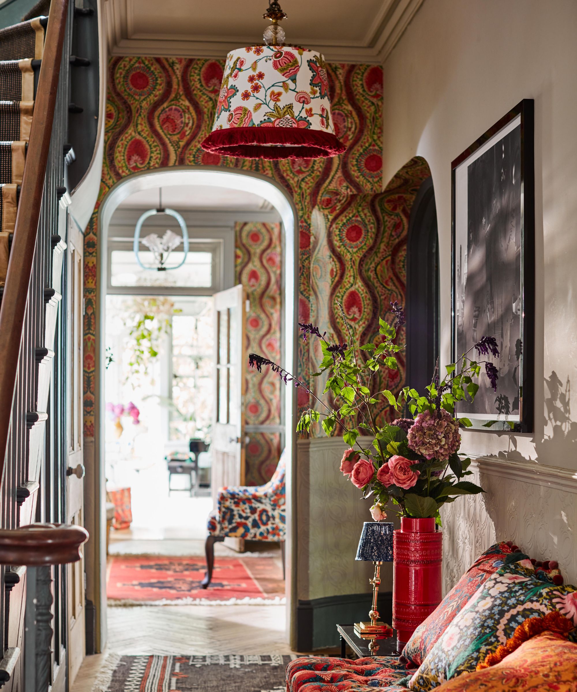
A maximalist entryway from MINDTHEGAP, similar to the one in Blake Lively's home
She advises: 'Don’t shy away from mixing textures and eras; the key is in the mix, not the match. Start with a statement piece that you love and build around it, layering in accessories that reflect your personality and passions.' In Lively's space, the interplay of the bold floral painting with the geometric carpet embodies this advice.
Shop The Maximalist Entryway Look
To help you easily recreate the look of Blake Lively's entryway in your own home, our editors tracked down a very similar frame to the ones on her gallery wall and a similar rug at an incredibly accessible price point. We also found Lively's exact candle choice but in a smaller size. These ideas will work whether you have a large foyer like the actress or a more narrow entryway.
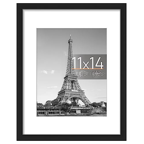
This black rectangular frame is highly durable with a stylish, minimalist appearance to complement a maximalist scheme
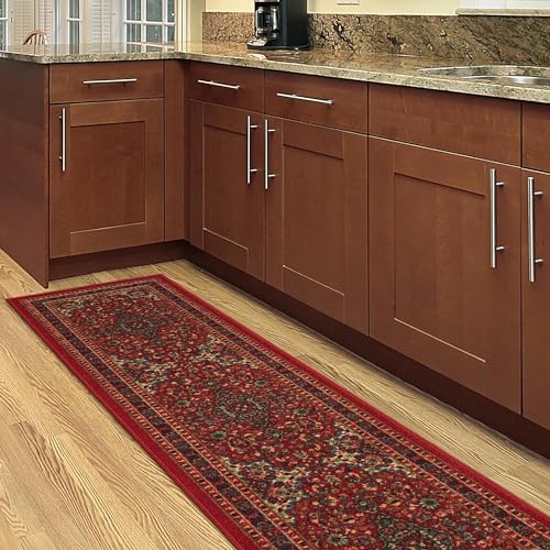
This non-slide, machine-washable runner rug is perfect for those with children and pets, providing a luxury look without the high-maintenance care
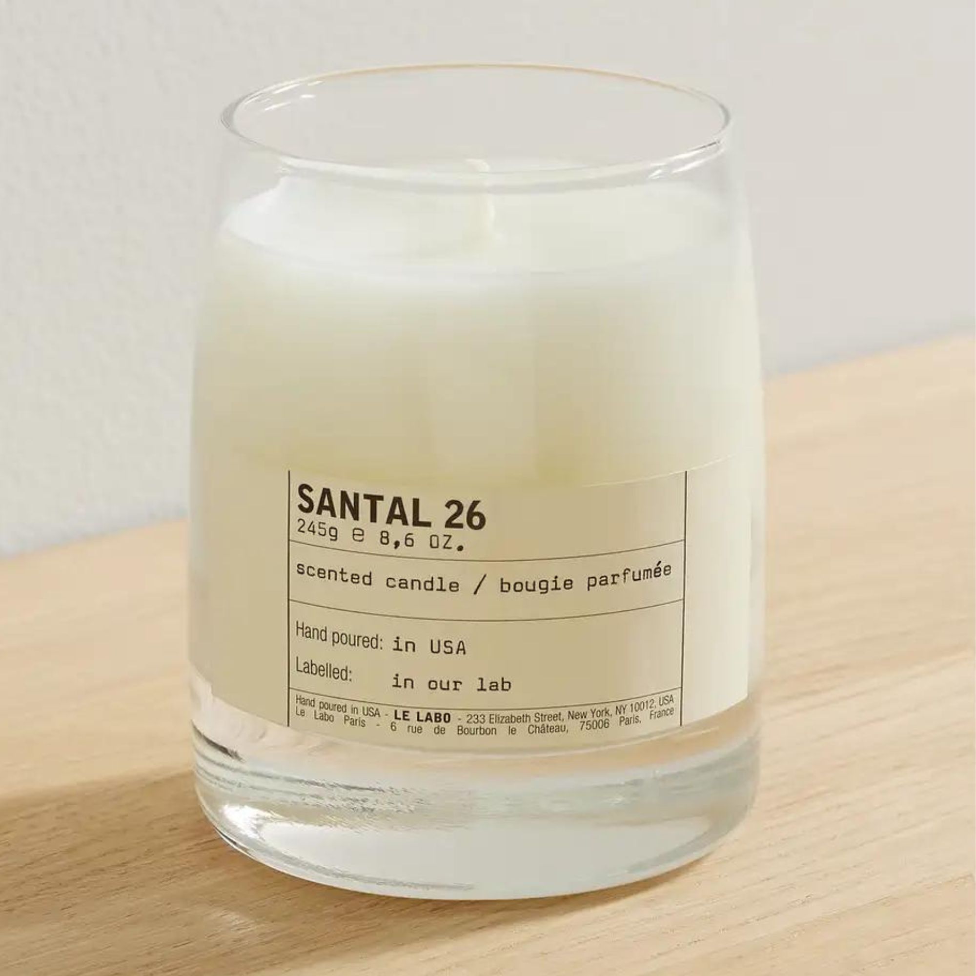
Scent your home like Blake Lively with Le Labo's Santal 26 candle, perfect for welcoming guests into your home.
Lively's scheme is all about balance. The neutral flooring and walls keep the brightly colored art and blue furniture from looking overwhelming, and the bright furniture and art keeps the flooring and walls from looking too dark. Color rules like the 60-30-10 rule are a great place to start at accomplishing a similar balance. This rule suggests decorating with three colors in different shades, with one taking up 60% of the room, the second taking up 30%, and the third taking up 10%. Though you don't need to adhere exactly to these percentages, it provides an excellent jumping-off point for conceptualizing the use of color.
Design expertise in your inbox – from inspiring decorating ideas and beautiful celebrity homes to practical gardening advice and shopping round-ups.
Bold colors and intricate patterns don't have to be destabilizing forces; they can be grounding and welcoming when used with restraint and care. Blake Lively's entryway is the perfect reference for learning how.

Sophie is a writer and News Editor on the Celebrity Style team at Homes & Gardens. She is fascinated by the intersection of design and popular culture and is particularly passionate about researching trends and interior history. She is an avid pop culture fan and has interviewed Martha Stewart and Hillary Duff.
In her free time, Sophie freelances on design news for Westport Magazine and Livingetc. She also has a newsletter, My Friend's Art, in which she covers music, culture, and fine art through a personal lens. Her fiction has appeared in Love & Squalor and The Isis Magazine.
Before joining Future, Sophie worked in editorial at Fig Linens and Home, a boutique luxury linens brand. She has an MSc from Oxford University and a BA in Creative Writing and Sociology from Sarah Lawrence College.