Cinderella's Billy Porter uses this interior designer-approved method for maximizing natural light in his New York home
Billy Porter expertly employs designer suggestions for creating an ultra-bright space in his NYC apartment


Properly amplifying natural light in your space is a proven way to make the space appear brighter, larger, and more visually interesting. Actor and certified style icon Billy Porter clearly agrees. The Cinderella star’s Manhattan apartment epitomizes the effective use of natural light.
A post shared by Billy Porter (@theebillyporter)
A photo posted by on
Billy took to Instagram to reveal his New York home and show that he takes excellent advantage of the huge, wall-length windows. The whole space appears incredibly bright and the sunlight coming from the window is reflected around the entire area.
The Pose actor’s room is equipped with two light-enhancing design choices: a pared-back color scheme and reflective surfaces. Interior design experts weigh in on the benefits of each of these design choices and why they are effective for brightening a space. These small living room lighting ideas are especially effective in small living rooms, where light can be restricted.
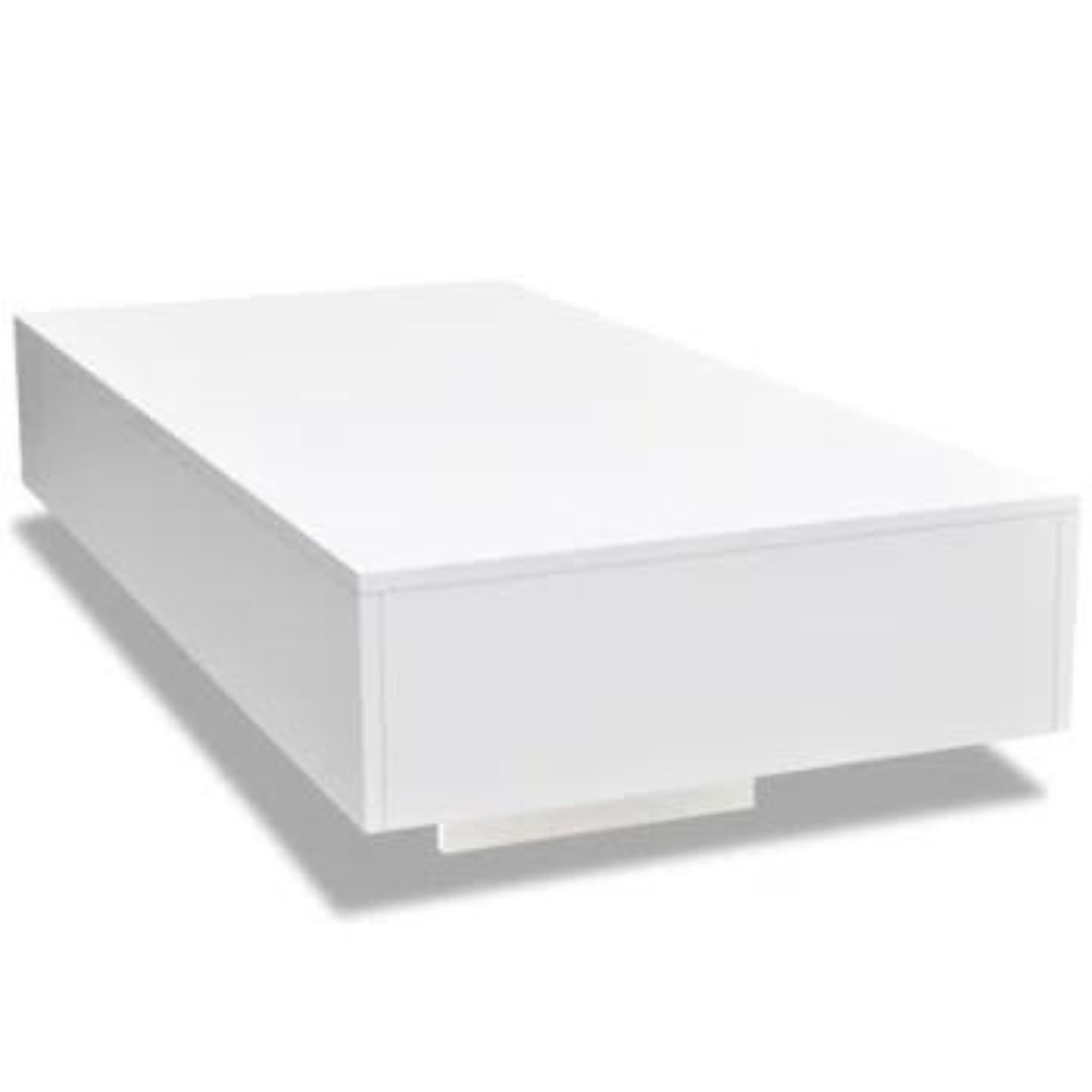
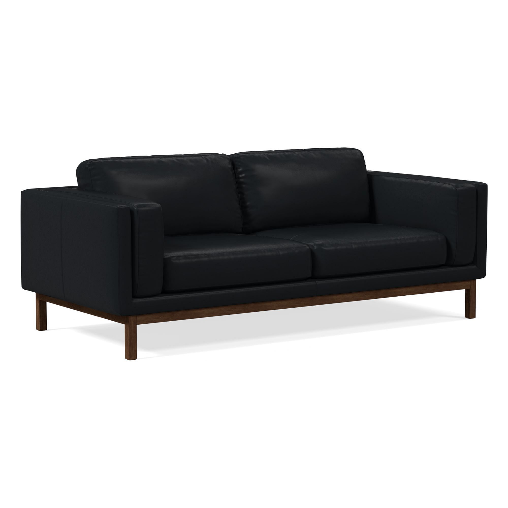
The activist’s space includes several reflective pieces of furniture including a shiny coffee table and polished black leather sofa. Design experts opine on the positive effects of this design choice. Michelle Woolley Sauter, Principal Designer at One Coast Design, says that ‘light-reflecting materials, such as glass, mirrored surfaces, polished metals, and high-gloss finishes, offer several advantages in a living room.’
She continues to say that reflective materials make a living room brighter because ‘these materials bounce natural and artificial light around the room, making it feel brighter and more open.’
Furthermore, Michelle says, these surfaces can make a small living room look bigger.
‘Reflections create a sense of depth and spaciousness, making the room appear larger than it is’ she continues. Finally, Michelle says that ‘the interplay of light and reflections adds texture and visual interest to the design, preventing a flat and dull look’ in a neutral-colored room.
Design expertise in your inbox – from inspiring decorating ideas and beautiful celebrity homes to practical gardening advice and shopping round-ups.

Interior designer Michelle Woolley Sauter is the founder of One Coast Design, an award-winning interior design firm based in Summerville, SC. An accomplished artist, Michelle also has a background in designing yacht interiors, bespoke furniture pieces, and wallpaper lines.
Billy Porter also enhances the light in his home by using a pared-back color scheme, featuring mostly white. Mohammad Ahmed, interior designer and home expert at The Home Guidance, celebrates the effectiveness of layers of white in a room, especially the use of white paint.
The expert says ‘white paints are versatile, make rooms look larger, highlight other colors, and are easy to care for.’ He goes on ‘when choosing a cream or white paint color you can keep the overall style of your home, the amount of natural light in the room, and the colors of your furniture.’
Additionally, Mohammad suggests that a neutrally decorated room can have positive psychological effects because they create a ‘serene and calm environment.’

Mohammad Ahmed is a graduate of the University of Minnesota with a degree in Interior Design. He has worked as an interior designer for one of the world's most renowned companies, where he helped design homes all around the globe.
The combination of reflective surfaces and neutral color scheme in Billy Porter’s space makes for a larger, and brighter-looking space, perfect for decorating a small apartment living room.
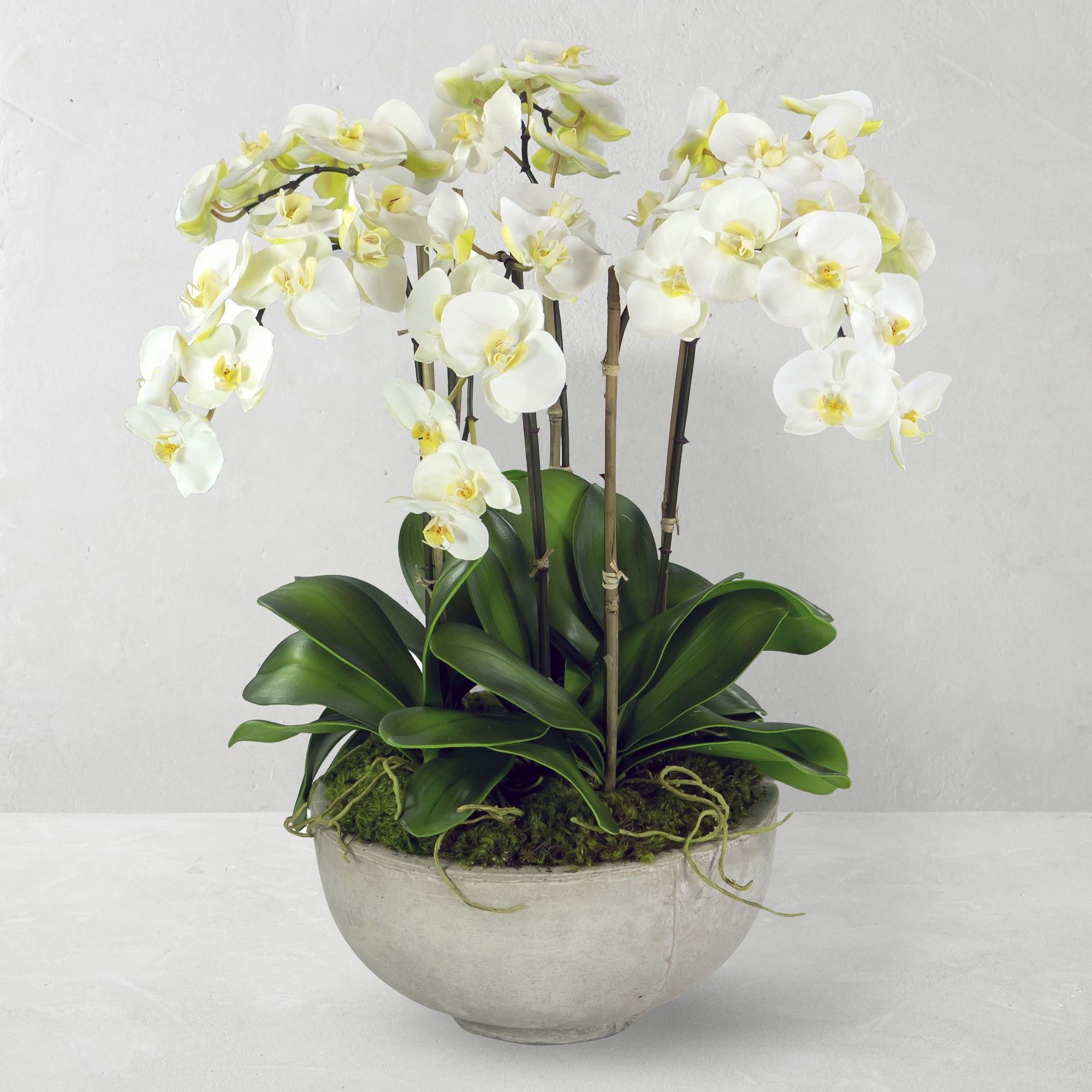
Shop the edit to recreate Billy’s iconic look.

Sophie is a writer and News Editor on the Celebrity Style team at Homes & Gardens. She is fascinated by the intersection of design and popular culture and is particularly passionate about researching trends and interior history. She is an avid pop culture fan and has interviewed Martha Stewart and Hillary Duff.
In her free time, Sophie freelances on design news for Westport Magazine and Livingetc. She also has a newsletter, My Friend's Art, in which she covers music, culture, and fine art through a personal lens. Her fiction has appeared in Love & Squalor and The Isis Magazine.
Before joining Future, Sophie worked in editorial at Fig Linens and Home, a boutique luxury linens brand. She has an MSc from Oxford University and a BA in Creative Writing and Sociology from Sarah Lawrence College.


