Bethenny Frankel's living room celebrates a bold shade that will 'never go out of style'
The personality employs this iconic pop of color in her living room – this is why it has the power to transcend all trends


A pop of color is a timeless way to bring visual interest to your neutral home. Bethenny Frankel celebrated the ever-stylish look with a photo of her living room corner, most of which is black and white with two notable exceptions: A Tiffany and Co. book and a yellow pop art print from the aforementioned brand.
The turquoise pop of color instantly elevates the RHONY's space, and interior designers love the look.
Bethenney's living room color has its roots in a strong design history. Nicole Cullum, interior designer and founder of Color Caravan, tells H&G: 'Some things never go out of style. There are only a few colors in the design community that are more iconic than this shade. This instantly recognizable robin's egg blue was made famous by Charles Tiffany as his signature hue for his jewelry catalog and eventually became the branding symbol for his branding and packages in 1966.'
A post shared by Bethenny Frankel (@bethennyfrankel)
A photo posted by on

Nicole Cullum is an interior designer in Taos, New Mexico, and Founder of Color Caravan, a charming hand-painted line of wallpaper, textiles, bedding, and home decor.
Nicole continues, 'The unique blend of a delicate light blue with a hint of green has become emblematic of luxury and refined sophistication. The color was formally trademarked in 1998 and is known as Pantone color ‘1837 Blue’ in honor of the year Tiffany & Co. was founded. This rare color is closely guarded and protected across most countries worldwide, adding to the allure of its timeless exclusivity.' This history makes it the perfect hue for adding subtle elegance to our living room.
'A small dose of a barely-there yellow-green adds a visually exciting tone to a normally basic light blue. This color combination was thought to be inspired by Victorian brides, who would gift wedding attendees with a turquoise brooch as a symbol of tradition in the early 19th century,' says Nicole.
This specific blue living room color trend was popular in the 19th century, and its popularity will continue into 2024. 'In a time when we see a lot of classic and traditional styles returning, this type of blue will be an on-trend shade this year,' says Jennifer Ebert. 'The color's timeless elegance and bright, uplifting shade make it the perfect pop of color.

Jen is the Editor (Digital) of Homes & Gardens. Before starting this position, she had completed various interior design courses at KLC Design School, as well as working across Ideal Home, LivingEtc, 25 Beautiful Homes and Country Homes & Interiors as an interiors writer.
Nicole adds: 'Use touches of this iconic blue as a chic accent in your living room to instantly elevate your color scheme. Guests will immediately recognize this color as synonymous with not only elegance and wealth, but classic femininity and grace.'
Sign up to the Homes & Gardens newsletter
Design expertise in your inbox – from inspiring decorating ideas and beautiful celebrity homes to practical gardening advice and shopping round-ups.
Shop Our Blue Edit
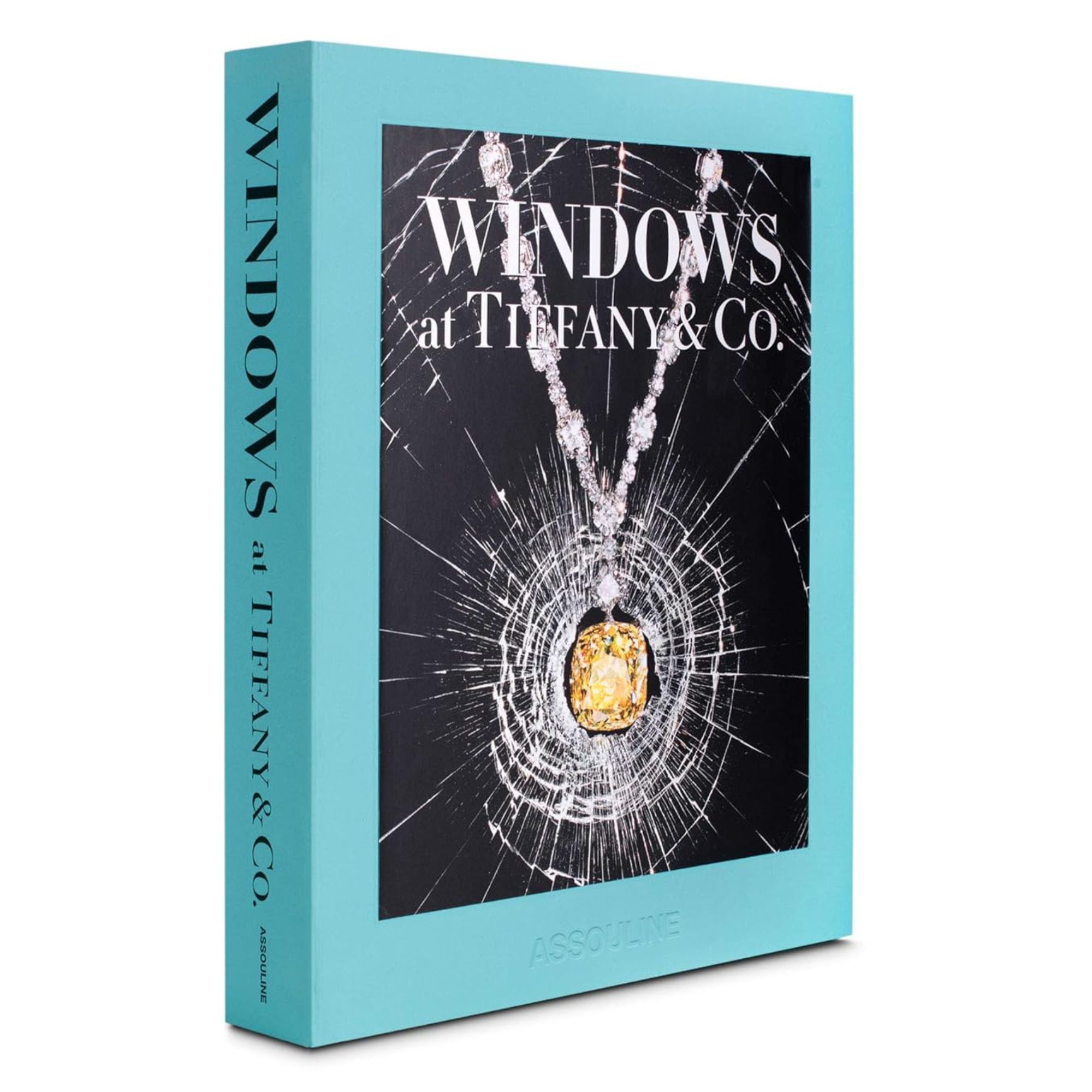
This book by Assouline features the windows at Tiffany's Fifth Avenue Flagship. It includes never-before-seen sketches, historical manuscripts, and behind-the-scenes images. Perfect for a coffee table.
For more inspiration on how to integrate turquoise pops of color into your home, our list of blue living room ideas is a great start. This shade has been on trend for almost 100 years, and it will continue to be popular for the next 100. Bethenny Frankel certainly knows it.

Sophie is a News Editor at Homes & Gardens, where she works on the Celebrity Style team. She is fascinated by the intersection of design and popular culture and is particularly excited when researching trends or interior history. Sophie is an avid pop culture fan. As an H&G editor, she has interviewed the likes of Martha Stewart, Hilary Duff, and the casts of Queer Eye and Selling Sunset. Before joining Future Publishing, Sophie worked as the Head of Content and Communications at Fig Linens and Home, a boutique luxury linens and furniture brand. She has also written features on exciting developments in the design world for Westport Magazine. Sophie has an MSc from the Oxford University Department of Anthropology and a BA in Creative Writing and Sociology from Sarah Lawrence College.
-
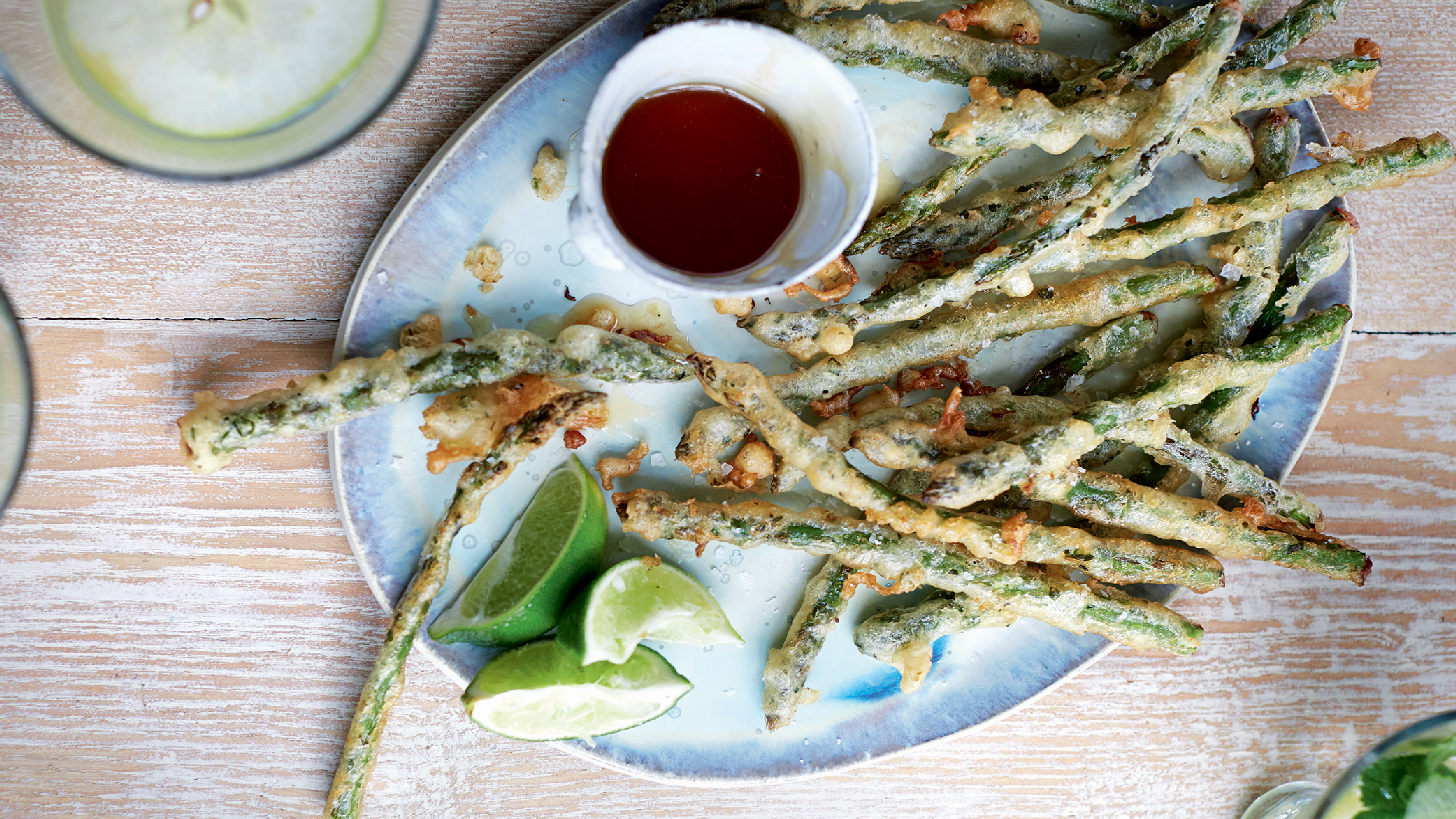 Crispy asparagus with honey
Light golden batter flavored with tarragon, lemon, and coriander makes this asparagus appetizer beautifully irresistible. The perfect spring hors d'oeuvre
By Alice Hart
-
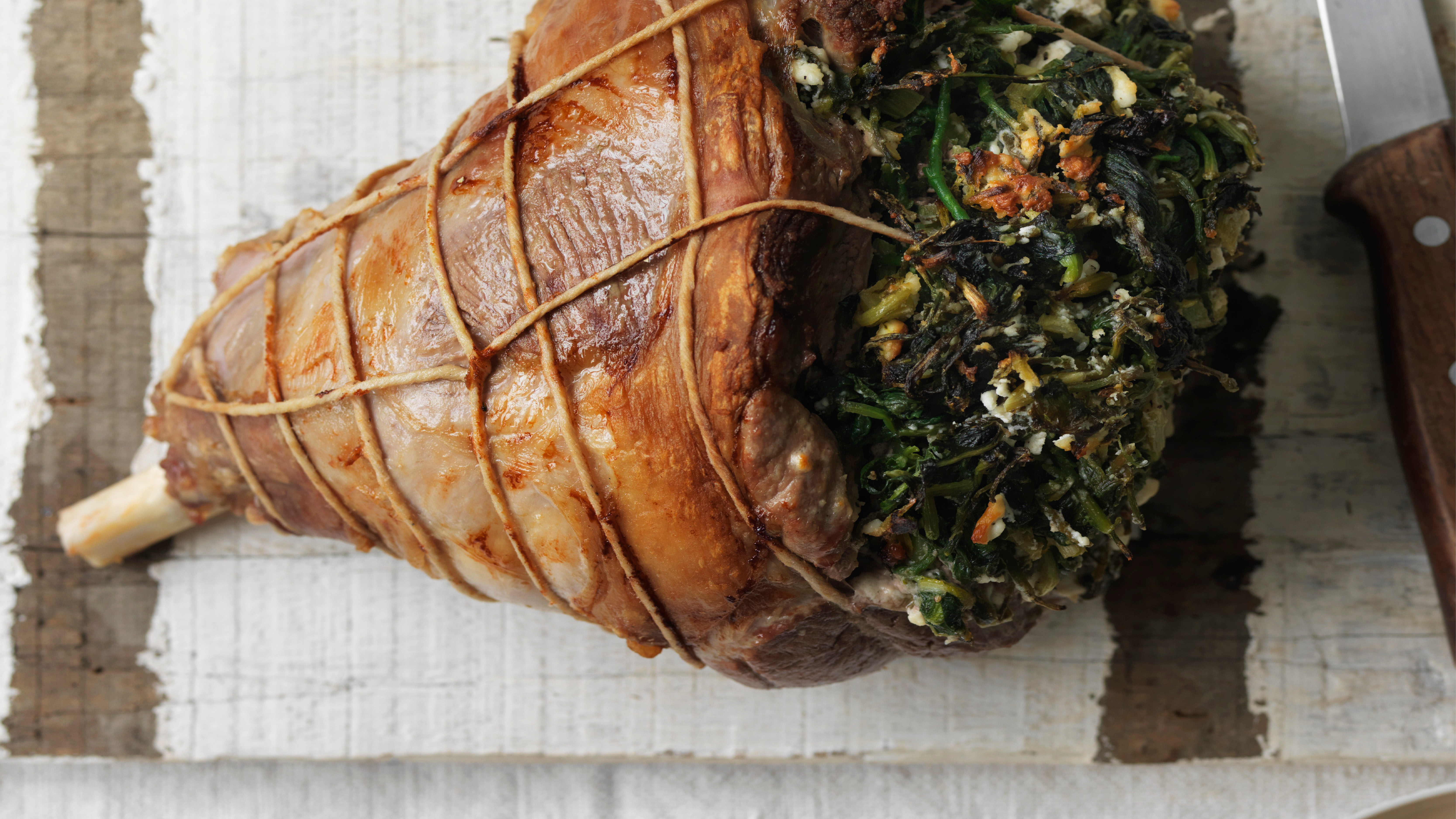 Lamb leg stuffed with horta and feta
This stuffed leg of lamb with greens and feta is a fresh take on a classic roast, perfect for Easter lunch with friends or family
By Alice Hart
