Anthony Hopkins makes the most of a 'dead space' with warm neutrals, statement lighting, and stone furniture – experts love his underrated technique
A simple landing becomes a luxurious place to spend time in Anthony Hopkins's striking home – it's one of the best uses of extra space we've seen


Design expertise in your inbox – from inspiring decorating ideas and beautiful celebrity homes to practical gardening advice and shopping round-ups.
You are now subscribed
Your newsletter sign-up was successful
Want to add more newsletters?
'Dead spaces' have some of the biggest untapped potential in our houses. These underutilized spaces are often too small, oddly shaped, or dark to know exactly how to decorate, but when done right can bring a sense of completion and luxury to the home. Principal among these is the landing at the top of the stairs. Though these spaces add square footage to our homes, they are too often left undecorated. Sir Anthony Hopkins changes all of this.
We spotted the actor's landing idea in a recent Instagram post showing him dancing with fellow actor Ian McKellen at the top of his stairs. If it weren't for a glimpse of the banister, we would never have known it wasn't a living room. The warm neutral space has cream walls and cream curtains. A tan rug with a marble pedestal table and plant on top anchor the space. A crystal chandelier hangs down anchoring the space, echoing the crystal wall sconces on either side of the room.
Nina Lichtenstein, a Westchester-based interior designer lauds the way he has fixed dead space stating: 'Anthony Hopkins’s landing is a masterclass in the thoughtful use of symmetry and minimalism to transform a traditionally “dead” space into an area of quiet grandeur and visual harmony. By leaning into symmetry, the landing establishes a serene yet elevated ambiance that feels intentional rather than wasted.
Article continues belowA post shared by Anthony Hopkins (@anthonyhopkins)
A photo posted by on
The space becomes much more than a hallway. Lichtenstein continues, 'Hopkins’s landing is a striking example of how a space often neglected can become a centerpiece of the home. The use of different textiles – the softness of the rug against the crispness of the tiles, the flowing curtains, and the delicate table decor—creates layers of comfort without compromising the clean lines of the design. The chandelier and sconces provide just the right amount of visual drama, casting soft, candle-like light that heightens the elegance of the space.'
A huge reason the space works so well is the creamy landing color scheme. 'The large, airy space is defined by its clean, white palette, which extends from the walls to the floor tiles, creating a sense of openness and brightness,' says Lichtenstein.
She continues, 'Hopkins’s choice of ornate architectural details, like the molding and doorways, introduces a subtle elegance that prevents the space from feeling sterile. On the far wall, twin floor-length white curtains frame two large outdoor doors while matching doorways on either side of the landing maintain symmetry. These doorways are flanked by candle-like wall sconces, which tie seamlessly into the stunning crystal chandelier hanging overhead. This chandelier, with its candle-like bulbs, anchors the space while playing with texture and light.' Be sure to bypass the colors to avoid painting a landing.
The way Hopkins creates symmetry here is essential to the visual focus of the room. Portland-based interior designer Elissa Hall states: 'A table and statement light are natural focal points when used together because they create a layered visual interest. I recommend using a table with sculptural or artisanal qualities—something that feels tactile and intentional. Pair it with a bold light fixture overhead, such as a chandelier or pendant light that contrasts with the neutrality of the landing. The juxtaposition of light and table provides both functionality and visual weight to the space.'
Design expertise in your inbox – from inspiring decorating ideas and beautiful celebrity homes to practical gardening advice and shopping round-ups.
Shop the Look

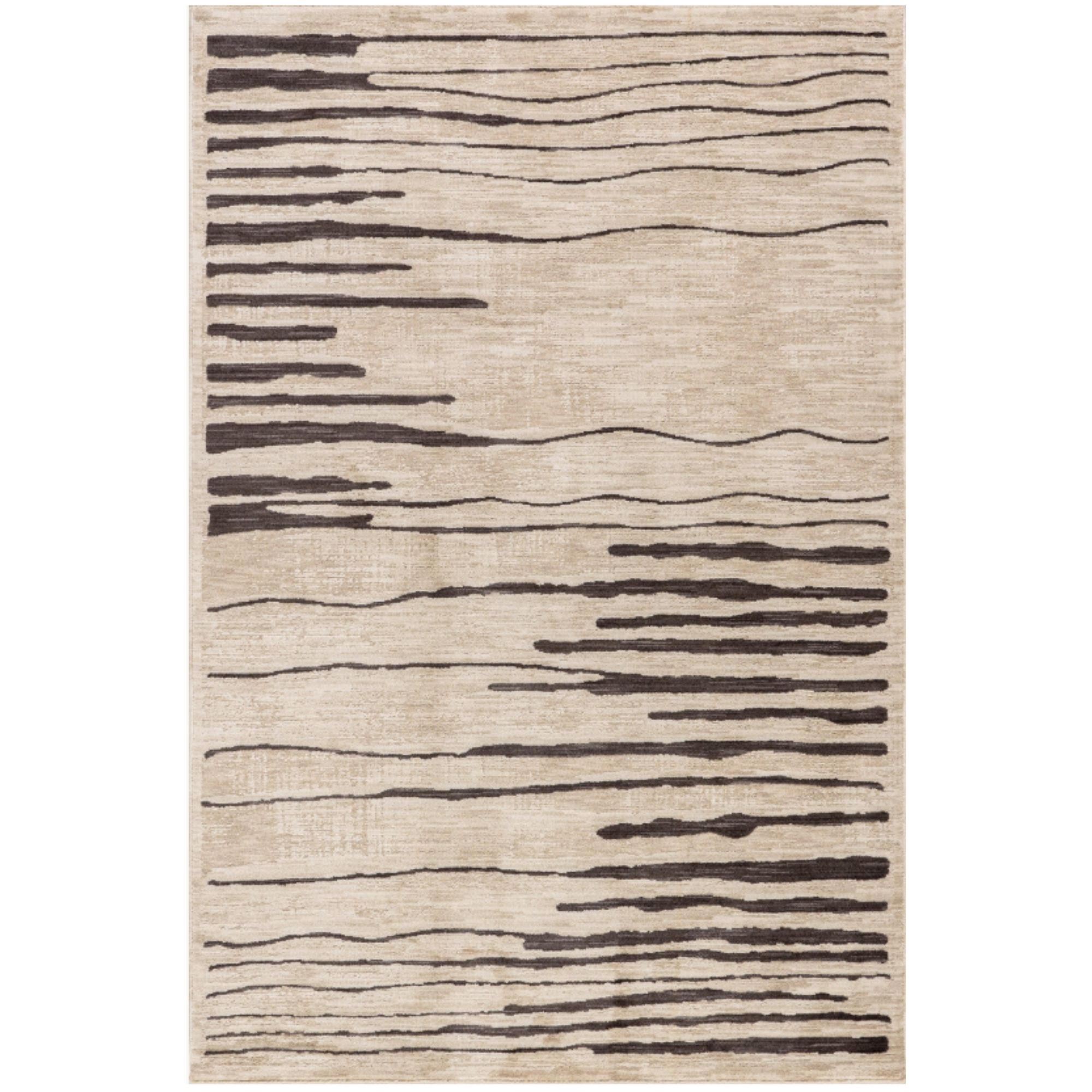
These deconstructed stripes make a bold impact on a beige base. The look is just as stunning as the feel underfoot.

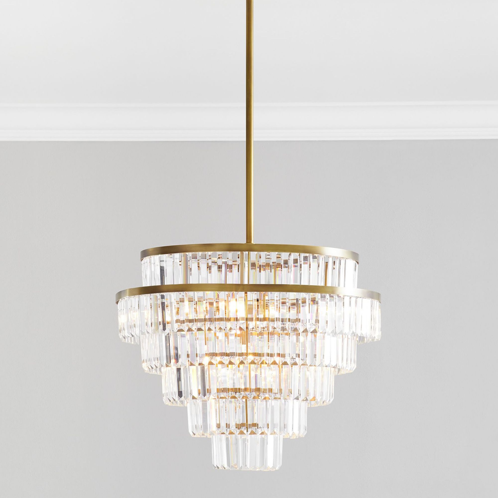
Effortlessly elegant, this chandelier speaks for itself.

Bring beauty and grace to your accent table without adding color with white faux flowers.
Luckily, Hopkins's landing lighting idea is easy to recreate. Hall advises: 'To replicate the look from the Instagram post, start by focusing on symmetry and simplicity. Use neutral tones for the base—soft beige or light gray walls—and introduce a few standout elements like a clean-lined console table and an oversized mirror or art piece. You can then add a pop of personality with statement lighting and a few curated accessories. Keep in mind the power of balance: the large, bold light fixture from the post is perfectly countered by the quiet elegance of the landing’s simplicity. I suggest looking for understated yet striking fixtures, which are often found at artisan shops or vintage stores, to give the space an authentic and lived-in feel.'
Transforming spaces in your home with design is a wonderful way to expand and take advantage of the full potential of the house.

Sophie is a writer and News Editor on the Celebrity Style team at Homes & Gardens. She is fascinated by the intersection of design and popular culture and is particularly passionate about researching trends and interior history. She is an avid pop culture fan and has interviewed Martha Stewart and Hillary Duff.
In her free time, Sophie freelances on design news for Westport Magazine and Livingetc. She also has a newsletter, My Friend's Art, in which she covers music, culture, and fine art through a personal lens. Her fiction has appeared in Love & Squalor and The Isis Magazine.
Before joining Future, Sophie worked in editorial at Fig Linens and Home, a boutique luxury linens brand. She has an MSc from Oxford University and a BA in Creative Writing and Sociology from Sarah Lawrence College.