Anne Hathaway's two-tone entryway features the expert-approved paint trick that everyone should try in 2024
Why choose one color, when you can have two? Anne Hathaway's two-tone entryway shows how pairing colors can double the design impact


A pairing pleasing of shades on walls will deliver depth and interest, and American actress Anne Hathaway and Adam Shulman's Studio Shamshiri-designed Californian cabin home is a perfect example of how to use color combinations to great effect.
Decorative paint tricks and finishes are becoming increasingly popular in interior design. Introducing paler finishes at eye level is a well-known ploy for improving spaciousness and preventing wall units from overpowering, particularly in on-show entrances.
‘We would generally recommend opting for dark shades at the bottom and lighter tones at the top, especially if the natural light isn’t great or the ceilings are low,’ says Sarah Ellison, founder and creative director at Frank & Faber.
A post shared by Studio Shamshiri (@studioshamshiri)
A photo posted by on
Creative paint ideas can bring unique beauty to a home – and the more inventive they are, the better.
If you don't want to use two contrasting colors, try a tone-on-tone option instead. Tone-on-tone color involves using different saturations of one color to achieve contrast and movement. It’s a great option for those who struggle with combining colors but don’t want a flat look.
To make life easier, many paint companies graduate popular shades numerically, from light to dark, to take the fuss out of finding the perfect paint ideas for your home. In north-facing rooms where the light is cold, it’s wise to use a lighter tone on the wall to help keep any potential gloominess at bay.
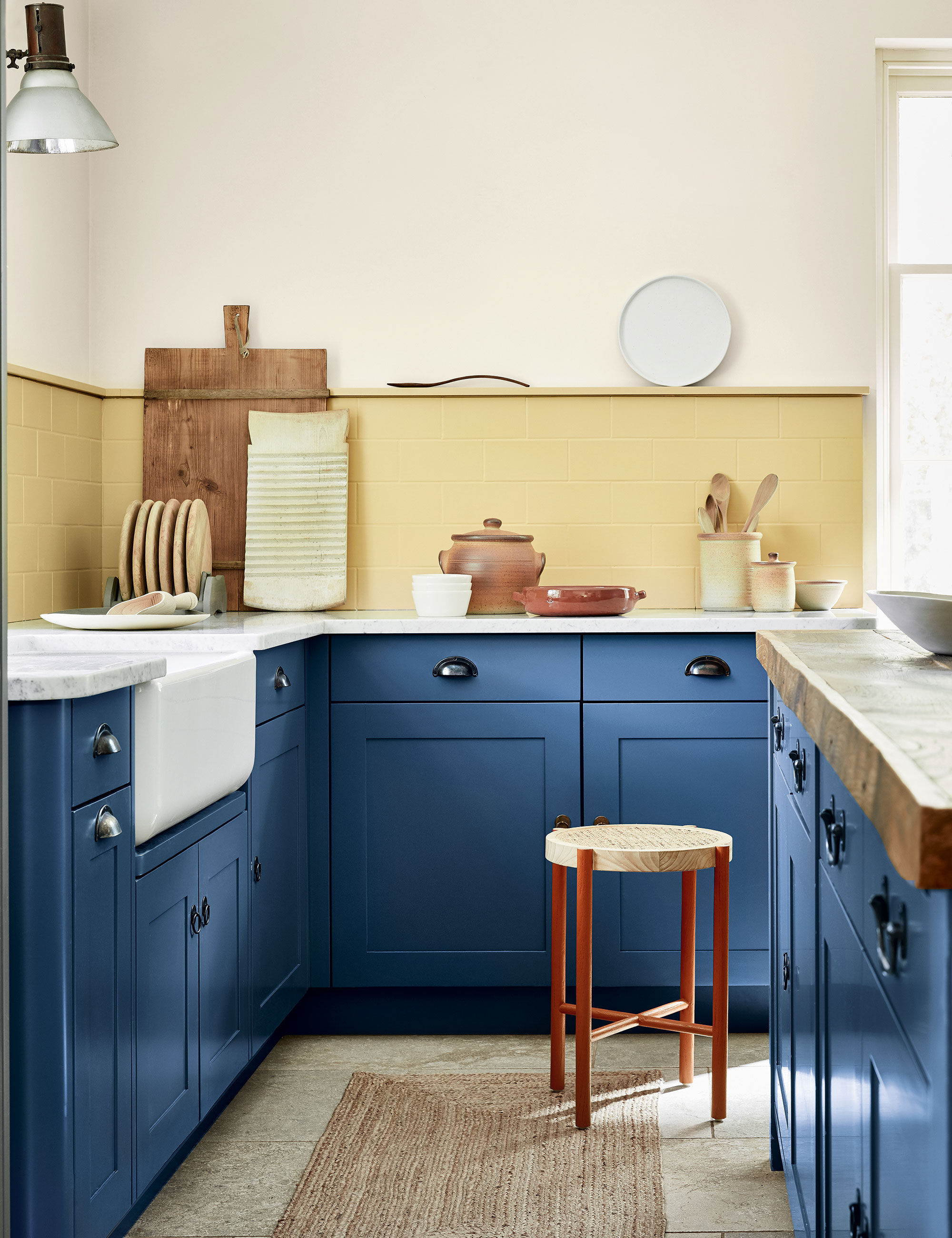
As Marianne Shillingford, creative director at Dulux says: 'The right paint colors can even make small spaces appear larger and reconnect us with nature. It has always had the power to transform on more levels than the way things look and we are only just beginning to realise its potential in our homes.'
Design expertise in your inbox – from inspiring decorating ideas and beautiful celebrity homes to practical gardening advice and shopping round-ups.
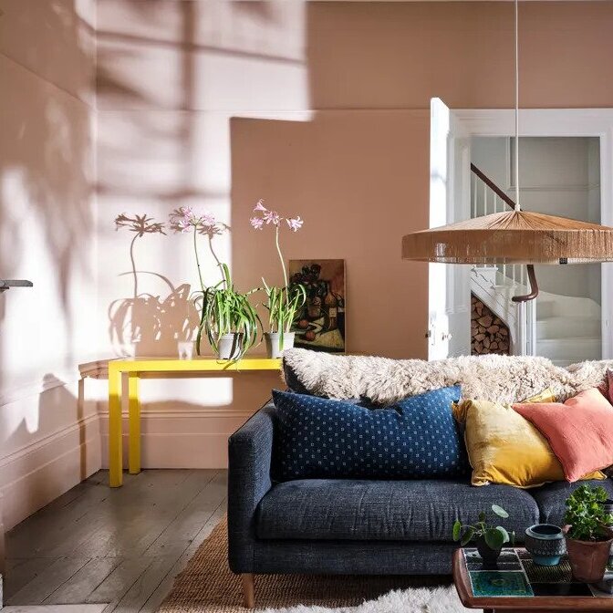
It is important to choose the right color for your home. We love the salmon pink and deep pink used in Anne Hathaway's home. Shades of pink are extremely versatile and have been a popular choice in interiors for centuries.
With its clear ties to the natural world, pink is used for painting accent walls and brightening a living space with splashes of color that symbolize and promote health and vitality.
‘Due to its close relationship with orange shades, this feminine color is mood-boosting and energy-stimulating without becoming overwhelming like many red shades,’ enthuses Sarah Lloyd, senior brand manager at Valspar
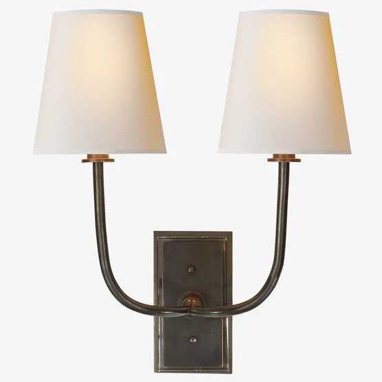
Shop the entryway edit

Jennifer is the Digital Editor at Homes & Gardens. Having worked in the interiors industry for several years in both the US and UK, spanning many publications, she now hones her digital prowess on the 'best interiors website' in the world. Multi-skilled, Jennifer has worked in PR and marketing and occasionally dabbles in the social media, commercial, and the e-commerce space. Over the years, she has written about every area of the home, from compiling houses designed by some of the best interior designers in the world to sourcing celebrity homes, reviewing appliances, and even writing a few news stories or two.
