Anne Hathaway's living room furniture is a masterclass in 'conversational seating' – her method could transform how you socialize, say designers
The right furniture arrangement is central to a space that's ideal for entertaining – Hathaway's living space masters this perfectly


Practicality is key for the living room, and the layout you select should not only be able to accommodate your lifestyle but enhance it. Inspiration on how to master this layout comes from Anne Hathaway's living room – the product of Pamela Shamshiri, the co-founder of Los Angeles-based Studio Shamshiri. The design firm first shared the room in 2019, but as we look toward 2025, the layout is just as impactful.
The Devil Wears Prada actress and her husband, jewelry designer Adam Shulman, have perfected a clever living room seating arrangement in their chalet-style residence in California. It epitomizes a 'conversational seating' method that, top designers say, is the perfect example of how to maximize your floorplan.
Design icon Nina Campbell is a champion of what she calls 'conversational seating.' Essentially, it's a living room layout designed entirely around your seating arrangement, best exhibited in Hathaway's space.
A post shared by Studio Shamshiri (@studioshamshiri)
A photo posted by on
Shop the look
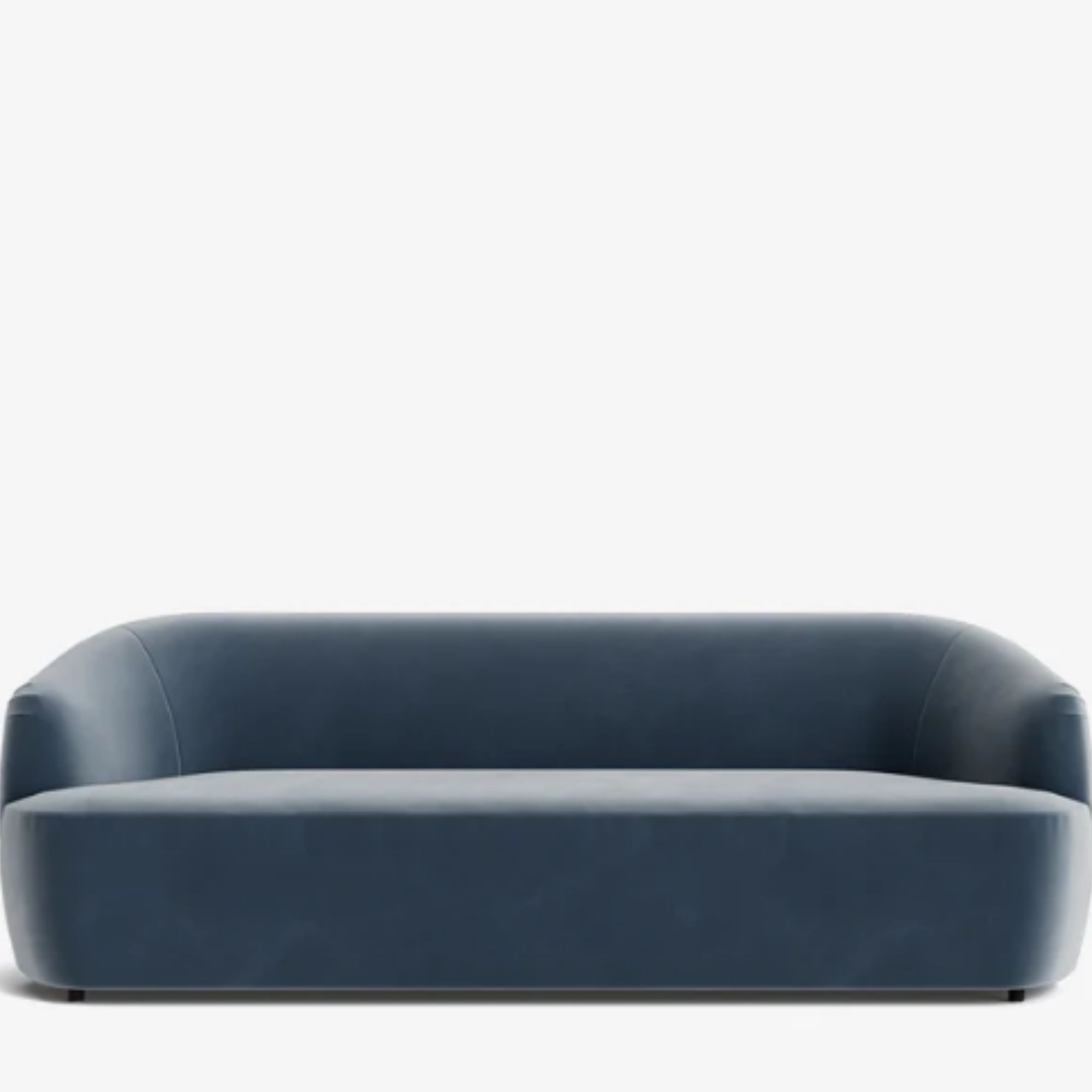
Nothing sets the tone for a conversational space quite like a statement sofa. This piece, inspired by the blue sofa in Hathaway's space, has a dressy but fun silhouette that feels sophisticated in every living room. It's the ultimate party centerpiece.
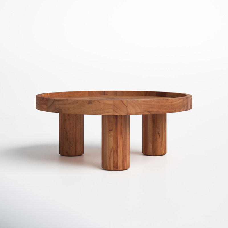
Crafted with a mix of kiln-dried solid and engineered wood, this modern coffee table features a tray-style top that's perfect for hosting. It keeps your guest's snacks and drinks in place and still has room for decorative candles and books.
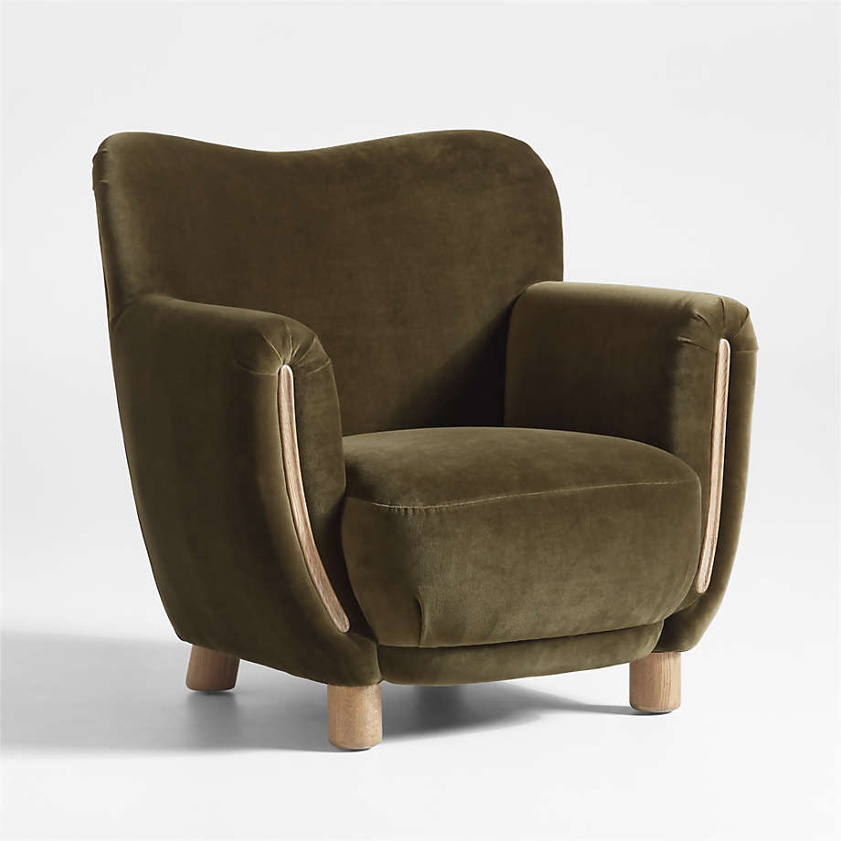
Inspired by the beautiful olive green chair in Hathaway's living room, this wingback has a vintage aesthetic that will bring old money charm to any contemporary living room. It's the product of Jake Arnold's genius (The Expert founder who's responsible for several celebrity homes). What's not to love?
Figuring out your floor plan is vital to ensure that your living room works from a practical and aesthetic standpoint. Start by working out the central point of the room; this will guide you as to where to place large pieces of furniture, such as sofas and chairs.
'For example, when designing a living room with a traditional fireplace, this will be a central point,' Campbell says. 'You can then either have the sofa to one side with a couple of chairs opposite. Alternatively, you can position the couch so it’s facing the fireplace and chairs on either side.'
It’s always good to throw off the symmetry of the room and add an extra dimension with mismatched furniture, color schemes, shapes, and styles to make the space feel more relaxed and encourage conversation.
But there is so much more to choosing a living room sofa or chair than just their appearance. The number of chairs you set out is an important consideration, too. Odd numbers are good for seating plans in general because they allow for some rotation of guests.
Sign up to the Homes & Gardens newsletter
Design expertise in your inbox – from inspiring decorating ideas and beautiful celebrity homes to practical gardening advice and shopping round-ups.
The interior designer Elsie de Wolfe wrote in 1913 that you must never place a chair on its own in a room; she was very shy herself and noted that it is always the shy person who arrives first, sits on the lone chair, and then is often rooted there for the whole party. But two next to each other does not always work, either. I find that two people sitting side by side do not always speak to each other, so having an occasional chair pulled in at a diagonal can create conversational triangles, similar to the seating placement in Anne Hathaway's home above.
Another way to arrange your seating is to place them within arm's reach of a side or coffee table. Can you imagine having to get up every time you – or your guest – wanted to reach the remote or sip their drink?
Perfecting the 'conversational seating' method is a good idea at every point of the calendar, but there is no time like the present – considering we're deep into hosting season.
This December, we suggest replacing art books and vases with small, tabletop Christmas trees while leaving room for a charcuterie board in the center of your social place. This way, your guests are all at an equal distance from the board – making it easy to eat, drink, and be merry long into the evening. I love how Hathaway's layout (with the coffee table in the middle) demonstrates this look perfectly.
Finally, you should never skimp on the most important piece of furniture in your living room: the sofa. 'The sofas and bigger pieces of furniture should be covered in a tough, strong, and relatively plain fabric so you don’t tire of it; they are expensive to recover. You can jazz them up with cushions and throws,' Campbell adds.

Jennifer is the Digital Editor at Homes & Gardens. Having worked in the interiors industry for several years in both the US and UK, spanning many publications, she now hones her digital prowess on the 'best interiors website' in the world. Multi-skilled, Jennifer has worked in PR and marketing and occasionally dabbles in the social media, commercial, and the e-commerce space. Over the years, she has written about every area of the home, from compiling houses designed by some of the best interior designers in the world to sourcing celebrity homes, reviewing appliances, and even writing a few news stories or two.
-
 Kylie Jenner, Tommy Hilfiger, and Lenny Kravitz transform their homes with prints – the London Original Print Fair Director has a method that makes their look 'accessible and affordable' in your home
Celebrities from the Kardashians to Lenny Kravitz decorate their homes with prints by famous artists, and it's easier to recreate than you might expect
By Sophie Edwards
-
 ‘Completion days’ are the answer to laundry doom piles, pro organizer claims – here’s how this hack can instantly stop fresh laundry from piling up once and for all
Stay on top of your laundry with the 'Completion days' method
By Chiana Dickson
-
 Anne Hathaway's unique maximalist living room vs. Kim Kardashian's ultra-minimalist space – which one works best?
Anne Hathaway's old money-style living room and Kim Kardashian's cool, modern living room could not be more different – but both have their benefits
By Hannah Ziegler
-
 Anne Hathaway's Hamptons-inspired NY patio has rebooted an anti-color trend I thought I was over – these 3 easy-to-find buys will bag you the look, too
The black furniture on the actress's New York terrace doesn't look dark – instead, it invites visual interest and intrigue to the pied-a-terre
By Sophie Edwards
-
 Anne Hathaway's 'uber-modern' kitchen shelving is the stuff of minimalist dreams – it is worthy of the finest art galleries
Gramercy Design used open shelving to introduce a delightful decorative moment to Anne Hathaway's white kitchen
By Jennifer Ebert
-
 Anne Hathaway's 'warm minimalist' living room showcases the most desirable furniture trend that we hope will never go out of style
Curved lines are a crucial consideration in interior design to make a room well-balanced and visually pleasing
By Jennifer Ebert
-
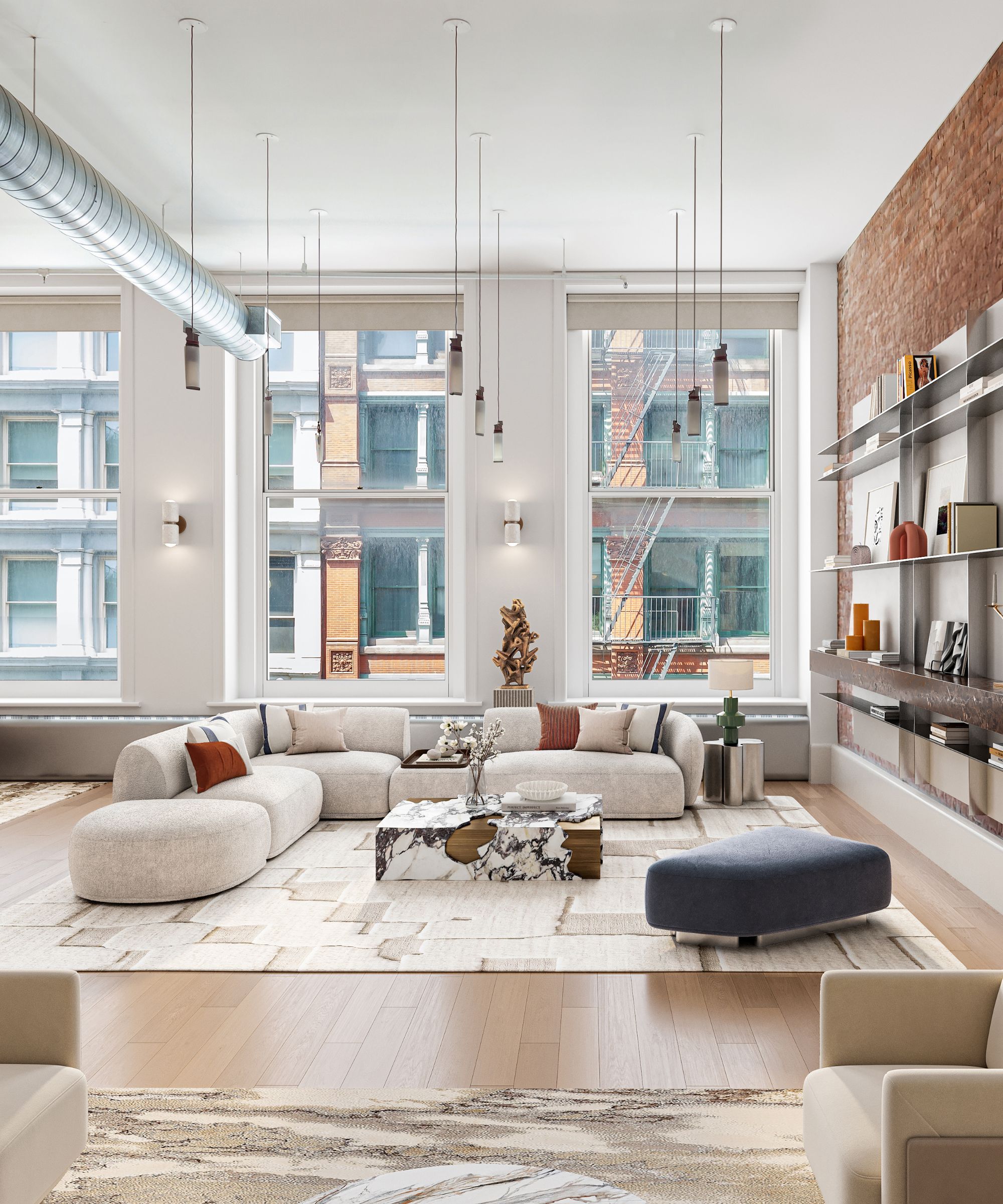 The SoHo loft visited by Anne Hathaway in The Devil Wears Prada is on the market for $8.95 million – it epitomizes chic NYC living
The loft served as the home of fictional designer James Holt, but it has a history beyond its Hollywood credentials
By Megan Slack
-
 Anne Hathaway's property portfolio – from a California chalet to an Upper West Side penthouse, these are the actress's most notable homes
The Devil Wears Prada actress has a rich property history spanning both the East and West coasts – including a Brooklyn apartment used as her closet
By Megan Slack
-
 Anne Hathaway's 1970s-style patio furniture is the most playful and elegant I've ever seen – it's a masterclass in integrating trending patterns with intention
The plaid furniture on the actress's patio taps into a current trend that looks to eras past – it's an elevated take on decorating an outdoor space
By Sophie Edwards
-
 Anne Hathaway's textured neutral bedding elevates her country-style bedroom – it's a masterclass in choosing fabrics and colors for a restful sleep
Linen, wool, and block-printed patterns combine on Hathaway's bed – for an Indian-inspired twist on her historic California cottage home
By Sophie Edwards