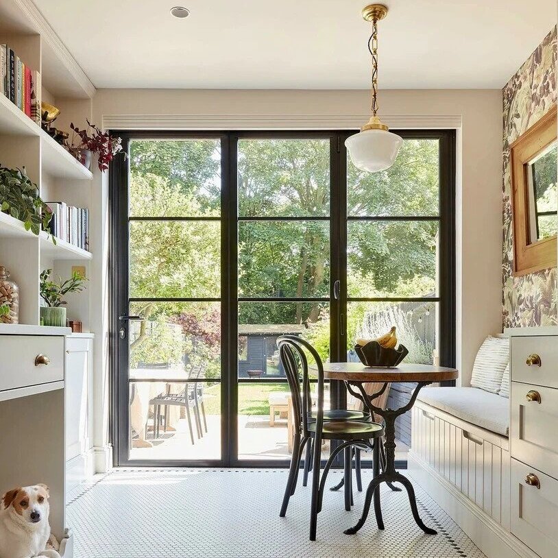
Amanda Seyfried's minimalist kitchen uses a monochrome color scheme to perfection, but there's a trick to getting it right
Mean Girl's actor Amanda Seyfried's family kitchen is effortlessly timeless and its beauty is that it can be modern or classic


Sophisticated and timeless in their simplicity, white schemes are a stalwart in the world of kitchen design – to get it right, it is all about the tone and how you use it. Monochromatic color schemes have been popular for as long as we can remember, but more often than not, they can look a little cold and clinical.
White is the ultimate modern and minimalist shade, but white also suits traditional, transitional, farmhouse, and Scandinavian kitchens, and more equally well. Amanda Seyfried's kitchen is a prime example of how white can work in just about any space.
Designed by General Assembly, the team behind Seyfried's New York pied-à-terre, is both contemporary and classic at the same time – a design feat that is not always easy to achieve.
A post shared by General Assembly (@gen_assembly)
A photo posted by on
With matte or gloss finishes on offer, whites can look strikingly different, and there’s huge variety in its shades from the crispest of pure whites to those with subtle warm or cool undertones.
It’s worth understanding how undertones work before committing to a white kitchen. Cool whites have hints of a blue undertone, while warm whites have more yellow. Use this intel to help coordinate other materials and colors on your mood board.
The white kitchen, above, draws on the traditional look of a traditional white kitchen, but with a contemporary, warm minimalist feel. This is in part thanks to the warm white paint used on the kitchen cabinets.
Interior designers and decorators love to decorate with white for its adaptability and availability. White is one of the most versatile shades in all of design – it instantly brightens while evoking a sense of calm and lawlessness.
Sign up to the Homes & Gardens newsletter
Design expertise in your inbox – from inspiring decorating ideas and beautiful celebrity homes to practical gardening advice and shopping round-ups.
'Add interest through colorful art, accent soft furnishings, and antique furniture and objects. It also makes it easier to change up the look of a room,' says Jane Landino, creative head of studio at Taylor Howes.
A post shared by General Assembly (@gen_assembly)
A photo posted by on
White kitchens continue to be hugely favored, despite notions that they can be too clinical for a home environment.
‘There are many ways to “warm up” the design, one of which is to consider the quality of artificial lighting in the room,’ says Richard Atkins, design director, DesignSpace London.
‘Cool white LED lighting can have a blue appearance when shone on a white surface, making it appear cold and uninviting. We always recommend warm or neutral white LEDs integrated into and around the cabinetry to enrich white surfaces and create definition.

Jennifer is the Digital Editor at Homes & Gardens. Having worked in the interiors industry for several years in both the US and UK, spanning many publications, she now hones her digital prowess on the 'best interiors website' in the world. Multi-skilled, Jennifer has worked in PR and marketing and occasionally dabbles in the social media, commercial, and the e-commerce space. Over the years, she has written about every area of the home, from compiling houses designed by some of the best interior designers in the world to sourcing celebrity homes, reviewing appliances, and even writing a few news stories or two.
-
 Your perfect Easter menu: our favorite Easter recipes for effortless entertaining
Fresh flavors, easy dishes, and crowd-pleasing ideas – our selection of Easter recipes make for a relaxed yet elevated spring celebration
By Alice Hart
-
 Sherry cosmopolitan
This sherry cosmopolitan is a lighter take on the classic cocktail, perfect for spring gatherings when you want something zesty and bright
By Alice Hart
